Select one ... (check one with "x")
[ ] bug
[X] feature request
[ ] enhancement
Description
Timeline is a visual indicator that shows progress and might guide the user through a certain process
Use Cases
- Set an expectation of the whole process
- See progress and the current step
- Read the additional description of each step and provide contextual actions
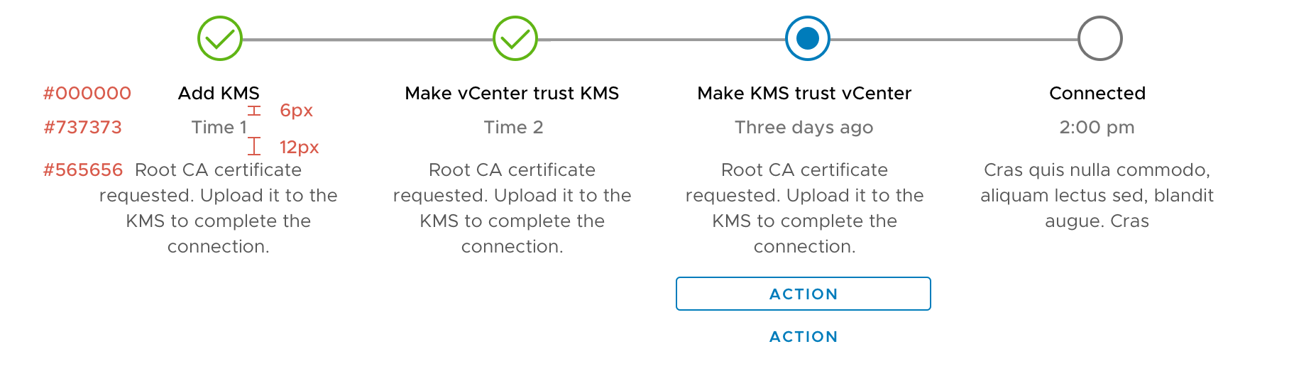
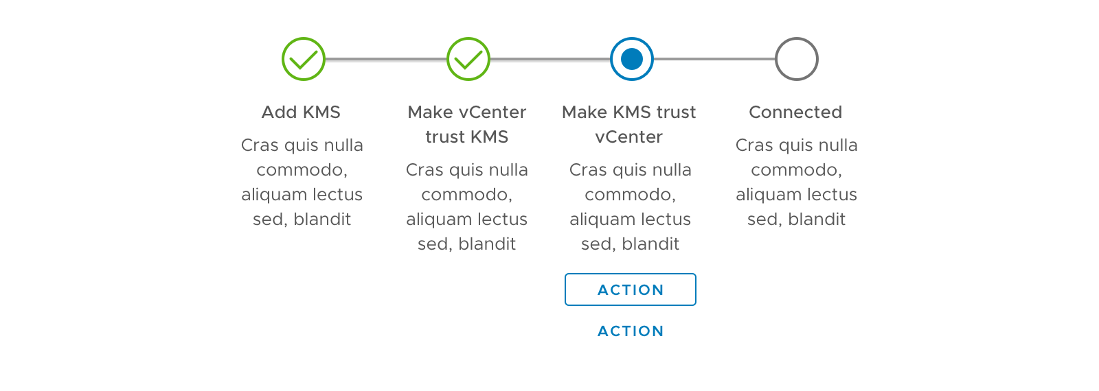
Horizontal Timeline
Layout
- Recommended for workflows of 3-5 steps
- The component should be displayed without wrapping
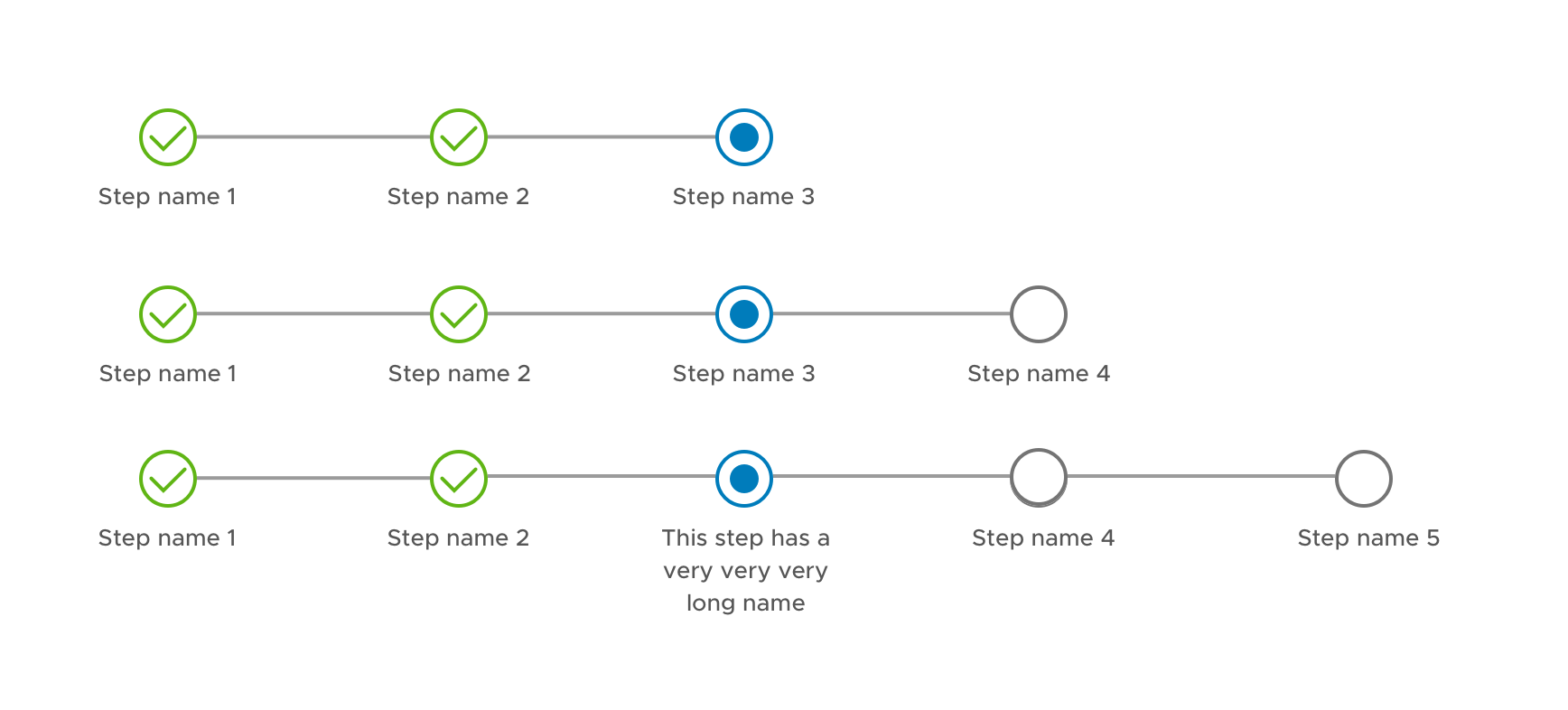
States
Timeline at each step

Various states of the steps
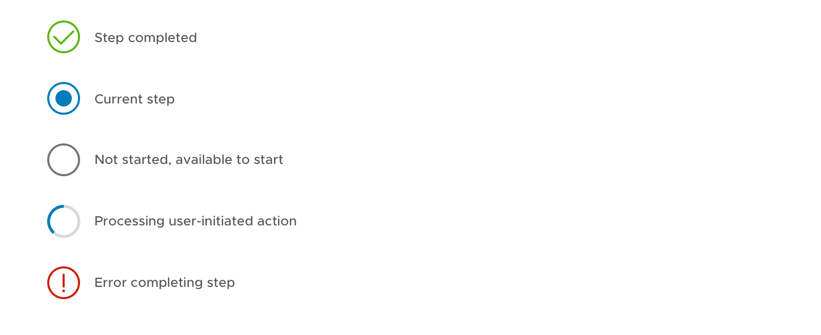
Loading State
- When loading, display a spinner
- Buttons will be disabled when loading, or make the buttons contextual for the loading state (e.g. CANCEL)

Error State
- Display the error message under the icon if needed
- Tooltip is not recommended because of the low affordance and accessibility issue

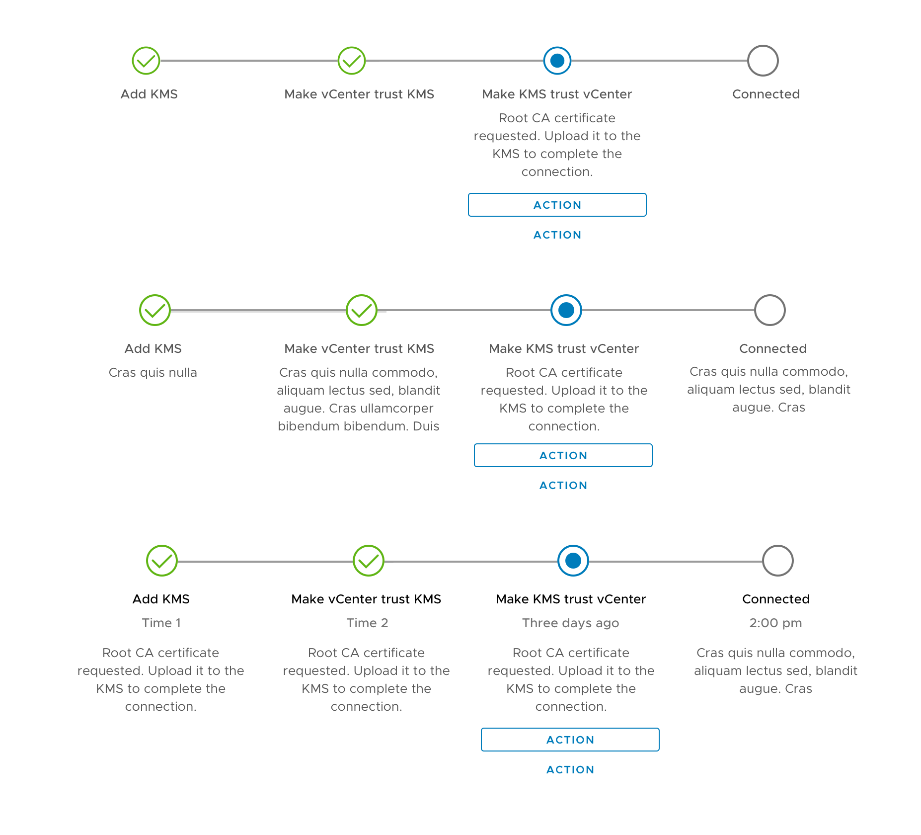
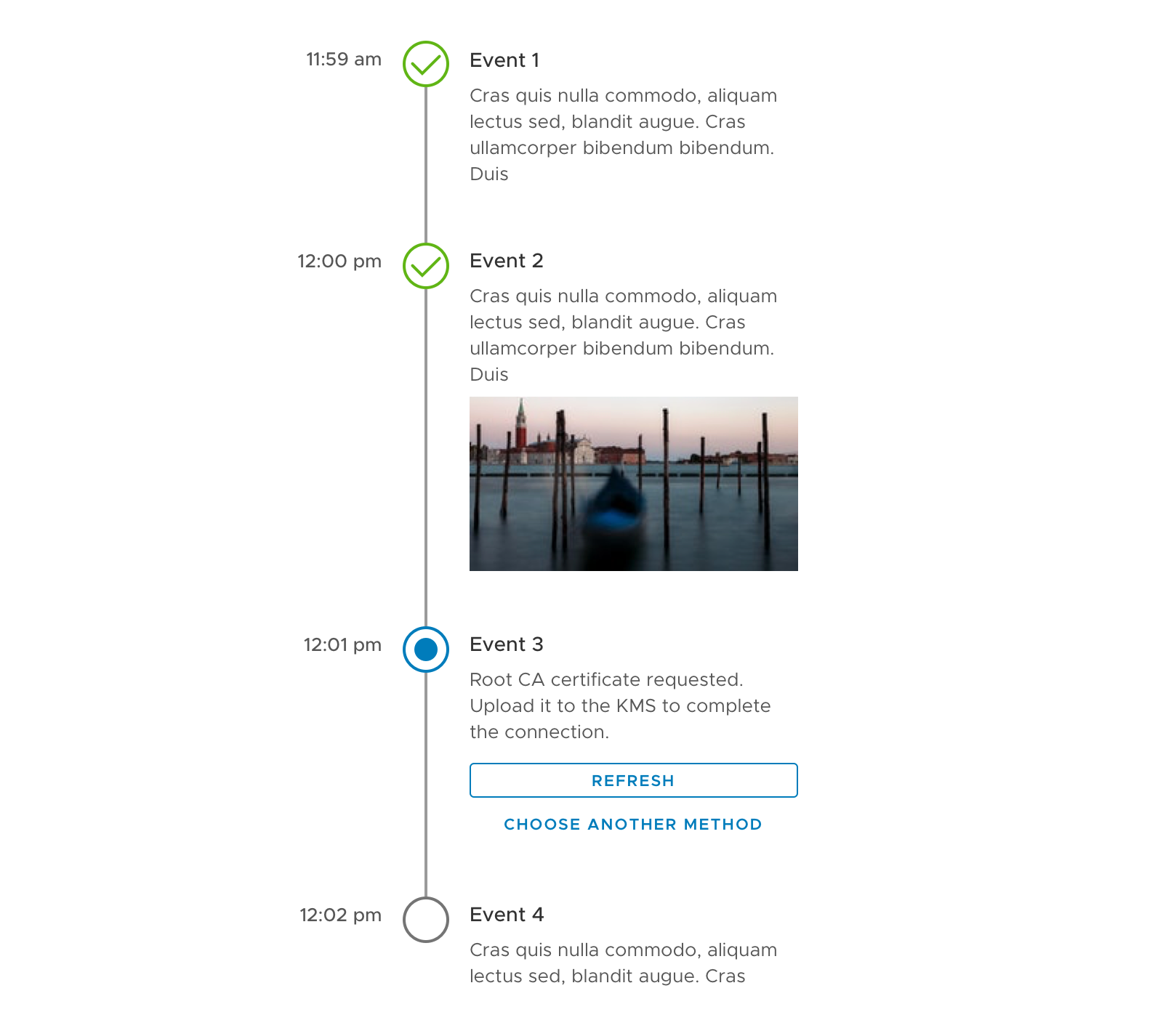
Step Description
- It is optional to have step description for additional information or guidance.
- The description can be either displayed all the time, or display only for the current step.
Redline spec
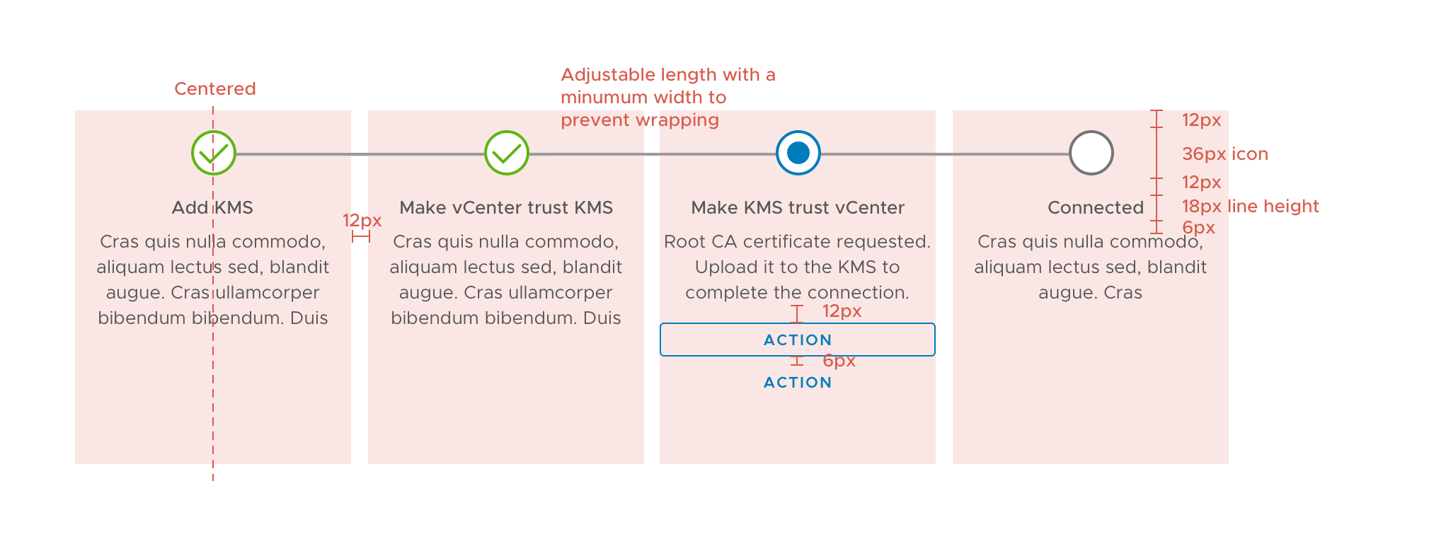
Minimum Width

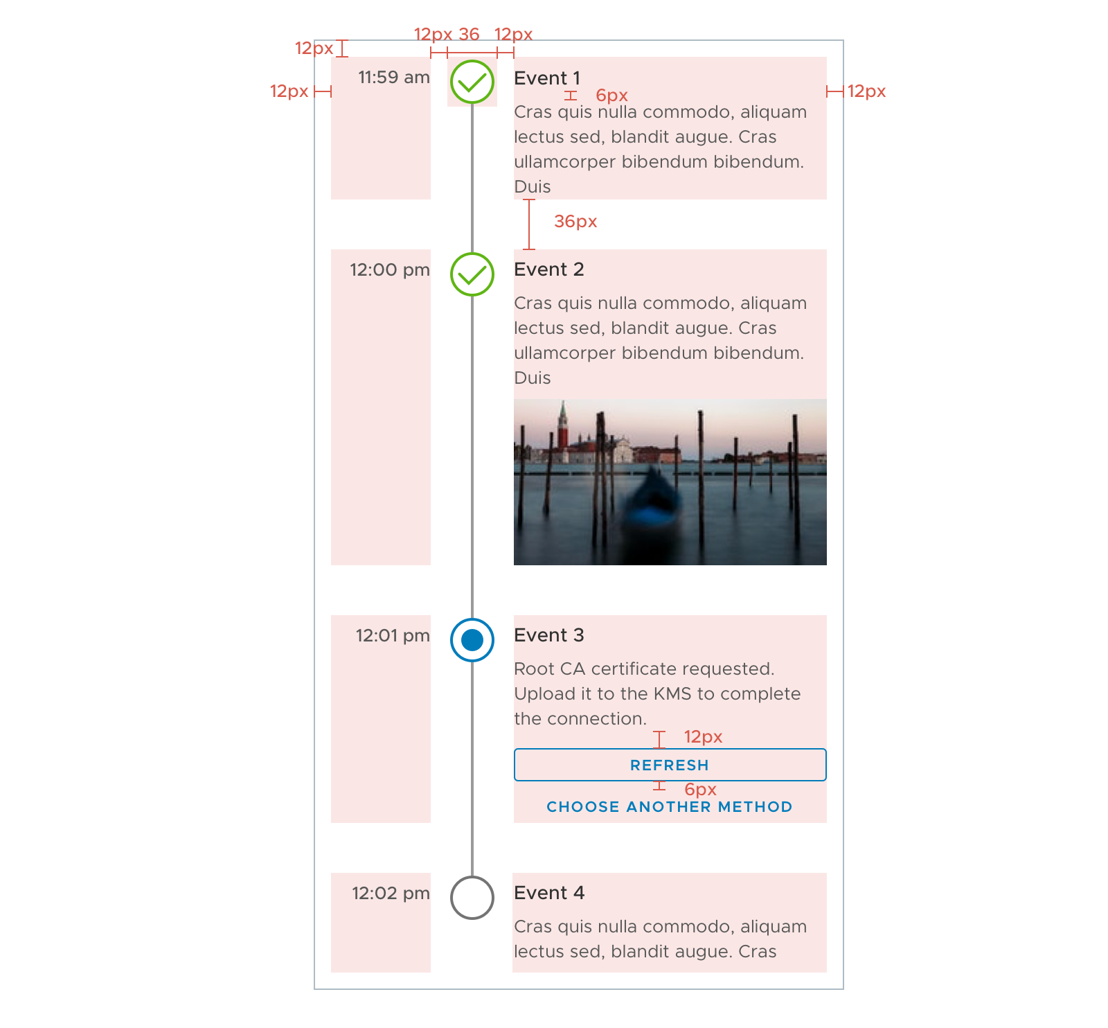
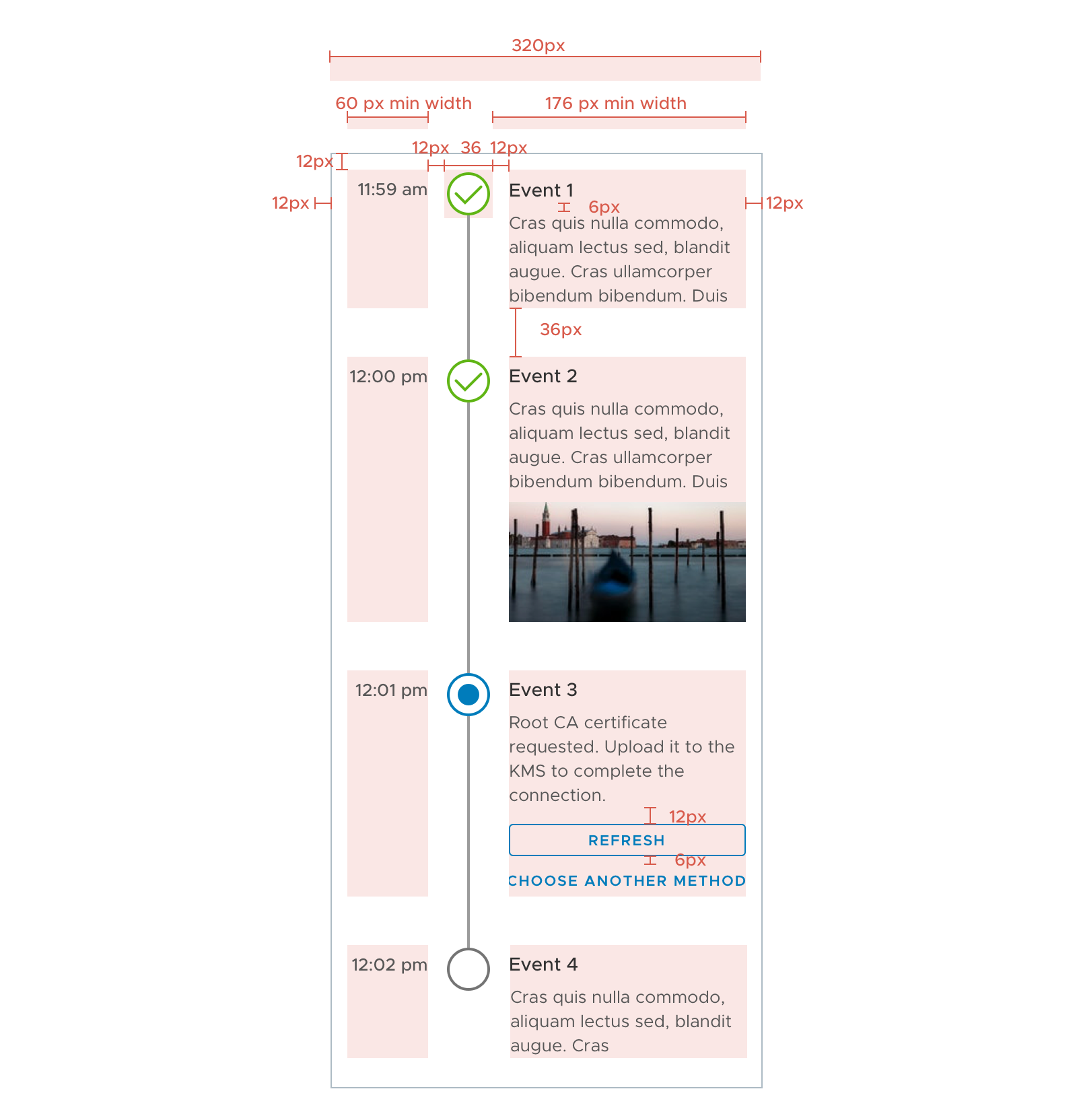
Vertical Timeline
- Similar to the horizontal timeline
- Time stamps are optional
Redline spec
Minimum Width
Sketch file
 yuxin-ux
All 20 comments
@reddolan
 adityarb88
on 24 Oct 2017
adityarb88
on 24 Oct 2017
Any target date to bring in this component?
 shravansofts
on 23 Nov 2017
shravansofts
on 23 Nov 2017
@shravansofts
We haven't reviewed it with our UX team yet. So it isn't in our queue for implementation. There are a lot of priorities ahead of it so giving a target date at this point in time would not be helpful.
Perhaps you can give us some information on your use case so we understand the urgency here.
As with many things, your team could pick up the development of this component if we can't take it on. Please subscribe to the github issue to track updates.
Thanks.
 mathisscott
on 27 Nov 2017
mathisscott
on 27 Nov 2017
@yuxin-ux We reviewed the design proposal. Here is our feedback
- recommend not more than 4 or 5 steps total, or it will get trimmed
- it will not wrap (it might be disastrous if it did)
- component looks tied to the datagrid
- can this be used outside the datagrid?
- if yes, would be helpful to see it in other context
- blobs and buttons below the step label look somewhat disconnected
- may need a container to pull together the content
- active state is just blank white circle
- use the action blue to highlight
- add another indicator (icon maybe) to show active state
- may consider increasing contrast in the unfinished steps
- not accessible
- lowest accessible grey is #747474
- slow loading step
- what happens when a step is loading/completing?
- spinner in button? spinner in circle?
- what does the content look like left-aligned or justified?
- 6px soft grid (spacing/sizes should be multiples of 6)
- localization considerations
- what happens with really long step labels or long content? wrap, ellipsis?
- vertical version of this?
- reference Timeline in Github #353
- vertical version may not have a limit on steps
- would be nice to capture both requests in one spec
- will each step have an action button/buttons while active?
- just curious about how a user would progress through the steps. manual? automatic based on something else?
 reddolan
on 29 Nov 2017
reddolan
on 29 Nov 2017
@yuxin-ux
Do we have an update on this component? As I recall, we were pretty close on finishing up the UX piece for this...
mathisscott
on 2 May 2018
This would be exciting feature to be include. Currently in one of my angular project, Timeline is the cornerstone. So if we really gonna see Timeline in Clarity than kindly make it highly customize able and just limit it to 5 steps. Because I see timeline as time line of video editor :)
 technbuzz
on 9 Jul 2018
technbuzz
on 9 Jul 2018
It is optional to have step description for additional information or guidance.
The description can be either displayed all the time, or display only for the current step.
During the last design review I was a part of, we had a question about the rest of the page "jumping" up and down every time the descriptions changed. This could happen on every step if you decide to only display the current step's description, or if you have action buttons that are only available on the current step.
The two available choices were either to just let the rest of the page go up and down, or preserve the maximum necessary space to avoid the jumping (which leads to potentially a lot of whitespace).
I do not see any indication one way or another in this spec, what's the final decision?
I also had a second, easier question: the recommendation is to have 3 to 5 steps. Do we want to keep this recommendation for the vertical timeline, or does it make sense to accept vertical timelines with many more items? I don't see a usability issue with a 20-items vertical timeline, to be honest.
 youdz
on 24 Jul 2018
youdz
on 24 Jul 2018
@yuxin-ux @reddolan @lil-kim ☝️
For the 3-5 step limitation, I think that is makes sense to limit that to horizontal timelines. One key reason for using a vertical timeline may be that the timeline has an unknown number of steps that exceeds the recommendation for a horizontal timeline.
Does that sound right?
mathisscott
on 24 Jul 2018
Thanks for the input!
@youdz Good catch! I somehow forgot that one. Will reconsider it a bit. My preference would be to let it jump with the assumption that people will not jump back and forth very quickly. So a little jump between steps is acceptable. But this is only based on my limited knowledge on the potential use cases.
@mathisscott The recommendation is only for the horizontal timeline. I agree that it is not necessary to set an upper limit. I am ok leaving it open until we find any technical limitations.
I am currently busy with something else. Will update the spec later this week. Thanks!
yuxin-ux
on 24 Jul 2018
Could you release the component style first so that developers can use it ? 😄
 jewway
on 21 Sep 2018
jewway
on 21 Sep 2018
That's actually the plan, we've been working with an external contributor who will submit the static CSS styles first. 👍
youdz
on 21 Sep 2018
When can we expect this component to be bundled with the Clarity component UI library?
 beaker1977
on 13 Nov 2018
beaker1977
on 13 Nov 2018
Hi @beaker1977
The timeline component is currently in development. We don't have a hard estimate at this time because the development is still in an early stage.
You can find all our current priorities and estimates here. Thanks!
mathisscott
on 13 Nov 2018
Looks amazing.
Is someone working on this Component? Is there any dev version to check out already?
The project definitely needs something like this (and so do I).
 Andreaux
on 27 Jan 2019
Andreaux
on 27 Jan 2019
An external contributor is working on it. I don't know his status as yet. We check in with him regularly.
mathisscott
on 27 Jan 2019
This looks fantastic. Do you have any updates as to when we can roughly expect this?
 dexfab
on 11 Jul 2019
dexfab
on 11 Jul 2019
@dexfab there is already a pull request for it: https://github.com/vmware/clarity/pull/3594
 Jinnie
on 11 Jul 2019
Jinnie
on 11 Jul 2019
Closing as completed, though dark theme is not available yet see #3763
 gnomeontherun
on 29 Aug 2019
gnomeontherun
on 29 Aug 2019
@gnomeontherun fyi - dark theme for timeline will be completed with this PR: https://github.com/vmware/clarity/pull/3755
 hippee-lee
on 29 Aug 2019
hippee-lee
on 29 Aug 2019
Hi there 👋, this is an automated message. To help Clarity keep track of discussions, we automatically lock closed issues after 14 days. Please look for another open issue or open a new issue with updated details and reference this one as necessary.
![github-actions[bot] picture](https://avatars.githubusercontent.com/in/15368?v=4&s=40) github-actions[bot]
on 5 Sep 2020
github-actions[bot]
on 5 Sep 2020
Related issues
 srikanthps
·
3Comments
srikanthps
·
3Comments
 BugsyFTW
·
3Comments
BugsyFTW
·
3Comments
 vzayko
·
3Comments
vzayko
·
3Comments
 ph55
·
3Comments
ph55
·
3Comments
 dennitsa
·
4Comments
dennitsa
·
4Comments
Most helpful comment
Thanks for the input!
@youdz Good catch! I somehow forgot that one. Will reconsider it a bit. My preference would be to let it jump with the assumption that people will not jump back and forth very quickly. So a little jump between steps is acceptable. But this is only based on my limited knowledge on the potential use cases.
@mathisscott The recommendation is only for the horizontal timeline. I agree that it is not necessary to set an upper limit. I am ok leaving it open until we find any technical limitations.
I am currently busy with something else. Will update the spec later this week. Thanks!