Clarity: Justified Tabs component (new)
Description
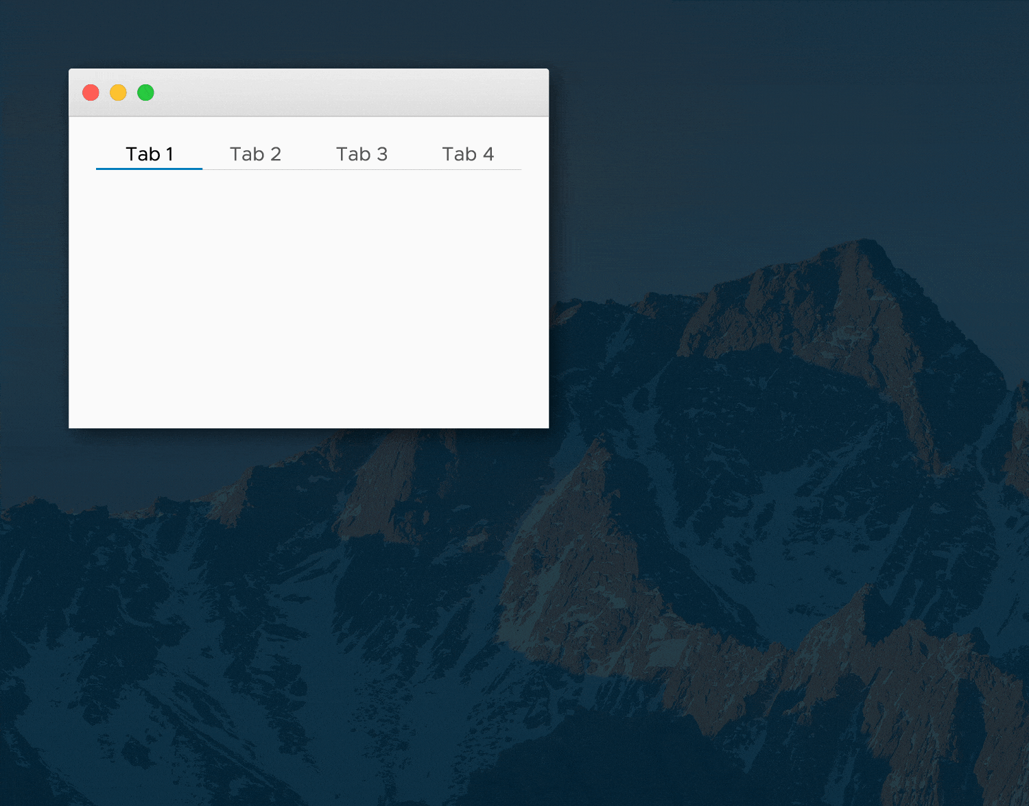
Justified tabs allow you to justify the tabs across the width of the container. The width is distributed equally between tabs and the labels are center-aligned. This layout works best for small containers (width less than 500 px) with 2 to 4 tabs.
Documentation
With Smart Resizing
By default, smart resizing is enabled for justified tabs. When the width of the container exceeds the threshold (pre-defined as 500 px), the container automatically switches to regular tabs.
This is helpful when developing responsive applications that will be accessed on all form factors: from phones to large displays. On the phone, the screen width is small and the use case is typically limited. With the few tabs you might need to display, it is helpful to justify the tabs to maximize the touch area for each tab. When the application is viewed on a larger display, the component automatically switches to regular tabs, which allows you to contextually display additional tabs (and even use tab overflow functionality) for a more in-depth use case.
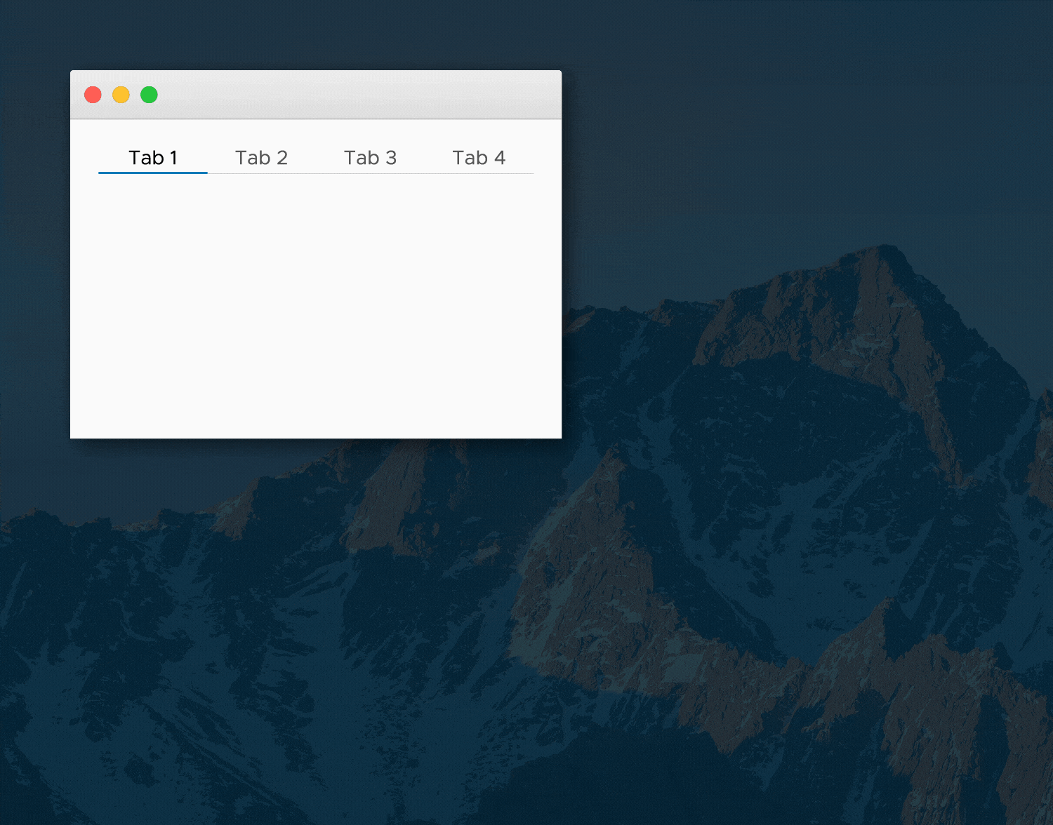
Without Smart Resizing
You can also use justified tabs without smart resizing.
This is helpful when you want to justify tabs purely from a stylistic point of view. This style is often seen in marketing pages and in software applications such as the Safari Browser and the Mac Finder. However, use this style with discretion. In large containers, the tab labels might be spaced far apart and affect the visual discoverability of the non-active tabs.
Labels
In addition to the general tab usage guidelines below, consider the following when labeling justified tabs:
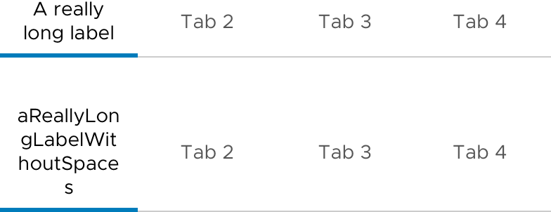
• A minimum of 12 px padding is applied to the left and right of each tab label.
• If the labels are too long to fit in a single line, then they will wrap.
 vijay-venkatraman-vmware
All 10 comments
Original request - 1135
vijay-venkatraman-vmware
on 29 Sep 2017
I do not understand the need for this new component. We already have a tab component. We should just add responsiveness to the current tab component. A field could be added, JustifiedWhenSmall. If true, then below threshold tabs become justified.
I also think that there should be a max form factor above which the tabs are always regular tabs no matter the setting. You said yourself, "use this style with discretion. In large containers, the tab labels might be spaced far apart and affect the visual discoverability of the non-active tabs." Rather than a warning, lets just prevent that mistake from happening.
 dworman
on 29 Sep 2017
dworman
on 29 Sep 2017
@dworman To your point the "smart resizing" seems to be just that. It seems like this should be a responsive feature of regular tabs, where the user could apply a "xs-justified" or an "md-default" on the regular tab component to make it change behaviour per responsive threshold. Or maybe don't call out a default state and instead layer in the thresholds you want to be responsive, like "xs-justified sm-justified" and then md and above would be normal tabs. Just a thought.
 joshjohnsonux
on 29 Sep 2017
joshjohnsonux
on 29 Sep 2017
@dworman and @joshjohnson72
This isn't just a responsive feature. We've had requests for tabs that can span the full width of containers -- especially for those using Clarity for website designs.
These are also useful for tabs inside of cards or tabs inside a sidebar or other smaller container.
The behavior adjusts based on the width of the container-- which may or may not be the full width of the screen.
 mathisscott
on 29 Sep 2017
mathisscott
on 29 Sep 2017
@mathisscott Fair enough. It sort of bugs me that there will be multiple 'branches' of the tab component rather than flags on a single component, but truth is I don't see myself actually using this component, so I guess it doesn't matter to me in practice.
joshjohnsonux
on 29 Sep 2017
@mathisscott I understand your point about the tabs having different behaviors in different containers. However, I agree with @joshjohnson72 that it feels wrong to have different branches of tabs. We could just have a single tab component with choices on behavior. developers can then add the tabs to a card and apply "xs-justified". So, they get the behavior, but no need for another component. We could have defaults for different container sizes.
dworman
on 29 Sep 2017
@dworman and @joshjohnson72
I think there is some confusion based on the presentation here.
Justified tabs _are_ going to just be a variant of existing tabs.
Making tabs justified will or should be accomplished with a simple CSS class. The switching based on container size will be an Angular-only behavior that might be part of the existing tabs component or may be an extension of the existing component.
Hopefully that is clearer.
mathisscott
on 29 Sep 2017
Ah, I assumed this was an entirely new component rather than a variation of an existing one. That's good to know and makes a lot of sense.
joshjohnsonux
on 29 Sep 2017
Yeah! ... and, yup!, was confused. Like Josh I had thought this was an entirely new component. Very happy that we are all aligned. Thanks for explaining. :)
dworman
on 29 Sep 2017
The feature request here has been captured into our list and we’re going to take it into consideration as we develop Clarity Core capabilities. In an effort to clean up our backlog and focus our attention, I’m going to close this as captured in our feature requests. Please follow our development and releases to see when we release relevant components to make this possible. Future feature requests can be made in our GitHub Discussions.
 gnomeontherun
on 5 Feb 2021
gnomeontherun
on 5 Feb 2021
Related issues
 ph55
·
3Comments
ph55
·
3Comments
 srikanthps
·
3Comments
srikanthps
·
3Comments
 clane
·
3Comments
clane
·
3Comments
 Vad1mo
·
3Comments
Vad1mo
·
3Comments
 mayesgr
·
3Comments
mayesgr
·
3Comments
Most helpful comment
Ah, I assumed this was an entirely new component rather than a variation of an existing one. That's good to know and makes a lot of sense.