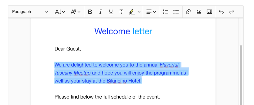
Ckeditor5: Link highlight resembles the selection
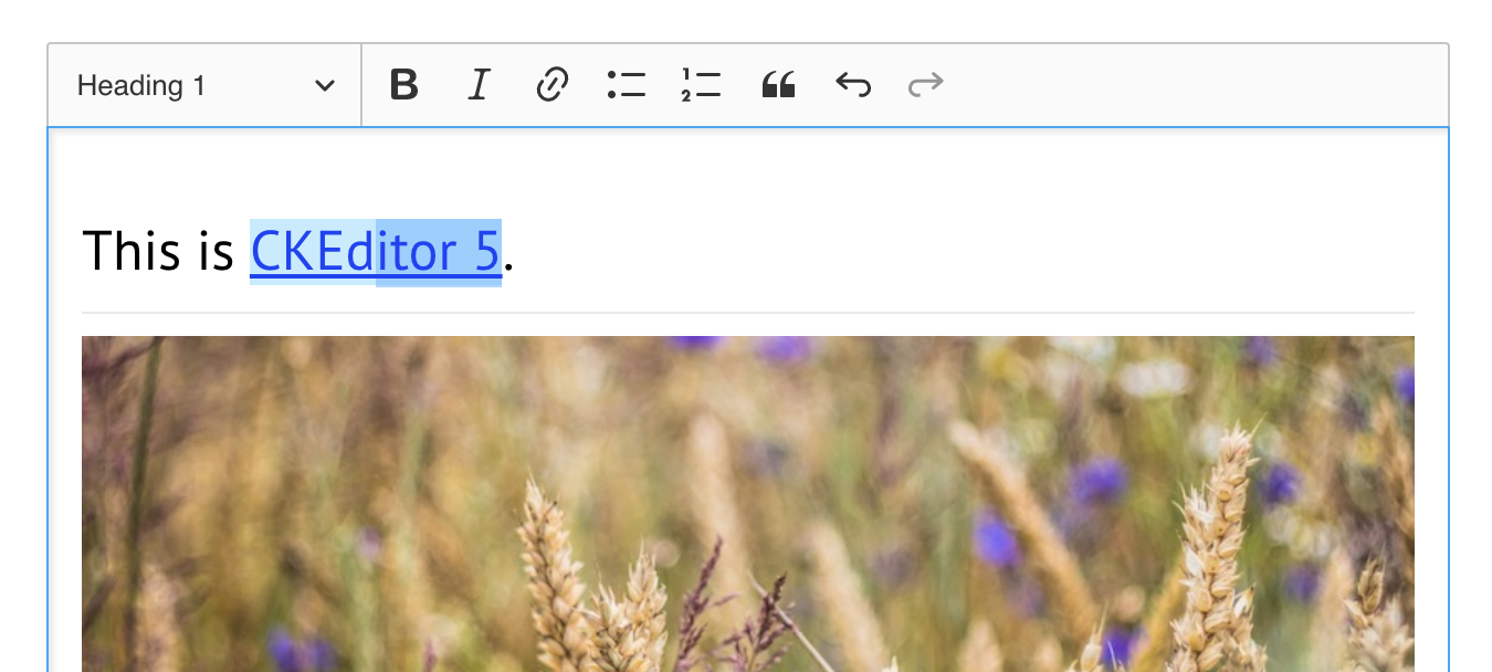
You have to think for second to understand what's selected here.
 Reinmar
All 5 comments
I'm for changing it to
--ck-color-link-selected-background: hsl(201, 100%, 96%);
since this is not an a11y feature and we don't have to be super contrast-compliant in this case IMO.
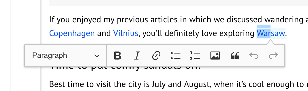
The outline that we added in https://github.com/ckeditor/ckeditor5-theme-lark/issues/155 causes some nasty bright line across the native selection. When disabled, it looks OK
cc @dkonopka
 oleq
on 15 Mar 2018
oleq
on 15 Mar 2018
since this is not an a11y feature and we don't have to be super contrast-compliant in this case IMO.
+1
Reinmar
on 19 Mar 2018
--ck-color-link-selected-background: hsl(201, 100%, 96%);
👍
When disabled, it looks OK
So we should drop outline solution, and try proposed.
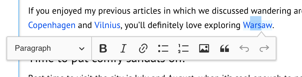
box-shadow: 0 0 0 1px var(--ck-color-link-selected-background);
outline:
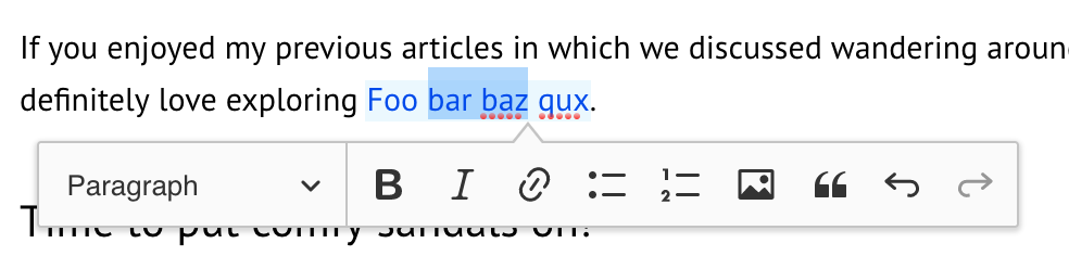
Box-shadow solution:
 dkonopka
on 19 Mar 2018
dkonopka
on 19 Mar 2018
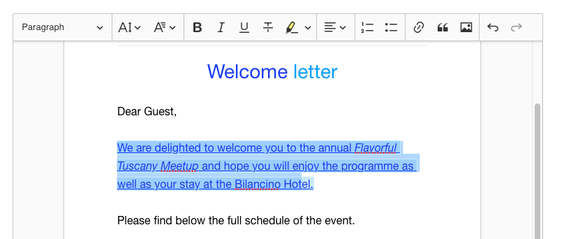
I used the highlight color that I proposed with the box-shadow. WDYT?
oleq
on 22 Mar 2018
In this screenshot, it looks a bit too light for me, but I guess that the best way to find out whether it works in real life is to see it live :)
Reinmar
on 22 Mar 2018
Related issues
Reinmar
·
3Comments
 pomek
·
3Comments
pomek
·
3Comments
 hamenon
·
3Comments
hamenon
·
3Comments
 hybridpicker
·
3Comments
hybridpicker
·
3Comments
 pjasiun
·
3Comments
pjasiun
·
3Comments
Most helpful comment
I used the highlight color that I proposed with the box-shadow. WDYT?