The CKFinder can host Images as well as other files.
For images we will insert them as <img> tags while the other might be inserted as links to a file.
Thinks to consider is:
- do we should allow such behavior? (might be configurable through CKFinder options)
- how the icon should look like then.
/cc @Reinmar @oleq
 jodator
All 20 comments
v1:

v2:
v3:

v4:

 RyszardB
on 10 Nov 2018
RyszardB
on 10 Nov 2018
From the above I like the v4. Mostly because of the + badge.
jodator
on 13 Nov 2018
I like v4 for the "+" as well. My only worry is that people looking for "a way to embed images" will not connect the "image" and "file" concepts together. But I hope that majority of users should understand that.
 Reinmar
on 13 Nov 2018
Reinmar
on 13 Nov 2018
Also v4, also for the "+" part, but none of them is 100% convincing/understandable to me. I know it's a difficult task though :/
The folder icon is confusing, looks like some sort of browser/open files/open folder/open project.
@RyszardB any other ideas around the "+"? Can we steal some inspiration from other products?
 AnnaTomanek
on 14 Nov 2018
AnnaTomanek
on 14 Nov 2018
Crazy idea (not sure if doable) – can we show that there's an image in that folder?
It came to my mind because we're considering titling this button "Insert image or file".
Reinmar
on 14 Nov 2018
v5

v6
RyszardB
on 14 Nov 2018
First of all, I would like to see this icon next to the other icons instead aligned to the right because I'm worried it will be looking a little bit different.
Anyway, as everyone said, I'm +1 with version number 4 👍 We could try to add inside an image, but we shouldn't overuse details (remember about Low DPI).
 dkonopka
on 14 Nov 2018
dkonopka
on 14 Nov 2018
RyszardB
on 14 Nov 2018


RyszardB
on 14 Nov 2018
By "next to the other icons" I meant for example standard image icon (to check if it is simple to find the difference between them for us/users) without any separator because in the future we won't separate it I guess (?). It would be great to see it in more realistic order.
dkonopka
on 14 Nov 2018


RyszardB
on 14 Nov 2018
I created a couple of mockups too. They're more in line with the current icon convention:
v7

v7b
v8

v8b

 oleq
on 15 Nov 2018
oleq
on 15 Nov 2018
I think I like Rysiek's proposal the most:

I'm not necessarily talking about the shape (which may need to be aligned to our convention), but the fact that both the folder and the "+" sign have white background. For me its "weight" fits our toolbar best.
Reinmar
on 15 Nov 2018
I would prefer @oleq's v8 because "+" sign on the white background is hard to notice (mockup vs live demo makes difference).
Anyways I agree: light bg of plus sign is looking good on this mockups because Rysiek enlarged this icon (it's around 20px height I guess, when we are trying to make icons ~17-18px).
dkonopka
on 15 Nov 2018
18x18px


RyszardB
on 15 Nov 2018
I think I like Rysiek's proposal the most:
I also like it but when downscaled, its details are lost. It's hard to tell what the bulge on the top is about.
P.S. @RyszardB We're using 1.5px for main outlines (straight lines) in out icons.
oleq
on 15 Nov 2018
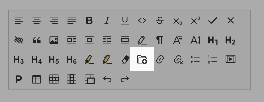
Another round of designs with more variations and improvements. My personal favorites are 2.3 and 2.5.
1.1

1.2
1.3
1.4
2.1

2.2

2.3

2.4

2.5

3.1

3.2
3.3

3.4
oleq
on 16 Nov 2018
3.1 - 3.4 icons looks like "Create a gallery button" so for me it's not a proper way to go.
As I said earlier, black "+" symbol is better (LoDPI issues), so I'm voting for proposal: 2.4.
OTOH I'm ok with 2.3 & 2.5. Mixing a folder, an image & a plus sign is almost impossible, so the only solution is to stay with a folder I guess.
dkonopka
on 19 Nov 2018
2.5 :+1:
jodator
on 19 Nov 2018
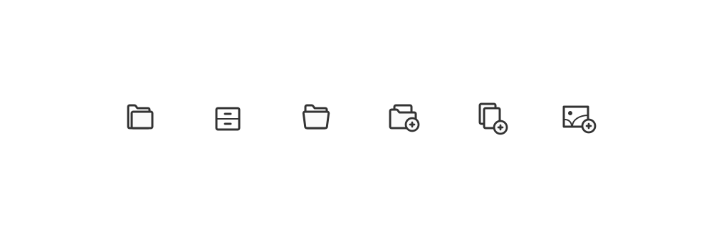
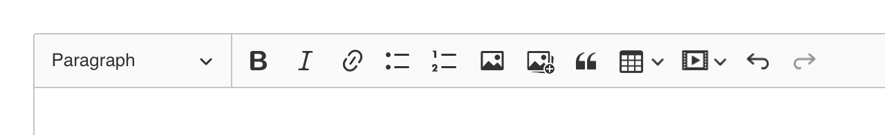
After "F2F" talks we went with the following design:
oleq
on 19 Nov 2018
Related issues
 MansoorJafari
·
3Comments
MansoorJafari
·
3Comments
 wwalc
·
3Comments
oleq
·
3Comments
wwalc
·
3Comments
oleq
·
3Comments
 hamenon
·
3Comments
hamenon
·
3Comments
 PaulParker
·
3Comments
PaulParker
·
3Comments
Most helpful comment
After "F2F" talks we went with the following design: