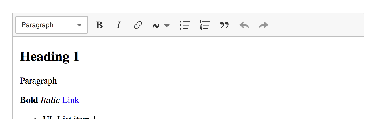
This is a follow up of https://github.com/ckeditor/ckeditor5/issues/631.
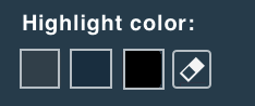
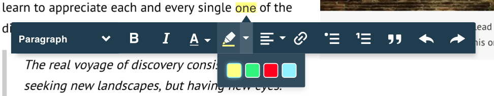
In proposals below, you can see two types of presenting color attributes.
I'm definitely for v2 (color grid ) with a label because we need to explain users difference between "pen" and "markers", in my opinion, it's not clear to everyone (I mean icons). Version one is like the old-school style, so I'm not sure about it.
Additionally, we can use "Highlight color" & "Highlight background" to be different from old tools naming like "Font color/Text color/Font background".

 dkonopka
All 97 comments
I like the third option - the one without text - the most with fourth/fifth as second.
Maybe if marker/pen icons could be a bit more distinct from each other? Just a though as currently they are pretty similar (especially when scaled down a bit). Also marker tip in icon has narrower tip then in pen icon.
 jodator
on 13 Nov 2017
jodator
on 13 Nov 2017
Maybe if marker/pen icons could be a bit more distinct from each other? Just a though as currently they are pretty similar (especially when scaled down a bit). Also marker tip in icon has narrower tip then in pen icon.
I actually wanted to comment that I have no idea what these icons mean. I can only guess that one of them sets the text color, the other bg color, but I don't know what the 3rd option does.
EDIT: After having 3rd look at this I noticed the label there :D It makes it more clear now and perhaps will be sufficient for the users. But I'd still agree with @jodator that icons could be more distinctive.
 Reinmar
on 13 Nov 2017
Reinmar
on 13 Nov 2017
I had a dream once about this feature. I would love to see how that would look like :)
 fredck
on 13 Nov 2017
fredck
on 13 Nov 2017
Btw, we can also think well about the list of colors we want to configure by default.
fredck
on 13 Nov 2017
Btw, we can also think well about the list of colors we want to configure by default.
Let's use some set proposed by Stabilo ;)

Reinmar
on 13 Nov 2017
I don't think that more than four colors is necessary for the scope of the feature. This is configurable, after all.
fredck
on 13 Nov 2017
I'm for this:
- Markers: Yellow, Orange, Bluish, Redish
- Pens: Red, Blue, Green
fredck
on 13 Nov 2017
@Reinmar or maybe from Crayola? 😉
jodator
on 13 Nov 2017
Nah... maybe the "basic" Pantone set then:

:trollface:
fredck
on 13 Nov 2017
Updated proposals then:
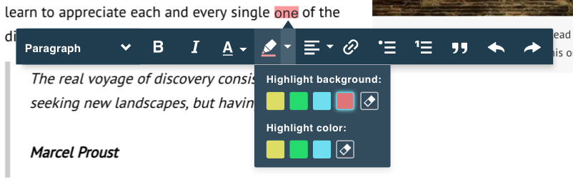
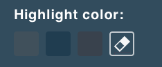
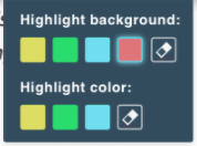
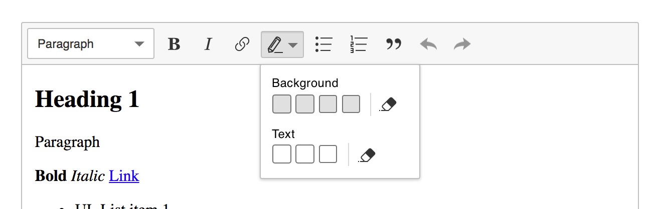
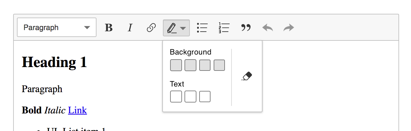
Should "eraser" button remove background & color of highlight or we need separate buttons? In my opinion, we should stay with one (KISS).
Another question: what is more important if color&background is enabled, which icon should we show? Both as proposed?

Color & background highlight enabled:

dkonopka
on 14 Nov 2017
@dkonopka no mixing (for sure in MVP) so it's either background or color at once.
jodator
on 14 Nov 2017
Let's get back to the starting point here to not mess things up.
We wanted to propose this feature based on a specific use case: users want to mark parts of the content with some color (usually as a review tool).
Let's pay attention to not transform this feature into the old "Foreground and Background Color" feature. It's about "highlight" and one can do so either by using a marker or by writing in a different color. That's our goal.
fredck
on 14 Nov 2017
I believe that the option I click in the panel should be the one I see in the toolbar after that. I mean, the panel should list icons that are also used as the toolbar button icon.
fredck
on 14 Nov 2017
Btw, "Yellow Marker" seems to be the most common option for this (it's, in fact, the way browsers style <mark> by default). Therefore, maybe we should have first markers and then pens in the panel, with the yellow marker being the first one.
fredck
on 14 Nov 2017
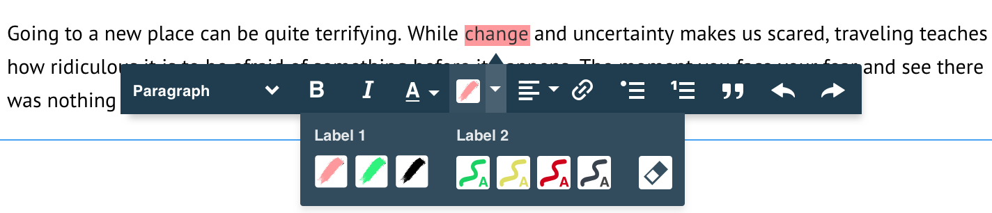
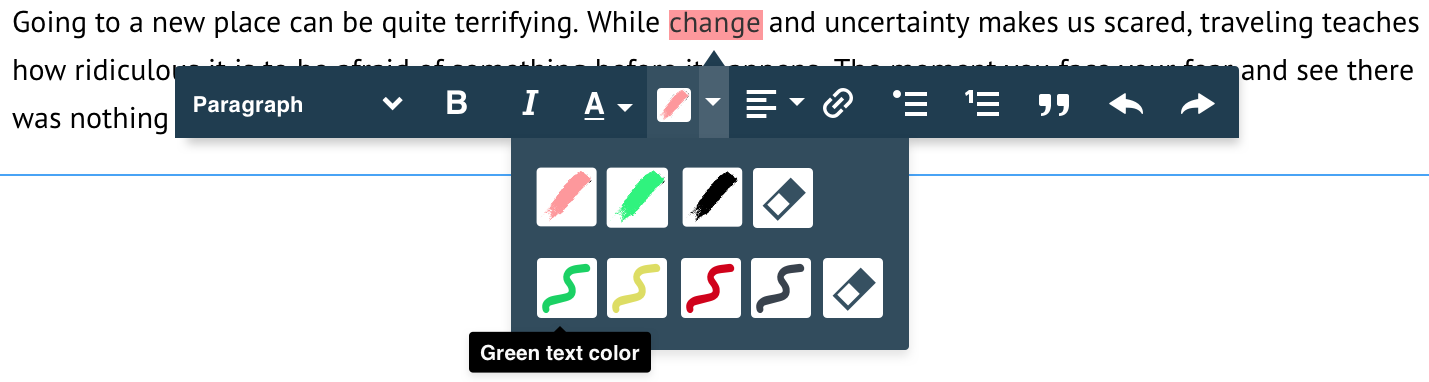
I'm still not sure if the user will properly recognize marker and pen icon (as you @fredck suggested in https://github.com/ckeditor/ckeditor5/issues/631#issuecomment-339955582 ). I was trying to put there even A/T letter to show typography, but it's not fit as good as I was expecting.
Proposal 2&3 clearly represent a state of the upcoming action. In my opinion, it doesn't look like old-type background/foreground tool and there is no way to wrongly understand event "behind" icon.
1. Highlight background and Highlight color as pen&marker icon

2. Highlight with common marker icon

3. Highlight with common cropped marker icon

dkonopka
on 15 Nov 2017
Cropped icon looks better. I have only problem with too small contrast on those icons (2&3) - the "zigzag" icons were better in that matter as there was better contrast.
jodator
on 15 Nov 2017
Another idea is making the options in the panel different than the icon, but also bigger. That was my initial idea in the mockup I've put down on paper earlier.
And sincerely, the proposed options don't look good to me. For now, the 3rd option proposed here is the one I like the most: https://github.com/ckeditor/ckeditor5-highlight/issues/3#issuecomment-344206677
fredck
on 15 Nov 2017
Another idea is making the options in the panel different than the icon, but also bigger
I was thinking about it too, do we really need to "copy" icon from the main toolbar to options panel?
the "zigzag" icons were better
☝️ I really prefer "zigzags" more than "marker/pen" icons. I think the first proposal looks modern opposite to default "color-palette" in most apps. @oleq WDYT?
1. Inline "zigzags"

2. "Zigzags" with label

3. "Color-palette" style

dkonopka
on 15 Nov 2017
TBH, to me, the best option is "3. Highlight with common cropped marker icon"

I just looked at it and I immediately knew what the feature is about, what to expect and how to use it.
Ideas
- Maybe splitting the palette into two rows (first one for the bg markers, second one–for the text markers, no text labels) would make it even more useful (easier to read, and ready for 20 markers). Where to put the eraser then?
- Maybe let's separate (a simple gap would do the trick) the bg markers from the text markers a little bit but keep them it a single line?
Issues
Although I like the icons, please note that people may create blue/black/dark markers. They must be visible in the palette, which has a dark background and vice versa if someone used a bright theme for the editor. They must be bulletproof.
What we need in the mockups:
- Examples of bright (yellow) and dark (blue) text and bg markers when the palette is dark (like in the mockups above),
- Examples of bright (yellow) and dark (blue) text and bg markers when the palette is bright.
It's all about contrast and basic usability and accessibility. We mustn't allow any icon to disappear in any situation.
 oleq
on 15 Nov 2017
oleq
on 15 Nov 2017
I like "Color-palette" style" very much. This clean and simple.
I don't get what "highlight color" is. Is it text color? Can we call it "highlight color" and "font color" like MS Office do?
 pjasiun
on 15 Nov 2017
pjasiun
on 15 Nov 2017
I'll add this one to have more options as I asked @dkonopka to create this variant (but he didn't like it as much as zigzag ;) ). Probably the line on the bottom is to be removed in this version:

jodator
on 15 Nov 2017
@oleq With gaps it looks more separated and very clear. Like we talked about contrast and case with black/dark green color/marker, we will wait for community feedback.
Anyway, if someone want so much black marker then it will be possible to change balloon background (or even icon?). I think is edge case when user will need dark marker similar to our balloon bg.

dkonopka
on 16 Nov 2017
Alrighty guys ( @oleq & @dkonopka ) do we have this UI settled down? I'm ready to implement the dropdown panel as I've already bootstrapped SplitButton in ckeditor5-ui so I'd love to hear if this is final (at least at this stage) or do you need more work?
jodator
on 22 Nov 2017
So, do I understand correctly that the last proposed version is this one?
I like its simplicity, but at the same time it worries me that these icons will not be understandable. I got confused by this feature initially.
So, if we'd go this way, we'll need to work hard on proper icons. Also, labels will be important to get it right.
But we can also address this issue (the lack of clarity) by choosing a more verbose version like this one:

I really like it and it and so did @pjasiun. It's clear and simple and easier to extend.
Reinmar
on 22 Nov 2017
IMO it's a final design as we talked with @oleq. Ready for comments about details like icons/spacings, but yes, it's the last version of Highlight mockup.
dkonopka
on 22 Nov 2017
We're aware that these icons have strong accessibility issues, right? Even trying to push it with the "dark yellow" used in the design, the contrast with the white pen inside of it is not good. Imagine what would happen if we put the real yellow there.
Additionally, a real-life marker is a pen with a colored tip... exactly what we use to show a "pen" in the proposed design, not the marker.
fredck
on 22 Nov 2017
@fredck that was a reason I've pushed this mockup (a dark marker/pen). But taking into a consideration that in split button should also represent last used marker (ie "yellow background") it shold be distinguishable between marker/pen variants. In other words the "more verbose" version is less verbose then that.
In my opinion the zygzags are pretty close to:
- differentiate background/font color icon
- will not attach it's meaning to background/font color too much as I get a feeling that having "Highlight background" and "Highlight color" would eventually drop it's semantics from this feature and will be turned into font/background color..
jodator
on 22 Nov 2017
will not attach it's meaning to background/font color too much as I get a feeling that having "Highlight background" and "Highlight color" would eventually drop it's semantics from this feature and will be turned into font/background color..
Strongly agree on this.
fredck
on 22 Nov 2017
What I'm afraid of is that we have a dark toolbar and the background color of the wysiwyg area will be usually white. Which means that usually:
- dark fonts will be used for writing (black & all variants of dark gray)
- bright colors will be used for highlight background, to have good enough contrast with highlighted dark text
- highlight colors may be again rather "darkish" (due to points above)... and I'm worried about that. For example, for me the proposed yellow font is hardly readable on a white background. The colors used in mockups are not quite realistic, because we need something with reasonable contrast on a white background.
If you look at the proposed colors in CKEditor 4 some time ago:

You will see that with most of the proposed designs, e.g.

there is a chance that it may be really hard to really notice some of the darker colors included there.
 wwalc
on 23 Nov 2017
wwalc
on 23 Nov 2017
My 5cts. I think that the less "graphical" the icons, the better. I like most the version without any additional icon (3. "Color-palette" style), but zig-zags are okay too. Markers icon are too overwhelming, totally against the whole "lightweight" UI.
Please, guys, don't go with marker-icons, they... don't look good. Trust me on this :P
 scofalik
on 23 Nov 2017
scofalik
on 23 Nov 2017
No matter which design we decide to use, accessibility will always be an issue (vision impairments and color deficiency).
Problems
If we go with graphical markers, bright backgrounds will not go well with a white tool (low contrast).

If we go with graphical markers, dark marker colors will not go well with the background of the panel

If we go with zig-zags and full backgrounds, still there will be issues. Which changes the text and which changes the background?

And many, many more...
In such situation, they only solution which is a little bit better is this one because even if the color is the same as the background, you may figure that out thanks to the label:
but
- It brings us back to v4 background/text color approach we agreed is oldfashioned, right?
- It still fails if, let's say 3 similar colors are used in a row
 (maybe a border could help here).
 - There's still the icon in the toolbar, which should retain the last used marker style and be ready to apply it immediately to the selection when clicked, right? It must inform the user which one is it and we're hitting the same (contrast) wall here

Conclusions
See, when it comes to the color features, it's very hard to provide all the necessary accessibility. They are about the colors, after all. And besides, they are configured by developers which means all we can do is reduce the potential damage.
In my opinion, there's no easy way to tell accessible from inaccessible here because there are dozens of different impairments that people could have. In many cases, they must rely on other visual aids e.g. a tooltip with an explicit name of the color to work with an editor. We can improve the experience but we will never handle all the cases.
What I wanted this feature to become was a very simple UI consuming minimal space and looking modern at the same time. In other words: unlike v4 text/background features. I'm ready to sacrifice some discoverability and accessibility to achieve that.
I feel that the discussion in this issue is more about "I don't like it because..." than about actual issues we face. I can find just as many different flaws is any approach we discussed. I also experienced a lot of pressure from different people lobbying one solution or another (either directly or indirectly, which is quite funny) and I don't believe in an easy consensus here. I appreciate the feedback, though.
Given that the feature is quite simple and eventual refactoring if the approach turns out wrong will not be time consuming, I'm still for https://github.com/ckeditor/ckeditor5-highlight/issues/3#issuecomment-344958207 (or very similar).
oleq
on 24 Nov 2017
I also experienced a lot of pressure from different people lobbying one solution or another
I think this reflects the overall level of dissatisfaction with the current status of the proposal, which leads me to think that taking the easy path right now may be a bad decision.
fredck
on 24 Nov 2017
It brings us back to v4 background/text color approach we agreed is oldfashioned, right?
Oldfashioned not always mean bad, especially when the new solution is new only for sake of being new.
It still fails if, let's say 3 similar colors are used in a row
The only problem I see here is no border. We could either apply a border to all colors or let it be configured or maybe even try to calculate it on the fly.
There's still the icon in the toolbar, which should retain the last used marker style and be ready to apply it immediately to the selection when clicked, right? It must inform the user which one is it and we're hitting the same (contrast) wall here
First, it's only one icon. Second, the user will already remember what color they have chosen (more or less). I think that this icon looks really good.
My problem was not accessibility, my problem was how it looks like, how heavy it is and how much the icon makes it more difficult to see the color (I guess that this is accessibility partially).
I think that if we ship this feature with those icons, anyone who will see it will wonder who in their mind accepted this design. Those who disliked our UIs in past will only stay confirmed that we didn't learn much. This is my opinion.
scofalik
on 24 Nov 2017
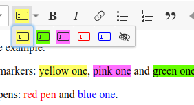
I'll only add that I'm still not sure which of these are font colors and which bg colors:

I'm serious. The analogy to real life is completely broken here, which I believe Fred mentioned. We present a marker with a coloured tip but (my guess is) it applies the font color, so it should actually be a colored pen (if we look for an analogy). And good analogies are important in good UX.
At the same time, I'm not claiming that any of the proposed solutions is the way to go. I just feel and see (by the number of comments) that more of us have similar doubts.
Reinmar
on 24 Nov 2017
Btw. I think we are using confusing names of end user features here.
If you search the internet, you will find that text highlighting is completely related to the "background color", not to the text/font color feature .E.g. google out "text highlight" or "text highlight color", it's always about the background color.
What we have in fact is the "text color" and the "highlight color". I'm afraid that we are bringing names that are not understandable and that will be confusing, lowering the overall UX.
wwalc
on 24 Nov 2017
I'm talking to @dkonopka to give a try to something else still. Fingers crossed!
fredck
on 24 Nov 2017
Idea
We decided to show bigger icons than in a toolbar with trying "brush" icons (ATM there are not perfect just mockup). Using white background for icons should help with misunderstanding colors and accessibility. WDYT? 🤔
1. Brushes as icons
2. Centered panel with labels
3. Huge panel
Anyway, I've found something like this (but it's the only bitmap) maybe we should try with similar to this (I mean outlines/brushes shape).
dkonopka
on 24 Nov 2017
+1 for the white background, I also thought about this (but were thinking about white background for the whole panel) and in the end did not suggest it.
I like the merged 1+2 proposal, which is "1" with labels. The brushes with letters are just more complicated then they could be (making them simply colored letters), while pure brushes look nicer and more consistent. However without labels one may confuse their meaning. It looks a bit like writing text with some color and writing bold text with some color. Labels clarify this.
wwalc
on 24 Nov 2017
On the other hand, the icons are different enough to learn and remember what's their meaning. So maybe after users try it one or two times they will learn. So maaaaybe labels are not that critical and "1" is the way to go.
wwalc
on 24 Nov 2017
I've got one question about those icons – if they will be SVG files, can we color them through CSS? We can't force everyone to create icons whenever they want to change the available colors a bit.
Reinmar
on 24 Nov 2017
@Reinmar yes, it will be easy to handle with CSS fill, no worries :)
dkonopka
on 25 Nov 2017
@Reinmar no worries:
This working highlight UI on t/3 branch have this :)
jodator
on 25 Nov 2017
I don't understand what problem exactly the white background solves (except of maybe dark colors are now more visible). It's better than "marker-icons" but worse than zig-zag or no icon.
scofalik
on 27 Nov 2017
It's better than "marker-icons" but worse than zig-zag or no icon.
Why exactly?
oleq
on 27 Nov 2017
Because less is more.
I know there's a problem with having highlight color same as tooltip background color. I understand.
But those icons looks like someone forgot to turn on transparency.
scofalik
on 27 Nov 2017
But those icons looks like someone forgot to turn on transparency.
I agree with this. I got the same feeling.
And with all I saw I still prefer the simplest colored boxes. Of course, there's a problem with dark colors which would require borders to be presented in a distinctive way. But that's a feasible solution.
But I'll go further – I don't like the dark toolbar at all. I found it wrong when I first saw it because it looks completely detached from the rest of UI (which is light) and now I see that it causes problems.
If not the dark toolbar bg, then it might be much easier to polish any of the proposed solutions because there would be much less contrast. Right now, I completely agree with @scofalik than when we present a white box with a colored squiggle on a dark bg it looks like a transparency issue.
Reinmar
on 27 Nov 2017
Okay, since this escalated quickly, I don't like dark toolbar either.
scofalik
on 27 Nov 2017
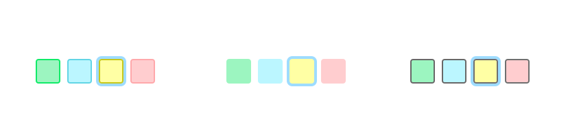
For me it's enough to add while border to make dark icons looks good:
I know that it's hard to see a difference between these colors, but this is only because they are very similar. It will be even harder if the colored part will be smaller.
pjasiun
on 27 Nov 2017
It is important to remember about light color of toolbar in the new UI. White background for icons won't fit there well, but white/dark border sounds like a good idea.
dkonopka
on 27 Nov 2017
Also, maybe we could go with something more abstract:

I believe it would not be very hard for users to get that the top color is the font color, the bottom is a background, and transparent part means that color does not change. This way developers will be able to create more semantic markers which can define both font and highlight (background) colors.
pjasiun
on 27 Nov 2017
The white background seems to work well in the options in the panel.
I would not repeat it though as the toolbar icon. I think it is fine to have a dedicated icon that fits better with its neighbor mates... just like the one proposed earlier (maybe with the marker/pen variation):

Btw, when presenting designs, it is better to use the real list we want to have by default. I've proposed something in the past without making these colors "mockup beautiful", where yellow is "oh, my eyes" yellow (which is also the default active one).
And I agree about the dark UI. We may use it for the ballon editor, but the default for the classic editor will still be light, I suppose. Maybe better to present the "close to final" option using both versions of the toolbar?
fredck
on 27 Nov 2017
It will be very hard to keep accessibility rules with that "oh, my eyes" yellow 😞
dkonopka
on 27 Nov 2017
@dkonopka can you prepare mockup with color boxes with white borders? https://github.com/ckeditor/ckeditor5-highlight/issues/3#issuecomment-347122996
pjasiun
on 27 Nov 2017
@dkonopka & @pjasiun or zigzags :D
jodator
on 27 Nov 2017
Especially for you @pjasiun :)
dkonopka
on 27 Nov 2017
@dkonopka: can you show how it looks with some dark colors for text? This was the problem with the previous concept as @oleq mentioned.
pjasiun
on 27 Nov 2017
@pjasiun how do you solve split button icon issue? IE how do you show last selected highlighter type on toolbar?
jodator
on 27 Nov 2017
Ok, I agree with @jodator that zigzag is the best. What was wrong with it? But I would add a white border to it to ensure that it looks good for dark text colors.
pjasiun
on 27 Nov 2017
Honestly, why do we even have font color here? Background color should be enough. This is a highlight feature, which is meant to highlight some text for editing purposes. ~The highlight should not be visible when content is put in its target place (I mean on the website). It's just for authors to mark some parts of text for further reviewing/processing/authoring/rewriting.~
Edit: I was under impression that this is the case for that feature because that was the discussion we had initially.
I think we should just settle on ~5 colors for background and that's it.
Especially since, AFAIR, we are going to have "font color" and "font background" feature, right?
scofalik
on 27 Nov 2017
should not be visible when content is put in its target place (I mean on the website).
It's not totally true @scofalik - you might want create a highlighted text (to mark it's importance) in blog post.
 jodator
on 27 Nov 2017
jodator
on 27 Nov 2017
But this is background color feature, right? :)
I mean -- we were supposed to have separate features for "font & background color" and for highlighting.
Edit: Okay, I could agree given that we have <mark> tag, that this could also be used in target content place (on the website).
scofalik
on 27 Nov 2017
Honestly, why do we even have font color here? Background color should be enough.
See https://github.com/ckeditor/ckeditor5/issues/631#issuecomment-339955582. Highlight (background) color is for reviewers. Foreground (text) color is for writers to convey the message, to stress something out (e.g. in an e-mail).
Besides, it's up to developers to enable foreground color, if they need it in their integrations.
Especially since, AFAIR, we are going to have "font color" and "font background" feature, right?
I don't think so. The whole idea was to replace font/background color with something smarter that is designed to help writers and reviewers in their workflow. This feature is supposed to do that.
oleq
on 27 Nov 2017
Especially since, AFAIR, we are going to have "font color" and "font background" feature, right?
🤔 I thought that we are working on Highlight feature to replace old style of changing color/background of text (that's why you can find a lot of designs here because it's important feature) like @fredk said:
So this feature could be expanded to replace both the old "foreground + background" color thing with a more modern approach. We could call it "Highlight" where it is possible to use either a "pen" or a "marker"
IMHO if we are changing the direction of working on this feature and we have in plans font-color/font-background feature then highlight color is not needed anymore and keep it simple:
Anyway, I agree that by highlight feature a lot of people think background, not a color of text (but it's not impossible to change this thinking).
dkonopka
on 27 Nov 2017
Foreground (text) color is for writers to convey the message, to stress something out (e.g. in an e-mail).
That's not exactly the reason why I've proposed this. That's the reason: https://github.com/ckeditor/ckeditor5/issues/631#issuecomment-339960214.
The fact is that there are use cases for using the foreground to "highlight" text as well, especially for text review purposes.
In other words... this feature has nothing to do with text formatting... it's about text highlighting and it is usually related to text review (although it can be used for formatting if one wishes.... mostly like any other semantic feature).
fredck
on 27 Nov 2017
Let's stop this discussion for a moment. I'm writing a summary of our chat with @oleq and @wwalc about this feature because we need to set a few things here which seem to be unclear.
Reinmar
on 27 Nov 2017
Here it is: https://github.com/ckeditor/ckeditor5-highlight/issues/4.
Let's first clarify what the feature is supposed to do and then we can get back to the UI and UX (related to the UI – in fact, we may be mixing UX into UI too fast).
Reinmar
on 27 Nov 2017
Let's first clarify what the feature is supposed to do and then we can get back to the UI and UX (related to the UI – in fact, we may be mixing UX into UI too fast).
I believe that this had already been clarified and implemented with ckeditor/ckeditor5-highlight#2. We're past that phase and the only missing thing is the UI. I'm proposing to close ckeditor/ckeditor5-highlight#4, in fact.
fredck
on 29 Nov 2017
It sounds like the "zig zag" proposal is the one leading here. I looks good, in fact.
fredck
on 29 Nov 2017
First things first, I'm sorry that discussion became inefficient and messy. It's been 3 weeks since we started working on the highlight issue and we failed to reach an agreement.
First of all, I failed as a moderator here: I didn't state the problem clearly and I abandoned the discussion when it escalated. Also, I allowed two major topics mix around here:
- the highlight feature UI/UX,
- the shared UI for CKEditor 5 and Letters
It seems that it was a huge mistake because talking about the first considering all the problems and unknowns of the second makes the issue very complex. At this moment, the topic of the shared UI is still super–open, and what we can see in the designs is really far from anything we could call final and stable. That's why using it as a canvas for the highlight feature makes very little sense.
So to speed things up, I propose that we split the highlight UI/UX problem into atomic decisions, discuss them and shape the entire feature this way. And of course, let's stay with Theme Lark at this moment.
Requirements
I analyzed the feedback and also considered recent requirements in ckeditor/ckeditor5-highlight#4.
Briefly:
- We're developing a feature which highlights both text and background, dedicated to content authors and reviewers.
- This feature is different from font/background color (based on inline styles) because it works on markers.
- Most likely font/background color will be developed later, e.g. used by paste from word to convert and allow editing of the pasted content.
- Only one marker can be applied to a content.
Problems to solve
Note: the problems are in the order of importance but they also depend one on another. This is tricky because some decisions at the beginning limit options in the later element of the chain.
Layout of the color palette
There are multiple variants here. Personally, 2, 5 and 7 make the most sense to me, but others are also worth considering.
Layout 1
Pros:
- space–efficient when just a few styles are defined
Cons:
- space–inefficient when there are lots of highlight styles (very wide),
- users must discover which styles are for the text and which for the background
Layout 2
Pros:
- space–efficient when just a few styles are defined
Cons:
- space–inefficient when there are lots of highlight styles (very wide),
- users must discover which styles are for the text and which for the background
Layout 3

Pros:
- thanks to labels, it does not rely so strongly on the discoverability,
- space–efficient when just a few styles are defined
Cons:
- space–inefficient when there are lots of highlight styles (very wide),
- will look just weird if the label is long (i18n) and there's just a single style underneath
Layout 4

Pros:
- space–efficient,
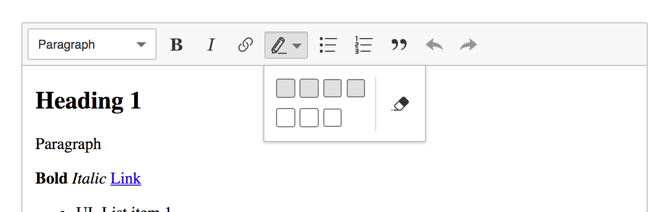
- two rows separate text and background highlight styles,
Cons:
- two erasers are certainly confusing,
- users must discover which styles are for the text and which for the background
Layout 5
Pros:
- all pros of the previous,
- a single eraser makes a lot more sense
Cons:
- users must discover which styles are for the text and which for the background
Layout 6
Pros:
- two rows separate text and background highlight styles,
- labels explain which styles are for the text and which for the background
Cons:
- not quite space–efficient (vertically),
- confusing doubled eraser,
- will look just weird if the label is long (i18n) and there's just a single style underneath
Layout 7
Pros:
- two rows separate text and background highlight styles,
- labels explain which styles are for the text and which for the background,
- a single eraser makes sense
Cons:
- not quite space–efficient (vertically),
- will look just weird if the label is long (i18n) and there's just a single style underneath
Style of the color palette
There are various styles of the color palette we could use. This decision is somehow connected to the previous one (layout) because:
- if we go with a layout without labels, UX will strongly depend on the palette styles (they must be very clear),
- if we go the other way around, we have more freedom to use some generic design here, even the same for the text and the background.
Note: Each color (style) will also have a tooltip just like all the toolbar buttons for better accessibility (e.g. users with visual impairments).
The "universal" approach
IMO it will perform the best with the layouts implementing labels. Otherwise, users will confuse text and background styles.
Additionally:
- In the very first design, we can use JS to determine the color of the border by shifting the base color's lightness by 10% or so.
- The last one is the most accessible thanks to the black border around the previews.
Different styles for text and background
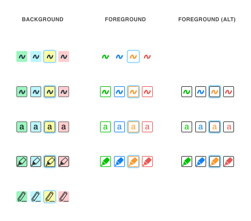
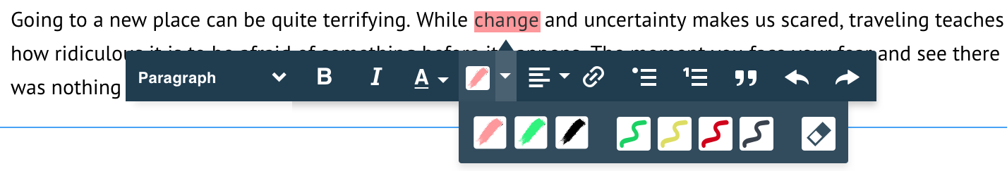
Best for the layouts without labels. And also something that caused the most confusion in the discussion. Again, there are many options here and in theory, we could even mix them (rows in the design).
Personally, I'd rather avoid zig-zags because they have this strong meaning in the world of image processors (either vector or bitmap) and they may suggest that there's some way to paint in the editor.
Eraser UI and UX
There are a couple of eraser designs we can choose from:
But if we focus on the UX first, we may notice that this kind of eraser will not act like the "rubber tool" in the image processors (enable, erase, erase... erase, disable) but more like an "erase style" (select, click "erase", select, click "erase"). So it could be that the obvious eraser icon could not be the best one.
Staying in the UX zone, IMHO the eraser could also behave a little bit different from other styles. The standard procedure of applying a highlight is as follows:
- select text,
- open the highlight palette,
- choose a highlight style,
- text gets highlighted,
- select other text,
- just click the toolbar button because it will remember the last used highlight style,
- other text got highlighted using the previous style.
I was wondering if it is a good idea to remember the eraser style just like other styles. It could be that eraser is not used much and keeping it under that quick toolbar button action brings some issues to the design of the toolbar icon. Again, this decision has an impact on the next one (we're chaining decisions here, remember? :p).
Alright, let's move on.
Toolbar icon
Personally options 1 and 3 make the most sense to me. But in truth, only as long as we won't allow "eraser" to be accessible through that button as a quick repetition of the last style.
The marker–shaped icons clearly suggest what happens when one clicks them and if we sometimes bind them to the eraser, this will cause a lot of confusion. I'm also against changing the icon to the "eraser" for a while because it's a discoverability killer ("where did my button go? :(").
Option 1

Option 2
Option 3

Option 4

Option 5
To color or not to color?
There's also still the question whether to color the icon or not as the style changes. If we decide to color it:
Cons:
- it collides with the eraser (which color to use when the eraser is on?).,
- how to tell if a text or background style is currently used? To differentiate, we'd need to change the icon, as different styles are chosen, which is not a very good UX (discoverability).
- there's also the question of accessibility (e.g. low contrast between some pale yellow highlight and a bright toolbar),
- I'm not sure how to implement that in different themes (@dkonopka?).
- how to implement this smart icon so it works with a different theme?
- what should be provided by the highlight feature?
- what should be provided by the theme?
- how to spare developers unnecessary trouble?
Pros:
- it looks great (and quite smart),
- it may actually help people to learn the status of the feature ("what will happen if I click that one again?"), it provides a useful information
(if we go with colors) BTW: Should the toolbar icon respond to the selection in the editor, representing the current highlight style under the caret?
Defaults
Finally, we must come up with defaults. A configuration which makes sense most of the time and explains the essence of the feature. Also a good start for developers.
- Should we present both text and background styles by default?
- How many styles should be defined by default?
oleq
on 5 Dec 2017
Additional ideas:
Layout of the color palette
Layout 8 (Link–like)
Note: The inside of the balloon could be any from Layout 1-7.
Pros:
- Close to the selection, always in the context.
- It could show up when the selection lands in the highlight, e.g. to change the style or remove it.
Cons:
- Unlike Link, this UI might expand as new styles are added. It could become a huge piece of a balloon.
- If it is to act like the Link balloon (shows up when selection lands in the highlight), what to do if the highlight is in a link? Which one should be visible: link UI or highlight UI? And if we chose one, what to do if highlight and link overlap perfectly (
<a><mark>foo</mark></a>) — how to reach the other UI (via toolbar button only?)?
Layout 9 (In-context eraser)
The eraser balloon shows up when the selection lands in the highlight.
Note: The inside of the dropdown could be any from Layout 1-7.
Pros:
- It solves lots of problems like eraser vs. toolbar button. Styles are in one place, eraser in the other.
Cons:
- Same as layout 8 — what to do when the link UI is to kick in?
- Would it work with editor-balloon?
- Discoverability?
oleq
on 11 Dec 2017
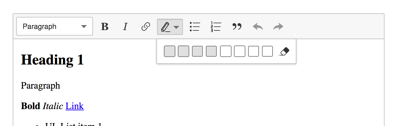
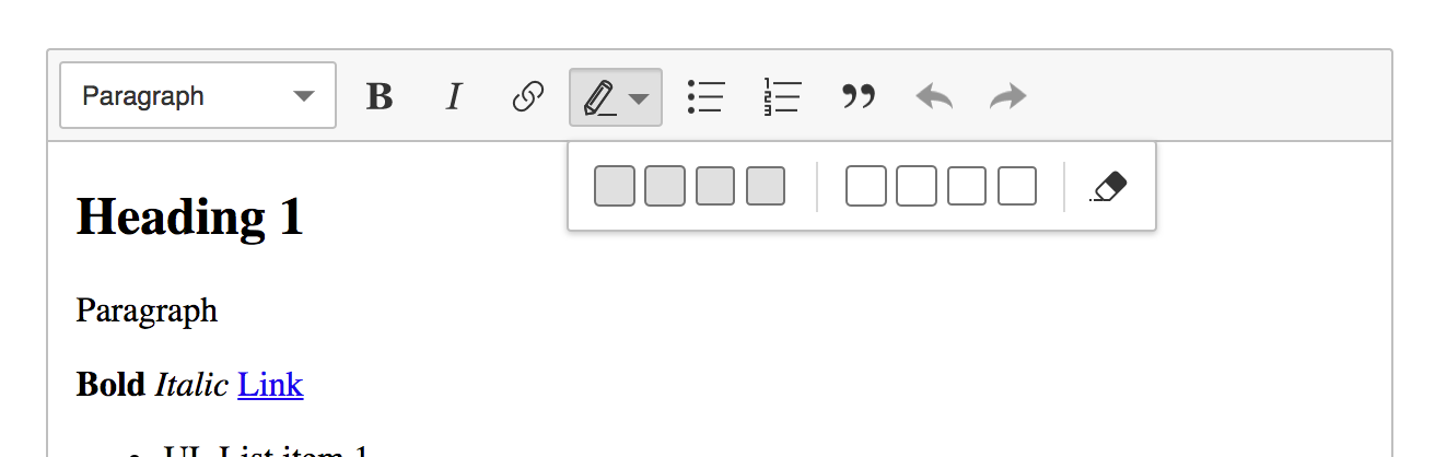
1. Dropdown panel
a) In my opinion, we should try to avoid labels, because of i18n and space saving. If we'll provide users the proper difference between background and text color there should be no worries from UX point of view.
b) The best design to me (it's the simplest & space-efficient) with the default number of colors is:
Layout 2. If we will do it with CSS flex we could split background and text color into two separated rows in the situation with the bigger amount of colors.
2. Icons
I know it looks cool, modern and different, but as @oleq and some people also said, it is too similar to a swung dash. I'm for a simply "a" letters .
3. To color or not to color?
There are so many cons that I would really stay with one colored icon. The biggest problem with coloring icon is mixing background and text color state + way of implementing it in other themes.
4. Defaults
By default, we should provide exactly this what people expect by hearing "Highlight", so I think background color can be a good start for them.
About colors - 4 are enough IMHO (red, yellow, green, blue).
I have another question: Should we use alpha for that colors (like 0.9)?
5. Favourite: Layout 8 ( link-like )
I really like this solution and to be honest cons are not so big blocker I think. That link-like design should be so intuitive for users and much smarter than previous mockups.
If it is to act like the Link balloon (shows up when selection lands in the highlight), what to do if the highlight is in a link?
I'm not so sure about it, but we can simply add one step more for the user and then open proper panel (we were thinking about it some time ago)
dkonopka
on 11 Dec 2017
I really like the Layout 8 proposal but this is indeed a problem:
If it is to act like the Link balloon (shows up when selection lands in the highlight), what to do if the highlight is in a link?
The biggest problem here is that the link feature shows a balloon, not a simple toolbar to which we could add another icon. In other words – we either show link's balloon or highlight's balloon.
However, there's a difference between these two features which we might use here. Currently, the link balloon is shown only for collapsed selection (on click). At the same time, for the highlight feature, it might make more sense to be displayed for non-collapsed selection. Kinda like link feature + balloon editor. But this is... so so and not future proof. Tomorrow we or someone else will add another inline feature which will use the balloon and there will be another conflict.
So, we kinda need a general rule for such conflicts. I can see two options:
- Agree that from inline features only the link feature uses the balloon ;(
Agree that many features may use the balloon. In this case, we'll have conflicts. However, those conflicts will not be super frequent so the solution can be somehow "secondary". In case of conflicts, the last to add its balloon will win. However, you should always have the option to bring the other feature by clicking its icon in the toolbar. So, if link's balloon was displayed and you want to remove the highlight in this place (or change the color), you can click the highlight icon in the toolbar to bring this balloon. The last one wins – in this case, the last action is clicking the icon.
PS. This solution will work with balloon toolbar in a similar way in which link works with it.
What do you think? Is the second solution possible?
Reinmar
on 12 Dec 2017
So, if link's balloon was displayed and you want to remove the highlight in this place (or change the color), you can click the highlight icon in the toolbar to bring this balloon.
👍 I was thinking about too, it's a win-win situation for highlight&link UX.
Currently if you want to edit part of a link, you will need to do exactly the same like your @Reinmar proposed solution (select some part, click link icon, then edit), so on the other hand users should learn to use highlight feature easily.
dkonopka
on 13 Dec 2017
After reading all of this I'm still unsure in which direction we're heading.
quick note: I'd stray from "background" and "font" in labels and use "marker" and "pen" - just to make it a bit distant from future font-/background-color feature.
After thinking on how this feature might be used (ie marking text with some meaning) it might be a case that you need to select text and mark it. While on paper you would read some part of text, pickup marker of some color and then mark a text. While reading I would often select a part of text that is "suspicious" and then would like to mark it somehow.
Now this part is where I'm for Layout 8/9 aka Balloon so the markers to choose from are "at hand". The whole go to toolbar click select might be too long.
The other thing is that while reviewing some text if you have at least two types of highlighters it might be common case in which you switch between different highlighters. So again the balloon is more handy here then going through toolbar route over and over again.
Now the eraser: I see two cases
- you simply changed your mind about some selection - so you would like to remove whole (click eraser click at marker)
- you selected a bit too much, a letter, word a sentence - doesn't matter you have to select some part of text and remove highlight
Could eraser in a balloon acts contextually? On collapsed selection it would remove whole highlight but on part of selection with highlight it would remove only selected part?
Agree that many features may use the balloon. In this case, we'll have conflicts
Dunno how this could act but maybe we could introduce a "SelectionToolbar" to which features might add own behavior if we see that more and more features overwrites them-selfs?
ps.: I liked the colored icons but I can see that it might cause problems with not in-house developed themes :/ I'm only worried that if we don't change it when selecting a marker/pen then the feature of clicking on a button will be harder to discover. (ps.: but maybe if the style of this button will be as "split button" then it will be a bit more clear).
As I wrote about split button - I have implementation of this ready. It introduces a dropdown with a button that have two areas: button and arrow button - I wonder if you remember about that as on proposed layouts it is current dropdown button with arrow.
To sum up:
- I can see that Balloon layout has some advantages and could be our winner.
- I'm unsure what the layout should be in the balloon.
- Probably the icon dosen't matter as much as in previous talks (to start implementing this).
- It's probably still too early to start implementing UI for highlight.
jodator
on 15 Dec 2017
During some recent F2F talks we discovered that the balloon approach (options 8 and 9) would mean a major (almost total) refactoring of the balloon system and API (ContextualBalloon, ContextualToolbar + features using them) because there are many combinations of content + selection where features using balloons (balloon toolbar, image, link, highlight) would collide. We found out that there is no universal resolution for all sort of conflicts, or at least none that preserves the UX, so we must come up with something simpler and get back to the topic later.
Since the scope of such refactoring is really huge and it would block this feature, we decided to go with a simpler approach:
Applying highlights
Just a single click before applying a highlight:
- The split button in the toolbar offers 2 creation features:
- Allowing to chose a new marker/pen from the dropdown using the arrow button.
- Applying the last used marker/pen when the main button is clicked.
- If none has been applied before, the default from the configuration should be used.
- The user selects content in the editable, then applies the marker/pen (there is no "painter mode").
Editing highlights
Collapsed selection in a marker/pen: changing the style via the drop-down changes the entire marker/pen.
Before
foo <penA>b[]ar</penA> bazAfter
foo <penB>b[]ar</penB> bazNon–collapsed selection: changing the style is character–wise. What has been selected is changed.
Before
foo <penA>b[a]r</penA> bazAfter
foo <penA>b</penA><penB>[a]</penB><penA>r</penA> baz
Removing highlights
- There are 2 ways to remove highlight:
- Using the main toolbar button. If a selection is in a pen/marker, the button is on (
.ck-on). Clicking it removes the pen/marker. - Using the eraser in the dropdown it works like the main toolbar button except that it can be used e.g. to remove all pens and markers from some large selection (whole content).
- Using the main toolbar button. If a selection is in a pen/marker, the button is on (
- Removal strategy is the same as editing (described earlier) to speed up the process:
- Collapsed selection: remove entire pen/marker.
- Non–collapsed: remove character–wise.
Button behavior and CSS
The UI directly after applying highlight:
- When the highlight is applied, the button retains its color, e.g. by coloring the underline in the icon.
- Hence it must be possible to add a class to the main part of the split button.
- The color of the icon’s line will come from the same stylesheet where colors used in the content are specified (especially that one needs to specify colors to be displayed in the dropdown’s panel anyway). In other words: content in editable, styles in the dropdown and the line should share the same CSS classes (right, @Reinmar?).
- When the highlight is applied, the button retains its type, slightly changing the icon (e.g. tip of the tool).
- The button (icon) does not react to selection changes. Even if the selection is anchored in a pen/marker, the button displays the last one used color/type.
oleq
on 18 Dec 2017
Alternative main button color/icon behavior
- When selection lands in a highlight, the button gets highlight's color and type.
- Clicking the button removes the highlight.
- When selection lands somewhere elese, the button displays the last applied highlight's color and type.
- Clicking the button applies the last used highlight.
oleq
on 18 Dec 2017
An idea of colorful, switchable icons that reflect current style:
Marker

Pen

oleq
on 19 Dec 2017
I really like proposed icons, they are fresh & modern. But in my opinion for the current toolbar it is not fitting as much as it could (for this icon set).
If we are going to refresh UI for CK5 these new icons could look very good IMHO, for dark-theme too.
dkonopka
on 19 Dec 2017
I'd wait for the rest of the theme to catch up. These are really nice icons themselves but they don't match the rest of the icons because they are very graphical (the first one is even comic-like).
Reinmar
on 20 Dec 2017
To unblock @jodator I pushed the icons in https://github.com/ckeditor/ckeditor5-highlight/commit/3523d5ff15e3890a180c780dd275f34e0bc3eff0. They might not be perfect but they do the trick. The inner color can be adjusted using CSS
svg .ck-icon__fill { fill: yellow }
I think the easiest way to do that at this moment is to retrieve path.ck-icon__fill from the features buttons' icons and apply inline styles to them with JS.

oleq
on 21 Dec 2017
The color of the icon’s line will come from the same stylesheet where colors used in the content are specified (especially that one needs to specify colors to be displayed in the dropdown’s panel anyway). In other words: content in editable, styles in the dropdown and the line should share the same CSS classes (right, @Reinmar?).
@oleq: Some previous talks required one to define this color in configuration:
editor.config.define( 'highlight', [
    {
        model: 'marker',
        view: { name: 'mark', class: 'marker' },
        title: 'Marker',
        color: '#ffff66',
        type: 'marker'
    }
] );
The color value is currently used as color set to buttons in toolbar and dropdown. Probably instead of using this config value I can set the view configuration on buttons and it should work as long as the page defines those styles like this:
.marker {
    color: #ffff66
}
I'd like to clarify the solution (either):
- using
colorfrom config. - using
viewdefinition on buttons (would require copyingclass,style,attributesif set (as it might useViewElementDefinitionhere) but no need to definecolorin config.
jodator
on 17 Jan 2018
The current config is too verbose but for a different reason. We don't need to define that it's the marker attribute – this should be hardcoded.
As for the color... I'm for defining it in the config. Retrieving it from the stylesheet by using the same class names will be really tricky IMO. Those styles would be then hard to write (e.g. you couldn't use the mark element name there). And it would be even more tricky if more attributes are used.
Finally, the option name should be highlight.options. We may need to set more config options for the highlight feature so we should not take the entire namespace.
Reinmar
on 17 Jan 2018
@Reinmar: Another question: should highlight behave the same as basic commands on collapsed selection when not in highlight? Ie.: apply highlight to a collapsed selection and start typing - the text will be highlighted?
jodator
on 17 Jan 2018
I'm not 100% sure now. Do you remember @oleq what we decided?
Reinmar
on 17 Jan 2018
I'm not sure if we discussed this behavior, but I assume highlight is a post-creation tool. That would mean such an action (highlight collapsed selection, then type) should not be possible. But what about the UI then? Should the toolbar icon be disabled in a collapsed selection?
oleq
on 18 Jan 2018
To help you think on this I've created a screen cast with such behavior:

First thought: a bit flashy toolbar button :D
jodator
on 18 Jan 2018
But looks OK to me after more time fiddling with this.
jodator
on 18 Jan 2018
ps.: wouldn't be better to unselect highlighted text and create collapsed selection to range end?
It is not visible ATM that selection get highlighted (nothing changes) as selection cover highlight.
Other features' changes are visible under selection (like bold, italics, font-size, etc).
jodator
on 18 Jan 2018
Other features' changes are visible under selection (like bold, italics, font-size, etc).
What do you mean by that? Pressing CTRL+B does not change anything (visually) when the selection is collapsed.
oleq
on 18 Jan 2018
@oleq I've talking about other case on expanded selection (normal use-case). When you select some text and execute highlight - visually nothing happens. While executing bold the text get bolded and it is visible under a selection. Similar with italic. But for highlight you have to unselect the text to actually see command's result on text.
jodator
on 18 Jan 2018
Now I get it. Maybe we can tune the styles for (at least) markers so the native selection does not cover the entire highlighted area?
oleq
on 18 Jan 2018
👍 for markers, but 👎 for pens:

jodator
on 18 Jan 2018
::selection {
    background: rgba(0, 145, 255, 0.8);
}
mark {
    padding-bottom: 2px;
}
With above (on Chrome):

jodator
on 18 Jan 2018
The same as above on FF:

jodator
on 18 Jan 2018
Doesn't look too bad to me. I'd wait for more feedback, though.
oleq
on 18 Jan 2018
- Let's go with the standard behaviour of the bold/italic buttons for collapsed selection. We can easily change it (e.g. to apply the highlight to the entire word) later. It will be easier to make the decision once we see and use it live and going with the familiar behaviour should be safe for now.
- The button needs to be on when the selection is inside a highlight. This is an important visual feedback that the feature reacts to your actions.
- Regarding the selection styles – nice catch. However, we can easily tweak this over time, so let's not spend too much time on this now. Let's have a followup for this and avoid overriding the
::selectioncompletely because it's not safe either. - We realised that there's a problem with leaving the highlight at the end of the paragraph (just like with the link feature). It's a significant issue because the "remove highlight" button removes the entire highlight, not just the style of the selection (which would allow escaping the style). So, we'll need to generalise the link's feature to all styles perhaps. But let's have a followup for this too and not block the highlight feature.
Reinmar
on 18 Jan 2018
Sounds like a plan. As for the link–at–the–end–of–the–line issue, I'm leaving this for future reference: https://github.com/ckeditor/ckeditor5-link/issues/72#issuecomment-352458361. Can't wait to see it stable!
oleq
on 18 Jan 2018
Related issues
 hamenon
·
3Comments
pjasiun
·
3Comments
oleq
·
3Comments
jodator
·
3Comments
Reinmar
·
3Comments
hamenon
·
3Comments
pjasiun
·
3Comments
oleq
·
3Comments
jodator
·
3Comments
Reinmar
·
3Comments
Most helpful comment
First things first, I'm sorry that discussion became inefficient and messy. It's been 3 weeks since we started working on the highlight issue and we failed to reach an agreement.
First of all, I failed as a moderator here: I didn't state the problem clearly and I abandoned the discussion when it escalated. Also, I allowed two major topics mix around here:
It seems that it was a huge mistake because talking about the first considering all the problems and unknowns of the second makes the issue very complex. At this moment, the topic of the shared UI is still super–open, and what we can see in the designs is really far from anything we could call final and stable. That's why using it as a canvas for the highlight feature makes very little sense.
So to speed things up, I propose that we split the highlight UI/UX problem into atomic decisions, discuss them and shape the entire feature this way. And of course, let's stay with Theme Lark at this moment.
Requirements
I analyzed the feedback and also considered recent requirements in ckeditor/ckeditor5-highlight#4.
Briefly:
Problems to solve
Note: the problems are in the order of importance but they also depend one on another. This is tricky because some decisions at the beginning limit options in the later element of the chain.
Layout of the color palette
There are multiple variants here. Personally, 2, 5 and 7 make the most sense to me, but others are also worth considering.
Layout 1
Pros:
Cons:
Layout 2
Pros:
Cons:
Layout 3
Pros:
Cons:
Layout 4
Pros:
Cons:
Layout 5
Pros:
Cons:
Layout 6
Pros:
Cons:
Layout 7
Pros:
Cons:
Style of the color palette
There are various styles of the color palette we could use. This decision is somehow connected to the previous one (layout) because:
Note: Each color (style) will also have a tooltip just like all the toolbar buttons for better accessibility (e.g. users with visual impairments).
The "universal" approach
IMO it will perform the best with the layouts implementing labels. Otherwise, users will confuse text and background styles.
Additionally:
Different styles for text and background
Best for the layouts without labels. And also something that caused the most confusion in the discussion. Again, there are many options here and in theory, we could even mix them (rows in the design).
Personally, I'd rather avoid zig-zags because they have this strong meaning in the world of image processors (either vector or bitmap) and they may suggest that there's some way to paint in the editor.
Eraser UI and UX
There are a couple of eraser designs we can choose from:
But if we focus on the UX first, we may notice that this kind of eraser will not act like the "rubber tool" in the image processors (enable, erase, erase... erase, disable) but more like an "erase style" (select, click "erase", select, click "erase"). So it could be that the obvious eraser icon could not be the best one.
Staying in the UX zone, IMHO the eraser could also behave a little bit different from other styles. The standard procedure of applying a highlight is as follows:
I was wondering if it is a good idea to remember the eraser style just like other styles. It could be that eraser is not used much and keeping it under that quick toolbar button action brings some issues to the design of the toolbar icon. Again, this decision has an impact on the next one (we're chaining decisions here, remember? :p).
Alright, let's move on.
Toolbar icon
Personally options 1 and 3 make the most sense to me. But in truth, only as long as we won't allow "eraser" to be accessible through that button as a quick repetition of the last style.
The marker–shaped icons clearly suggest what happens when one clicks them and if we sometimes bind them to the eraser, this will cause a lot of confusion. I'm also against changing the icon to the "eraser" for a while because it's a discoverability killer ("where did my button go? :(").
Option 1
Option 2
Option 3
Option 4
Option 5
To color or not to color?
There's also still the question whether to color the icon or not as the style changes. If we decide to color it:
Cons:
Pros:
(if we go with colors) BTW: Should the toolbar icon respond to the selection in the editor, representing the current highlight style under the caret?
Defaults
Finally, we must come up with defaults. A configuration which makes sense most of the time and explains the essence of the feature. Also a good start for developers.