We need a nice icon for the feature. In the initial rollout I used erase icon that could be reused (actually font/bg color will reuse it too).
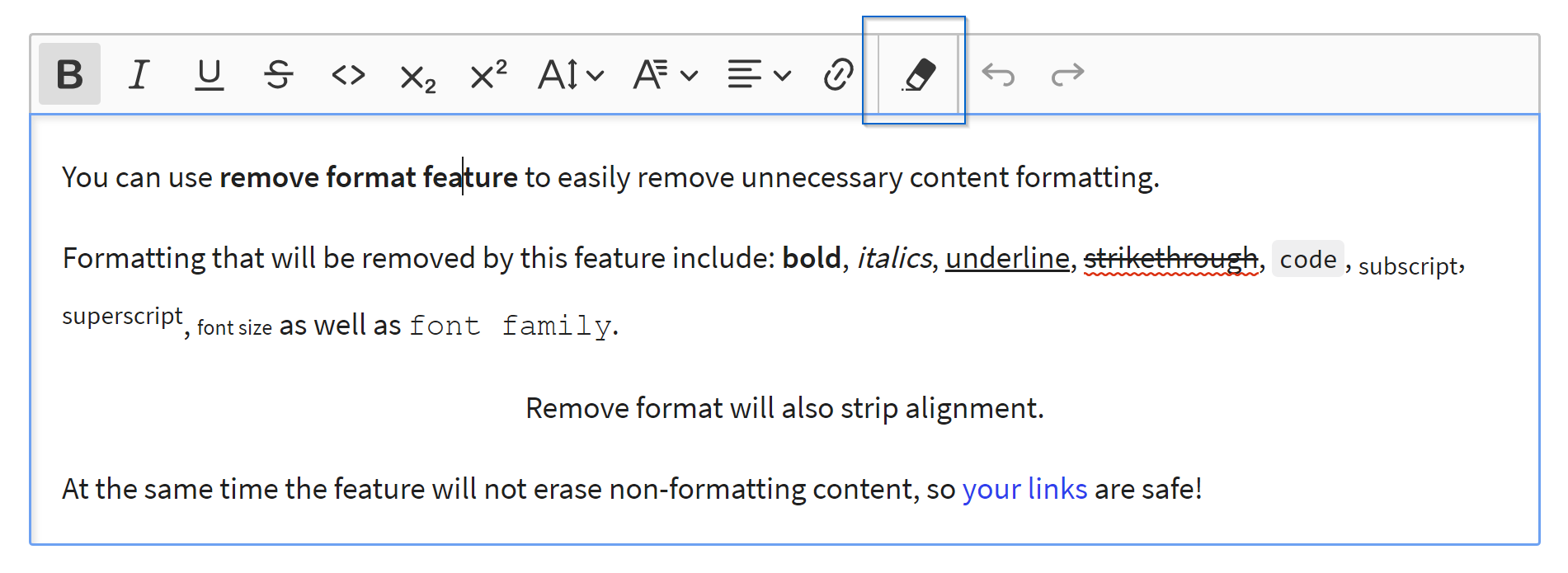
What do you think about the icon? Do we want to add a new one or is it ok to reuse the existing one?
 mlewand
All 3 comments
This needs a research. We need to come up with an icon the users are familiar with, preferably the most common among the word processors.
 oleq
on 28 Mar 2019
oleq
on 28 Mar 2019
I've made a quick research, which says that almost everyone is using T with × sign (or strikethrough in GDocs case).
FYI: The last one example - A with rubber is a Word usage.

I'll propose something for CK5 soon.
 dkonopka
on 28 Mar 2019
dkonopka
on 28 Mar 2019
👍3
oleq
on 29 Mar 2019
Was this page helpful?
0 / 5 - 0 ratings
Related issues
 pomek
·
3Comments
pomek
·
3Comments
 pandora-iuz
·
3Comments
pandora-iuz
·
3Comments
 MCMicS
·
3Comments
MCMicS
·
3Comments
 jodator
·
3Comments
jodator
·
3Comments
 wwalc
·
3Comments
wwalc
·
3Comments
Most helpful comment
I've made a quick research, which says that almost everyone is using
Twith×sign (or strikethrough in GDocs case).FYI: The last one example -
Awith rubber is a Word usage.I'll propose something for CK5 soon.