Ckeditor5: Table merges end up shrinking table columns
Is this a bug report or feature request? (choose one)
🐞 Bug report
💻 Version of CKEditor
11.2.0 (Tested on https://ckeditor5.github.io/)
📋 Steps to reproduce
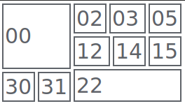
- Try to create a table with the same layout as the TableWalker documentation(showed below)
| 00      | 02 | 03      | 05 |
|         +----+----+----+----+
|         | 12      | 14 | 15 |
|         +----+----+----+----+
|         | 22                |
|----+----+                   +
| 31 | 32 |                   |
+----+----+----+----+----+----+
✅ Expected result
Have the desired table layout
| 00      | 02 | 03      | 05 |
|         +----+----+----+----+
|         | 12      | 14 | 15 |
|         +----+----+----+----+
|         | 22                |
|----+----+                   +
| 31 | 32 |                   |
+----+----+----+----+----+----+
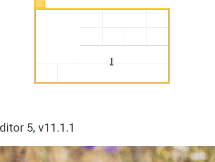
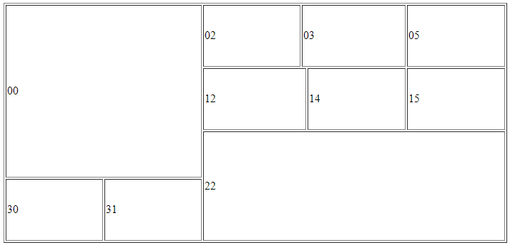
❎ Actual result
| 00      | 02 | 03 | 05 |
|         +----+----+----+
|         | 12 | 14 | 15 |
|----+----+----+----+----+
| 31 | 32 | 22           |
+----+----+----+----+----+
📃 Other details that might be useful
Did not find a way to accomplish it, any order of merges give the same result.
 dkrahn
All 11 comments
Well that's unfortunate but it seems that The example might be not valid (I'd have to confirm that with specs).
This is how this happen:
This is how the DOM is rendered in FF:
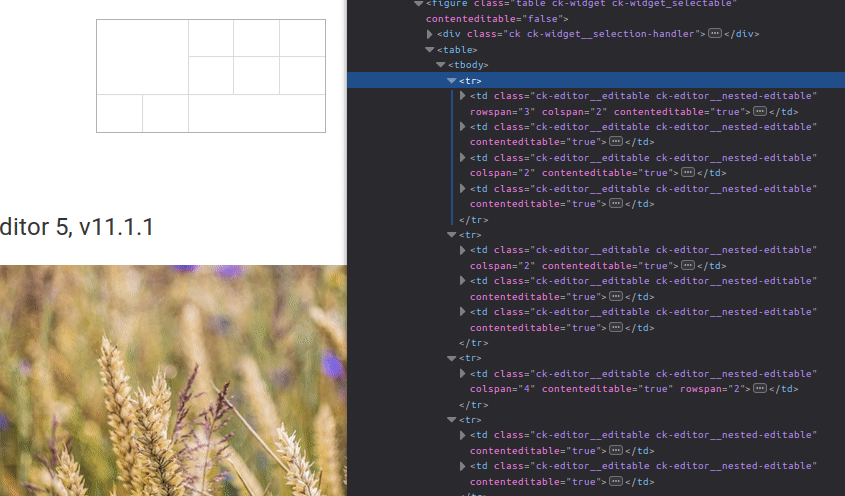
And this is the markup (without additional attributes and td contents):
<table>
    <tbody>
        <tr>
            <td rowspan="3" colspan="2"></td>
            <td></td>
            <td colspan="2"></td>
            <td></td>
        </tr>
        <tr>
            <td colspan="2"></td>
            <td></td>
            <td></td>
        </tr>
        <tr>
            <td colspan="4" rowspan="2"></td>
        </tr>
        <tr>
            <td></td>
            <td></td>
        </tr>
    </tbody>
</table>
Below is a table rendered in Chrome with only user-agent styles (+ borders for td). You can see that problematic cells (12 and 22) are render slightly off:
And similar thing with CKEditor 4:
So without much digging into I think that at least we should update the example in the docs. Fortunately the markup is correct but the problem lies in how browsers renders such markup.
 jodator
on 17 Jan 2019
jodator
on 17 Jan 2019
Does that happen in all browsers?
 oleq
on 17 Jan 2019
oleq
on 17 Jan 2019
@oleq Firefox & Chrome - I didn't test Edge though.
jodator
on 17 Jan 2019
Hi @oleq and @jodator
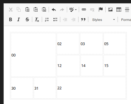
Did more tests and I think it is related to the table's height, that the browser optimizes.
With the following table, setting to a bigger height, the correct layout is maintained:
<table border="1" height="200" width="400">
    <tbody>
        <tr>
            <td colspan="2" rowspan="3">00</td>
            <td>02</td>
            <td colspan="2">03</td>
            <td>05</td>
        </tr>
        <tr>
            <td colspan="2">12</td>
            <td>14</td>
            <td>15</td>
        </tr>
        <tr>
            <td colspan="4" rowspan="2">22<br/>22</td>
        </tr>
        <tr>
            <td>30</td>
            <td>31</td>
        </tr>
    </tbody>
</table>
This way the table shows up ok. The browsers are shrinking each of the cell heights because of it's content, apparently breaking the table.
Sorry for the taking your time.
dkrahn
on 17 Jan 2019
OK, so maybe let's not use a confusing content HTML in the docs.
oleq
on 17 Jan 2019
I'm lost – what needs to be done to resolve this ticket?
 Reinmar
on 13 Feb 2019
Reinmar
on 13 Feb 2019
@Reinmar The sample needs to be updated so it will provide "visually correct" table. As the sample in the docs produces "visually incorrect" table as browsers collapse cells/rows and thus it looks incorrect. But this is only visual - the HTML is valid.
tl;dr: provide other sample in that docs that will not create confusing effect in the browser
jodator
on 13 Feb 2019
The example could be just add a new line and column with no row/col span.
| 00      | 02 | 03      | 05 | 06 |
|         +----+----+----+----+----+
|         | 12      | 14 | 15 | 16 |
|         +----+----+----+----+----+
|         | 22                | 26 |
|----+----+                   +----+
| 31 | 32 |                   | 36 |
+----+----+----+----+----+----+----+
| 40 | 41 | 42 | 43 | 44 | 45 | 46 |
+----+----+----+----+----+----+----+
This will make the browser not collapse the table.
dkrahn
on 13 Feb 2019
@dkrahn thanks! This will land in the docs for upcoming release.
jodator
on 13 Feb 2019
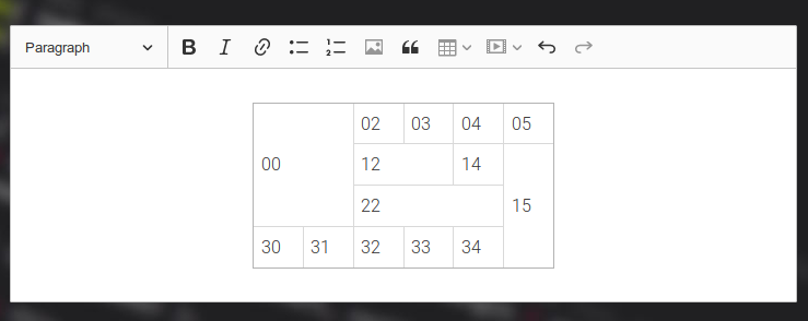
After some fiddling I went with:
| 00      | 02 | 03 | 04 | 05 |
|         +----+----+----+----+
|         | 12      | 14 | 15 |
|         +----+----+----+    +
|         | 22           |    |
|----+----+----+----+----+    +
| 30 | 31 | 32 | 33 | 34 |    |
+----+----+----+----+----+----+
As this table is the same size as previous and illustrates how walker skips rows/columns. Also is nice in the rendered table:
jodator
on 15 Feb 2019
Closed by: https://github.com/ckeditor/ckeditor5-table/commit/b97bc1200cbe9b9be0726dc2536ba662b946c2b7.
jodator
on 15 Feb 2019
Related issues
Reinmar
·
3Comments
Reinmar
·
3Comments
 pandora-iuz
·
3Comments
pandora-iuz
·
3Comments
 wwalc
·
3Comments
wwalc
·
3Comments
 MansoorJafari
·
3Comments
MansoorJafari
·
3Comments