Ckeditor5: The highlight buttons are hard to distinguish
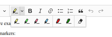
I looked at the document editor demo to play with the highlight feature after a longer break with this feature. Guess what? I thought it was missing the highlight background color (the marker color) and that only pen colors are available there. Only because I knew we implemented both (text/background color) I started pressing buttons blindly to discover that they indeed have different functionality. Only after that experiment I noticed that they indeed look slightly different.
Reporting it here just to see if there are more people with this problem. And I'm not blind, I just guess it's the way how the brain works, probably a similar mechanism that lets us easily read text with typos without noticing them much.
Maybe just a separator between pen and marker would help, dunno.
 wwalc
wwalc
All 2 comments
👍 for the separator.
 Reinmar
on 15 Mar 2018
Reinmar
on 15 Mar 2018
Quick question on how we would like to see it.
To introduce a separator in current highlight feature configuration we should sort the highlighters (and write about it in docs of course).
In highlight.config we introduce which highlighters are available and their order is taken directly. To introduce a seprator in dropdown we should sort highlighters to group them. So the first will be markers then pens and then the remove highlight button at the end.
Here comes also the dropdown toolbar configuration issue. But the sorting algorithm might be a default one if a developer will not define a toolbar config. In oder words it might be implemented independently.
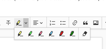
@wwalc a preview for a highlight dropdown with default configuration:
 jodator
on 16 Mar 2018
jodator
on 16 Mar 2018
Related issues
 oleq
·
3Comments
oleq
·
3Comments
 MansoorJafari
·
3Comments
MansoorJafari
·
3Comments
 pomek
·
3Comments
pomek
·
3Comments
 hamenon
·
3Comments
wwalc
·
3Comments
hamenon
·
3Comments
wwalc
·
3Comments
Most helpful comment
👍 for the separator.