Type of report
Feature request
Preview:
Users interested in seeing how the feature looks today can preview it on our Emoji feature branch preview.
Provide description of the new feature
There should be an option to insert emoji from a button. Clicking the button would show full list of available emojis.
Because of the default emoji count, this feature requires some performance to make sure that the feature is responsive.
This feature could be implemented as a drop-down with some UI aiding usability.

Browser Support
Same as Emoji plugin itself.
Features
Here are some words on the initial design:
Must Have
Search
Search box should search based on the emoji ID or keyword (#2181).
If the search box is empty it just displays the initial view.
It is to be determined how the search results should be displayed - whether results should be grouped in categories or should it put it into one bunch.
Grouping
Emojis should be categorized. Categories should be shown as tabs, e.g. on the top of a dropdown.
The industry generally threads these tabs purely as navigation, meaning that clicking a given category does scroll to a given section, rather than filter the results.
Accessibility
There needs to be basic accessibility. We need to make sure that dropdown elements has correct labels and that the dropdown is operable using the keyboard alone.
Nice To Have
The following features are optional, and may be skipped.
Initial Render
All the emojis should be displayed during the first render.
It is important to provide a very good performance here.
Skin Tone
Possibility to set the skin tone of an emoji.
Improved Configuration
It would be nice to allow for groups customization. At the minimum being able to hide groups.
Would be better if there's an option for adding custom categories to the mix - however this one would affect the design, as it would be very easy to break the tabs layout.
Turning Popular Matches into Emoji
Feature would turn some old-school style emotion expressions into an emoji, for instance :), <3 or :D. From the technical side of things I believe we could use text watcher/match combo for that.
 jacekbogdanski
All 32 comments
Option that I'd like to see here is a small dorpdown that adds a search field and allows to look through entire emoji set. Once emoji is clicked it is inserted into a position where the editor selection is.
For sure it should be a modal dialog like the old one, but just a dropdown instead.
 mlewand
on 7 Jun 2018
mlewand
on 7 Jun 2018
It seems to be much easier to choose both frequently used emojis and the one found during a search if there are available within one click and can be scanned quickly without too much effort.


Could you paste a screenshot/sketch of how you would see this feature @mlewand?
 wwalc
on 7 Jun 2018
wwalc
on 7 Jun 2018
@wwalc For sure it has to contain some emojis at the beginning, I didn't mean to show just a search input alone.
This is something that is on my mind:
mlewand
on 7 Jun 2018
This is something that is on my mind:
Yep, looks good. I was confused with what did you mean by writing "dropdown".
wwalc
on 7 Jun 2018
I have updated the functional overview. Meanwhile we'll get the design proposals from @ryszardb soon.
Things to be resolved:
- Do we want to categorize search results? Say you type "face", there are few matches in "smiley", "people" and "animals & nature" categories (maybe more categories). Options are to put the results in bulk, or to categorize the results. I personally prefer when the matches are categorized, it allows me to find my match quicker when the search phrase is ambiguous.
mlewand
on 16 Jul 2018
it's just mockups..
toolbar main:

toolbar.. skin and category:

text:

custom config:

 RyszardB
on 18 Jul 2018
RyszardB
on 18 Jul 2018
@RyszardB thanks for the mockups. Looks pretty nice.
Mockups use a different color scheme from the default moono-lisa that should be adjusted.
In terms of the design, I don't think that rounded search input match our moono-lisa skin. If you check the dialogs, each input is a box with _slightly_ (2px) rounded corners. I believe it should be consistent here.
The above relates also to the skin color picker, although I think it really looks nice if you skip the fact that it it does not fit the rest of UI (love these white borders). What if we make it simpler, so it's just a box, that has no spacing in-between the colors?

Finally the custom config will look pretty much as a regular dropdown (it should include search, label area and tabs). The only difference is that there is a case where there could be a single tab. In that case I think that skipping the tabs make sense.
mlewand
on 18 Jul 2018
Everything looks so nice 👍
I'm just thinking about the discoverability of skin tone. Personally, I prefer this Slack idea with hand, but it's only my opinion. Will users properly understand this "yellow circle" as a skin-tone switch?
 dkonopka
on 18 Jul 2018
dkonopka
on 18 Jul 2018
I'm just thinking about the discoverability of skin tone. Personally, I prefer this Slack idea with hand, but it's only my opinion. Will users properly understand this "yellow circle" as a skin-tone switch?
There is a label next to it. I guess that thanks to rounded circles this section can be smaller. Also this way we can avoid confusion with what is emoji and what is not. Anyway for me looks cool.
BTW "Choose your skin tone" may in other languages change into a longer string. It would be good if the layout supported longer label. If not, the label should be changed to "Skin tone" or sth.
Mockups use a different color scheme from the default moono-lisa that should be adjusted.
+1
Other than that, 👍 ❤️
wwalc
on 19 Jul 2018
@RyszardB How the focus on emojis should be reflected? Simply a background or some sort of a border behind the focused emoji?
mlewand
on 20 Jul 2018
- Won't the label show only when it's clicked? I agree with the skin tone switch can be a hand emoji. I think it's better to see the color change on an actual emoji.
- When someone will choose a skin tone, this will affect all the (edit: future) emojis right? So I think it'd be nice to have the word "default" as well. Smt like "Default skin tone"
- Another thing is I would like a positive version of this negative icon

for me it looks a bit weird 😅
 gok9ok
on 20 Jul 2018
gok9ok
on 20 Jul 2018
Btw. "choose your skin tone" should be remembered somehow. It will be annoying if one has to set it every time. Aaaand here comes the trouble... we should not make this complex.
Let's see what options we have:
Saving asynchronously preferences in CMS.
Pros:
- Full control by the CMS. It may be that this kind of setting already exists in the CMS.
- Preferences can be shared across different editor instances, even across different domains.
- Preferences are correctly loaded on different browsers, computers.
Cons:
- Complex to setup. "Seriously, I have to write some code to support saving emoji color tone?"
Saving in local storage.
Pros:
- Yay, works out of the box.
Cons:
- Hard to determine how to save user preferences. Per domain? Per editor ID (element ID that is replaced with CKEditor)? What if the ID is a randomly generated hash? What if the domain hosts multiple applications?
Note: Emoji skin tone is not a critical part of the application. If it resets to the default value because someone cleared the browser cache or logged on a different computer, it's not a big deal.
Solution?
We could introduce a new plugin for saving user preferences (e.g. default skin tone, last used emojis, in the future maybe settings for other plugins).
It could by default save settings in the local storage. If we receive requests to support other backends (saving in CMS), we'd introduce it later.
Such plugin could introduce config option called userpreferences_applicationId. If someone would like to share settings between multiple editors with different IDs, he could use the same userpreferences_applicationId.
wwalc
on 23 Jul 2018
There are generally 8 main groups used in Emoji. That's why we need to have icons representing each of those groups:
- People
- Nature & Animals
- Food & Drink
- Activities
- Travel & places
- Objects
- Symbols
- Flags
And additional icon for search results / default view.
 msamsel
on 23 Jul 2018
msamsel
on 23 Jul 2018
When someone will choose a skin tone, this will affect all the emojis right? So I think it'd be nice to have the word "default" as well. Smt like "Default skin tone"
@gok9ok I'm not sure if I got you right, but just to clarify: this will affect all the _future_ emojis - so it won't modify these that are already in the editor.
@wwalc there needs to be a config option that allows to customize the _default_ skin tone. On top of that there could be this feature that remembers the settings. I was thinking about such plugin for a long time actually, but we need to plan it correctly. That being said let's get back to it as we 're closer to the point where we implement skin tone feature, as this is a nice to have feature.
@msamsel why do we need to get a default icon for search results?
All: we didn't resolve the search results grouping, see my previous comment: https://github.com/ckeditor/ckeditor-dev/issues/2062#issuecomment-405281985
I think that uncategorized search results would best fit the most use cases. Typically there are not that many search query matches, so it will be more compact.
mlewand
on 23 Jul 2018
@mlewand Do we want to categorize search results? (...) Options are to put the results in bulk, or to categorize the results.
I'm for keeping categories for emojis, but if I'm going to search something I don't care which category it is (@RyszardB was right about it). Furthermore it requires (often) additional action from the user to scroll the content.
Personally, displaying search results as bulk is not something wrong from the UX point of view, IMHO let's keep it simple.
Twitter search results:

Slack search results:

dkonopka
on 24 Jul 2018
@msamsel why do we need to get a default icon for search results?
@mlewand it's used in other systems and @RyszardB also embed it in mockups (clock icon).
msamsel
on 24 Jul 2018
+1 for Slack search results. All results are visible instantly, much less scrolling/searching to get what you need.
wwalc
on 24 Jul 2018
mono-lisa skin and icons:


RyszardB
on 24 Jul 2018
all icons: png, retina, svg:
emoji-icons-all-test.zip
RyszardB
on 24 Jul 2018
Isn't the lower opacity of icon groups inconsistent with mono-lisa? See for example the indent buttons (or unlink, undo) on the screenshot. They are grayed out because they are not working.
wwalc
on 24 Jul 2018
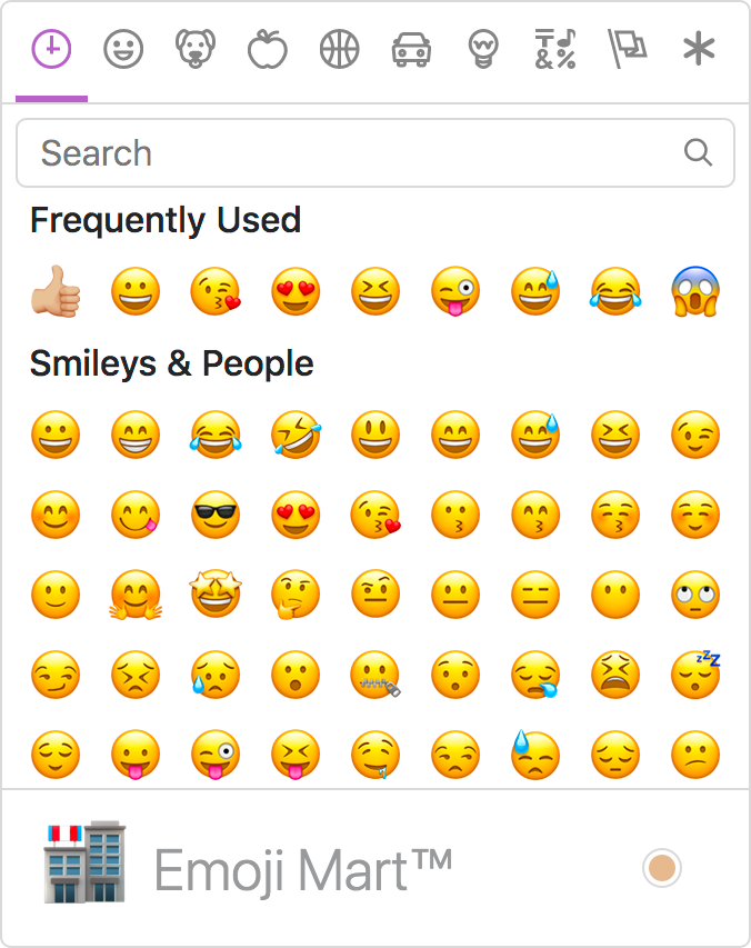
Adding it here as it may bring us some interesting ideas: https://github.com/missive/emoji-mart
wwalc
on 17 Aug 2018
I made a quick review from the end user perspective, here are the findings:
hi prio
- filter state should be cleared out (search text and active category) on each open
- since recently used group is not implemented, let's skip it for now, and we could add it in the future releases
we need improved toolbar icon
- also for some reason I think there's weirdly little space between the icon and an arrow (dropdown indicator)

emojis seems to be placed unevenly in the grid. There's more space on the left and on the top, than bottom and right.

medium prio
- initial open of the dropdown that is async, should be more responsive. I mean the dropdown should appear immediately but the content should appear asynchronously.
- the dropdown should have focus trap / focus cycle
low prio
focus groups: tab order should be organized differently, there should be following tab groups:
- tabs
- search box
- emojis
Each of these groups when focused should be operated with keyboard arrows.
mlewand
on 3 Oct 2018
new toolbar icon:

RyszardB
on 4 Oct 2018
png+svg:
smile-2-icon.zip
RyszardB
on 4 Oct 2018
Thanks @RyszardB. Personally I like the second (right one) a little more. The first one has a creepy smile. Second is fine, although it has kind of anime-style eyes.
mlewand
on 4 Oct 2018
@RyszardB according to @mlewand comment: https://github.com/ckeditor/ckeditor-dev/pull/2461#pullrequestreview-164209766
That has to be verified, but IMO the icon looks like it has a different color from other icons. It looks as if it was disabled.
Do you have any tips how to improve that, or is there required new ( a little darker ) icon?

msamsel
on 15 Oct 2018
I changed the stroke thickness. check now:
smile-3-icon.zip
RyszardB
on 15 Oct 2018
It looks better.
@mlewand WDYT?

msamsel
on 15 Oct 2018
@msamsel I guess so, for sure I'll have a closer look while reviewing.
mlewand
on 15 Oct 2018
Just adding my 2 cents 😄
IMHO this dropdown arrow is too close to the icon.
dkonopka
on 15 Oct 2018
@dkonopka yeah but it's added directly by plugin responsible for making dropdown, similar to case with background color (top-right). IMO Changing it should be done by separate issue. :)
msamsel
on 15 Oct 2018
Closed by #2461.
mlewand
on 29 Oct 2018
Related issues
 DmitrySmolsky
·
4Comments
DmitrySmolsky
·
4Comments
 blackcoder87
·
4Comments
blackcoder87
·
4Comments
 f1ames
·
3Comments
mlewand
·
5Comments
f1ames
·
3Comments
mlewand
·
5Comments
 jurajkapsz
·
3Comments
jurajkapsz
·
3Comments
Most helpful comment
mono-lisa skin and icons: