Circuitverse: UI Improvements for Projects Page : Increase focus on simulator preview
Is your feature request related to a problem? Please describe.
In the project page, the simulator is the main interest but is taking very less percentage of space. This page needs to be redesigned.
Describe the solution you'd like
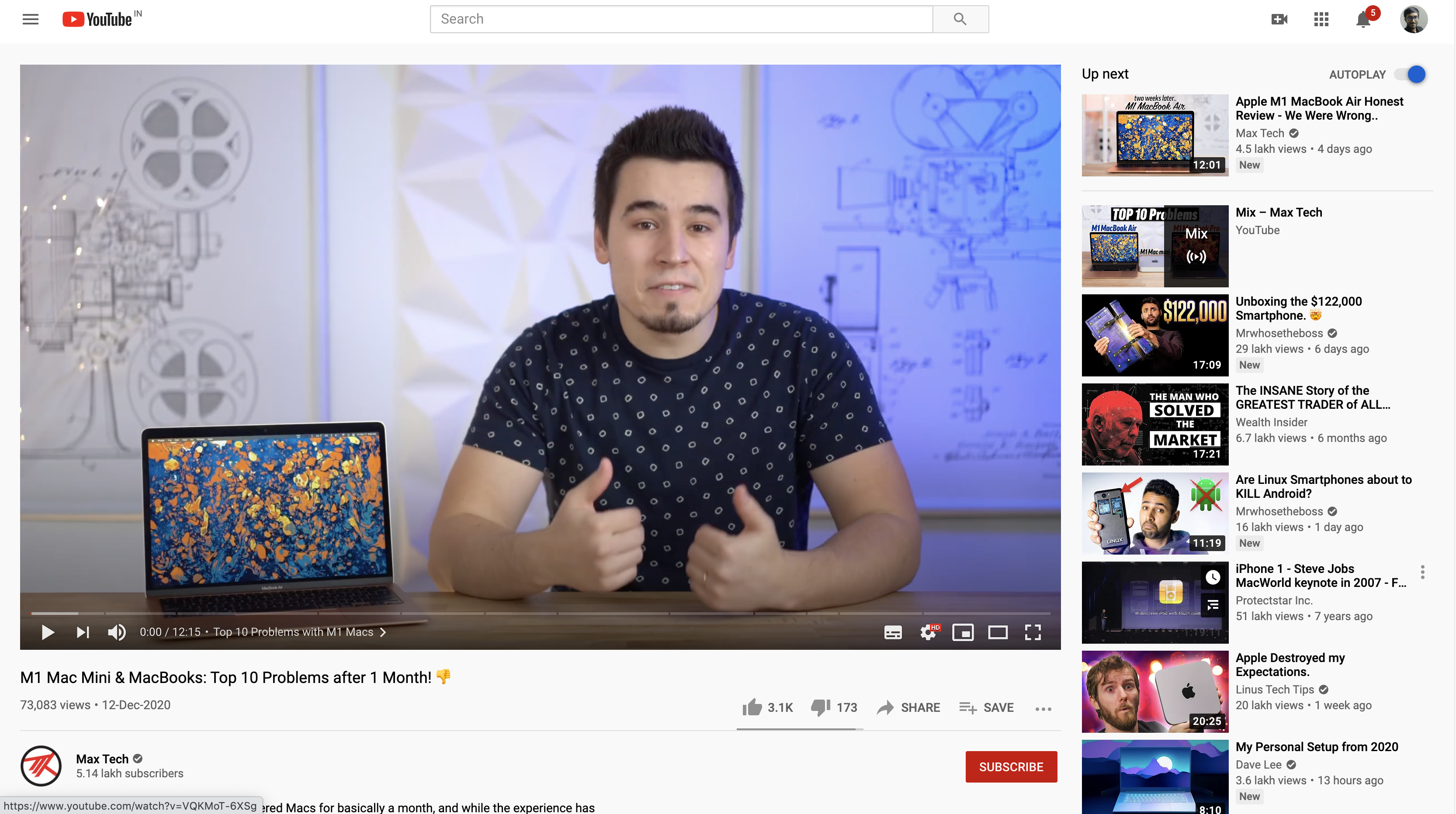
One way to go would be YouTube's video layout, without the recommended videos on the side. There are other possibilities as well. Would love some design previews from which we can finalize on one.
Additional context
Current Layout

YouTube's Layout
Are you working on this? (Yes/No)
No.
Things to note
- The simulator needs to be the focus of the design.
- Majority projects don't have a detailed description. It is short.
- We have to display views, stars, username, circuit name, fork, embed buttons in a proper way.
 sal2701
All 9 comments
Please try and show designs before trying to make the page, so we can suggest improvements and changes.
 satu0king
on 12 Dec 2020
satu0king
on 12 Dec 2020
Hello @satu0king @sal2701, can I work on this?
 Kartik1397
on 13 Dec 2020
Kartik1397
on 13 Dec 2020
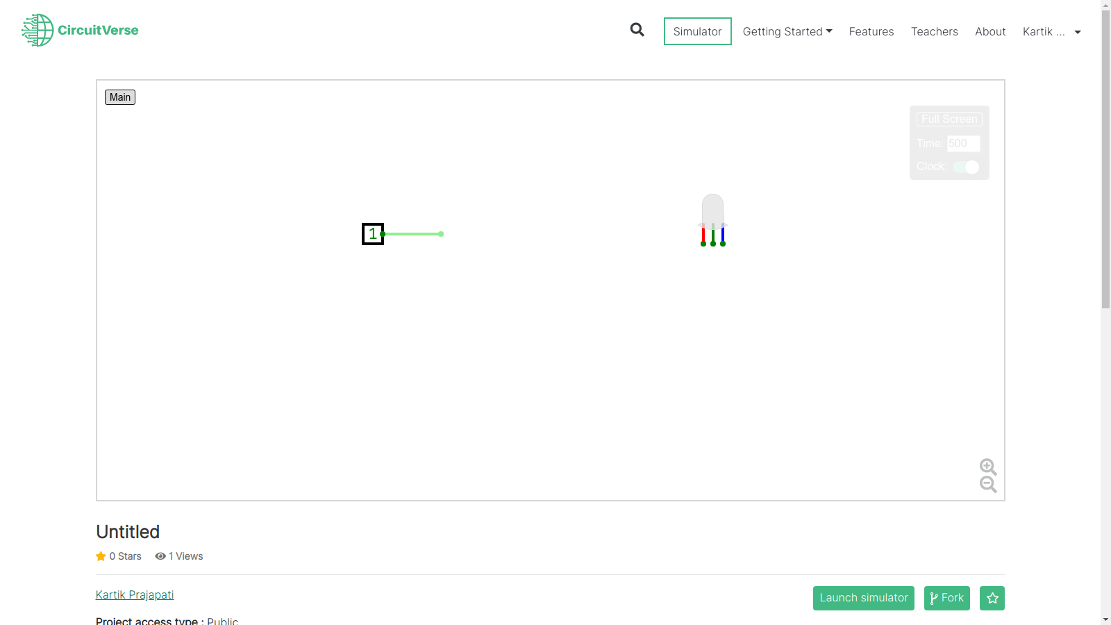
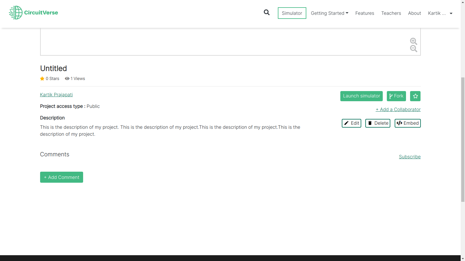
My design preview
Kartik1397
on 14 Dec 2020
Hey @Kartik1397 Great work! You can surely work on this. A few things to consider
- The space beside the title is empty, do you think you can shift few elements there? Like the Launch, Fork, Star Button, Project Access Type, etc
- How long are you planning to keep the Title and Description? What will happen when limit is exceeded. Since there are buttons beside the description, how will it be displayed?
- Do you feel we can combine the Star button and number of Stars information? Like GitHub does it.
- The comments section seems fine so not much to do there.
sal2701
on 15 Dec 2020
- How long are you planning to keep the Title and Description? What will happen when limit is exceeded. Since there are buttons beside the description, how will it be displayed?
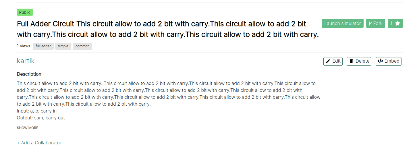
If lenght of the Title and Description exceed the text will wrapped into the next line. We can see exact behavior in this screenshot.
These are the other suggested changes.
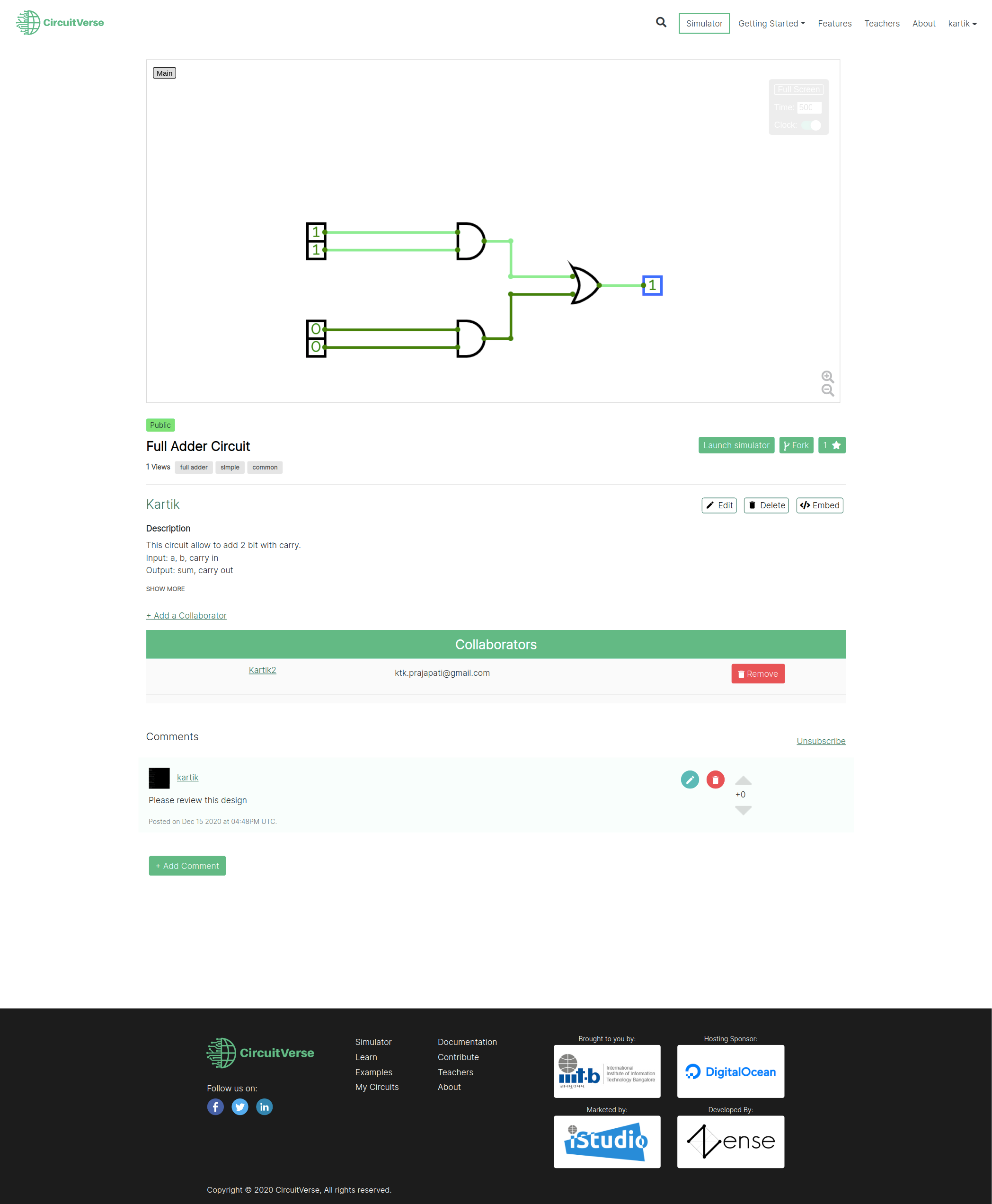
What about showing cards like these in collaboration section?

Kartik1397
on 15 Dec 2020
@Kartik1397 Great work. Looks quite good. Few points
- Since the username and Fork, Embed, Star buttons are aligned and you could've the description span all columns.
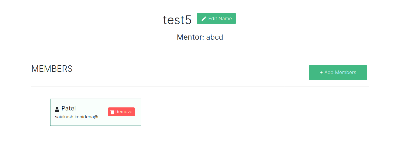
- Yeah, the wide collaborator section looks weird, we could try the cards approach, it has been done in the 'Groups' page.
- The simulator background is completely white so is the web page. Having a darker border might give better visibility to the simulator. What do you feel?
- Also, the arrows for up-voting and down-voting seem to be misaligned. Can you fix that as well?
Apart from that everything looks good to me. What do you say @satu0king?
Cards used for Members in a Group
sal2701
on 16 Dec 2020
Updated design
https://www.figma.com/file/jUuuEsFFzfxA7SPvb6si8L/Circuit-Verse-Project-Page?node-id=0%3A1
Kartik1397
on 17 Dec 2020
Updated design
https://www.figma.com/file/jUuuEsFFzfxA7SPvb6si8L/Circuit-Verse-Project-Page?node-id=0%3A1
The design seems to be really well crafted, a few minor things that can be given a thought:
- would the
Show Morecenter-aligned look better? - Not making the unsubscribe button primary & keeping the old style?
- I think a threaded comment section would be better as well as hiding after a particular number of comments with a 'Show More'
 abstrekt
on 10 Jan 2021
abstrekt
on 10 Jan 2021
- would the
Show Morecenter-aligned look better?I think left aligned
Show Morewill be more easy to reach.
- Not making the unsubscribe button primary & keeping the old style?
Maybe, this can add inconsistency to design.
- I think a threaded comment section would be better as well as hiding after a particular number of comments with a 'Show More'
Yes, this feature can make comment section more organized.
These are my thoughts but I'm not expert at UI/UX.
Kartik1397
on 15 Jan 2021
Related issues
satu0king
·
5Comments
 fpintos
·
9Comments
fpintos
·
9Comments
 eKuG
·
7Comments
eKuG
·
7Comments
 1337w0rm
·
3Comments
1337w0rm
·
3Comments
 Ananthavijay
·
5Comments
Ananthavijay
·
5Comments