CIDRAM works fantastically to prevent scammers and spammers, and I congratulate all of you for the terrific work you do.
Is there a CIDRAM logo & link that I can place on my web sites to indicate that the sites are protected, and provide some promotion for CIDRAM?
Frank
 frank4360
All 44 comments
THX for the suggestion Frank. I would like to do the same thing. ZB Block has such a logo wiitch I had on my websites.
 delle54
on 1 Jun 2019
delle54
on 1 Jun 2019
I have CIDRAM, Bot-Trap and ProjectHoneypot running :D
delle54
on 1 Jun 2019
Thanks! And any possibility to promote CIDRAM at all, would always be welcomed and appreciated. :-)
We don't have any official logos, emblems, mascots, etc yet. I could ask around though, to see whether anyone would be willing to come up with something for us.
As for links: Linking either directly to the repository here, or to cidram.github.io, would probably be the best choices, I think.
 Maikuolan
on 2 Jun 2019
Maikuolan
on 2 Jun 2019
(I forgot to mention: We do have a favicon, and that favicon has been around for a long time now, since the early days of CIDRAM. It only looks kind of half-decent at 16x16 dimensions though, and any larger than that, e.g., when stretched or expanded to fit larger spaces, it looks pretty bad and cheap. You're welcome to try doing something with that, if you'd like. But, I'll ask around anyway, to see whether anyone would be willing to come up with something, because the favicon isn't much to work with).
Maikuolan
on 2 Jun 2019
Perhaps we can buy/order from a professional logo designer? I would be happy to pay for it. ✌
 Dibbyo456
on 3 Jun 2019
Dibbyo456
on 3 Jun 2019
The website Fiverr comes to mind for someone to create a logo. I advertise CIDRAM in my signature at the phpBB support forum, but many there I'm afraid may be too stupid to know how to deploy it. Well, I was a little in the beginning. LOL I still don't know how to create signatures as I did with ZBblock, but I have created IP blocks relatively simply. Even if I was told how to create sigs here, I wouldn't get it. I saw how to do it a little but it was over my head. I don't even know PHP so that's probably part of it.
 737simpilot
on 10 Jun 2019
737simpilot
on 10 Jun 2019
I still reckon this would be a good idea, but TBH, I don't really have many good ideas for our logo, what it should look it, whether it should have a particular theme and so on, lol. Anyone got any thoughts in that regard?
Maikuolan
on 19 Sep 2019
Something basic like a shield icon https://www.google.com/search?hl=en&as_q=SHIELD+ICON and optionally letter "C" inside it, on the right logo text "CIDRAM", that's what comes to my mind.
Don't overthink this too much :-)
 dev-101
on 19 Sep 2019
dev-101
on 19 Sep 2019

I smacked this one together some time back, although I think the underlying original came from some stock vector collection of uncertain origin.
So I wouldn't use it officially for the project without doing some real back-tracing on it first .
_(Anyone able to find an original somewhere?)_
 ghost
on 19 Sep 2019
ghost
on 19 Sep 2019
Maybe if you upload non-modified version without text?
https://www.tineye.com
dev-101
on 19 Sep 2019
Looks like the origin comes from a 2014-ish badge promoting 256bit security for credit card payments. I can't really place it, nor say that it is used any longer.
Tineye doesn't come up with much either, and it turns out it wasn't a vector but a bitmapped original. So the only use is as a good teaser ;)
ghost
on 19 Sep 2019
Made an edit to that image.

737simpilot
on 20 Sep 2019
I got the lock here, but it says free for commercial use. Not sure about this project here.
737simpilot
on 20 Sep 2019
We should let a designer create (a new) one.
 DanielRuf
on 20 Sep 2019
DanielRuf
on 20 Sep 2019
Greetings,
Now that I think I have managed to properly set an instance of CIDRAM (thanks to the much appreciated help from some maintainers as @Maikuolan and @737simpilot), I look at some opened issues in this repository and discover this one, for which I presume I would be able to make some suggestions (and would be pleased to do so as an _open source_ contribution).
Indeed, considering the purpose of CIDRAM, the use of a shield or a lock might seems relatively appropriate. Other projects in the security field have made same choices: uBlock (for a shield) or Keepass (for the lock). Considering to mix the two seems also potentially acceptable: a lock set on a shield, for example. Of course, using such current and frequent elements implies implementing them in an original way, in order that the CIDRAM brand will not be confused. A flame image (as for junk mail in Thunderbird) or a gagged robot could also be quite eloquent and maybe a little less common.
Consideration should also be given to a _simple_ color palette (if possible defined to match colors used by the website, even if it currently seems to use a little modified default template) and ensure that a perfectly monochromatic variant remains readable (keeping in mind a possible integration of such a brand in various collection projects, like Simple Icons for example).
I will think about some feasible suggestions, working with scalable SVG files and foremost stem from the shield concept (after all, doesn't my own avatar contain such a shield)... 😉
 gizmecano
on 2 Aug 2020
gizmecano
on 2 Aug 2020
Those all sound like great ideas, I reckon. :-)
I also agree, that a simple palette will most likely serve the needs of the project the best, not just for memorability, but also for portability (I'm not an expert at graphics design, but from the experiences I have, I've found images which utilise more simple palettes tend to be easier to transform, to modify, to rescale, etc when necessary).
In regards to the website: The whole thing probably needs to be redesigned at some point anyway, I think. Mostly, I haven't put a great amount of effort or attention towards the design of the website, because I've always been more of a coder than a designer, leaning more towards the mentality of functionality than the mentality of aesthetics, and the limited functionality of the website (really, just acting as a landing page to point people towards the documentation, the repository, providing some download links, etc), combined with the easy-to-use themes/templates/designs available via GitHub's page builder and similar, has been enough of an excuse for me to mostly ignore the aesthetics of it to-date. Kind of lazy of me, I know.. but it's just one of those things, I've figured, "I'll get around to it eventually, when there's time, and nothing else more important to do", or "when I feel it". But also, if anyone else felt like tackling it..? I'd be totally okay with that, too. But, my main point, and the reason I bring that up here, now: Defining a palette to match the website's colours is a good idea, and I agree, but we needn't necessarily feel constrained by the the website's current colours, because TBH, if we can come up with a really nice colour palette for our branding and related images, which we all generally like, I'd be just as happy to change the website so as to match the new colour palette. ;-)
I will think about some feasible suggestions, working with scalable
SVGfiles and foremost stem from the shield concept (after all, doesn't my own avatar contain such a shield)... 😉
That would be fantastic! I look forward to seeing what you come up with. :-)
Maikuolan
on 2 Aug 2020
I also agree, that a simple palette will most likely serve the needs of the project the best, not just for memorability, but also for portability (...)
I largely share this opinion, especially because the core of CIDRAM's purpose does not seem needing to be oriented towards a particularly _audacious_ visual aspect: it is above all intended to be a _robust_ and _functional_ tool.
In the example below, I used two very contrasting colors (more symbolic than simple black and white rendering):
#F1E9D2(_Parchment_) for the light tint#B22222(_Fire Brick_) for a more significant red cast
Of course, this is a first draft (not even a proposal) and this palette needs to be discussed.
The whole thing probably needs to be redesigned at some point anyway, I think (...)
Of course, that would be a good thing: this template has been used a lot (one of your other project, phpMussel, uses it too), and if the main backbone are still widely usable, it could no doubt be modernized and especially adapted to more specific content.
I've figured, "I'll get around to it eventually, when there's time, and nothing else more important to do", or "when I feel it".
I understand: it's a problem when you manage a lot of projects (especially if web design is not your core business). On the other hand, "_the cobbler always wears the worst shoes_" : I'm currently rebuilding my own website after forsaking it for too long...
But also, if anyone else felt like tackling it..?
I took a quick look at the website repository: I'll try to take a closer look at this when I have enough time.
(...) we needn't necessarily feel constrained by the the website's current colours, (...) I'd be just as happy to change the website so as to match the new colour palette.
Certainly, especially since the current color palette is really very minimal.
In any case, the redesign of a visual identity goes through different steps: the color palette is certainly a part of the bedrock on which everything else is built.
Now, I post below a first draft based on the elements mentioned in previous comments, _ie._ the ideas of the shield (also used by phpMussel) and the padlock. It's a only a first attempt, of course.
The shield is adapted and recalibrated from my own avatar. The padlock is inspired by some files used on _Wikicommons_ (like this one), but it's an original work done from plainly simple shapes.

gizmecano
on 3 Aug 2020
Nice work! Looking pretty good, I reckon. :-)
Maikuolan
on 6 Aug 2020
Great ideas.
I think green or blue may make more sense from an image language perspective(tech and good / protective). Red is mostly negative or bad. So far it looks very generic and could be any security product. And I'm not sure if it is a "good" idea to promote the solution on the website to let attackers know which code is used in the background.
In most cases we can use https://img.shields.io/badge/CIDRAM-protected-green or similar. Maybe a second and detailed version makes sense but works only in big(ger) sizes and does not directly transport the relevant information (what is it about).
DanielRuf
on 6 Aug 2020
@Maikuolan
Nice work! Looking pretty good (...)
Thanks, but like I said, you may just consider this as a very first draft.
@DanielRuf
I think green or blue may make more sense from a image language perspective (...)
As I said earlier, the palette I used here is purely speculative. I fully understand that it can (and should) be discussed between the maintainers of the project.
So far it looks very generic and could be any security product (...)
I have to admit that this point is particularly true: As an example, a lot of adblockers use variations of red.
And I'm not sure if it is a "good" idea to promote the solution on the website to let attackers know which code is used in the background
Indeed, sure it might not be a good idea to promote the source code in an untimely or inappropriate manner (especially directly on websites that use CIDRAM to improve their own security).
However, having a minimal visual identity (even just in order to be used on the team page or as a shortcut icon of the introductive website) can make it easier to identify CIDRAM.
gizmecano
on 7 Aug 2020
Just tossing an idea out there for consideration. My personal nature is all about uniqueness so this is where I'm getting this idea. We see a lot of shields and locks used by anti-virus or Ad blocking software. What if it can be more creative by using an image of two knights holding their lance's in a cross configuration? Or maybe the image of a knight from the side or front? LOL I don't know, just a thought and I realize this could be more of a pain in the butt to accomplish. But I do think there's good potential in brand recognition. However, I know this project (CIDRAM) isn't some commercial software or anything, just going by some creativity and knowing about how marketing works for companies. I literally analyze all TV commercials and YouTube Ads all damn day long wondering what their appeal is and so fourth. It's just been a hobby of mine. Some TV Ads here are not what I would do from a marketing perspective at all. To go off topic, there's this Ad campaign on TV for a self-installed home security product called Simplisafe. They have this guy as part of their promotion who is wearing a ski mask acting like a "professional" burglar and talking about the product and what it can do. All fine and well. But just today I saw this Ad (maybe new) with this ski mask wearing guy and he always says something like, "take it for me, I'm a thief." Now in this new Ad he added in a subtle voice after the first part, "take it for me, I'm a thief...and a con artist. LMAO! Right there when I heard him say that I thought that was very poor to have your "promo guy" say I'm a "con artist" all the while trying to sell the product. I just personally felt like it wasn't needed at all as part of the TV commercial. HAHAHA I thought that bit was funny. And a self-installed home security product has nothing to do with con artists anyway.
Anyway, brand recognition and uniqueness is what path I'd go down.
737simpilot
on 7 Aug 2020
@737simpilot
We see a lot of shields and locks used by anti-virus or Ad blocking software.
Indeed, it is an undeniable fact. 👍
(...) it can be more creative by using an image of two knights holding their lance's in a cross configuration?
It's an stimulating idea, which probably deserves to be explored. Nevertheless, I tend to think that two spears will probably already denote a cross...
(...) this guy as part of their promotion who is wearing a ski mask acting like a "professional" burglar (...)
Funny, but where I reside, people wearing a ski mask rarely turns out to be confused with burglars... 😉
Anyway, brand recognition and uniqueness is what path I'd go down.
I would tend to follow the same inclination.
My first try was simply following the initial comments.
But recently I was thinking about the idea of using a robot image.
And now these knights can also be another way forward.
gizmecano
on 7 Aug 2020
My two knights idea of using their lances to form a cross, for lack of the right term looks like this in the attached image.
Where ever you live you're lucky ski masks are a common occurrence. Even here in the frigged Winter of Colorado, walking down the street with a ski mask on may arose suspicion from a passing cop. It happened to me while I was walking in the Winter.
Anyway, I give you the Knights in white satin. LOL!
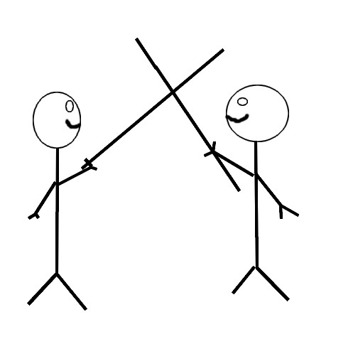
737simpilot
on 7 Aug 2020
Actually, their faces would be looking straight ahead, not towards each other. They are "guarding" the entryway so to speak. LOL
Edit-
Ah! I see where you live now. One day I would love to go there. I use Protonmail which is based there.
737simpilot
on 7 Aug 2020
My two knights idea of using their lances to form a cross, for lack of the right term looks like this in the attached image.
It was kind of the idea I was just considering. I just found an image that can be more or less inspiring (even if it is really too overloaded to make a simple emblem)...
Where ever you live you're lucky ski masks are a common occurrence.
Yes, not uncommon to see ski masks between November and April. On the other hand, I live in an area full of ski resorts...
Actually, their faces would be looking straight ahead, not towards each other. They are "guarding" the entryway so to speak.
Well, thanks for the clarification: indeed, it seems more logical to represent them as "guardians" than as "fighters"...
Ah! I see where you live now. One day I would love to go there. I use Protonmail which is based there.
So my remark about ski masks doesn't surprise you anymore. It is a relatively well-known touristic region. And indeed, the safety and reliability of various products from this country seem to have been proven... 😉
In addition, I wonder if it would not be a good idea to open a specific repository dedicated to tasks concerning the global visual identity (color palette, logo, stylistic charter, etc.) which has to be common to the whole project (because this discussion seems to not be directly linked to the core of the CIDRAM project). @Maikuolan, what's your opinion?
gizmecano
on 7 Aug 2020
I just found an image that demonstrates the idea I have except in this photo they have long handed axes and not lances. I suppose it doesn't matter which weapon is used. Long handed axes might actually be more appropriate. https://image.shutterstock.com/z/stock-photo-two-knights-in-shining-armor-costumes-guarding-a-castle-in-lithuania-with-medieval-weapons-753288787.jpg
So it would be a simple image with a background of some sorts with two knights in this configuration. It wouldn't be a photo-like image though, just a logo type image. Not too sure what the background would be though. Perhaps a shield could be used and withen that the two knights in their guarding position as indicated. Or there could be the use of an emblem its self. The color palette should probably be two distinct colors. I was thinking for this idea of black and silver, black and copper or black and gold. Black I was thinking would be the background color. But on the other hand, I don't know if that would work out too well. I do think that the use of metal colors should be used seen as how this is of knights. But it doesn't have to be that way at all. I mean, the background could be green and the knights could be blue or what ever else.
Just throwing this all out there as a possible idea. I think it should be up to Caleb to make the final decision unless he indicates something different.
Again, I just wanted to point out the possibility of being unique and the use of brand recognition versus that of other software that already incorporates some form of "shield" for their products. And of course there are many other ideas that could be used. Off the top of my head a logo could make use of computer imagery and maybe a picture of a gate or something. Maybe in an effort to create a good logo, one should create a word storm using words that describe CIDRAM and its capabilities and based on those ideas logos can be drawn up. On the other hand, it may make sense one may not want to put a massive amount of effort into this. LOL
PS: Sorry about the link. I don't fully understand how to use the code in here. I just know how to use BBcode and know that very well. LOL I clicked the markdown link which loaded a page of all kinds of stuff which I'm not willing to read right now. Also, when I clicked the "add a link" button it inserted its code but I don't know how to fully use it or if the link has to be wrapped in that code, etc. I take it that all this markdown stuff, etc is more geared for those who know code. I'm not one of them.
737simpilot
on 8 Aug 2020
Yeah, overloaded images for a logo should be frowned upon. I think it should be of perhaps two points of interest (for lack of a better word) using two colors . Especially if it's going to be reduced in size to be placed in a footer or what ever.
I bet companies spend a massive amount of time with their logos. Incorporating a massive amount of marketing data, psychology and focus groups. LOL I do know that places like McDonalds or Burger King, etc use red and yellow because I guess it makes you feel hungry. So I have been told.... I think red and yellow has another subconscious meaning but I can't remember what it was now.
737simpilot
on 8 Aug 2020
PS: Sorry about the link. I don't fully understand how to use the code in here.
No problem. :-)
As an example, this, in bbCode:
[url=http://domain.tld/][img]http://domain.tld/images/foobar.jpg[/img][/url]

[url=http://domain.tld/][img alt="Hello buddy"]http://domain.tld/images/foobar.jpg[/img][/url]
Would be equivalent to this, in markdown (markdown is what GitHub uses):
[](http://domain.tld/)
[](http://domain.tld/)
More detailed information: https://guides.github.com/features/mastering-markdown/
Maikuolan
on 8 Aug 2020
Some of the ideas are good, but we should also be careful to not end up creating something which becomes too complex for anyone to be able to use in some cases.
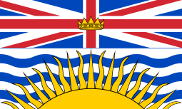
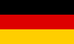
As some examples (not logos, and not really "branding" exactly, but a nice parallel for what I mean by "too complex"), imagine you are 10 years old again, back at school, and your teacher has just asked you to try drawing some of these flags:
British Columbia | Belize | Germany | France
:-:|:-:|:-:|:-:
 |
|  |
|  |
| 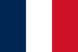
Drawing Germany and France should be really easy, because they're basically comprised of just three rectangles of varying colours. But, unless you're really, really good at drawing, you'll probably struggle for a long time with British Columbia and Belize, and even when you're finished, it probably won't look too good.
Basically, what I'm saying is that whatever we use here for CIDRAM, it shouldn't be anything that people would struggle too much with, I think. ;-)
Maikuolan
on 8 Aug 2020
I think red and yellow has another subconscious meaning but I can't remember what it was now.
..Communism, perhaps? (Many possible jokes there, but better to leave it be for now, best kept to a venue elsewhere). 😂
Maybe in an effort to create a good logo, one should create a word storm using words that describe CIDRAM and its capabilities and based on those ideas logos can be drawn up. On the other hand, it may make sense one may not want to put a massive amount of effort into this.
I'm loving the enthusiasm that I'm seeing here, and those are all things which definitely could help. But yeah.. Keeping in mind the likely limited application of such branding, the fact that we're a small-scale, free, open-source project, and the fact that we're not likely to be running any major advertising campaigns in the foreseeable future, one should definitely only put in as much effort as one wants to be putting in, and shouldn't feel any obligation or pressure to do so (i.e., have fun with it, but no stress and no worries).
I do think that the use of metal colors should be used seen as how this is of knights.
Take in mind that it's really, really difficult to properly convey "metal" colours on a computer screen. Gold ends up just looking like yellow, silver and iron both end up just looking like grey, bronze like brown, copper like a dull orange, etc. If you look at metallic paint (e.g., for painting your car, your roof, etc), the main differences between ordinary colours and their "metallic" counterparts usually comes down to additives in the paint, which give it greater luminosity, reflectivity, "chique", etc. Since we can't do that so well with digital colours, it's more difficult to create "metallic" digital colours. Website themes and templates which require such colours, usually achieve such an effect through trickery such as employing colour gradients, shadows, different brightness zones, filters, and contrasts on the page to create the illusion of luminosity or reflectivity. I would advise against thinking in terms of "metallic colours" for that reason.
Maikuolan
on 8 Aug 2020
In addition, I wonder if it would not be a good idea to open a specific repository dedicated to tasks concerning the global visual identity (color palette, logo, stylistic charter, etc.) which has to be common to the whole project (because this discussion seems to not be directly linked to the core of the CIDRAM project). @Maikuolan, what's your opinion?
We could do that. :-)
I should note, that we do already have an "__extras__" repository (described at the repository in question as being "for any extras for CIDRAM that don't belong in the core CIDRAM repository"). So, we could put branding things there. But, the purpose of that repository is also super generic, so if we wanted somewhere more specific, more dedicated for the purpose of branding, it might be better for us to create a new repository. I'm not entirely decided about that though, one way or the other. I would be open to hear the views of others though, if others have any views about that..?
Maikuolan
on 8 Aug 2020
This discussion having developed highly, I will not discuss all the points mentioned previously, but try to add few comments as brief as possible.
@737simpilot:
It wouldn't be a photo-like image though, just a logo type image.
As I wrote before, I will first work on scalable vector files (svg): at this time, most part of brand identities use such a format.
Not too sure what the background would be though.
Generally, most of brands do not use any background. If you take a look to a project such as Simples Icons, you will see that all these emblems can be simplified as a unique single vector path.
The color palette should probably be two distinct colors.
As I wrote before, the color palette can be set primarily for the website (and other related things). But, IMHO, the main emblem should be recognizable even in a monochromatic output.
@Maikuolan:
Keeping in mind the likely limited application of such branding, the fact that we're a small-scale, free, open-source project (...) one should definitely only put in as much effort as one wants to be putting in, and shouldn't feel any obligation or pressure to do so (...)
I cannot agree more: visual identity is important for memorization and differentiation, but it's not the core of the project. I have just start to make some suggestions in this opened issue because I think I am probably able to lend a hand... 😉
I should note, that we do already have an "extras" repository (...)
Indeed, but I thought it was more dedicated to modules, themes and other possible additions to the application.
So, we could put branding things there.
Of course, that could probably do the job. As I don't know exactly what internal process is used by the maintainers of CIDRAM, I'll let you decide what would be the best way to proceed. 👍
To conclude, I add that I started to consider a composition with _two knights_ to see if the rendering is simple enough to make a scalable emblem: I will tell you what it can be like soon.
gizmecano
on 8 Aug 2020
@gizmecano
"As I wrote before, the color palette can be set primarily for the website (and other related things). But, IMHO, the main emblem should be recognizable even in a monochromatic output."
I'm not understanding on how that is achieved. I was thinking that a set logo was created unless there's some code here beyond what I thought a simple set logo is.
@Maikuolan
HAHAH Communism... I guess that's one way of putting it, but I was thinking in terms of a psychological perspective. So I said I heard yellow and red make one hungry, so I've heard, but it also could concur up fear or danger or something. In fact, it's in the animal kingdom with things like bees or snakes.
Yeah, I had thought metallic colors wouldn't be able to render properly in digital form. It was precisely my thought yesterday when I pondered this, but since I don't understand CSS and all that I wasn't sure. I've used HTML colors and so knowing that, a metallic color can't really be rendered like one would want.
@gizmecano
Yeah, I was thinking a single vector path as you call it is probably what one would be more purvey to using as opposed to a background image.
737simpilot
on 8 Aug 2020
Again, markdown is not my thing, so the use of quotes is what I used. LOL @Maikuolan That looks more complicated then I'm willing to type. On my forum running phpBB and even in Xenforo you can highlight text and hit a BBcode button and wrap the code around the text for formatting. Can that be done in here?
Again, I know BBcode very well and seldom ever have to use the full editor, but looking at markup it just looks too foreign to me at this time. When I have the time I'll try to read and remember how to use it for certain things.
Edit-
And now I see the quote button.
737simpilot
on 8 Aug 2020
By trying to combine the ideas initiated by @DanielRuf (about a green based color palette) and @737simpilot (suggesting two knights crossing their spears), let me introduce a second proposal (entitled _Bredbeddle_, in reference to the famous Green Knight of the legend)...
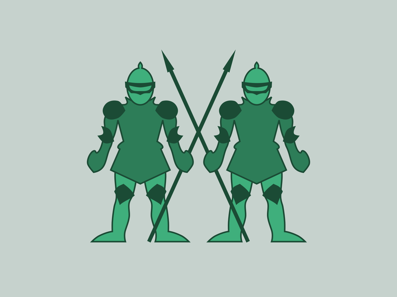
The exploratory sketches of the two figures are inspired by various knights presenting themselves head-on in historical heraldry (such as the coat of arms of Wappen Obercunnersdorf for example).
For the shades of green, the main basis is made up of a dark green #1B4B35 (sometimes called County Green) which has been declined using variants from a regular color chart.
I had initially thought of placing these two knights as guarding some sort of large gate (like a nearby drawbridge), but then the composition would have become too complex for a simple emblem. On a related note, adding plume on helmets or other details on armors complicated the whole, making it difficult to read when it is scaled down.
It should also be borne in mind that, from the perspective of resizing this type of picture (for example to create a square icon), an image with a rectangular ratio containing too much detail will probably be difficult to maintain as understandable.
Let me know your opinions...
gizmecano
on 14 Feb 2021
I was just thinking of this. That looks great. What's your opinion on adding that to a shield or leaving as is?
I'm thinking adding the image to a shield the words, PROTECTED BY and CIDRAM can be in an arch.
So PROTECTED BY would be at the top and of course CIDRAM would be at the bottom.
When I get on my computer (currently on my phone) I'll see what something like that might look like. If it's too overwhelming with graphics (which might be a possibility) then perhaps something else can be done. Perhaps not a shield and just arched lettering.
737simpilot
on 15 Feb 2021
Adding the "RFC" label due to the nature and progress of the discussion.
I had initially thought of placing these two knights as guarding some sort of large gate (like a nearby drawbridge), but then the composition would have become too complex for a simple emblem. On a related note, adding plume on helmets or other details on armors complicated the whole, making it difficult to read when it is scaled down.
It should also be borne in mind that, from the perspective of resizing this type of picture (for example to create a square icon), an image with a rectangular ratio containing too much detail will probably be difficult to maintain as understandable.
I agree. Simple is definitely better, and I think the image presented, with the two green knights, sufficiently conveys the intended feeling and idea, even without all the extras.
Let me know your opinions...
Looks fantastic! I really like it. :-)
I've noticed also how the proportions are almost entirely square (approximately ≈400x≈450 pixels, judging at a glance), which is super helpful for the purpose of resizing or scaling down for icons and thumbnails. :+1:
Maikuolan
on 15 Feb 2021
Well, scratch that. I can't figure out how to add curved text with my photo editor and other tools are overly complicated. I'm not a photo editing guru.
737simpilot
on 15 Feb 2021
@737simpilot
What's your opinion on adding that to a shield or leaving as is?
As knights are often used as supporters in classic heraldry, my personal opinion would be not to overload the central composition more.
I'm thinking adding the image to a shield the words, PROTECTED BY and CIDRAM can be in an arch.
Keep in my initial focus was about the core emblem for the project, not specifically a scope work on a badge. However, once the composition sheet is clearly defined, building a more elaborate badge using a typographic string encircling the emblem is still workable.
@Maikuolan
Simple is definitely better, and I think the image presented, with the two green knights, sufficiently conveys the intended feeling and idea, even without all the extras.
At the very least, I think it's better to start from the simplest and then elaborate (I wasn't going to introduce something too complex if this proposal didn't suit anyone).
In addition, this is a computer project, where graphic elements are often simple, even simplistic (think of the emblems for PHP or WordPress which are only stylized letters for example). Even if we use classic heraldic imagery, it is not a question of composing a sophisticated branding for a whiskey or a beer... 😉
Looks fantastic! I really like it.
Thank you.
I am thinking if I can arrange a few details.
I think the armor core is a bit empty: appending belts would probably be valuable. Trying to add crests on the helmets also seems a way of enrichment...
Let me know what you think and if you have any ideas too.
I've noticed also how the proportions are almost entirely square (...), which is super helpful for the purpose of resizing or scaling down for icons and thumbnails.
Yes, the two figures fill an area with a somewhat uncommon ratio of 15:13 which effectively approaches a square: positioning this basis in a regular shape (a square or a circle) seems relatively easy...
gizmecano
on 15 Feb 2021
my personal opinion would be not to overload the central composition more.
I think the armor core is a bit empty: appending belts would probably be valuable. Trying to add crests on the helmets also seems a way of enrichment...
Yet you're wanting to fluff up the image with minor details. I'm just saying that perhaps the knights should be inside a crest/shield of some sorts. Is that not what you understood?
Since green is a secondary color, maybe a shield could be a primary color of red, yellow or blue. Though, I believe there was mention further up not to use red for some reason. Although, green and red tends to create a weird illusion. At least in my eyes. I know purple was the color of hierarchy. Not sure if that would make sense, probably not.
737simpilot
on 18 Feb 2021
Although, green and red tends to create a weird illusion.
Yeah.. I would be super, super careful about combining green and red together on the web. I'd never say never for any particular colour combination, since for most, there'll always be an appropriate time and place for them, somewhere out there. But at least, green and red together is a combination that'd always sit pretty low on my list of combinations to try, for any situation.
Tried googling for the common reasons just now; Found this (though, I'm certain there are other, stronger reasons; but this is the best I could find offhandedly in a short, 3 minute search):
Why You Should Never Pair Green and Red on the Web
The issues with colour blindness and competing saturation and contrast could be alleviated by adjusting the brightness of each in opposite directions, or by slightly shifting the hue of one or the other until it becomes acceptable enough. But, going that far to push a particular combination, when there's no specific colour requirements at hand, and when plenty of other combinations are available, it's probably going to be easier and less time consuming to just stick to something more complimentary or intuitive to work with.
Also kind of vague, but should be quite useful, for anyone not familiar with colour theory:
Want to know what colors look good together?
Maikuolan
on 19 Feb 2021
Right now, the main object is to submit a basic emblem that current mainteners (suc as @Maikuolan) would think is meaningful enough.
The colorization of the preview above is purely indicative and temporary (based on @DanielRuf 's proposal to use green): concretely, the primary work is carried out only _in two-color_. Certainly a more precise definition of the color palette would be useful. But using a fairly simple SVG file should make it easy to add the appropriate colors (e.g. using fill attribute).
As mentioned above, I would soon try to see if I can add some minor details on the characters (and maybe see if some kind of frame can wrap around the whole).
gizmecano
on 16 Mar 2021
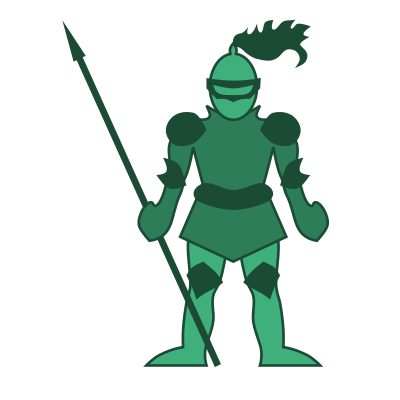
I think the armor core is a bit empty: appending belts would probably be valuable. Trying to add crests on the helmets also seems a way of enrichment...
Following what I said above, I started to draw the add of a belt and a helmet crest on one of the two knights: it thus seems to me a little more fleshed out. What do you think ?
gizmecano
on 20 Aug 2021
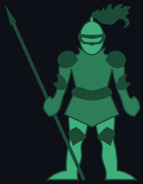
Looks good. :+1:
It REALLY looks good the way I'm seeing it now since I'm using the dark mode for github.
737simpilot
on 21 Aug 2021
Related issues
Dibbyo456
·
3Comments
 mikeruss1
·
5Comments
Dibbyo456
·
7Comments
mikeruss1
·
5Comments
Dibbyo456
·
7Comments
 soumsps
·
5Comments
soumsps
·
5Comments
 eurobank
·
3Comments
eurobank
·
3Comments
Most helpful comment
Perhaps we can buy/order from a professional logo designer? I would be happy to pay for it. ✌