Description
I would like to share the major concern after one-day usage of Che6 of 30 peoples.
It was:
- Small, blurred fonts
- Blurred contrast
- Small buttons.
- Hard to read text on developers monitors (24 inc DELL, FullHD)
 skabashnyuk
👍21
All 3 comments
Comparation Font size and contrast in
- Tabs
- Project tree
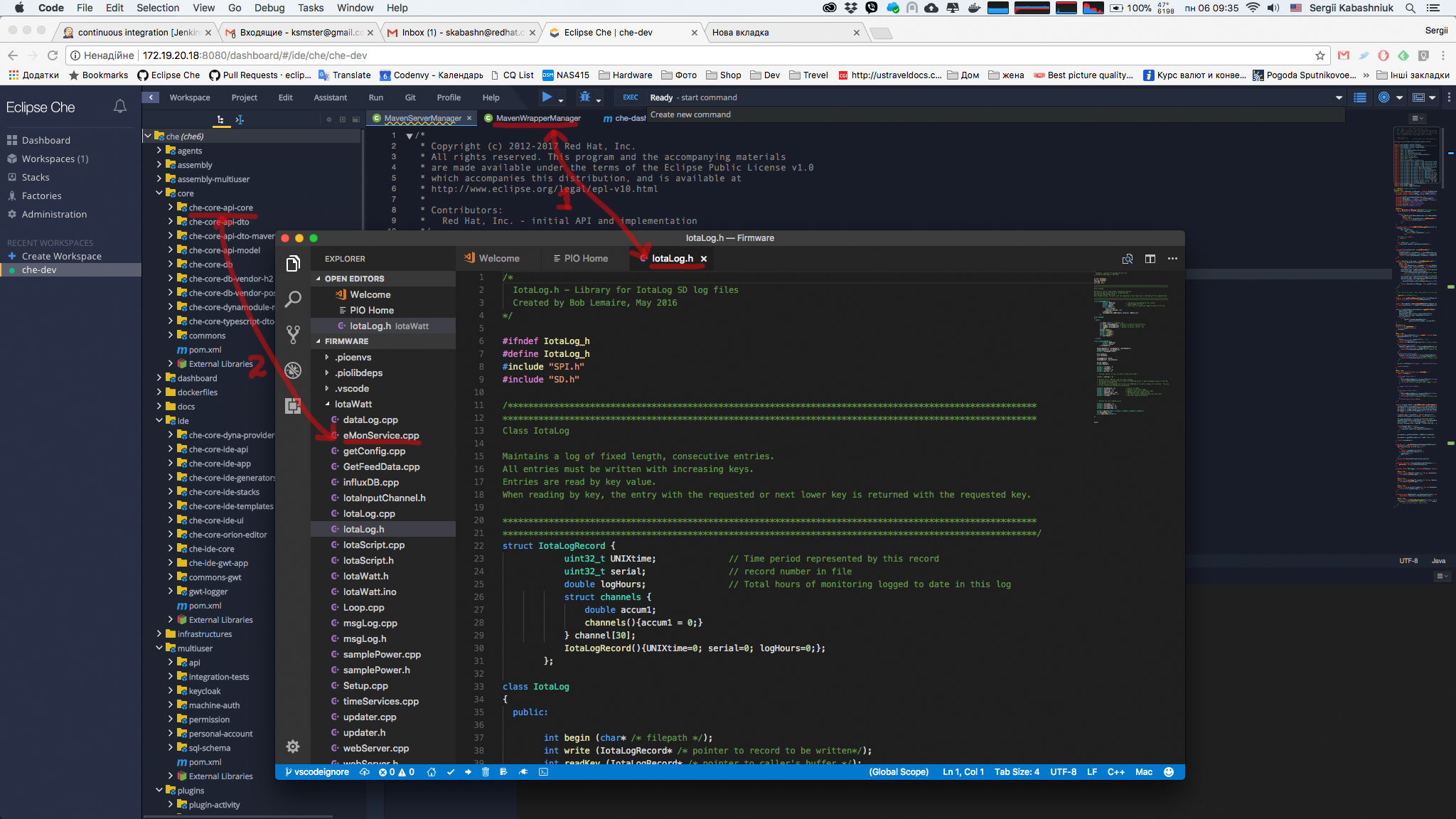
It would be nice if we can enhance our version.
I think menus can have large fonts too.
skabashnyuk
on 6 Nov 2017
👍13
OK.
We are going to review/refine/finalize the theme for Che6 and will take that into consideration to improve the contrast and readability of the texts.
Note: It would be better to allow the user to define the font sizes. A unique font size might not fit for all users :)
 slemeur
on 6 Nov 2017
slemeur
on 6 Nov 2017
👍2
Also need to
- [x] Add more space between icon and title on tabs in the Processes panel
- [x] Review icons to have proper sizes and paddings
 ashumilova
on 21 Nov 2017
ashumilova
on 21 Nov 2017
Was this page helpful?
0 / 5 - 0 ratings
Related issues
 sleshchenko
·
3Comments
sleshchenko
·
3Comments
 sudheerherle
·
3Comments
sudheerherle
·
3Comments
 vanzhiganov
·
3Comments
vanzhiganov
·
3Comments
 azatsarynnyy
·
3Comments
azatsarynnyy
·
3Comments
 InterestedInTechAndCake
·
3Comments
InterestedInTechAndCake
·
3Comments
Most helpful comment
Comparation Font size and contrast in
It would be nice if we can enhance our version.
I think menus can have large fonts too.