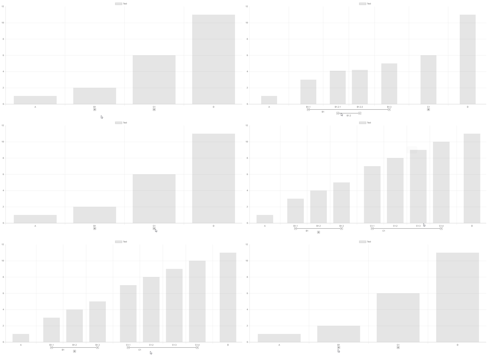
Chart.js: [FEATURE] Support multi-level (a.k.a hierarchical) category axis
Expected Behavior
Add support for displaying hierarchical categories.
An example of hierarchical category could be: Country > City
e.g:
- USA
- New York
- San Francisco
- Canada
- Toronto
- Vancouver
When displaying such hiearchical category on an axis it is interesting to display the axis similarly to what MS Excel does
See https://i.stack.imgur.com/CYp8Y.jpg for instance.
Current Behavior
With current version of chartjs we have to flatten the hierarchy and have category labels like this:
- USA - New York
- USA - San Francisco
- Canada - Toronto
- Canada - Vancouver
The problems with that solution is that:
- there is a lot of repetition in the axis so this uses more space to display
- repetition also prevents user from quickly identify the hierarchical nature of the categories.
Possible Solution
This could be implemented either by supporting this in the existing category axis or by having a dedicated axis.
To support this the configuration API could be modified to support hierarchical labels.
A label would be either a simple string or to supported child categories an object with label and children properties.
e.g.
xAxes: [{
    type: 'category',
    labels: [
          { label: 'USA', children: ['New York', 'San Francisco']},
          { label: 'Canada', children: ['Toronto', 'Vancouver']}],
}]
Context
I originally posted a question on stack overflow for that and some additional context can be found there if needed.
All 11 comments
Hi, I started looking at how this could be implemented as a plug-in.
I looked at the documentation of how to create new axes. http://www.chartjs.org/docs/latest/developers/axes.html
However from what I see in the documentation and in the code the extension point documented for scale are not flexible enough to implement what I need. So the plug-in would need to re-implement lot of what is implemented in Chart.Scale like the draw method right?
Also to get me started I copied the code from the core.category.js and registered it with an alternate name 'categoryHierarchical' however I didn't get the same rendering: the bars were not positioned between ticks but were centered on the ticks. However as soon as I renamed my category to 'category' the chart behaved properly so it seems that the type "category" has some hard coded behaviour attached to it side of the scale itself. Is there some way to fix this?
@sarod that's correct about the drawing code. You'll need to re-implement a lot of the draw code since there is so much different between the axes.
To see if there is any category axis hard codings I would try searching for "category" in the codebase. I did a quick search and didn't see much. Did you remember to change the default config for your new axis?
@etimberg thanks for the answer.
Regarding "category" specific behavior.
I found that configuring my xAxes with offset: true when using my category axis solves my layouting issue.
However when I register my axis I use the same defaults that are used to register the standard axis so I don't understand why I need this additional configuration.
I found that the chart types also declare some defaults so maybe those are the defaults that get applied when I use the built-in "category" axis. However I still don't understand why this chart defaults would be preserved for the standard "category" axis and not for my custom axis.
e.g. defaults declaration from controller.bar.js
defaults._set('bar', {
    hover: {
        mode: 'label'
    },

    scales: {
        xAxes: [{
            type: 'category',

            // Specific to Bar Controller
            categoryPercentage: 0.8,
            barPercentage: 0.9,

            // offset settings
            offset: true,

            // grid line settings
            gridLines: {
                offsetGridLines: true
            }
        }],

        yAxes: [{
            type: 'linear'
        }]
    }
});
Anyway this is certainly not blocking me from implementing the axis.
So thanks again for the answer I'll try to wrap my head around the draw method logic.
In terms of the category defaults from a chart default not merging, you might be hitting https://github.com/chartjs/Chart.js/blob/master/src/core/core.helpers.js#L51-L58 which was designed to prevent accidentally using the wrong settings if the axis type changes.
Is there anything I can answer about the draw logic?
Thanks for the pointer about settings merge.
The draw method is a big piece so I'll need to find time to familiarize before I ask questions. I'll let you know.
hey @sarod,
is there any progress with this feature? Iv'e been looking for something like this for some time
@dav-sap, No I didn't make any progress so far.
Implementing this is more involved than what I initially thought as most of the drawing logic needs to be rewritten.
FYI I don't use chartjs anymore so I don't plan to work on this anymore.
our implementation: https://github.com/datavisyn/chartjs-scale-hierarchical

Just want to make a compliment,
sgratzl's solution solves this issue and more.
- stacked bar : yes
- multiple-level labels : yes
- interactive : that's more than excel 👍
There is a plugin that supports this https://github.com/sgratzl/chartjs-plugin-hierarchical
Most helpful comment
our implementation: https://github.com/datavisyn/chartjs-scale-hierarchical
see also https://codepen.io/sgratzl/pen/vrVXae