Chart.js: [BUG] bar charts scales are inconsistent when type: 'time' and unit: 'week' OR 'month'
Expected Behavior
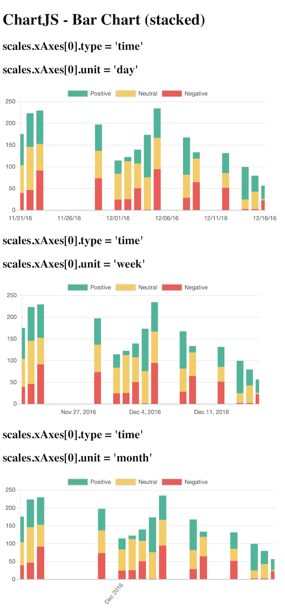
I expected the graph chart to remain consistent, and for only the xAxis time format to change.
Current Behavior
The xAxis scale seems to increase too much, and data is lost in both the week and month (more than week) charts.
Clumping the bars together as a week or month metric seems to be the root of the problem.
Possible Solution
I suggest that when bar charts (stacked, or not) have type: 'time' configured, display the bars as days, keeping the chart graph itself consistent, and only change the axis labeling (days, weeks, months).
We need to ask ourselves if we think this is working as intended or not. Here are my opinions
Leaving it the way it is (clumping up data by week/month)
Pros: ??
Cons
- truth of the original data is altered
- some data will be hidden/truncated (bad!)
- stacking bar charts seems to exacerbate the previous 2 problems
Making a special case for bar charts with the 'time' configuration always display the chart in day bars
Pros:
- we avoid all the Cons of leaving it the way it is
Cons:
- We break convention, adding a special case to one of the chart types, possibly breaking backwards compatibility
Maybe we can avoid the last con by adding another configuration option that gives us the ability to be flexible with how we want the chart to render.
Steps to Reproduce (for bugs)
- Look at my demos
- Compare the data in the graph vs all 3 types of time units (day, week, month)
- Assert the data does not stay consistent, is often truncated on the right-hand-side, and could be avoided if bar charts only used days for bars rather than attempting to clump weeks and months together somehow.
Context
I'm trying to represent data with a clear bar chart, provide 3 options for the xAxis scale labels (days, weeks, months).
Environment
- Chart.js version:
2.4.0 - Browser name and version: Any
- Link to your projects:
Bar Chart (stacked)
https://jsfiddle.net/5y0rk63a/
This demo shows a big difference in the way the chart is rendered when the scale unit differs.
Bar Chart
https://jsfiddle.net/5y0rk63a/1/
This demo is fork of the stacked bar chart, with hopes to further isolate the root cause. It contains a single dataset, and does not stack any bar data.
 marclundgren
All 9 comments
This is causing us some issues for us as well, especially when bar + time series is used in conjunction with the zoom plugin (due to ticks changing).
From what I understand the bar width is calculated off of the # of ticks which can change due to a number of factors. This works fine with line chart, as we only need to draw a single point but when used on a time axis the bar actually represents a range of data.
It seems like the proper solution is to use some kind of new property such as "barUnit" which represents the duration of each bar. If the duration is set to "hour" then we can calculate the width regardless of zoom, tick setup, etc. with something like:
const scaleDuration = scaleEndTime - scaleStartTime;
const barMillis = 3600000; // millis in hour, would look up based on barUnit
const barRatio = barMillis; / scaleDuration;
const scaleWidth = scaleEndPixel - scaleStartPixel;
const barWidth = barRatio * scaleWidth; // need to factor in category and bar percentages
Am I on the right track? I could work up a proof of concept but architecturally where does this fit? Should there be a new bar element specific to the time series?
 tuckwat
on 20 Apr 2017
tuckwat
on 20 Apr 2017
@tuckwat I think you might be on the right track. I think the code would somehow live in the bar controller and the axis.
Architecturally this is hard to fit in, since we really want the controller class to be agnostic from the scale if possible. There is already a concept of a fixed bar size in pixels, so maybe this could be in there. The relevant code is https://github.com/chartjs/Chart.js/blob/master/src/controllers/controller.bar.js#L182-L184
Maybe a specific bar type for these kinds of axes is the way to go, or maybe all axes need to have a specific bar interface that gives some nice properties for creating the bars but this leads to other questions like: do we bin data that falls inside a bar? How do we auto size the bars? etc.
Tagging @simonbrunel @tannerlinsley @derekperkins @panzarino for their thoughts
 etimberg
on 21 Apr 2017
etimberg
on 21 Apr 2017
@benmccann @simonbrunel I tested with 2.7.1 and this looks a lot better. https://jsfiddle.net/gh21s6vw/1/
I struggled to get the bars evenly sized (barThickness: Number was the only way). I thought there was a setting at one point to make them evenly spaced? Or am I mis-remembering that? Also, I thought the bars at the ends would not be truncated when bounds: 'data' is set (the default).
etimberg
on 22 Jan 2018
@etimberg I think evenly sized bars is supposed to be the default now since https://github.com/chartjs/Chart.js/pull/4994 was submitted. Perhaps there's a bug. What do you think @simonbrunel?
 benmccann
on 22 Jan 2018
benmccann
on 22 Jan 2018
I am trying to plot bar graphs with type = time
Aren't we expected to provide x and y values like so {x: , y: } for data array when type=time?
(the doc seems to say so http://www.chartjs.org/docs/latest/axes/cartesian/time.html#time-cartesian-axis)

My data points are for the same day, does chart.js expect Date() object, full date/time, and I have format the xAxis with hours and minutes in order to display some labels from 00:00 to 23:59 ? as in :
minute: 'HH:mm',
(I hacked the jsfiddle above into my example, I am poor at JS, as I am working with TS, so hopefully I did not do something awfully wrong)
I fed the dates/time x values as strings like so '2018-1-21 12:00'
I also tried
data: fakeData.map(obj => ({x:new Date(obj.label), y:obj.value})),
Here is the demo of the issues with bar time scale rendering weird ???
https://jsfiddle.net/91e7xo3f/17/

When I try scatter with type=linear I get a more accurate plot, with OK auto x-min-max labels. Most importantly the x-values, I fed as raw integer values 0..2359, are positioned correctly against the xAxis, like this one:
https://jsfiddle.net/9v647m89/6/

Regarding the bar chart, setting distribution:series/linerar does not seem to affect things either.
What am I doing wrong with Bar type=time?
Thinking from the scatter plot perspective why it would not support a different datapoint style called "bar" :) and draws bars instead of circles?
Thank you.
PS. ignore unit=minute for scatter as it probably does not apply.
 AlGantori
on 22 Jan 2018
AlGantori
on 22 Jan 2018
I was on 2.4.0
Moved to latest chart.js 2.7.1
added
barThickness: 'flex', per the thread below but it does not seem to affect me,
Implement equally sized bars by simonbrunel · Pull Request #4994 · chartjs/Chart.js
A ticks' step size within the time object seems to be supported. I set to 360 but I don't know what it actually means (minutes/seconds) ?
stepSize: 360,
Here is the code...
https://jsfiddle.net/91e7xo3f/20/

Getting better, but far from correct
1) I don't understand the distribution of the xAxis labels
setting max: '2018-1-21 23:59', won't display it, but setting it to next day as max: '2018-1-22 0:0', will display 00:00 as the right most xAxis label.
2) The bars still don't line up correctly on the xAxis?
AlGantori
on 22 Jan 2018
@etimberg: I struggled to get the bars evenly sized
@benmccann: Perhaps there's a bug
Evenly sized: #4994 (v2.7.2) is not released yet - fiddle
@etimberg: I thought there was a setting at one point to make them evenly spaced?
Evenly spaced: #4582 (v2.7.1) scale.distribution: 'series' - fiddle
@etimberg: I thought the bars at the ends would not be truncated
Bar offset: #4545 (v2.7.1) scale.offset: true (default true for bar) - fiddle series / fiddle linear
@AlGantori: added barThickness: 'flex', per the thread below but it does not seem to affect me
barThickness: 'flex' is probably not what your are looking for (currently internal IIRC).
@AlGantori: The bars still don't line up correctly on the xAxis?
I think #4994 is the fix you need but it's not release yet - fiddle
@AlGantori: I set to 360 but I don't know wha...
It's almost equivalent to setting scale.time.unit: 'hour' - fiddle
 simonbrunel
on 22 Jan 2018
simonbrunel
on 22 Jan 2018
Ah cool, forgot that #4994 is in 2.7.2. Once that's released I think this can be closed 😄
etimberg
on 22 Jan 2018
I verified that this was fixed in 2.7.2. Regarding the x axis label issue, use the formats supported by moment.js. For example, '2018-1-22 0:0' is not supported, but '2018-01-22 00:00' is.
 nagix
on 26 Jun 2018
nagix
on 26 Jun 2018
Related issues
 nickgoodliff
·
3Comments
nickgoodliff
·
3Comments
 kennsippell
·
3Comments
kennsippell
·
3Comments
 JewelsJLF
·
3Comments
JewelsJLF
·
3Comments
 gabrieldesouza
·
3Comments
gabrieldesouza
·
3Comments
 SylarRuby
·
3Comments
SylarRuby
·
3Comments
Most helpful comment
I verified that this was fixed in 2.7.2. Regarding the x axis label issue, use the formats supported by moment.js. For example, '2018-1-22 0:0' is not supported, but '2018-01-22 00:00' is.
