All 10 comments
Haha, I think Heroku own the copyright on that one. I'm not particularly artistically inclined, I'll see if I can rustle one up though.
 andrewgodwin
on 5 Apr 2017
andrewgodwin
on 5 Apr 2017
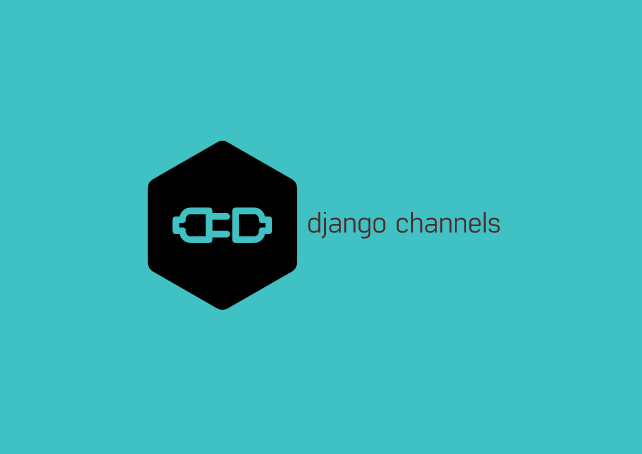
@proofit404 @andrewgodwin I'd like to help with this issue! I took inspiration from the Heroku blog post you suggested. It's still a prototype, so let me know what you think!

 nicokant
on 19 Feb 2018
nicokant
on 19 Feb 2018
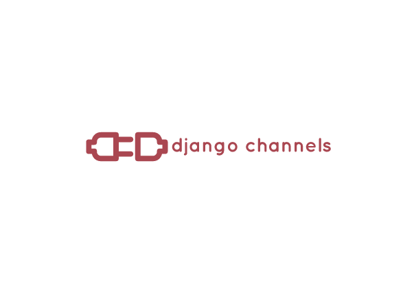
I quite like it, but I generally prefer logos to have their text and their graphic element separate! Could you try a version with the text off to the right? And maybe make the lines and elements thicker/larger so they're more visible at small sizes? I'm just trying to think of how it would look in small-square, small-rectangle and similar forms.
andrewgodwin
on 20 Feb 2018
@nicokant Thanks a lot for the effort! Andrews comment seems reasonable.
 proofit404
on 20 Feb 2018
proofit404
on 20 Feb 2018
Yeah, I think you are right. I wasn't really sure about keeping together graphic elements and text. In a few days, I hope to have something ready to show you!
nicokant
on 20 Feb 2018
@nicokant Did you end up doing another version? I think Django Channels needs a logo too!
 maxg203
on 16 Apr 2018
maxg203
on 16 Apr 2018
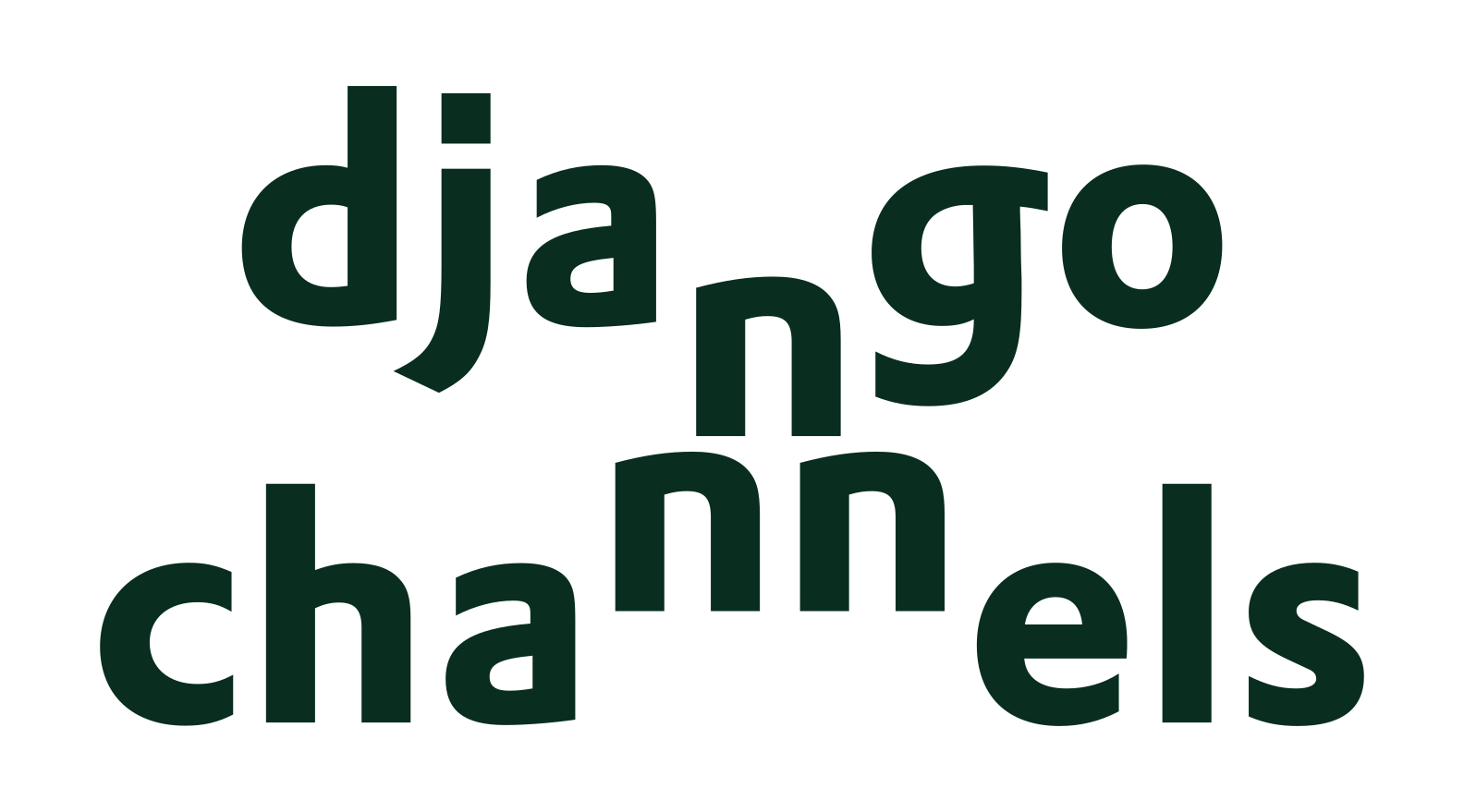
Not to undermine anybody's efforts. But just few more options ;)
 rajeshyogeshwar
on 23 Apr 2018
rajeshyogeshwar
on 23 Apr 2018
Not to undermine anybody's efforts too, of course, but this is an example suggesting we could stick to the roots both in the means of colors and font and in minimalist nature of the original logo.
 kradem
on 5 Jul 2018
kradem
on 5 Jul 2018
Another "Not to undermine anybody's efforts too"! 😄


 KakarN
on 22 Jan 2019
KakarN
on 22 Jan 2019
The concept for C is really good, upvoted.
rajeshyogeshwar
on 24 Jan 2019
Related issues
kradem
·
38Comments
 ipartola
·
20Comments
ipartola
·
20Comments
 devxplorer
·
24Comments
devxplorer
·
24Comments
 djangojack
·
19Comments
djangojack
·
19Comments
 joshua-s
·
30Comments
joshua-s
·
30Comments
Most helpful comment
Not to undermine anybody's efforts. But just few more options ;)