Cellprofiler: Update Welcome Screen for CellProfiler 4
We have a proposed redesign! Far less texty. Comments are welcome.
 AnneCarpenter
All 9 comments
As requested, here is @AnneCarpenter's drawing!
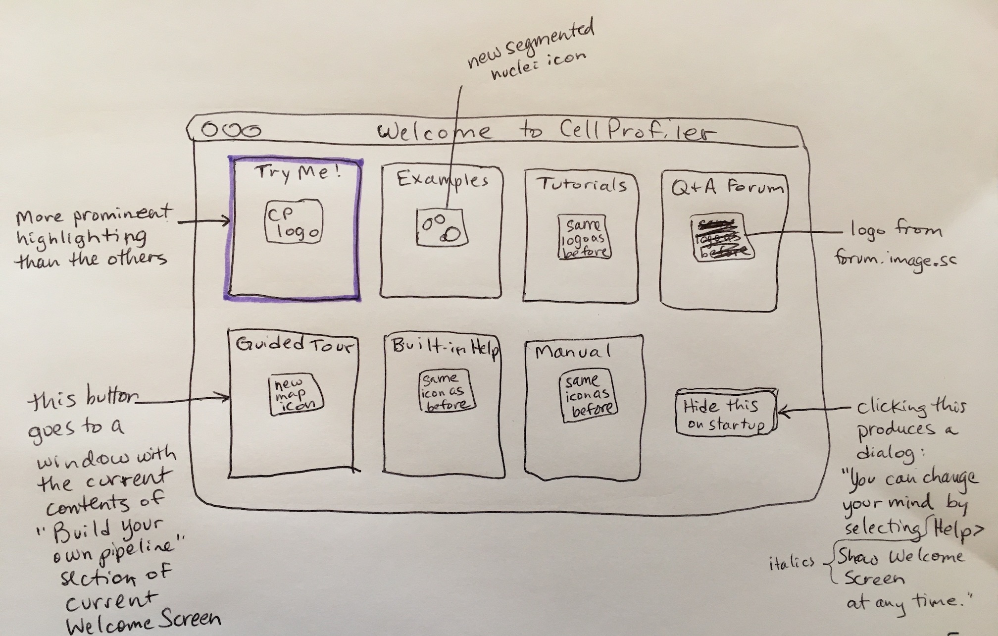
 DavidStirling
on 26 Jun 2020
DavidStirling
on 26 Jun 2020
I'd suggest that the 'What's New' link goes to something that is auto-generated, or that we are already doing so that we don't create maintenance for ourselves. Options include:
- link to the most recent BIG release (3.0, 4.0) blog post, since we always do blog posts (downside: it won't be completely current)
- link to some kind of automatic github-generated list of recently closed issues (downside: not as human readable/translated to end user)
thoughts?
AnneCarpenter
on 2 Jul 2020
I like the idea of using the blog. We could link to a tag like this to keep things as current as possible, but perhaps make a dedicated tag for releases? Alternatively we could have a broad.io link or something to point to the newest post.
On the subject of the blog, I think you really shouldn't need to scroll down so far to see the content. Just the menu and header takes up my entire screen right now.
DavidStirling
on 2 Jul 2020
ooh, agree about the blog, will pass that note to Becki; she could also implement a new tag if that's what you'd like to do.
AnneCarpenter
on 2 Jul 2020
@DavidStirling How is the layout now?
 bledford87
on 2 Jul 2020
bledford87
on 2 Jul 2020
I've also added a "Releases" tag and added it to previous release announcements. https://carpenterlab.broadinstitute.org/blog/categories/releases
bledford87
on 2 Jul 2020
Brilliant, thanks @bledford87! The new layout is much better, although there's still a gap at the top of the page before the header image. Not sure if we can do anything about that?
DavidStirling
on 2 Jul 2020
Unfortunately that's at the theme level (which I don't have access to edit because it's the theme Broad chose with OpenScholar).
bledford87
on 2 Jul 2020
That's understandable. Another solution might be to reduce the vertical size of the banner by having less space between each line of text (if we still have the original template), although it's not a major concern. The new version is already so much better!
DavidStirling
on 2 Jul 2020
Related issues
 bethac07
·
7Comments
bethac07
·
7Comments
 AetherUnbound
·
4Comments
AetherUnbound
·
4Comments
 0x00b1
·
5Comments
0x00b1
·
5Comments
 katrinleinweber
·
3Comments
katrinleinweber
·
3Comments
 imagejan
·
8Comments
imagejan
·
8Comments
Most helpful comment
As requested, here is @AnneCarpenter's drawing!