Cbioportal: should we reconsider the hamburger icon?
I find it confusing to duplicate the actions in icon and dropdown of the hamburger icons.
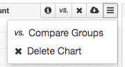
I think I have seen other website doing this but only list additional items in the hamburger. Maybe we should do the same, ie. having infrequently used items in the hamburger only, e.g. for this? When there is no item, we could just hide it.
@adamabeshouse @tmazor @schultzn
 jjgao
jjgao
All 16 comments
Good idea… I agree.
On Jul 3, 2019, at 5:20 PM, JianJiong Gao notifications@github.com wrote:
I find it confusing to duplicate the actions in icon and dropdown of the hamburger icons.
https://user-images.githubusercontent.com/840895/60625618-54926600-9db6-11e9-9afd-5a04c18ced2c.png
I think I have seen other website doing this but only list additional items in the hamburger. Maybe we should do the same, ie. having infrequently used items in the hamburger only, e.g. for this https://github.com/cBioPortal/cbioportal/issues/5819? When there is no item, we could just hide it.@adamabeshouse https://github.com/adamabeshouse @tmazor https://github.com/tmazor @schultzn https://github.com/schultzn
—
You are receiving this because you were mentioned.
Reply to this email directly, view it on GitHub https://github.com/cBioPortal/cbioportal/issues/6356?email_source=notifications&email_token=AC2XPYGJGBAYGQGBPD6MO5DP5UJ2NA5CNFSM4H5LG7LKYY3PNVWWK3TUL52HS4DFUVEXG43VMWVGG33NNVSW45C7NFSM4G5HOFKA, or mute the thread https://github.com/notifications/unsubscribe-auth/AC2XPYHCKUKICXTTKI52LU3P5UJ2NANCNFSM4H5LG7LA.
 schultzn
on 3 Jul 2019
schultzn
on 3 Jul 2019
how about using a question mark icon instead, and maybe also adding a header in the dropdown that says “Help” ?
 adamabeshouse
on 6 Jul 2019
adamabeshouse
on 6 Jul 2019
I have a running instance to elaborate JJ's suggestion, the hamburger icon is removed for pie chart but kept for bar chart to include the Custom bins feature.
https://cbioportal-frontend-pr-2518.herokuapp.com/study/summary?id=acc_tcga_pan_can_atlas_2018
 zhx828
on 8 Jul 2019
zhx828
on 8 Jul 2019
how about we run a google analytics experiment to settle it once and for all?
adamabeshouse
on 8 Jul 2019
@zhx828 thanks for the implementation.
@adamabeshouse I don't think we need a Help icon since we already have a tooltip on each icon. I am also not sure if running analytics would help -- say if we found 50% (or even more) users uses the hamburger icon, does that mean it's a good choice? I think providing two entries for each of the options in a small interface is confusing. Annd I think the user can be trained if we provide only one option. I would prefer the hamburger icon onnly over the current solution for simplicity but I get Niki's point about two clicks. Since we don't have so many icons after all and we can move future non-critical icons into the hamburger icon, I would vote for not duplicating the items.
@cBioPortal/product any comments?
jjgao
on 9 Jul 2019
@jjgao if we dont want to duplicate then if we found users overwhelmingly prefer the hamburger then we would keep it there. Also its not two clicks its one click, the menu opens on rollover.
adamabeshouse
on 9 Jul 2019
I agree that its confusing to have buttons shown twice.
I think I also prefer the hamburger menu over individual buttons in general, although I wonder how well that will work for something like the download button, which currently brings up a menu of its own. That said, I don't feel super strongly about the hamburger menu vs individual buttons as the ultimate solution. I would also be fine with using the hamburger menu for some buttons and keeping others outside the menu. But I definitely strongly support not duplicating any buttons.
 tmazor
on 9 Jul 2019
tmazor
on 9 Jul 2019
Let's try and see how it look like when we have all in the dropdown. @adamabeshouse @zhx828 could you mock it up. Maybe @zhx828 can modify it in your PR? For download, is it possible to have a submenu for the different options?
jjgao
on 10 Jul 2019
Actually, let's leave info, reset filter, and close buttons and try to move all others into the dropdown? @zhx828
jjgao
on 10 Jul 2019
@jjgao will do in my pr.
zhx828
on 10 Jul 2019
@jjgao @adamabeshouse @tmazor @schultzn I have updated the instance base on JJ's suggestion. Now only info/reset/delete icons are in the header, the rest icons are moved to hamburger icon. The download also has a submenu but the functionality hasn't been implemented yet. Please take a look and give us some feedbacks. https://cbioportal-frontend-pr-2546.herokuapp.com/study/summary?id=acc_tcga_pan_can_atlas_2018
zhx828
on 10 Jul 2019
@zhx828 i think it looks great!
adamabeshouse
on 10 Jul 2019
I like it!
@zhx828 one thing I noticed is that the download menu always opens to the right, which doesn't really work for charts on the right side of the window.
tmazor
on 10 Jul 2019
@tmazor yeah, I noticed too. There are few more things need to be considered when the actual implementation is done. I didn't do any of that just in case we want to change the prototype.
zhx828
on 10 Jul 2019
I like it this way. Thanks!
On Jul 10, 2019, at 16:49, Hongxin notifications@github.com wrote:
@tmazor yeah, I noticed too. There are few more things need to be considered when the actual implementation is done. I didn't do any of that just in case we want to change the prototype.
—
You are receiving this because you were mentioned.
Reply to this email directly, view it on GitHub, or mute the thread.
schultzn
on 11 Jul 2019
@jjgao @tmazor @schultzn @adamabeshouse this is now deployed in production.
zhx828
on 16 Jul 2019
Related issues
 sdpetrides
·
3Comments
sdpetrides
·
3Comments
 c4cam
·
4Comments
c4cam
·
4Comments
 inodb
·
10Comments
inodb
·
10Comments
 ChandraPedamallu
·
3Comments
ChandraPedamallu
·
3Comments
 fedde-s
·
8Comments
fedde-s
·
8Comments