Cataclysm-dda: proposal to refactor remaining ui elements
proposal to refactor remaining ui elements
the goal is to have the following windows thinner and nicer:
- list_items
- list_monsters
- examine/pickup
- fire/shoot data
rationale:
with sidebar-panels being able to get hidden completely, it is necessary to make offset so the player always seem to be in the center of gaming area (whatever the size of it).
this is done, and working well, offsets are made and are corrects, according if there is enough panels on screen (panels covering more than half the screen = no offset, panels covering less than half the screen = offset)
but with current dialog windows (list_items/monsters, shooting data, pickup) being larger than the panels, when those windows are active, user may run into a case of listing an object or an enemy, that is being hidden under those larger dialog windows. one could argue that another offset could be made while those windows are active, but i think it is a good occasion to revisit those windows and make them on par with the new ui element, for consistency, and better looking. they need a refresh.
problem in implementing:
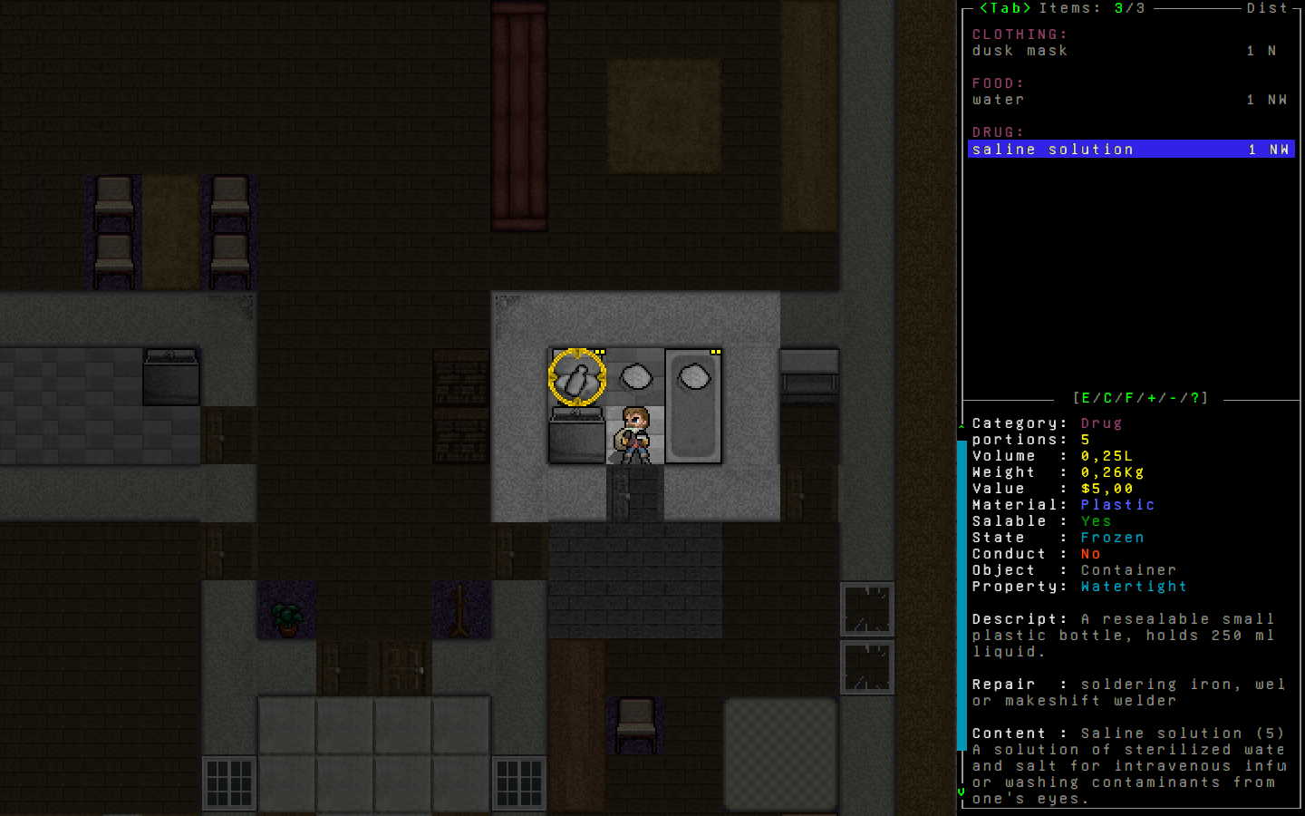
panels are 32 spaces wide. these dialog windows are 45.
and even with current size (45) some strings cannot be displayed properly.
for example: "a small plastic bottle of saline solution"
as an idea:
(maybe it already exists, i don't know yet)
i am proposing to add for all items and monsters names and additional string.
so each object and monster would have a short name string, and a full name string to them.
in the example above, "a small plastic bottle of saline solution" could become just: "saline solution".
i intend to use it this way, in the list_item dialog for example,
on the upper part of it, the list itself, use shorter string.
on the lower part of it, the item details, use the longer full string.
anyway, there's a need to revisit and update those ui elements listed above.
i'm also thinking of fusing pickup/examine and list_items (always use list_item for every object pickup)
here's a mockup of the kind of things i have in mind:
before:
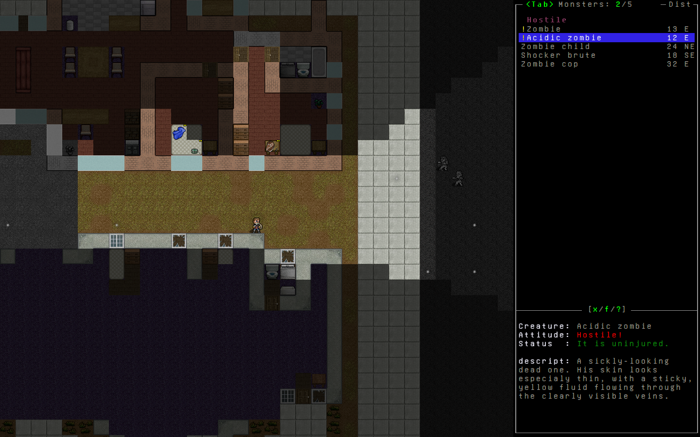
( this also display the current problem, monster being hidden by larger dialog, it happens with object pickup and firing too )

after, item_list
after, monster_list
after, firing panel

 nsklaus
All 10 comments
In the first 2 mock ups, is there a reason your not using the unused space on the right. There is room for more there so it seams like your trying to waste vertical space rather then horizontal. It makes sense to have information in a horizontal list more then a vertical one since computer monitors have more space in the horizontal rather then an already limited vertical space. This make the before ( current implementation ) superior to your after image.
Again with your second mock up it conveys less information then the current implementation. The original one shows which zombies are hostile at a glance rather then having to select each one to view its properties.
Also your reasoning that the zombie is chopped off is also invalid here since tiles allows you to zoom out. If this saved actual space in both dimensions I think this would be a good change but like your UI "improvement" this does nothing but add needless labels, and waste more space in the vertical without any benefit. This is just personal preference for you not something that a marked improvement.
 Treah
on 11 Feb 2019
Treah
on 11 Feb 2019
@Treah
(edited)
ok no problem, thanks for telling.
nsklaus
on 11 Feb 2019
Suggestion about a aiming panel: show lines after Current only if chances are better then current.
I think this will not confuse, but will reduce lines count.
 AMurkin
on 11 Feb 2019
AMurkin
on 11 Feb 2019
Suggestion about a aiming panel: show lines after Current only if chances are better then current.
I think this will not confuse, but will reduce lines count.
that's a suggestion, it could be possible, but since we have enough space i prefer to show the full choice range and let the user choose according to data. before all the data were shown too. i like that.
on very low resolution, it could be useful thing to do though. the part in the middle could be completely shut off as an option too.
nsklaus
on 11 Feb 2019
@Treah
one zombie detected you, but instead of wanting to rip your guts off, he started to be friendly and wanted you to pet him, does that makes sense to you ?
For a generic zombie, that's usually a safe assumption, but those are not the only creatures in this game. A creature detecting you does not mean it has the Hostile status. Zombie necromancers, dogs, and Z-9s could instead be Tracking. Wildlife could also have the Tracking, Ignoring, or Fleeing status. Removing that information from the UI and making the user scroll through the list of creatures manually to find it would be a direct downgrade from the current functionality. Without it, a user could not know at a glance if a pack of wild dogs is attacking, tracking, or ignoring them.
 rselias
on 11 Feb 2019
rselias
on 11 Feb 2019
"Thinner and nicer" isn't a sufficient rationale for overhauling the UI.
user may run into a case of listing an object or an enemy, that is being hidden under those larger dialog windows
This is why there's an option to re-center the view when selecting items in these menus.
This seems to be a solution in search of a problem, you need a much stronger set of rationales to embark on an overhaul like this. It WILL cause distruption and breakage, and there is no clear indication that it will be worthwhile.
 kevingranade
on 11 Feb 2019
kevingranade
on 11 Feb 2019
i thought it would be nice to have panel and action windows using the same kind of size and layout.
but if it's not needed, current offering still work nicely. i'll search something else to work on, no problem.
should i close that issue ?
nsklaus
on 12 Feb 2019
@Treah
one zombie detected you, but instead of wanting to rip your guts off, he started to be friendly and wanted you to pet him, does that makes sense to you ?For a generic zombie, that's usually a safe assumption, but those are not the only creatures in this game. A creature detecting you does not mean it has the Hostile status. Zombie necromancers, dogs, and Z-9s could instead be Tracking. Wildlife could also have the Tracking, Ignoring, or Fleeing status. Removing that information from the UI and making the user scroll through the list of creatures manually to find it would be a direct downgrade from the current functionality. Without it, a user could not know at a glance if a pack of wild dogs is attacking, tracking, or ignoring them.
ok fair point, thanks for the explanations, it makes sense. some goes for @Treah too, i've jumped on the gun too quickly it seems, i'm adapting, things should go smoother now. i'll be a nicer apologies to all.
nsklaus
on 12 Feb 2019
in the example above,
"a small plastic bottle of saline solution"could become just:"saline solution".
This actually doesn't need any new labels, although users can still ruin it and a few items might simply have far too long names.
The item you listed is a container listing its contents. Showing only one of the two, most likely the contents, would allow the game to shorten names with no additional work beyond the actual UI display function.
 Photoloss
on 12 Feb 2019
Photoloss
on 12 Feb 2019
The container information is useful, for example, when you are looking for things to empty for their precious plastic chunks.
 curstwist
on 18 Feb 2019
curstwist
on 18 Feb 2019
Related issues
 Taberone
·
3Comments
Taberone
·
3Comments
Taberone
·
3Comments
Taberone
·
3Comments
 BorkBorkGoesTheCode
·
3Comments
BorkBorkGoesTheCode
·
3Comments
 ituluwituluwzev
·
3Comments
ituluwituluwzev
·
3Comments
 Cyrano7
·
3Comments
Cyrano7
·
3Comments
Most helpful comment
The container information is useful, for example, when you are looking for things to empty for their precious plastic chunks.