Cascadia-code: Glyph for arabic numeral 4 seems out of place
The glyph for the arabic numeral "4" seems out of place for me as Central European with some exposure to eastern languages (though not speaking any!!).
At first sight, it reminds me of cyrillic glyphs:
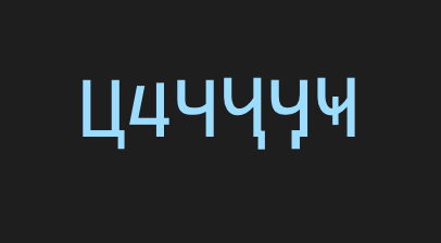
(The second one is the 4)
Please change the glyph so that the top of the 4 is more closed, creating a more visually closed triangular shape.
 dasMulli
All 10 comments
On the other hand, I love the 4 and think it gives character to the font. ^_^
(The "open" 4 is a standard variant, tho it is more common in handwriting; fonts seem to usually prefer the closed 4.)
 tabatkins
on 3 Oct 2019
tabatkins
on 3 Oct 2019
If I'm not too mistaken the open 4 the left part pointing to the top is mostly used in English handwriting. That one is different all around the world.. Not entirely against that but then I think it should follow more English handwriting style, like wiring the 1 with just a line etc.
dasMulli
on 3 Oct 2019
There I'll disagree on practical grounds - keeping 1, capital-I, and lowercase-l all distinct is more important, especially in a programming font, than any stylistic concerns. ^_^
tabatkins
on 6 Oct 2019
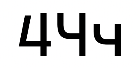
Thanks for the feedback! I'm not sure, at this time, there is sufficient need to modify the /4 to create increased differentiation with the Ч or ч. I think the different height of the two vertical strokes, as well as the different heights of the crossbar will help differentiate the different characters. That said, I'll leave this bug open for the time being (especially once the Cyrillic is released!) if others have a similar issue as you.
As a sneak preview, here's what things look like right now:
 aaronbell
on 12 Nov 2019
aaronbell
on 12 Nov 2019
I guess the thing that makes it stick out even more is that it's the only open character, all other appear to be stylized but "normal". I certainly hope this gets fixed as it is (at least for me personally) highly distracting. The 6 also looks a bit smudged where it connects, but i could get over that, it's definitely less intrusive than the 4. Other than that great job! Really no complains, it looks much, much better than Consolas.
 Vulgaris-Viridis
on 13 Jan 2020
Vulgaris-Viridis
on 13 Jan 2020
@dasMulli
I've been thinking about this 4 some more and have decided to leave it as is.
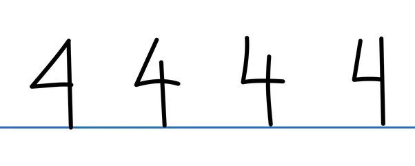
In handwriting, there's a lot of different ways that people write /4. In the sample above, we have the fully-closed 4, the triangular but disconnected 4, a boxy 4 with curved left-side stroke, and boxy 4 with angled left stroke. In looking around online, I've found even more options—particularly in the cursive sphere.
In choosing how I wanted to design the /4 for Cascadia Code, I wanted to (a) make sure that it would take up as much white-space in the box as possible, (b) be easily and clearly renderable at small sizes on lower resolutions, and (c) still retaining its 'four'-ness.
Referencing the samples above, the /4 I ended up designing is something of an amalgamation of option 2 and option 4. The more boxy structure helps the /4 use up a lot of the white-space and helps it render more cleanly and clearly, but I made sure that the diagonal was preserved in order to maintain the essence of a /4.
Also, in your comment on the /y bug report, you mentioned that the /4 shape I chose is particular to the US / Britain. I disagree with that assertion.
Here's a writing sample from Ethiopia where you can see an open / boxy 4:
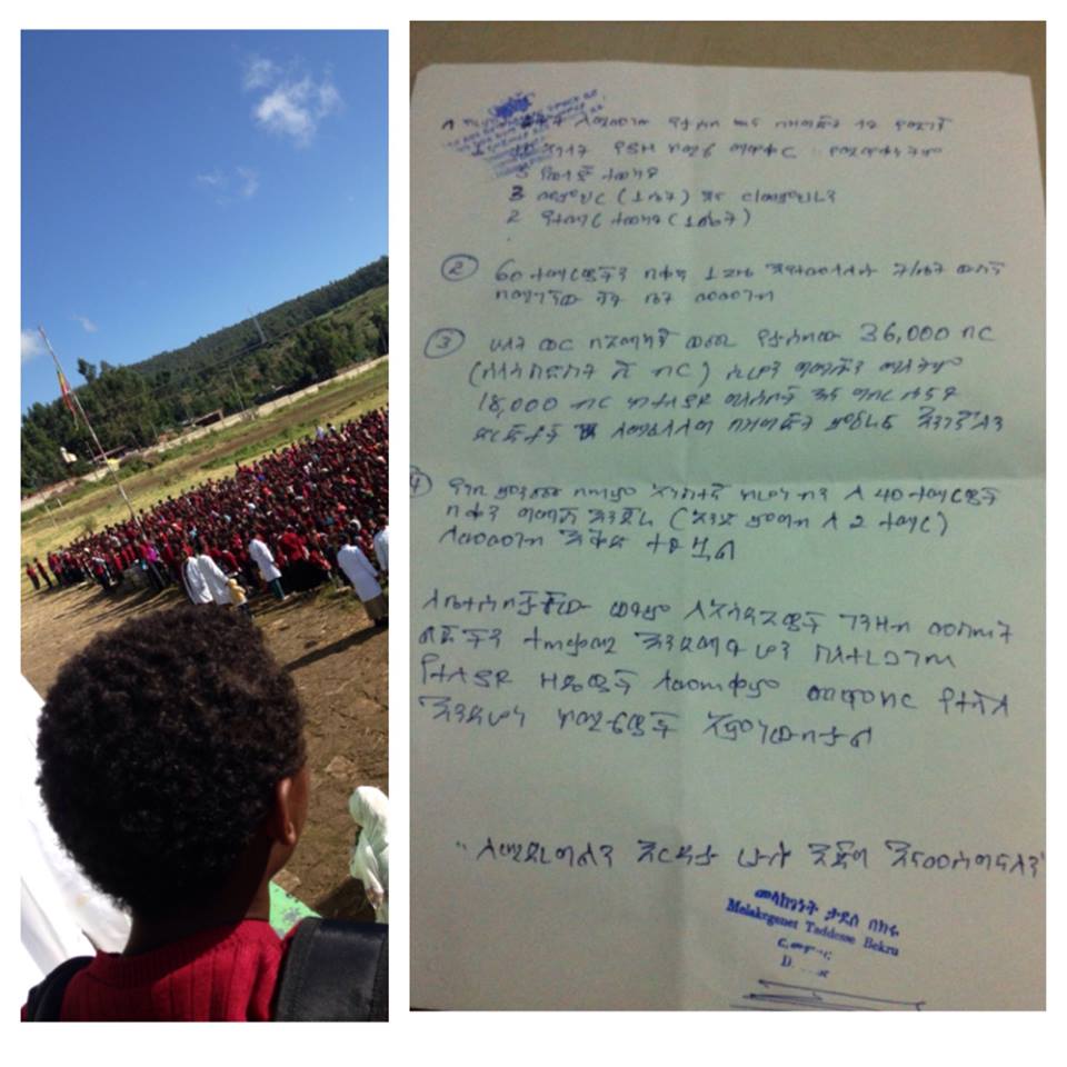
Or this graffiti from Brazil:
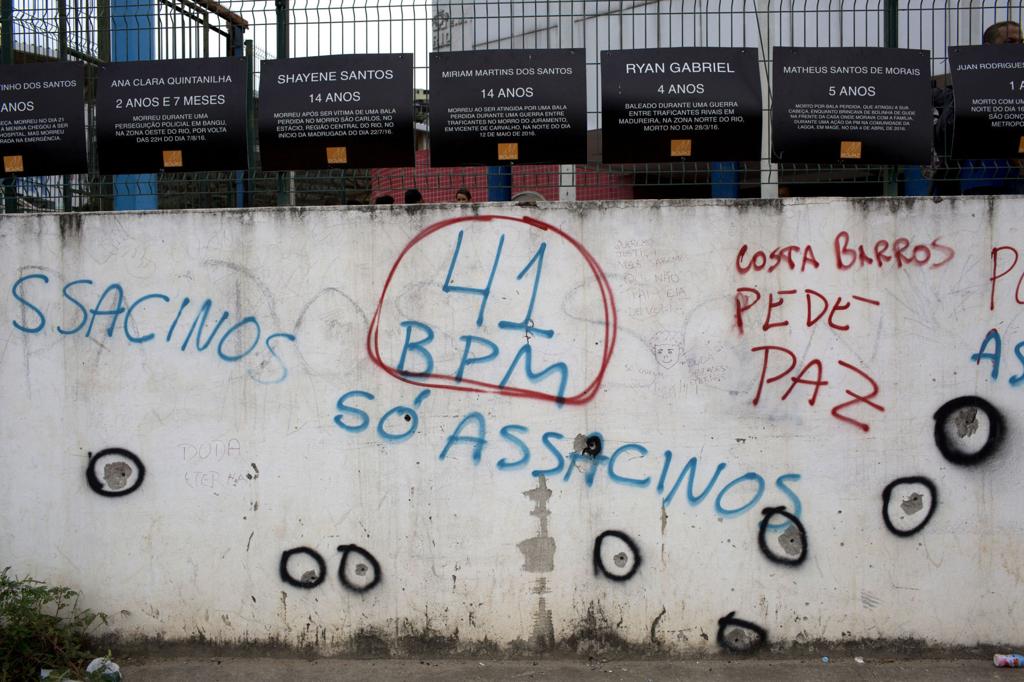
Or these various forms of the 4 in Morocco:
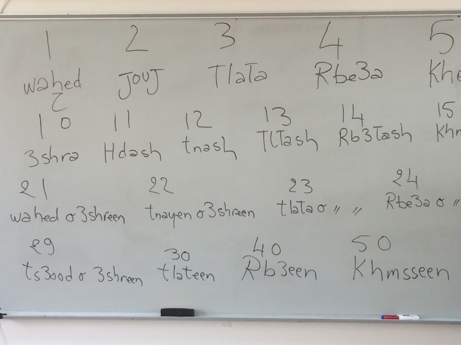
There's a lot of fours in the world! I completely understand if the one I've created is a bit too handwriting-esque for your tastes, but I still feel that it is the best shape for Cascadia's design.
aaronbell
on 14 Jan 2020
Thanks for taking the time for such a detailed explanation @aaronbell, much appreciated!
dasMulli
on 14 Jan 2020
@aaronbell I appreciate you thoroughly explaining the reasoning behind your design choice, and while i come from the part of the world where we use the open 4, it is certainly my preferred style - but only when it comes to handwriting. In digital world i prefer clearly defined parameters and uniformity.
Ultimately my issue is not with the design itself but with your choice to partially mix different styles into one. Yes in this part of the world 4 is written as open but also 7 is written as 7 with a crossline, 1 is often written as underlined, 3 is written with top line straight and zero is never written with a cross-through line. So Cascadia is basically all American font with European 4. 😕
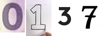
So once again, nice, clean style, I'm sure many people will eagerly accept it as the replacement for their current font type, but as with anything many people will also choose to keep the things as they already are. I am one of the latter, 'Consolas' works and as they say if it ain't broke...
Vulgaris-Viridis
on 16 Jan 2020
The design is certainly a mix of styles, but not intentionally "American" nor "EU" nor anything. The design is intended for clarity, recognition, and even color (amount of whitespace / black in a glyph).
Cascadia's 0 is dotted to differentiate from the O, which is difficult to discern in monospaced designs.
Cascadia's 1 is the same as the one you showed.
Cascadia's 3 is rounded as that helps increase the amount of whitespace in the upper counter, for better clarity at small sizes.
Cascadia's 7 doesn't have the bar since it would interrupt the upper serif. Certainly I could remove the upper serif in favor of the slash, but I prefer the serif for recognition :).
In any case, the great thing with fonts is that you can use whatever you prefer!
aaronbell
on 16 Jan 2020
In any case, the great thing with fonts is that you can use whatever you prefer!
That's the one thing we can certainly agree on. Once again, despite my personal preferences, really good job with the font and who knows, maybe it inspires next Luc de Groot to create his own version of it that is more to my liking.
Though somewhat negative, this is after all only feedback from a limited pool of people who are on GitHub and of those, selected few who are aware of Cascadia's development. Once it exits the beta stage and go mainstream, the feedback will be more accurate.
In any case i applaud the development and this will without doubt be one of the best optional font styles that, I'm sure, many people will use until Microsoft releases update to the Consolas, hopefully with the next major OS revision.
Thank you for your time and once again for the detailed explanation.
Vulgaris-Viridis
on 18 Jan 2020
Related issues
tabatkins
·
6Comments
 dreamer
·
4Comments
dreamer
·
4Comments
 pmartin-brierley
·
5Comments
pmartin-brierley
·
5Comments
 khoshroomahdi
·
4Comments
khoshroomahdi
·
4Comments
 ratishphilip
·
3Comments
ratishphilip
·
3Comments
Most helpful comment
Thanks for the feedback! I'm not sure, at this time, there is sufficient need to modify the /4 to create increased differentiation with the Ч or ч. I think the different height of the two vertical strokes, as well as the different heights of the crossbar will help differentiate the different characters. That said, I'll leave this bug open for the time being (especially once the Cyrillic is released!) if others have a similar issue as you.
As a sneak preview, here's what things look like right now:
