Cartodb: Warning/Maintenance notification in dashboard
Related https://github.com/CartoDB/cartodb-platform/issues/5505
We need to show the users a warning/notification block that we are going to set in the notification field.
We used to have something like that in the old dashboard, I'd love to go back and make a screenshot but I wasn't able, to announce maintenance tasks for example.
So the basic idea is to insert a text in the notification field for a user or group of users using a rake. Then, when that user enters in her dashboard that message appears in the front page to warn the user.
Adding @inigomedina to the issue as PM, @elenatorro as the current RT person for awareness and probably we have to add someone from design.
Take into account that this should be an easy and quick thing that could even be disposable.
 ethervoid
All 34 comments
@inigomedina we need to take action on this to unblock one of the tasks for the migration of pg11
ethervoid
on 8 May 2019
From the frontend side, we'll need this new user field to know if there's any notification. We already have a parameter for organization notifications, but this would be different. We need to know where should we show these notifications from a design perspective, but we could do a PoC to create the needed components in the new dashboard and then apply the design.
 elenatorro
on 8 May 2019
elenatorro
on 8 May 2019
we'll need this new user field to know if there's any notification
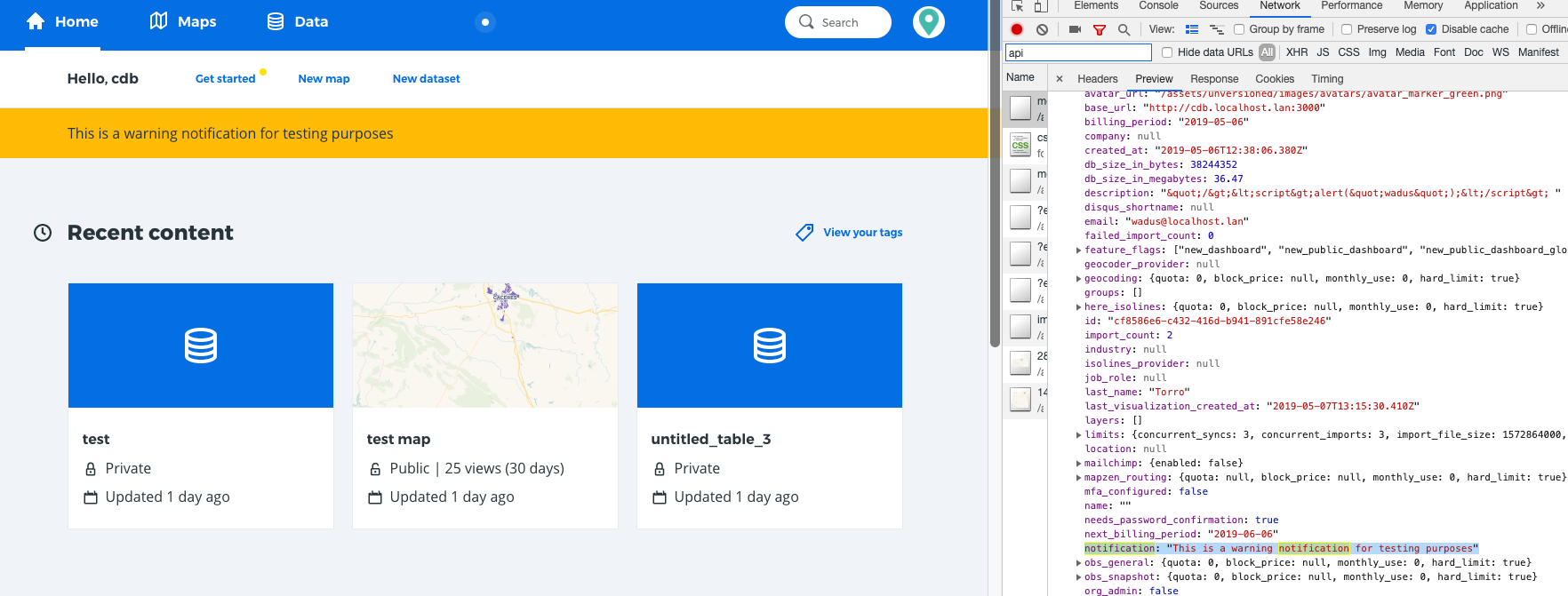
We're providing it. Is a field called notification inside the user_data. We can rename it but is available
ethervoid
on 8 May 2019
ok! then I can start working on it 👍 Adding the rt-frontend label to this task
elenatorro
on 8 May 2019
Cool thank you @elenatorro !
ethervoid
on 8 May 2019
I created the component to start working on it (https://github.com/CartoDB/cartodb/pull/14866), but we need help from the @CartoDB/design-team to implement it.
elenatorro
on 8 May 2019
Thanks, people, for including me here.
@ana-md is shadowing me in this initiative and a nice first exercise for her is to participate at this specific action. Could you explain to her how she should work on this?
Thanks!
 inigomedina
on 8 May 2019
inigomedina
on 8 May 2019
I think the first thing to do is work with someone from the design team and get final message we're going to show to the users to communicate this kind of warnings/notifications. It's important because looks like we're going to use this kind of message to notify about important things like maintenance, migrations and so on but as the PM you have the whole picture :)
ethervoid
on 8 May 2019
Thanks @ethervoid and @inigomedina for adding me here! Is this message the one we are just showing to the FREE users? Or also the one for the Enterprise? As I understood yesterday, the downtime will be longer for the FREE users and for the Enterprise we will schedule 10 minutes in a specific day and time, isn't it? Do we want to mention that at all in the warning?
 ana-md
on 9 May 2019
ana-md
on 9 May 2019
From my point of view, this issue is about adding a general notification warning for any kind of warning message we want to show at any time. Therefore, we need a common design for these notifications, so we can make use of them when necessary.
About the specific message for this case (thanks @ana-md for mentioning it!) this warning accepts html content, which means you can customize it, for example, with bold texts.
elenatorro
on 9 May 2019
Thanks @elenatorro for the explanation!
Adding design team in this discussion to decide how we want to show this warnings to the users in general from a design perspective. After talking to @alonsogarciapablo it seems that there wasn't any specific idea/plan for this purpose when the dashboard was firstly designed. @kukukaka what do you think about this?
ana-md
on 9 May 2019
Hi!
In fact this kind of big / really noticeable notification in the Dashboard could be useful also for the pricing-related warnings: eg. "you are getting close to reaching the maximum number of datasets in your plan" or "you have reached the XXX limit, some features might be disabled...".
Pinging @alejandraarri to be aware of this conversation
 VictorVelarde
on 10 May 2019
VictorVelarde
on 10 May 2019
 newLadyAga
on 10 May 2019
newLadyAga
on 10 May 2019
@VictorVelarde, don't worry about it!
@ana-md just explained it to me :)
newLadyAga
on 10 May 2019
@newLadyAga Yes!, my comment was on the path of a possible reuse of the component, and I'm glad if it is that way.
It that makes sense from Design, then the next step would be to bring the backenders & frontenders in. But that's your next move! 😄
VictorVelarde
on 10 May 2019
@VictorVelarde we're in vector, we're watching you...
ethervoid
on 10 May 2019
It'd be awesome to reuse the component for other purposes, +1 to this. However, I thought that we needed to have a notification urgently (that's why it's on RT) in order to notify the users about the PG11 migration as explained here. So, in my opinion:
If we think we can design and implement a reusable component for multiple purposes before the PG11 migration, then go for it!
If this is going to take longer than what it'd be to design something simpler for a unique component, then I'd try to focus on this specific task and after that create something better from what we have to fit other use cases.
elenatorro
on 10 May 2019
@elenatorro I completely agree on that. First the original objective, specially if it is urgent. Then, the oportunity to reuse
VictorVelarde
on 10 May 2019
Yes, @elenatorro's approach is the right one: next week we are going to start with the first migrations so this week we need to start notifying that.
@kukukaka, do you think we could have a first iteration to be used this week?
inigomedina
on 13 May 2019
Exactly :) after talking with infra, we would need to have this on Thursday, but remember that this Wednesday is holiday for most of us.
elenatorro
on 13 May 2019
Hi!
I'm working on it, but just to clarify: all notifications should go into the notification page /dashboard/notifications. That page was meant to grow to be the notification hub (even if at the moment we only had org notifications and the ones we send). That's where the limit notifications etc should be displayed (+the limits module).
So I understand is just a wording issue, but I guess this would be more a warning, or a more highlighted notification (right now we show them with a green dot in the user avatar).
 kukukaka
on 13 May 2019
kukukaka
on 13 May 2019
Hi again,
I'm sharing with you 2 options to highlight the notification.
The first one is already built and is the same mechanism we use to highlight the Feedback Form inside the user dropdown. As is a pattern we already use, I would prefer to use it.
The second one is more visible and is a common pattern. But it would be a new component.
Cheers.
kukukaka
on 13 May 2019
That's awesome ✨ ! Let me try to add the notification to the dropdown then. Thank you very much 👍
elenatorro
on 13 May 2019
Awesome, @kukukaka! 👏
The current notification system expects by default 3 types of message? Long, medium, short? Or are we able to launch just with one of them?
inigomedina
on 13 May 2019
It looks really cool @kukukaka !
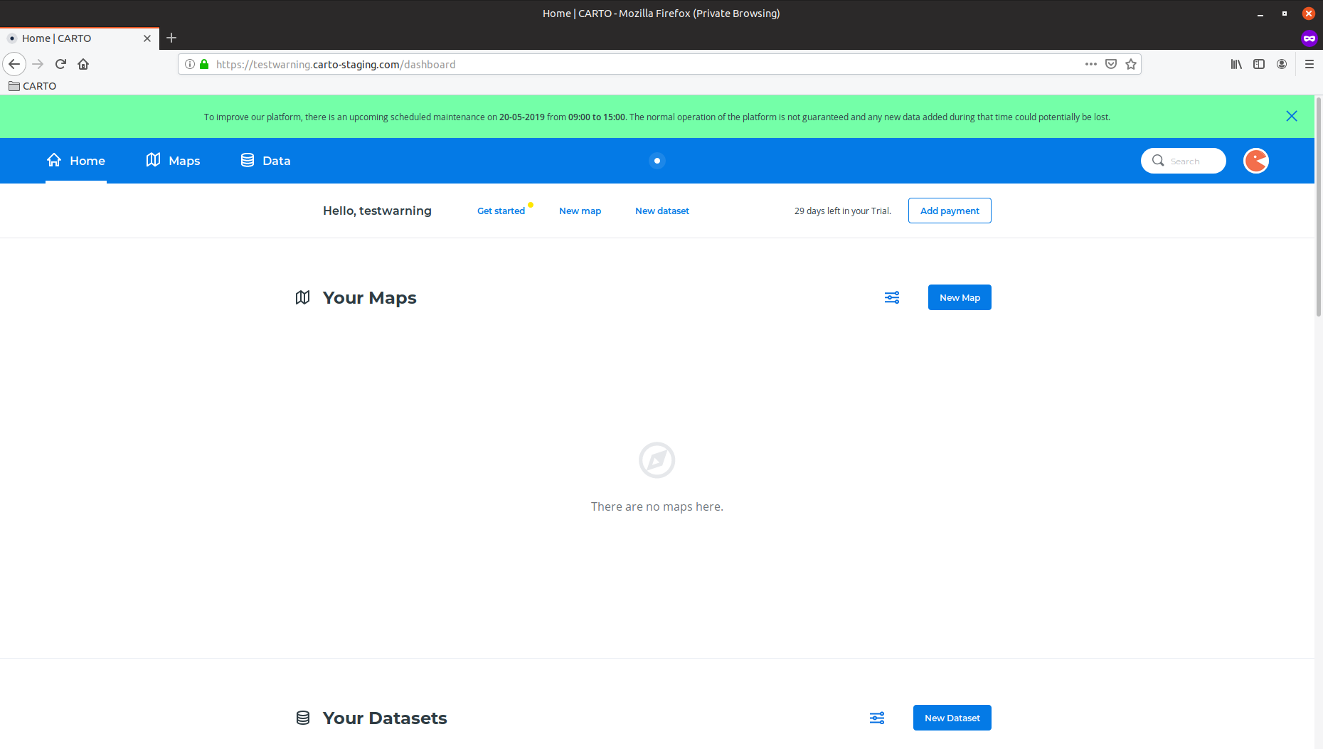
For the pg11 upgrade we will show the short notification with the following message:
To improve our platform, there is an upcoming scheduled maintenance on DD-MM-YYY from XX:XX to YY:YY. The normal operation of the platform is not guaranteed and any new data added during that time could potentially be lost.
@ethervoid ^^
ana-md
on 14 May 2019
@elenatorro please let me know when we have it implemented to start testing it in staging :)
ethervoid
on 14 May 2019
Here you can see the notification working on staging. From my PoV we should make the text bigger and mention the hours are in UTC but there you can see text with HTML tags () and it works great :)
One funny thing is that we cant put commas, for now, in our text because our rake version doesn't allow it :man_facepalming:
ethervoid
on 15 May 2019
I randomly bumped into this in staging when testing something else (I just happened to chose the testwarning account 😝):
Also:
⚠️ For some reason the header has disappeared!
 alonsogarciapablo
on 15 May 2019
alonsogarciapablo
on 15 May 2019
Another comment / question... not sure if we're using the user's local timezone, but just in case, should we include the timezone to make it more explicit?
alonsogarciapablo
on 15 May 2019
Another comment / question... not sure if we're using the user's local timezone, but just in case, should we include the timezone to make it more explicit?
Probably yes, makes sense to make it clear to everyone and avoid confusion. Thanks for pointing it out @alonsogarciapablo
ana-md
on 16 May 2019
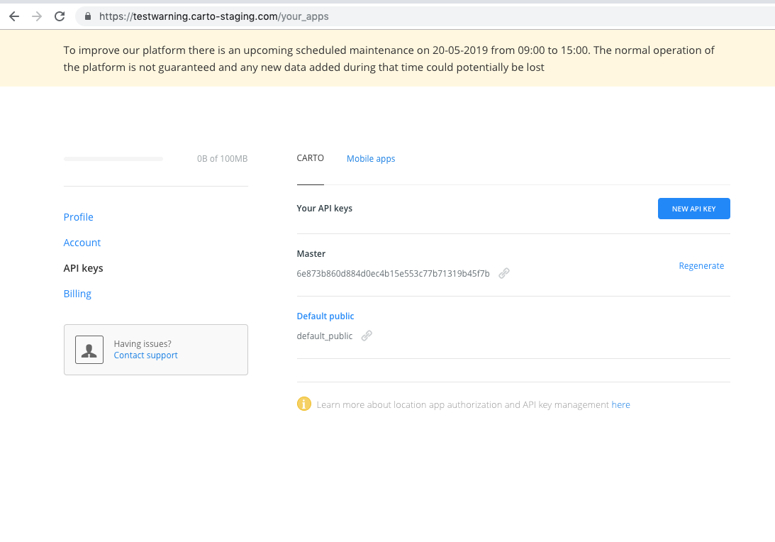
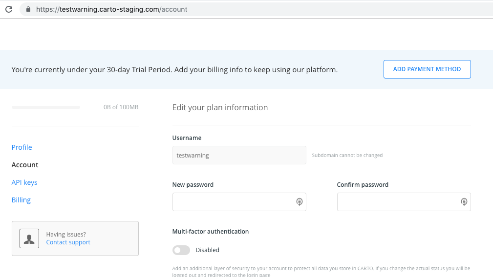
I've fixed the issue we had in the "old" dashboard pages (profile, account, api-keys...). I currently have a problem with the 'close' button in the notification. This button would require more implementation as it is right now in the old pages to be aligned with the new ones. I think the best solution, for now, and since this is for a specific use case, remove the close button and create a separate task to improve the integration of these notifications with the new dashboard and with the user profile pages.
What do you think?
elenatorro
on 16 May 2019
Yes, @elenatorro. Your approach sounds absolutely reasonable and pragmatic. Let's do it! 😃
inigomedina
on 16 May 2019
Deployed 🚀 thanks everyone for the hard work 💪
elenatorro
on 17 May 2019
VAMOS @elenatorro! 👏👏👏
alonsogarciapablo
on 17 May 2019
Related issues
 ramiroaznar
·
5Comments
ramiroaznar
·
5Comments
 ivanmalagon
·
3Comments
ivanmalagon
·
3Comments
 xavijam
·
3Comments
xavijam
·
3Comments
 piensaenpixel
·
4Comments
piensaenpixel
·
4Comments
 javitonino
·
5Comments
javitonino
·
5Comments
Most helpful comment
Deployed 🚀 thanks everyone for the hard work 💪