Cartodb: Time Series Widget - ability to filter ranges of time
Context
Working with a client that has a requirement that currently isn't covered by the time series widget.
Problem
The time series widget counts and allows selections of points within time buckets but each event is considered to occur at a single point in time. We need to represent stores closing and opening with the time series widget in such a way that they contribute to widget totals and are filterable etc the entire time they are open.
So for example, if a store opens January 2014 and closes March 2017, it should contribute to totals etc during that time frame.
Solution
We would need the ability to filter ranges of time rather than just points of time.
cc/ @stuartlynn
 asimcox
All 74 comments
cc/ @saleiva @noguerol
 jorgesancha
on 5 Jun 2017
jorgesancha
on 5 Jun 2017
Just to make sure I understand this: in your example, if you had one bucket per month, would that store add 1 to each bucket that falls between those dates?
jorgesancha
on 6 Jun 2017
Yeah or another value associated with the store, like total square footage for all the stores open at that time.
The thing you would be trying to show is how many open stores there are at any given time step.
 stuartlynn
on 6 Jun 2017
stuartlynn
on 6 Jun 2017
Hum but you wouldn't have data for that dates if the store is closed isn't it? (I'm trying to understand the use case)
 ethervoid
on 6 Jun 2017
ethervoid
on 6 Jun 2017
@asimcox Just to have it clear, could you please give us a more explained example? Thank you!! :)
ethervoid
on 7 Jun 2017
guys, this is a dupe I believe -> https://github.com/CartoDB/cartodb/issues/12241
 saleiva
on 7 Jun 2017
saleiva
on 7 Jun 2017
Hey @saleiva being able to do an aggregate on the time series widget is part of this issue but the main part is being able to have the time widget deal with intervals for a point being active. Let me give you a solid example.
You are managing a large chain of stores that open and close frequently. You have a table that looks like
|Store ID|Opened at|Closed at|
|-----------|---------------|-------------|
| 1 | 1/2/2000 | null |
| 2 | 2/12/2000 | 2/12/2003|
| 3 | 1/6/20004 | 5/12/2005|
So store 1 opened in 2000 and hasn't closed, store 2 opened in 2000 but closed in 2003 and store 3 opened in 2004 and closed in 2006.
In this example, to create a time widget you would pick a column and a number of buckets. So lets say we do it yearly with the opened at column then we would get a time series widget that would have values for the years:
|year|stores that opened in that year|
|------|-------|
|2000 | 2 |
|2001| 0 |
|2003| 0 |
|2004| 1 |
|2005| 0 |
|2006| 0 |
This tells us the number of stores that opened in a given year but that's not what we want to see, we want to see how many stores are open in year x. So really we want to be able in the time widget to specify a start date column and an end date column and then have counts of active columns in the years. So the result should look like
|year|stores that are open in that year|
|------|-------|
|2000 | 2 |
|2001| 2 |
|2003| 2 |
|2004| 2 |
|2005| 2 |
|2006| 1 |
Does that make sense?
stuartlynn
on 7 Jun 2017
Sorry accidentally closed the issue
stuartlynn
on 7 Jun 2017
Now I can see the use case cleary, thank you very much @stuartlynn .
ethervoid
on 8 Jun 2017
I see @stuartlynn but that should be treated as a different issue and maybe descoped from this first sprint on this – or we will never finish :P
saleiva
on 8 Jun 2017
Hey man, I agree it's totally a different issue from the time series aggregation of column values. Me and Ashley were aiming for this issue to capture not the aggregation issue but the ranges issue described in the clarification above.
It's something we are hitting with [client], we have a workaround but it doesn't scale very well at all. I think we can remove this from the time series fixes sprint but we are going to need it relatively soon to make good on providing value to [client]
stuartlynn
on 8 Jun 2017
Moving to the design kanvan, this needs to be thought deeply...
saleiva
on 8 Jun 2017
Sounds good. I would like to be involved in that deep thinking if possible, have some useful insights into the use case from our client!
stuartlynn
on 8 Jun 2017
After looking to other possible use cases analyzing a bit more the information provided by @stuartlynn and @asimcox I'm going to work on some mockups to support two column dates instead of just one for the aggregation.
saleiva
on 16 Jun 2017
We've 2 options:
A. Adding a selector for the type of the date aggregation at the beginning and then customizing the labels depending on that


B. Keeping an optative field for the INTERVAL TO column.
Anyway, I think you guys @asimcox and @stuartlynn could help a lot by providing better label texts.
saleiva
on 16 Jun 2017
blocking until catching up with @stuartlynn and @asimcox
saleiva
on 20 Jun 2017
@saleiva +1 for Option A -- seems more flexible, but setting up quick regroup with Stuart to finalize.
asimcox
on 21 Jun 2017
Hey yup Option A gets my vote as well. Instead of "single"/"interval", I would perhaps go for "event","interval"
stuartlynn
on 27 Jun 2017
Honestly I don't find much difference between both, but I prefer the later because it removes a mandatory question (event? interval?) that may block some users, being the checkbox much less of an obstacle.
 noguerol
on 27 Jun 2017
noguerol
on 27 Jun 2017
I think it's a pretty binary choice so making the user make that decision seems ok to me in option A.
One extra thing to consider is that we may need an option for how to treat open intervals. So for example, if a store has an open date but no close date, do we ignore that store or do we assume it is open from its open date to the end of the time series? Similarly, what do we do if it has a close data but no open date? Or no dates at all, do we treat that as a store that is constantly open or constantly closed?
We might need to allow the user some flexibility there and so we might need a slightly more complicated UI for the interval style interface. In that case having the toggle I think would be better.
stuartlynn
on 27 Jun 2017
Makes sense, but before we go back to @CartoDB/design , is there any other non covered interval use case you can think of?
noguerol
on 27 Jun 2017
Stores that open and then close and then open again I guess but at that point, I think you need to include another row in the table.
I think that's all the ones I can think about.
stuartlynn
on 27 Jun 2017
After reading your comments I think we should go with A. It gives us more flexibility to provide better feedback by changing the labels, for example, after choosing the type we are interested in.
About the intervals, I'd try to simplify the amount of options in the UI and:
- if both dates are nulls, it will not appear in the widget (this is how widgets work right now).
- if start date is null, we don't add it to the widget neither.
- if end date is null but there is an start date, that row will be shown in the widget from the start date til the end.
saleiva
on 27 Jun 2017
@saleiva That sounds like a good plan to me. One thing I am curious about is how we make those assumptions transparent to the users. I feel like we make these kinds of calls occasionally, and they are good calls but we don't communicate them in the UI which can lead to unexpected or unintuitive behavior.
Is there a way to have a tooltip or something that describes those three scenarios? Or perhaps if a data set has rows that fall into the set above, we somehow indicate that to people.
stuartlynn
on 27 Jun 2017
Sure, we have tooltips for labels and widgets also show the number of nulls
- only within builder -. We can add a tooltips to each label for the date
column selectors explaining how null works on that case.
We don't need to add those to the mock-up tho.
On Tue, Jun 27, 2017, 16:55 Stuart Lynn notifications@github.com wrote:
@saleiva https://github.com/saleiva That sounds like a good plan to me.
One thing I am curious about is how we make those assumptions transparent
to the users. I feel like we make these kinds of calls occasionally, and
they are good calls but we don't communicate them in the UI which can lead
to unexpected or unintuitive behavior.Is there a way to have a tooltip or something that describes those three
scenarios? Or perhaps if a data set has rows that fall into the set above,
we somehow indicate that to people.—
You are receiving this because you were mentioned.
Reply to this email directly, view it on GitHub
https://github.com/CartoDB/cartodb/issues/12272#issuecomment-311384143,
or mute the thread
https://github.com/notifications/unsubscribe-auth/AAIENbmZD4k52D2-tvcbEMb5pXaUQi_Tks5sIRe0gaJpZM4NwZqK
.
saleiva
on 27 Jun 2017
Sounds good! Thanks guys!
stuartlynn
on 27 Jun 2017
We have tooltips and we have guides, which I would prefer in this not that simple scenario: https://github.com/CartoDB/learn/issues/411
noguerol
on 28 Jun 2017
Summarizing, we are going with option A
saleiva
on 3 Jul 2017
@josecruz can you take a look and if everything looks ok, promote to the good widgets file?
saleiva
on 3 Jul 2017
LGTM!
Promoting this to Builder - Widgets
 josecruz
on 3 Jul 2017
josecruz
on 3 Jul 2017
thanks for taking care @josecruz
I'm reopenning this since it's on the cartodb repo and will need to be tracked here!
saleiva
on 4 Jul 2017
Adding @rochoa
jorgesancha
on 25 Jul 2017
What if there are several entries per store?
|Store ID|Opened at|Closed at|
|-----------|---------------|-------------|
| 1 | 1/2/2000 | 2/4/2015 |
| 2 | 2/12/2000 | 2/12/2003|
| 3 | 1/6/20004 | 5/12/2005|
| 1 | 4/7/2015 | null |
Because, you know, the spent 3 months renovating the store with the latest maple wood.
What if my dataset has a different schema? Like:
|Store ID|date|event|
|-----------|---------------|-------------|
| 1 | 1/2/2000 | opened |
| 2 | 2/12/2000 | opened |
| 2 | 2/12/2003 | closed |
| 3 | 1/6/2004 | opened|
| 3 | 5/12/2005 | closed |
| 1 | 2/4/2015 | closed |
| 1 | 4/7/2015 | opened |
How could we support that?
My point is this is an advanced use case of the time series, the data schema alternatives are quite open, and explaining it (as per this issue) is not trivial. Do we want to support it at Builder level? Or this is the classical use case that should be supported at Engine level by having the proper cartodb.js API for building and manipulating histograms?
 rochoa
on 27 Jul 2017
rochoa
on 27 Jul 2017
They way I have been thinking about is that a location (point polygon or line) has a period in which it is active. The active state exists from a start date to an end date.
While it's active it's values are added to the bins in the time series widget and when any part of its active period is enclosed by the filter on the time series widget it's shown on the map and counts in other widgets.
Each row is a separate active period even if it shares a store id. They should be treated as such and be added to the time series bins whenever that bin overlaps with the active period.
The periods shouldn't overlap but if they do CARTO should count both in the histogram and they should be added to the map.
Eventually, it would be great to offer the ability to do Unique counts by ID in the time period but we don't even have that for points just now so I wouldn't worry about that.
While this is a more complicated use-case than simply having a point be a single instance in time, there are lots of domains where that is the case:
- Store openings and closing -> Total number of stores open at a given time
- A person visiting a location -> Total number of people at a venue
- A single location who's properties change over time but slowly enough that you dont want to duplicate a point a large number of times just to keep it on the map
For me there are a lot of advantages to supporting geometries that exist over a time range as opposed to asking our users to duplicate geometries :
You don't have to duplicate geometries which increases storage space and render time just to essentially have the same information shown over a time range.
You don't end up double counting points you have duplicated for each time bin in the other widgets. This is a huge problem right now. If you want to have a point persist for 5 time bins you have to create it 5 rows with different timestamps but the same values and location. The widgets then give the wrong numbers because each of those points are counted. For example say you have a store with a profit=$10 that's open for 5 months. You duplicate the point 5 times and then you create a formula widget for total income. When there is no filtering on the time series it will read $50 instead of $10 as each point is counted individually. This is really misleading. Also as you filter the time series it will vary from $50 -> $10 based on how many bins are active which again is really wrong and misleading. This goes for all the widgets.
You have to be less careful about time-bin ranges. For example lets say you have 10 time bins and you duplicate a point 10 times with different time signatures. That would mean the point persists in the time series and on the map in every time bin. Now you increase the number of bins to 100... all of a sudden that point is only visible on every 10th time series bin and will disappear if you filter to less than 10 bins. If you have a range : start - end date you don't have to worry about the bin size.
No one has to write SQL to generate additional points to fill in the time gap
In terms of implementation does this just mean changing how we count rows from
select count(*) from table where time > filter_start_time and time < filter_end_time
to
select count(*) from table where ( geom_end_time < filter_start_time or geom_start_time > filter_end_time) = False
where filter_start_time and filter_end_time are either the start and end points of either the currently selected time range or the start and end points of a histogram bin and geom_start_time and geom_end_time are the start and end of the row period.
stuartlynn
on 27 Jul 2017
@rochoa's concern about the schema is fair but let's do this as with the rest of the analyses: we design for the most common use case, as far as we know the one proposed by @stuartlynn, and we can later extend it if we discover we need more flexibility (e.g. what we did with geocoding)
noguerol
on 28 Jul 2017
Speaking clearly:
Unless we find any other reason against, we will develop this feature taking into account the first proposed schema by @stuartlynn including the count based binning he suggests for duplicated ids. In terms of the UI we will use the first option provided by @saleiva with meaningful tooltips to help with the obviously complicated usage; summoning @CartoDB/design for working on a live Invision version of the interface + working on those tooltips.
We will additionally work on an updated guide (cc @csobier ) with detailed information about the suggested workflow and mandatory data schema, i'm sure @stuartlynn can also give us some help with that.
noguerol
on 4 Aug 2017
modifying the API for a specific use case is killer. In this case this can be fixed with an analysis that denormalizes the table + regular time series widget + filter by other layer analysis.
In general, if you are fixing application stuff with custom logic in the widget (filter) is likely you are doing something wrong. A widget is just a view of the data it should not have any logic.
Are we going to change our core API for every single client that comes with a requirement not supported by widgets?
cc @kevin-reilly
 javisantana
on 7 Aug 2017
javisantana
on 7 Aug 2017
I can't see any logic beyond our need to fix a filter that doesn't understands periodic events but only specific time points, which prevents a good amount of use cases. And is important to note we are assuming this is good for our product based on many conversations with an relevant client, that beyond any particular interests on that deal is the type of good quality feedback we normally lack on many features we finally implement.
That said, I understand and share your pains for unnecessarily fattening a feature that should remain simple, the lack of compatibility with every data schema and even impairing the filters consistency and architecture, so if you think all this makes more sense implemented as an analysis, I of course listen to your proposal. It should, however, meet two aspects:
1) While extremely important, I honestly don't care about respecting our internals architecture if this means we are building workflows no user understands. If the user wants to visualize its temporal data as an histogram, whether is a singular point or an interval, it makes more sense to me that the choice happens when adding the histogram itself. If this should be an analysis we should somehow relate one to the other by suggesting the data has time intervals that may need further processing. As an example, Arcgis makes this as a separate transformation and is pretty confusing.
2) Being the analysis a transformation and not a visualization I wonder how the data will look after applying it. Will the points within the interval be duplicated for every time bin? If that is the case, how we will prevent multiple point counting? I would love to have more detail about this point
noguerol
on 7 Aug 2017
I honestly don't care about respecting our internals architecture if this means we are building workflows no user understands
:)
Yes, I understand, that's my job and that's why I tell you our current architecture does not support what you propose
javisantana
on 7 Aug 2017
Ok, so here you have an example:
time series thing (on 2017-08-07 at 16.41.12).carto.zip
Please, review carefully the analysis chain
The only thing we'd need to create is a custom analysis that denormalizes data, in other words, an analysis that does this:
with ranges as (
    select min(open_date), max(close_date) from javi.time_range_based_widget
)
select s.*, d as month_open from javi.time_range_based_widget s join (
    select generate_series(ranges.min, ranges.max, '1 month') d from ranges
) aa
on aa.d >= s.open_date and (s.close_date is null or aa.d <= s.close_date)
And this thing does not need product involved, you just need to use deprecated sql analysis (TM)
If we want to do this more user-friendly, let's go the non-hacky way:
1) we change the current architecture so we support widgets and filters to work with several columns (useful if we want to create scatter plot widgets)
2) we create a widget to do this kind of things but supporting more than this use case, for example, for events or years-in-columns based tables (which are pretty common as well)
javisantana
on 7 Aug 2017
We've agreed to check if internally building this time data normalization as an analysis and then consuming it, in the UI, via the time series widget -in contrast as doing so as a Builder analysis- is feasible (and smart) or not. Summoning @xavijam and @alonsogarciapablo for giving a little bit more light on the topic.
noguerol
on 9 Aug 2017
Ok, thanks to @rochoa for explaining to me the whole thread (:kiss:). Further to the possibility to create the analysis from a widget, making use of a "not present" layer,... I feel it isn't a good idea. Why not?
- There is no such logic right now implemented: a widget doesn't create anything, in fact, it needs to know the source node before creating it.
- Having "not present" layers is not a good idea either: we don't have that possibility now, and it could add us an overhead in both places, Frontend (Builder and CARTO.js) and Backend.
- Builder should add another attribute (frontend, backend and CARTO.js should support it) in order to know if that layer is "not present" in the UI (:S). Of course, CARTO.js should send that "not present" layer to the Maps API, but not render it over the map (:boom:).
- And now, let's talk about the viz.json. That "not present" layer should be defined in the Viz.json, but... hum... how could we explain to the user that layer is there but not present in the UI (:scream:)? Even more, we couldn't let the user remove that layer using CARTO.js API, because it is a "special" layer.
- Finally, all these changes (and they could be possible) will change how things are implemented right now and trust me, it will take us a big amount of time (and technical debt) only for supporting a use case.
 xavijam
on 10 Aug 2017
xavijam
on 10 Aug 2017
How unfortunate is that. Ok, @rochoa can you please expose any other reason, beyond the ones already in this ticket, for doing this as an analysis and not a widget? With that in hand, we'll decide.
noguerol
on 10 Aug 2017
Just to summarize the previous points about not solving this at widget (dataview) backend level:
- From day 0 we know it is a difficult concept to explain: "temporal data as a histogram", even with a UI, it will be very difficult to explain for future API users.
- Apart from that, it implies changing the API for a very specific use case: generating more tech debt.
- It just covers one kind of data schema: users will have to process their data to adapt it to the supported schema, forcing them into having to use an analysis or several analyses to accomplish that task.
The is an existing alternative, probably far from ideal, but it is supported by the current analysis framework/infrastructure, and it works seamlessly with all widgets features: time-series aggregations and filtering.
So if that's the price we have to pay to have a simpler UI, I don't see the point of doing it through the widgets as proposed.
rochoa
on 11 Aug 2017
Just to make sure I am clear: you are proposing that we do not do this as a
widget using the screens Sergio proposed but instead do this as an Analysis.
Is this just a productionalized version of the Custom Node Analysis
work-around we are going to propose as a temporary measure?
--
Kevin Reilly
SVP Product
CARTO https://carto.com/ | [email protected] kevin@carto.com
(917) 375-2168
On Fri, Aug 11, 2017 at 1:27 PM, Raul Ochoa notifications@github.com
wrote:
Just to summarize the previous points about not solving this at widget
(dataview) backend level:
- From day 0 we know it is a difficult concept to explain: "temporal
data as a histogram", even with a UI, it will be very difficult to explain
for future API users.- Apart from that, it implies changing the API for a very specific use
case: generating more tech debt.- It just covers one kind of data schema: users will have to process
their data to adapt it to the supported schema, forcing them into having to
use an analysis or several analyses to accomplish that task.The is an existing alternative, probably far from ideal, but it is
supported by the current analysis framework/infrastructure, and it works
seamlessly with all widgets features: time-series aggregations and
filtering.So if that's the price we have to pay to have a simpler UI, I don't see
the point of doing it through the widgets as proposed.—
You are receiving this because you were mentioned.
Reply to this email directly, view it on GitHub
https://github.com/CartoDB/cartodb/issues/12272#issuecomment-321871899,
or mute the thread
https://github.com/notifications/unsubscribe-auth/ACy_X-DmsNyb-jH7HDdr0JLJIK3wBSD7ks5sXI8JgaJpZM4NwZqK
.
 kevin-reilly
on 11 Aug 2017
kevin-reilly
on 11 Aug 2017
Sorry if I wasn't clear (late Friday comment).
Yes, I'm opposed doing it as a widget, and I'm aiming for doing it as an analysis.
If we want to overcome the situation quickly, yes, we can use a deprecated-sql-function.
rochoa
on 11 Aug 2017
Hey all, it's not my intention to add any more noise to this issue, but maybe looking at the problem this way might help to get to a unified solution faster. From what I could gather from this issue (and please correct me if I'm wrong), this is what we're facing:
Widget option
|Pros|Cons|
|---------------|-------------|
| Easier/More intuitive workflow, a single widget will fulfill the original purpose | Unnatural behavior for a widget (meant to view data, not add any logic to it. Widgets shouldn't change data (even more without filtering) |
| Doesn't duplicate points | Logic not implemented in Builder |
| | It will take more time for implementing it |
| | Changing the API for a specific use case - more technical debt |
| | Several columns inputs on a widget UI could be confusing, making it look like an analysis|
| | More complexity when adding Time Series widgets |
Analysis option
|Pros|Cons|
|---------------|-------------|
| Natural use of an analysis (applying logic to transform data) | Workflow gets trickier, involving an analysis and two widgets to fulfill the original purpose |
| Logic already implemented in Builder (analyses) | Duplicates points |
| Easier and faster to implement | |
| We wouldn't change the API | |
| Not changing the time-series widget UI or concept | |
| Could be used for other use cases not related to a Time Series visualization | |
My two cents, if I may:
Even though I would normally push for intuitive workflows, in this case, seems quite obvious that the cons outweigh the pros.
And even if it gets trickier to the get the desired outcome, it wouldn't be the first (and I'm sure certainly not the last) workflow in Builder that takes a few steps and a combo of items to create. We must accept the fact that we're building a very complex system and not everything can be simplified just for the sake of simplicity when it means a set of cons like those (taking into account our manpower, time frame, and an already quite long to-do list).
We can always create a guide explaining the workflow as we have done [1] [2] in the past for other not-as-intuitive workflows.
I hope this helps <3
 arianaescobar
on 14 Aug 2017
arianaescobar
on 14 Aug 2017
Rochoa, about your concerns:
- If this is finally an analysis, will always be in company of the widget so the problem remains. Plus, I doesn't makes much sense to me to have two complete separate mandatory pieces in the workflow: first you add the analyses, then you add the widget. If we finally do this I would rather investigate on automatically adding the widget when plugging the analyses; we already do this with animated maps.
- Being the API and its UI two systems supporting each other, this happens all the time, right? It seems to me more a problem of how good is our support to a certain use case.
- This will also be a limitation if we work on a proper analysis, right? Of course not in the deprecated version; but we've all agreed that should be a short term solution.
noguerol
on 14 Aug 2017
Ari, thank you for your careful thoughts. Just some points:
· From a Builder user's perspective there is nothing unnatural, or being more precise, unintuitive in managing the time dimension of data in the only time component we have in Builder, the widget. Plus (again from a Builders user perspective) I don't get the difference, concerning data transformation, between aggregations, time zone switching and these intervals we're talking about. From a user standpoint these data transformation is also happening in other places, like aggregations on styling, and it has so far not being confusing (pretty much the opposite, to be fair).
· I don't know a reason for the analysis, being properly developed, to take less time to be done than the widget option.
· TS widget will get more complicated, that for granted, but much more complicated and cumbersome will be to force an analysis + the widget every time an interval should be interpreted. What use cases do you have in mind that only make use of the analysis?
· The "non present layer" issue only affects the widget calling and analysis approach, which we have discarded.
For sure if there is one very thing that skyrockets costs and buries efficiency is to restlessly debate what with some perspective seems to be a quite minor feature. Please, guys, let's agree this soon and turn the page.
noguerol
on 14 Aug 2017
· From a Builder user's perspective there is nothing unnatural, or being more precise, unintuitive in managing the time dimension of data in the only time component we have in Builder, the widget.
Those options won't transform your layer or dataset, those are just settings for that particular visualization. This widget idea would transform the user's data in order to visualize it the way we want to. That's the strange part.
· I don't know a reason about the analysis, being properly developed, to take more time to be done than the widget option.
As said before, we don't transform data in widgets, we do that in analyses. That's why I understand it will take more time doing this on widgets.
· TS widget will get more complicated, that for granted, but much more complicated and cumbersome will be to force an analysis + the widget every time an interval should be interpreted.
To this point: are we willing to overly complicate our TS Widget UI for this particular use case? What % of TS usage do we expect to be meant for this type of data visualization? I would rather keep a simpler UI for the general usage.
· The "non present layer" issue only affects the widget calling and analysis approach, which we have discarded.
You're right, removing this from the table above.
arianaescobar
on 14 Aug 2017
@noguerol
- If this is finally an analysis, will always be in company of the widget so the problem remains. Plus, I doesn't makes much sense to me to have two complete separate mandatory pieces in the workflow: first you add the analyses, then you add the widget. If we finally do this I would rather investigate on automatically adding the widget when plugging the analyses; we already do this with animated maps.
No, if the widgets and filters remain as they are, we are not changing their API, so the problem is only at UI level.
- Being the API and its UI two systems supporting each other, this happens all the time, right? It seems to me more a problem of how good is our support to a certain use case.
The difference is are changing how simple – one variable filters and histograms work, to add the complexity of handling an artificial second variable: the histograms and filters must understand about a second variable that needs to be generated (histogram) and considered (filter) on the fly.
- This will also be a limitation if we work on a proper analysis, right? Of course not in the deprecated version; but we've all agreed that should be a short term solution.
You are, precisely, describing the real problem: we will create a solution to a specific problem that doesn't support anything but a specific data schema for a specific client. If it's not good enough for a specific analysis, it is way worse with that logic embedded into widgets and filters.
Please, guys, let's agree this soon and turn the page.
I think, in our meeting, we already agreed to check if it was possible to do this behind the scenes (creating a hidden analysis and consuming from it) in Builder as an alternative to having the analysis exposed to the user, otherwise we were going with the analysis approach. So I don't know why we are trying to force this to go into the widget/filter direction.
One more thing:
From a user standpoint these data transformation is also happening in other places, like aggregations on styling, and it has so far not being confusing (pretty much the opposite, to be fair).
And that will be a problem when we try to replicate that from CARTO.js because that's a hack we did to bring some functionality from the old editor.
rochoa
on 16 Aug 2017
I think, in our meeting, we already agreed to check if it was possible to do this behind the scenes (creating a hidden analysis and consuming from it) in Builder as an alternative to having the analysis exposed to the user, otherwise we were going with the analysis approach. So I don't know why we are trying to force this to go into the widget/filter direction.
According to @xavijam comment it's impossible so we discarded that solution last week. Ok, guys, enough debate IMO for such a little thing. Let's go on with the analysis solution. @CartoDB/design can you come with a similar approach to what Sergio proposed but in the form of an analysis? @xavijam is there a natural way we can automatically add a time series every time the analysis is calculated, in a similar fashion of animated maps?
noguerol
on 16 Aug 2017
@xavijam is there a natural way we can automatically add a time series every time the analysis is calculated, in a similar fashion of animated maps?
There is no way right now of adding it by default, but I feel we can do it and also we can explore a way of creating a "post action after adding a new analysis", no matter if it involves widgets, styles, whatever,...
xavijam
on 21 Aug 2017
Which one do you recommend?
noguerol
on 21 Aug 2017
Attaching here an Invision project of how it would work:
https://invis.io/YSD6V49D5
One question: Should we have an input to change the widget name? Right now (in prod) the name on the widget is based on the column's name.
josecruz
on 24 Aug 2017
@josecruz, what is the "_TIME ZONE_"?
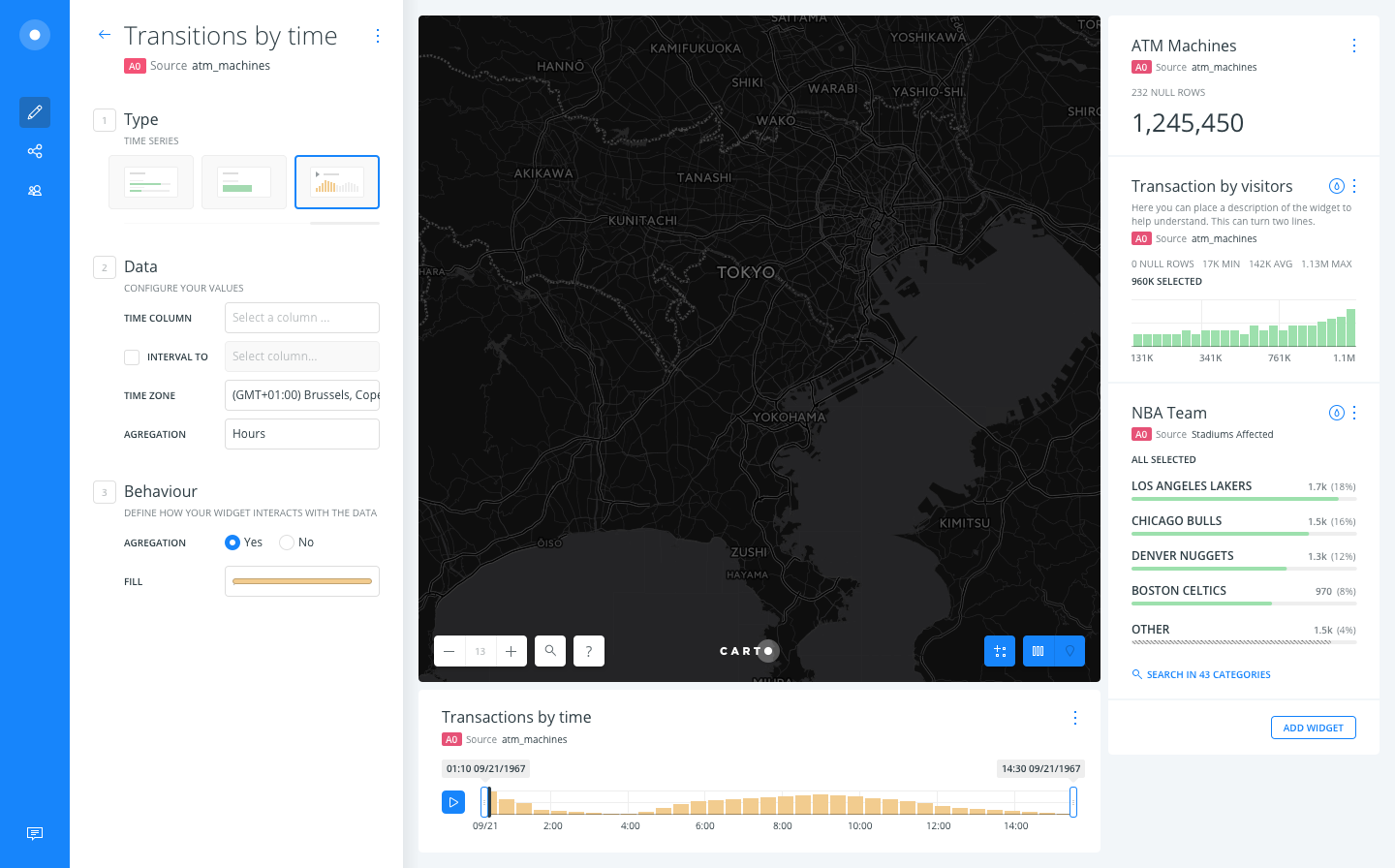
BTW, @noguerol, this still only supports one data schema, are we creating a custom analysis that only covers one data schema? If so, where the data ends? I mean, it should go until today or until the maximum value found in the "_DATE TO_" column?
rochoa
on 25 Aug 2017
@rochoa This will change the timezone of your data. The user also has the ability to do it in the public view to match its local time zone. Due this is an interval-based data, do you think that keeping that input makes sense?
josecruz
on 25 Aug 2017
OK, understood. But I'm not sure about what that will output in some cases. As per the use case, some stores might be in one time-zone and others in another one. Imagine stores across all different states in the USA, if I force their time-zone to just one, I will aggregate them into incorrect buckets in some circumstances. However, if I don't assign them with a time-zone, the same happens later on the time-series widget as the data is already aggregated. Weird.
rochoa
on 25 Aug 2017
Ok so updated the complete workflow based on the feedback given by @noguerol @piensaenpixel.
- Added a field on the analysis to name the output column
- Data styling outside the analysis
josecruz
on 25 Aug 2017
Why did we remove the "_TIME ZONE_"?
rochoa
on 25 Aug 2017
@rochoa don't you think the "time zone" should be inside the widget edition as we have now?
 piensaenpixel
on 25 Aug 2017
piensaenpixel
on 25 Aug 2017
@rochoa My bad. Restored the interface of the TS widget edit (last screen).
josecruz
on 25 Aug 2017
@rochoa don't you think the "time zone" should be inside the widget edition as we have now?
It depends on where we want to account the error. But I will keep the widget edition as it is, the widget must not know any detail about the analysis that generated the data.
rochoa
on 25 Aug 2017
@rochoa:
- About the data schemas: well above in this ticket we decided to limit the scope of this feature for only one well documented schema.
- Time zones: if a certain interval is on a certain timezone that differs from other intervals on the same table I guess the normalized resulting table will also have those different timezones per each row, which will at the end be time-normalized by the widget, right?
noguerol
on 25 Aug 2017
- About the data schemas: well above in this ticket we decided to limit the scope of this feature for only one well documented schema.
OK. Then we need to define this:
Where the data ends? I mean, it should go until
todayor until the maximum value found in the "_DATE TO_" column?
- Time zones: if a certain interval is on a certain timezone that differs from other intervals on the same table I guess the normalized resulting table will also have those different timezones per each row, which will at the end be time-normalized by the widget, right?
But if you force the time-zone when you are doing the aggregation into the buckets, you can end with different results depending on the timezone. As an example, 5 stores that opened January 1st at 5 different time-zones, that end in different buckets (day, months, years) depending on the time-zone used:
postgres=# set timezone = 'Etc/UTC';
SET
postgres=# WITH stores as (
    select 'store_t0' as store_name, '2016-01-01T00:00:00Z+00'::timestamptz store_opened
    UNION ALL
    select 'store_t+1', '2016-01-01T00:00:00Z+01'::timestamptz
    UNION ALL
    select 'store_t+2', '2016-01-01T00:00:00Z+02'::timestamptz
    UNION ALL
    select 'store_t-1', '2016-01-01T00:00:00Z-01'::timestamptz
    UNION ALL
    select 'store_t-2', '2016-01-01T00:00:00Z-02'::timestamptz
)
select
    store_name,
    date_trunc('day', store_opened at time zone 'GMT+0')::date gmt0,
    date_trunc('day', store_opened at time zone 'GMT+1')::date gmt1,
    date_trunc('day', store_opened at time zone 'GMT+2')::date gmt2
from stores;
 store_name |    gmt0    |    gmt1    |    gmt2
------------+------------+------------+------------
 store_t0   | 2016-01-01 | 2015-12-31 | 2015-12-31
 store_t+1  | 2016-01-01 | 2016-01-01 | 2015-12-31
 store_t+2  | 2016-01-01 | 2016-01-01 | 2016-01-01
 store_t-1  | 2015-12-31 | 2015-12-31 | 2015-12-31
 store_t-2  | 2015-12-31 | 2015-12-31 | 2015-12-31
(5 rows)
Where the data ends? I mean, it should go until today or until the maximum value found in the "DATE TO" column?
The range should be the maximum value overall, yeah
But if you force the time-zone when you are doing the aggregation into the buckets, you can end with different results depending on the timezone. As an example, 5 stores that opened January 1st at 5 different time-zones, that end in different buckets (day, months, years) depending on the time-zone used:
I guess so, but that should be the correct behavior, right? Aggregations are always based on the end user timezone
noguerol
on 25 Aug 2017
But as per my previous example, if I ask myself: how many shops did we open during 2015? I could answer: 2 (GTM+0), 3 (GTM+1), or 4 (GTM+2), depending on the time-zone I used for the aggregation. I don't care that much about this concrete example, but this can happen in other situations, e.g. how many branches do we keep open between 08:00 and 16:00 at Paris time?
rochoa
on 28 Aug 2017
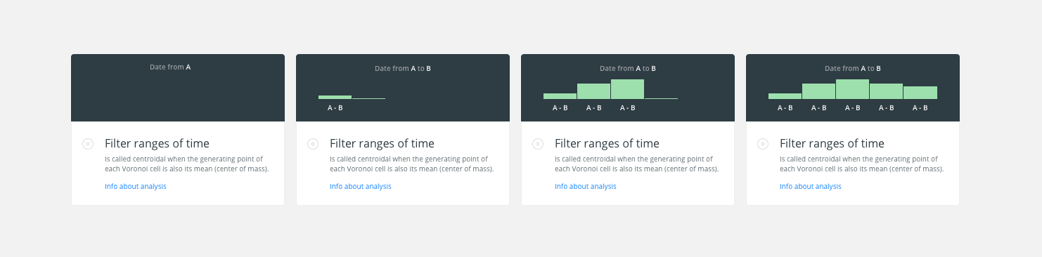
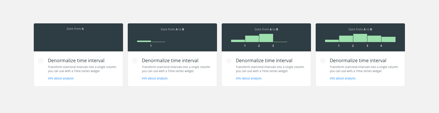
I’ve been making the image/-illustration that we show when the user selects an analysis on the modal.
The idea is to represent the final output, the widget, taken into account that it is possible to select a date from “A” to “B”.
At the beginning appears the top text as writing mode. Then it is shown the 1st bucket growing from the bottom and showing the label (A-B) and until you reach the last bucket.
An image the possible animation.
cc/ @CartoDB/design
Design File: /Dropbox/CARTO/Projects/01 Builder/01 Tool/_res/Analysis-Illustration.sketch
 urbanphes
on 29 Aug 2017
urbanphes
on 29 Aug 2017
@rochoa I don't know if I'm missing something but that is exactly what should happen, right? The same could happen now with aggregations and timezones. What do you suggest, then? @stuartlynn has probably an opinion about this
@urbanphes I think I get the idea, but I find it confusing because the Date from A to B refers to the columns while the A - B label refers to the binning. I would call the analysis Denormalize time interval with this description: Transform start/end intervals into a single column you can use with a Time-Series widget and for the animation I would change the text to "Interval from start to end" and then label the axis (and not the buckets, as you do) with numeral series: "1, 2, 3, 4, 5"
noguerol
on 29 Aug 2017
@rochoa I don't know if I'm missing something but that is exactly what should happen, right? The same could happen now with aggregations and timezones. What do you suggest, then? @stuartlynn has probably an opinion about this
I don't suggest anything, I'm pointing to a potential problem, so you are aware and you can decide if that's important or not.
BTW, I don't understand why you mean with "_The same could happen now with aggregations and timezones_". Can you give me an example of that scenario?
rochoa
on 29 Aug 2017
That the same can happen with the current functionality
noguerol
on 29 Aug 2017
I’ve to change the label on buckets by 0-1, 1-2, 2-3, … to identify them with intervals.
Here is the image:

urbanphes
on 30 Aug 2017
Updated
urbanphes
on 30 Aug 2017
Stale issue. Closing 👋
 alrocar
on 1 Oct 2019
alrocar
on 1 Oct 2019
Related issues
 javitonino
·
5Comments
arianaescobar
·
5Comments
arianaescobar
·
4Comments
javitonino
·
5Comments
arianaescobar
·
5Comments
arianaescobar
·
4Comments
 atlefren
·
3Comments
rochoa
·
3Comments
atlefren
·
3Comments
rochoa
·
3Comments
Most helpful comment
There is no way right now of adding it by default, but I feel we can do it and also we can explore a way of creating a "post action after adding a new analysis", no matter if it involves widgets, styles, whatever,...