Carbon: DatePicker focus ring is overridden by form validation UI red border
What package(s) are you using?
- [ ]
carbon-components - [x]
carbon-components-react
Detailed description
Describe in detail the issue you're having.
When focus is in the <DatePicker> input, blue focus ring is overridden by red border from validation UI.
Is this issue related to a specific component?
DatePicker
What did you expect to happen? What happened instead? What would you like to
see changed?
For keyboard user, focus ring(blue outline) should not be overridden by form validation UI red border
What browser are you working in?
Chrome, FF
What version of the Carbon Design System are you using?
Screenshot by latest carbon react storybook
What offering/product do you work on? Any pressing ship or release dates we
should be aware of?
QRadar Workflow Analysis(Query Builder). Not any pressing time you should worry about, we should be able to fix that by overriding the styling.
Steps to reproduce the issue
- Go to react storybook > DatePicker
- Click on DatePicker input
- Chk storybook validation UI knob
- Screenshots or code

 liunate
All 8 comments
from what I understand this is an intentional design decision to call attention to the component's invalid state. this is a pattern found throughout the library in other input controls like TextInput and TextArea (and to a similar degree Dropdown, and so on)
 emyarod
on 22 Jul 2020
emyarod
on 22 Jul 2020
cc @carbon-design-system/design should the invalid state take precedence over focus states? It seems like focus should take precedence here.
 tw15egan
on 22 Jul 2020
tw15egan
on 22 Jul 2020
We thought that the error border should remain until a different selection is made that fixes the error to indicate that you are still on an invalid state. When the calendar is open, it hides the error message.
 laurenmrice
on 22 Jul 2020
laurenmrice
on 22 Jul 2020
The menu won't open until a user actually navigates to it though, so they would see the error until they tab to It and open the menu. When they tab to it though, it seems as though it should receive focus styles otherwise this could cause a11y problems.
Say there are 4 invalid items in a form, all of them would have a red outline. A keyboard user would have no way to tell which invalid item they are navigating to/from if they do not receive focus. @dakahn is this a valid concern?
tw15egan
on 22 Jul 2020
I confirmed this with design before closing and that's why I referenced the behavior we have throughout the system at the moment. if the decision is reversed then this would be a system wide change
emyarod
on 22 Jul 2020
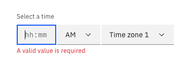
So if the behavior that validation UI overrides focus ring is a confirmed pattern, then <TimePicker> might be doing wrong?
liunate
on 23 Jul 2020
there is an open PR to resolve that issue (https://github.com/carbon-design-system/carbon/pull/6522) but this pattern is under further reevaluation by the design team, so it may change
emyarod
on 23 Jul 2020
I created a larger issue to determine an outcome in regards to this, and we can make the changes once we get a design resolution 👍
tw15egan
on 23 Jul 2020
Related issues
 ahoyahoy
·
3Comments
ahoyahoy
·
3Comments
 joshblack
·
3Comments
joshblack
·
3Comments
 drewdistefano
·
3Comments
drewdistefano
·
3Comments
 carmacleod
·
3Comments
carmacleod
·
3Comments
 PatrickDuncan
·
3Comments
PatrickDuncan
·
3Comments
Most helpful comment
there is an open PR to resolve that issue (https://github.com/carbon-design-system/carbon/pull/6522) but this pattern is under further reevaluation by the design team, so it may change