Carbon: Contrast ratio insufficient for some color combinations
According to the Color Guidelines:
If the difference between two values is 50 or greater, the colors are accessible. Anything below a difference of 50 may fail accessibility standards.
However, there are multiple colors that do not meet this criteria (expected ratio: 4.5), e.g.:
magenta-60(#e5f6ff) andcyan-10(#d12771):4.471
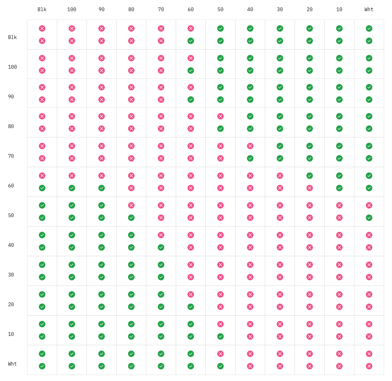
Here's the full list:
cool-gray-10 / magenta-60 (4.498217550836486)
cyan-10 / magenta-60 (4.4714999480018385)
cyan-10 / warm-gray-60 (4.479357949030447)
green-10 / magenta-60 (4.492613562183291)
magenta-10 / magenta-60 (4.49537081238271)
purple-10 / magenta-60 (4.496385732743474)
warm-gray-10 / magenta-60 (4.494925931674778)
Here's a script I wrote to check the contrast ratio for all colors.
 darekkay
All 25 comments
white-0 / blue-50 (3.3464504153204073)
white-0 / cool-gray-50 (3.34366601212804)
white-0 / cyan-50 (3.333001658346336)
white-0 / gray-50 (3.3190497783477215)
white-0 / green-50 (3.3511330791059426)
white-0 / magenta-50 (3.326399184830143)
white-0 / purple-50 (3.347019623927855)
white-0 / red-50 (3.3542431942619726)
white-0 / teal-50 (3.3389474588768637)
white-0 / warm-gray-50 (3.368736346798396)
White text is accessible on colors from 60 to 100
Are these errors with white-0 a wording problem? I believe white-0 text should never be used on any color value under 60
 tw15egan
on 2 Jun 2020
tw15egan
on 2 Jun 2020
@tw15egan Thanks for pointing this out. Other palettes with similar properties (like the USWDS) don't have such an exception for black/white colors. I've removed all white-0 color combinations from the issue description.
darekkay
on 3 Jun 2020
Tagging @carbon-design-system/design as they will know more about this type of issue
tw15egan
on 3 Jun 2020
Hey thanks for pointing this out. @shixiedesign and @sadekbazaraa can you take a look at this?
 aagonzales
on 21 Jul 2020
aagonzales
on 21 Jul 2020
Hey @darekkay thanks or doing the checking and I wish we had your code to help us when we were doing the color work.
I noticed a lot of the values in your list was 4.495+ something... Those colors, when I double checked in Sketch using Stark plugin, shows up as exactly 4.5:1. So these could be real short comings, and I'll let Carbon team decide if these should be fixed...
The other pairs you caught, could be worth a fix. Sadek and I might have missed them. This can be fixed by tweaking
cyan-10ormagenta-60.
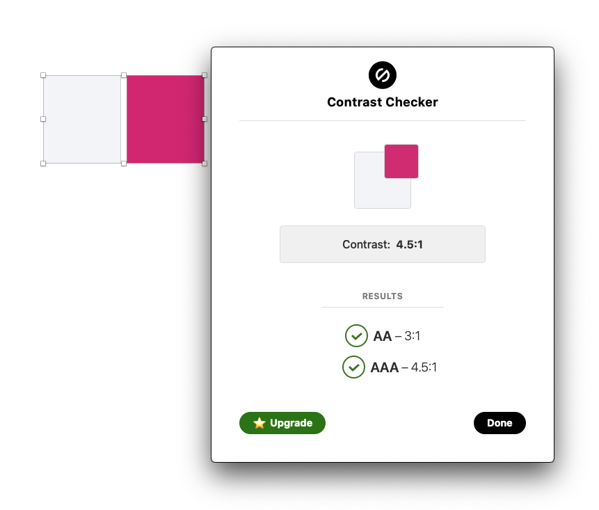
Here's the _expected contrast ratio_ of this palette (bottom circle is 3:1, top circle 4.5:1)
 shixiedesign
on 22 Jul 2020
shixiedesign
on 22 Jul 2020
Interesting, I think there's a few things happening here. We did our best to cross-reference every possible permutation for accessibility when fine tuning the palette but it seems a couple may have slipped through the cracks. It also seems that different tools apply slightly different algorithms and rounding profiles.
My guess is that the sketch plugin that we used for contrast analysis rounds up from 3 decimal places, in other words anything with a ratio of 4.495 or higher will yield a result of 4.50. See example with Cool Gray 10 / Magenta 60.
The resolution on the custom script in use by @darekkay has many decimal places of resolution. That being said, it does look like a few slipped through the cracks in the process.
A microscopic adjustment to make Magenta 60 a hair darker would fix everything in the full list outlined above along with a similar adjustment to make Cyan 10 a hair lighter.
cool-gray-10 / magenta-60 (4.498217550836486)
cyan-10 / magenta-60 (4.4714999480018385)
cyan-10 / warm-gray-60 (4.479357949030447)
green-10 / magenta-60 (4.492613562183291)
magenta-10 / magenta-60 (4.49537081238271)
purple-10 / magenta-60 (4.496385732743474)
warm-gray-10 / magenta-60 (4.494925931674778)
My only question / concern is with the knock-on effect of issuing an entirely new palette update which affects every business unit, set of brand guidelines, communications that would need to go out, etc... It's a pretty massive undertaking believe it or not. And we'd be doing this explicitly for 4.5 text accessibility at the second or third decimal place of resolution for pretty wild combinations mostly involving Magenta which isn't even a part of our theming in the first place.
Just trying to think it all though. 🧐
@darekkay @aagonzales @shixiedesign
 sadekbazaraa
on 22 Jul 2020
sadekbazaraa
on 22 Jul 2020
@sadekbazaraa While I agree that the _perceived_ difference might not be worth a change, the contrast ratios are technically failing WCAG. It would be interesting to check how axe-core, wave and pa11y calculate the contrast ratio. I would assume they're not rounding up the values.
darekkay
on 22 Jul 2020
Here's a gist with all failing contrast ratios and a preview (also rehosted here).
All of the mentioned accessibility tools catch all contrast ratio violations:
- pa11y: 14/14 errors
- axe-core: 14/14 errors
- wave: 14/14 errors
Accessibility auditors rely on those tools and a color contrast violation will fail your accessibility audit.
which affects every business unit, set of brand guidelines, communications
involving Magenta which isn't even a part of our theming in the first place
I understand that it's not trivial, but if magenta-60 is not part of your theming, how can it affect so many business guidelines?
Again, I agree with the pragmatic approach: 4.49 vs. 4.5 will not have any major impact on the users. But when talking about business/enterprise, WCAG compliance plays a huge role. Keep in mind that WCAG violations may also cost a lot of money for a business.
I can see two solutions here:
- Update your documentation to state that some
magenta-60andcyan-10color combination may not be accessible. Easy to achieve, but difficult to explain why a general-purpose UI library is not able to adjust two colors to make it fully accessible. It's also easy for developers to miss this piece of information. - Adjust the colors so the whole color palette is accessible.
darekkay
on 23 Jul 2020
We need to make the adjustments to the palette. It will require the painful process to update but ultimately must be done.
 mjabbink
on 23 Jul 2020
mjabbink
on 23 Jul 2020
@darekkay the reason it affects so many is because this is the core IBM brand color palette and not just a simple update to the hex values in Carbon. The entire palette will need to be updated to a new version and redistributed in multiple formats to every practitioner working with color across IBM, including partner agencies, updating multiple design kits, brand guidelines, websites, etc. This requires comms across many different channels.
We can go through the process even though I suspect the specific color combinations with Magenta 60 being used in a situation requiring 4.5 WCAG compliance for small text contrast in UI would never happen. At least in a completely hypothetical world it will be fool proof and we can make sure it passes any scripts or various calculation methods should the use case ever arise.
I'll create two new hex values and report back here with the findings.
– Magenta 60
– Cyan 10
FYI @aagonzales @mjabbink @shixiedesign @jeanservaas
sadekbazaraa
on 23 Jul 2020
Upon further study, an adjustment to Warm Gray 60 vs. Cyan 10 has less of a knock-on effect across the board, so I've applied the update there instead.
To the eye, there's no discernible distinction between the two colors but mathematically it should pass all scripts regardless of the calculations and rounding methods being used.
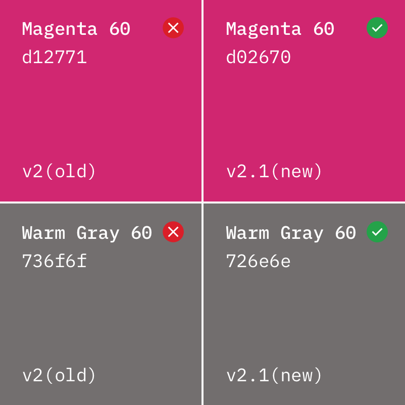
I'm proposing a title change from v2 to v2.1 since this is such an imperceptible update. The change from v1 to v2 was much more significant by comparison. Alternatively, since future palette updates are highly unlikely for many months, if not years, to come, we could just go to v3 to keep it clean and simple. Thoughts? @mjabbink
@darekkay do you mind updating the script with the new values just to quadruple check?
Revised:
– Magenta 60: #d02670
– Warm Gray 60: #726e6e
FYI @shixiedesign @aagonzales @jeanservaas
sadekbazaraa
on 23 Jul 2020
V3 makes sense in this context of color palette. Clean and simple to your point. To use 2.1 is logical but unnecessary when compared to v3.
mjabbink
on 23 Jul 2020
From what I understand, the naming convention is where v2.1 implies bug fixes and v3 would imply a potentially breaking change. But, this is a color palette, I don't think we need to follow this code versioning standard and v3 is definitely simpler. Thank you Sadek!
shixiedesign
on 23 Jul 2020
Just an FYI, If there is a coded color package that will also need to be updated with these changes, it may be better to use 2.1. That way users will automatically get the update. If we ship it as 3.0 developers may interpret it as a breaking change and lead to less end-users updating.
tw15egan
on 23 Jul 2020
do you mind updating the script with the new values just to quadruple check?
@sadekbazaraa Yes, the new values are fine 🙂
darekkay
on 23 Jul 2020
@tw15egan there will be a new color package as well.
@mjabbink it sounds like there may be more reasons than we initially thought to go with 2.1, see above comments.
sadekbazaraa
on 23 Jul 2020
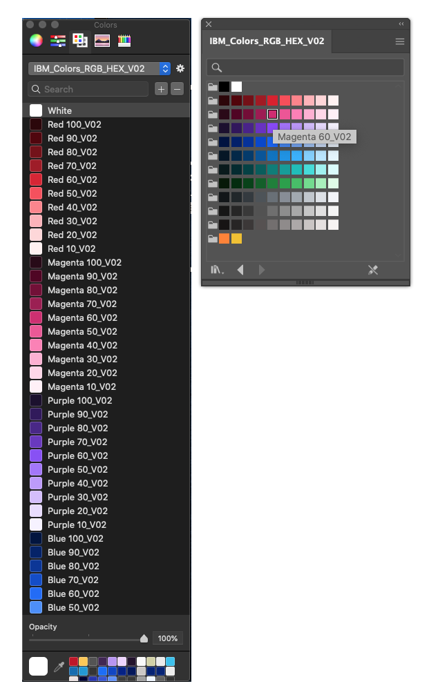
Another consideration with the naming convention is that every single swatch has to be renamed manually across all the various formats to keep track with the versioning for redistribution—Pantone, CMYK, RGB/HEX, .clr
@mjabbink @shixiedesign @jeanservaas
sadekbazaraa
on 23 Jul 2020
Just following back up on this issue after having a broad discussion with @dudley-ibm who will be handling the changes across all the files that are hosted in the downloadable color package available here:
https://github.com/carbon-design-system/carbon/raw/master/packages/colors/artifacts/IBM_Colors.zip
Those contents are as follows:

After considering the breaking change point that @tw15egan mentioned above, we're leaning towards naming this "v2.1" to better reflect the insignificant nature of the changes vs. "V03". Additionally, we're moving towards dropping the numeral "0" from the naming structure in favor of more traditional versioning, hence "v2.1".
If there are no objections we can start work on this soon. @jeanservaas we'll need to update the Carbon color package as well. I think it's just a .json file that needs editing.
Once everything is live and direct, we'll want to coordinate our announcements across the appropriate channels.
cc
@mjabbink
@shixiedesign
sadekbazaraa
on 10 Sep 2020
Awesome, I can help @jeanservaas with the changes and making sure we get it out with our next minor release 👍
tw15egan
on 10 Sep 2020
@tw15egan, please share the timing of the next minor release, just so I can plan accordingly with the assets.
 dudley-ibm
on 11 Sep 2020
dudley-ibm
on 11 Sep 2020
@dudley-ibm here's the upcoming slate of planned releases for the next month or so
https://github.com/carbon-design-system/carbon/wiki/Release-radar
tw15egan
on 11 Sep 2020
Thanks @tw15egan
dudley-ibm
on 11 Sep 2020
@tw15egan and @sadekbazaraa here is the updated IBM Color files (v2.1) as previously discussed.
IBM_Colors.zip
dudley-ibm
on 24 Sep 2020
PR is up here if someone can verify
https://github.com/carbon-design-system/carbon/pull/6907
The update will be included in our release next week 👍
tw15egan
on 24 Sep 2020
Thanks everyone for your work 🙂 I have summarized the topic of color palettes with "magic numbers" in my blog post. I have also written a11y-contrast for magic number calculation and testing.
darekkay
on 28 Sep 2020
Related issues
 JordanWSmith15
·
3Comments
JordanWSmith15
·
3Comments
 laurenmrice
·
3Comments
laurenmrice
·
3Comments
 ajdaniel
·
3Comments
ajdaniel
·
3Comments
 ConradSchmidt
·
3Comments
ConradSchmidt
·
3Comments
 snidersd
·
3Comments
snidersd
·
3Comments
Most helpful comment
Just following back up on this issue after having a broad discussion with @dudley-ibm who will be handling the changes across all the files that are hosted in the downloadable color package available here:
https://github.com/carbon-design-system/carbon/raw/master/packages/colors/artifacts/IBM_Colors.zip
Those contents are as follows:

After considering the breaking change point that @tw15egan mentioned above, we're leaning towards naming this "v2.1" to better reflect the insignificant nature of the changes vs. "V03". Additionally, we're moving towards dropping the numeral "0" from the naming structure in favor of more traditional versioning, hence "v2.1".
If there are no objections we can start work on this soon. @jeanservaas we'll need to update the Carbon color package as well. I think it's just a .json file that needs editing.
Once everything is live and direct, we'll want to coordinate our announcements across the appropriate channels.
cc
@mjabbink
@shixiedesign