Carbon: Content should handle margins in regards to sidenav state OOTB
Continuing #5589 since I never got a response:
https://codesandbox.io/s/long-flower-p3jgd
Here is a CodeSandbox which demonstrates the following:
- If the sidenav is expanded on smaller screens, you can NOT click outside the sidenav to close it.
- On larger screens, the sidenav covers the
Contentinstead of it accomodating the fixed sidenav. - Styling on new versions is completely inconsistent with the outdated docs, as seen in the sidenav.
For the 10th time, bx--offset-lg-3 bx--col-lg-13 is a hack job, and changes from screen to screen. Content should actually serve a purpose instead of being a useless div, it should accomodate the EXACT width of the SideNav. Furthermore, the docs should be updated such that we don't have to post 10 issues to address the same problem only to be pointed to outdated information.
 ghost
ghost
All 11 comments
Hi 👋 let us monitor how many request we get on OOTB margin solution upon side nav open/closed/rail states. Meanwhile you can just write the Sass code by yourself. Also if anybody has a reusable code good to have a PR.
 asudoh
on 12 Mar 2020
asudoh
on 12 Mar 2020
So what exactly is going on in the docs website, which appears to be built with Carbon as well? You can click outside and there are none of these other issues.
ghost
on 12 Mar 2020
In case you are referring to carbondesignsystem.com, it takes lots of manual approach instead of relying on OOTB solution. You can inspect the DOM and computed styles with Chrome DevTools to see what's going on.
asudoh
on 13 Mar 2020
So to clarify, what is the purpose of the Content component and what functionality does it provide? Like I said, it doesn't make sense to designate a component that does nothing.
ghost
on 13 Mar 2020
Interesting question, at https://carbon-components-react.netlify.com/iframe.html?id=ui-shell--fixed-sidenav:
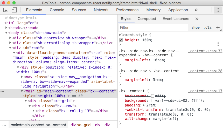
So it seems to be doing something...?
Update: This seems different from how <div class="bx--content"> is styled at https://carbon-components-react.netlify.com/iframe.html?id=ui-shell--header-base-w-navigation-actions-and-sidenav, along with some markup difference. I personally don't know what the intent is (I'm not the author of that UI), but by looking at the computed style of that <div> you'll get some ideas on what <Content> is for and how to customize your application's style to achieve what you desire.
asudoh
on 13 Mar 2020
Well it looks like it's setting some margin left in the CSS inspector there ... maybe no enough for the width of the SideNav. In any case, I think we can all agree that it makes no sense for some of the components to respond to a breakpoint and not others. If SideNav and HeaderNavigation respond to the breakpoint then so should Content
ghost
on 13 Mar 2020
Ya that's probably a better way of putting it. On that same note, SideNav should also close when you click outside of it, on the overlay.
ghost
on 13 Mar 2020
So y'all were saying I could get a work around going with sass? What is the variable for the breakpoint and how would I apply it to the content component? Do I have to apply the ui-shell feature flag?
ghost
on 14 Mar 2020
Hi 👋 let us monitor how many request we get on OOTB margin solution upon side nav open/closed/rail states. Meanwhile you can just write the Sass code by yourself. Also if anybody has a reusable code good to have a PR.
So how would I do it in sass?
ghost
on 16 Mar 2020
Your first step is listening to onToggle() in <SideNav>, which tells updates in expanded/collapsed state of side nav. Then you can add/remove a CSS class (say, bx--content--with-side-nav-expanded) to <div class="bx--content"> so that something like below works:
.bx--content.bx--content--with-side-nav-expanded {
  margin-left: 16rem;
}
Ah ok awesome, I'll give that a try!
ghost
on 16 Mar 2020
Related issues
 xrissot-ibm
·
3Comments
xrissot-ibm
·
3Comments
 laurenmrice
·
3Comments
laurenmrice
·
3Comments
 windgaucho
·
3Comments
windgaucho
·
3Comments
 drewdistefano
·
3Comments
drewdistefano
·
3Comments
 mouadcherkaoui
·
3Comments
mouadcherkaoui
·
3Comments