Carbon: Design for tree view component
Based on the proposal in this issue https://github.com/carbon-design-system/carbon/issues/2230
Create design specs for a tree component.
Requirements
As an end user I want to...
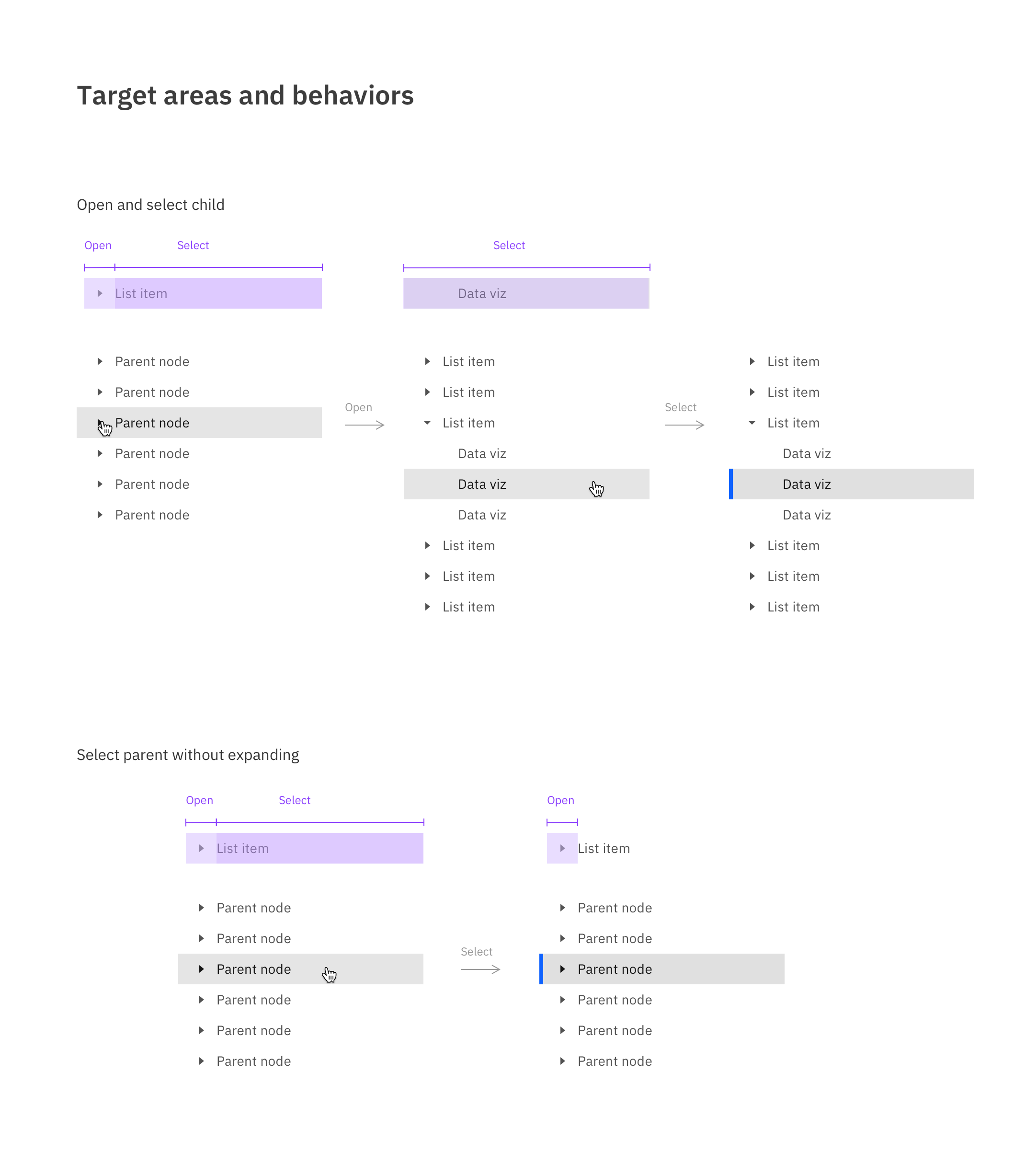
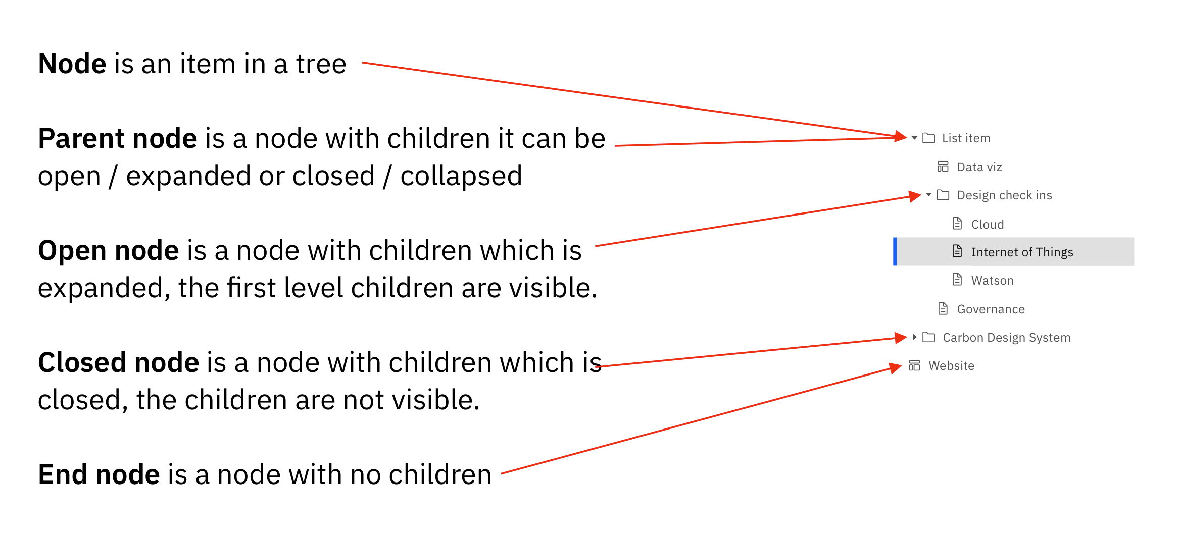
Select a parent node without expanding the children so a user can see information tied to the parent node.
Open a parent node without it taking selection so I can keep my current selection in view while I open/close other nodes in the tree.
Add any number of children or parent nodes under a parent so a user is not limited to one type of child.
Have multiple parent nodes open at the same time so I can browse without losing my orientation.
Collapse a parent with a selected child without the parent taking the selection state to avoid accidental selection change.
See which node is selected even if the parent node is collapsed so I know when a hidden child is selected (Parent node inherits the selected state?)
Have my opened nodes remain open even if their parent is collapsed and then opened again. The nodes should remain in the same open or closed state.
As a product team implementing a data tree, I want to...
Have the option to represent the node's file type by an icon so the user can understand the node's file type.
Have the option to not use a file type icon when the file type is not important for my data.
Show a node as disabled so the user knows it cannot be active.
Support the ARIA keyboard and mouse behaviors for tree view here https://w3c.github.io/aria-practices/#keyboard-interaction-23 2 so the user's expectations are consistent for other trees.
Keyboard Behaviors for a vertically oriented tree:
When a single-select tree receives focus:
If none of the nodes are selected before the tree receives focus, focus is set on the first node.
If a node is selected before the tree receives focus, focus is set on the selected node.
When a multi-select tree receives focus:
If none of the nodes are selected before the tree receives focus, focus is set on the first node.
If one or more nodes are selected before the tree receives focus, focus is set on the first selected node.
Right arrow:
When focus is on a closed node, opens the node; focus does not move.
When focus is on a open node, moves focus to the first child node.
When focus is on an end node, does nothing.
Left arrow:
When focus is on an open node, closes the node.
When focus is on a child node that is also either an end node or a closed node, moves focus to its parent node.
When focus is on a root node that is also either an end node or a closed node, does nothing.
Down Arrow: Moves focus to the next node that is focusable without opening or closing a node.
Up Arrow: Moves focus to the previous node that is focusable without opening or closing a node.
Home: Moves focus to the first node in the tree without opening or closing a node.
End: Moves focus to the last node in the tree that is focusable without opening a node.
Enter: activates a node, i.e., performs its default action. For parent nodes, one possible default action is to open or close the node. In single-select trees where selection does not follow focus (see note below), the default action is typically to select the focused node.
Type-ahead is recommended for all trees, especially for trees with more than 7 root nodes:
Type a character: focus moves to the next node with a name that starts with the typed character.
Type multiple characters in rapid succession: focus moves to the next node with a name that starts with the string of characters typed.
- (Optional): Expands all siblings that are at the same level as the current node.
Mouse Behaviors
Click on a node sets focus and selects the node
Ctrl-click on a node focuses and selects the node. Previous selections are maintained.
double click on an end node causes any associated action to be invoked. Open issue: are there ever parent nodes that have an action other than expand or collapse?
click on a closed node opens the node.
click on expand / collapse icon associated with a parent node toggles the expand/collapse of the node
Future functionality to be considered
Multi select:
Selection in multi-select trees: Authors may implement either of two interaction models to support multiple selection: a recommended model that does not require the user to hold a modifier key, such as Shift or Control, while navigating the list or an alternative model that does require modifier keys to be held while navigating in order to avoid losing selection states.
Recommended selection model -- holding a modifier key while moving focus is not necessary:
Space: Toggles the selection state of the focused node.
Shift + Down Arrow (Optional): Moves focus to and toggles the selection state of the next node.
Shift + Up Arrow (Optional): Moves focus to and toggles the selection state of the previous node.
Shift + Space (Optional): Selects contiguous nodes from the most recently selected node to the current node.
Control + Shift + Home (Optional): Selects the node with focus and all nodes up to the first node. Optionally, moves focus to the first node.
Control + Shift + End (Optional): Selects the node with focus and all nodes down to the last node. Optionally, moves focus to the last node.
Control + A (Optional): Selects all nodes in the tree. Optionally, if all nodes are selected, it can also unselect all nodes.
Alternative selection model -- Moving focus without holding the Shift or Control modifier unselects all selected nodes except for the focused node:
Shift + Down Arrow: Moves focus to and toggles the selection state of the next node.
Shift + Up Arrow: Moves focus to and toggles the selection state of the previous node.
Control + Down Arrow: Without changing the selection state, moves focus to the next node.
Control + Up Arrow: Without changing the selection state, moves focus to the previous node.
Control + Space: Toggles the selection state of the focused node.
Shift + Space (Optional): Selects contiguous nodes from the most recently selected node to the current node.
Control + Shift + Home (Optional): Selects the node with focus and all nodes up to the first node. Optionally, moves focus to the first node.
Control + Shift + End (Optional): Selects the node with focus and all nodes down to the last node. Optionally, moves focus to the last node.
Control + A (Optional): Selects all nodes in the tree. Optionally, if all nodes are selected, it can also unselect all nodes.
Type ahead:
Type-ahead is recommended for all trees, especially for trees with more than 7 root nodes:
Type a character: focus moves to the next node with a name that starts with the typed character.
Type multiple characters in rapid succession: focus moves to the next node with a name that starts with the string of characters typed.
- (Optional): Expands all siblings that are at the same level as the current node.
Horizontally scroll within the tree container so I can read text that may be cropped.
Have the ability to edit (create, update name, delete) any node.
See the loading state when children nodes may take a while to load.
Scroll up and down a tree inside a container and know there's more content above or below that isn't shown.
Have the option to use a border bottom as a divider between nodes to help with visual grouping or to use no border bottom.
Dock the parent node on scroll so the user can always see the parent.
Have the ability to take batch action on nodes so I can edit multiple at once.
Can drag and drop a node anywhere in a tree to change its location.
Can see the number of children inside a parent node without expanding the parent. For example, a number (3) representing the children.
Can search a tree to find the node I'm looking for.
Can adjust the viewing container's width so a user can read the text of deeply nested nodes.
Can change the sort method and order so I can browse the data by any sort of metadata.
Tree view
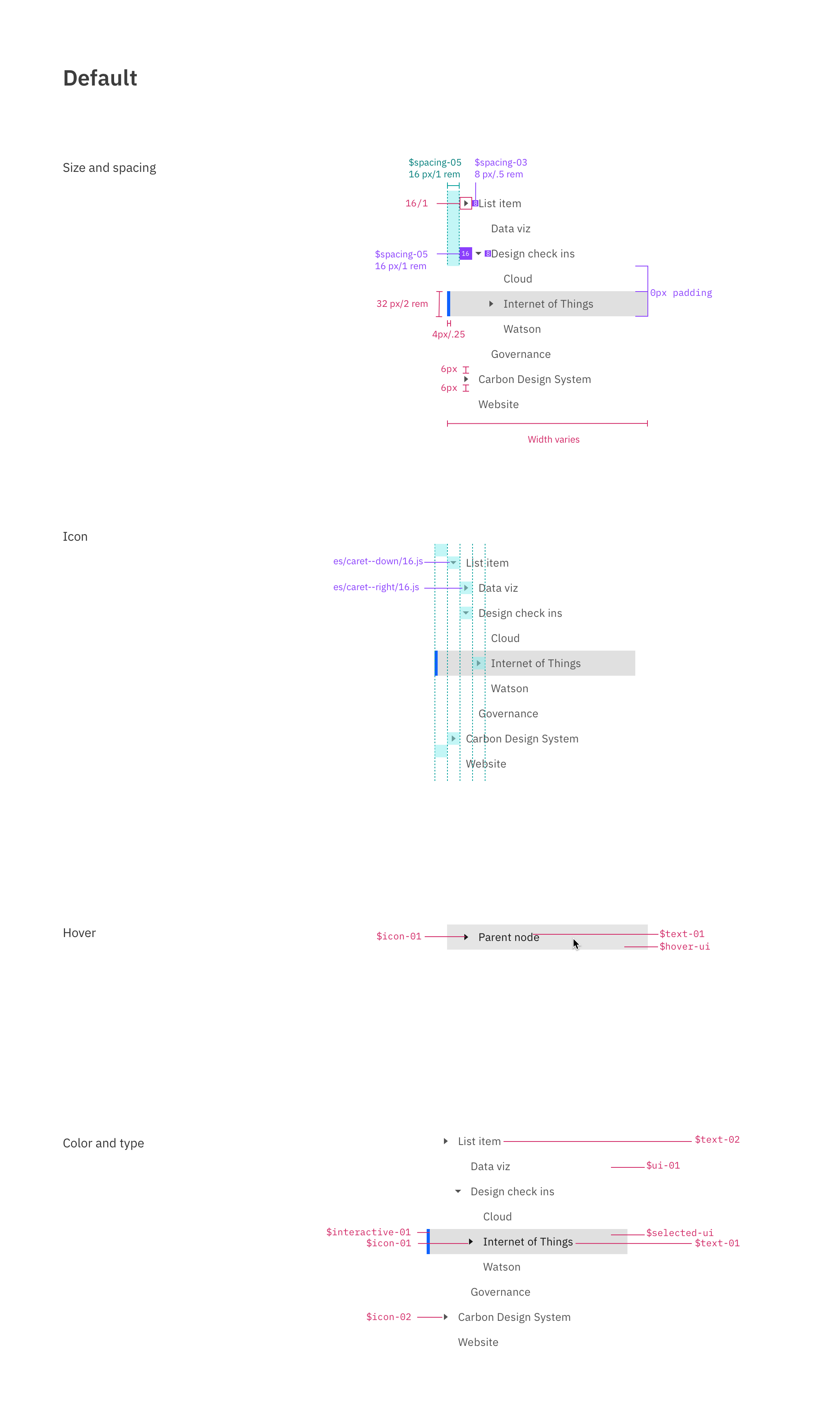
Default
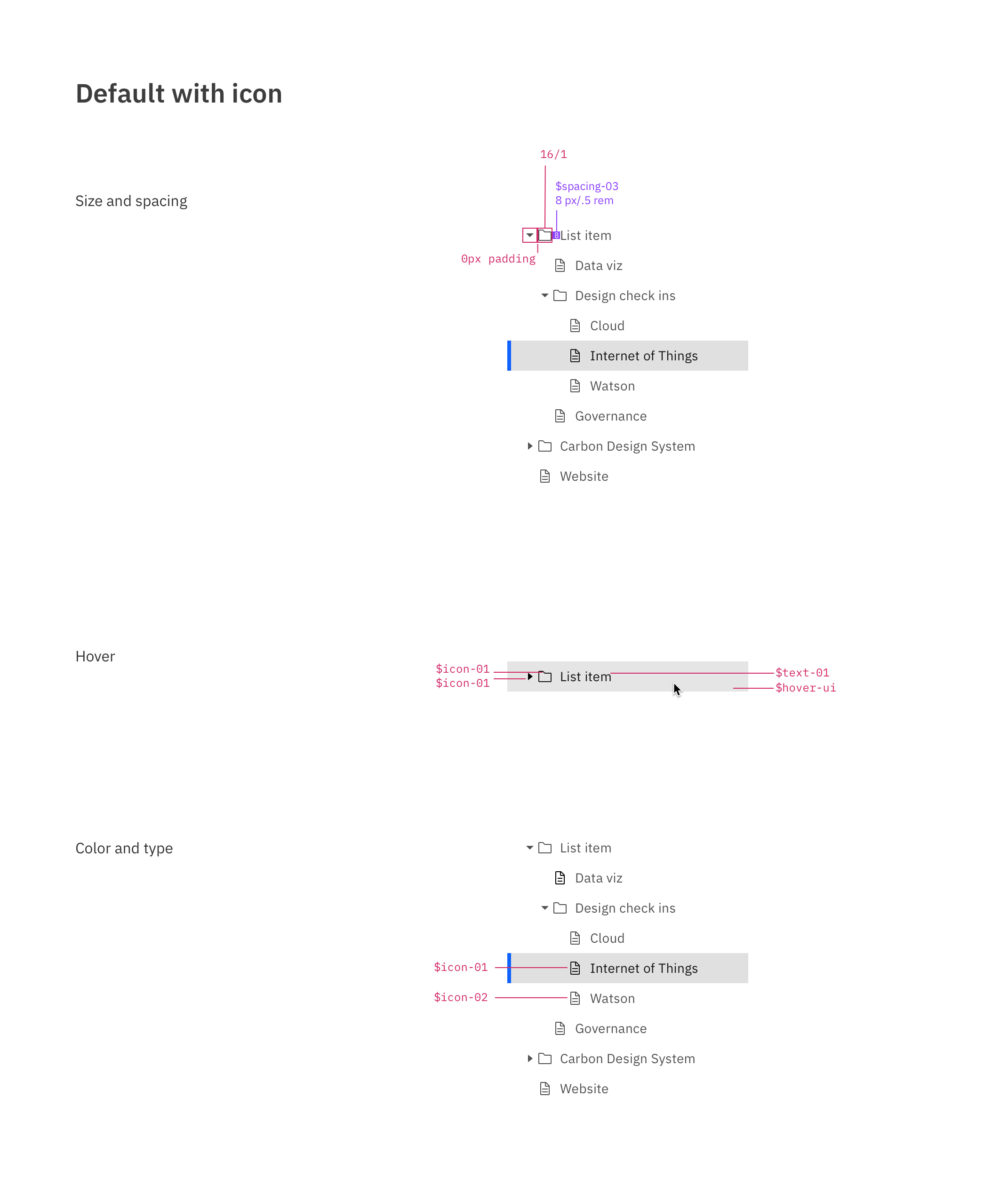
Default with icon
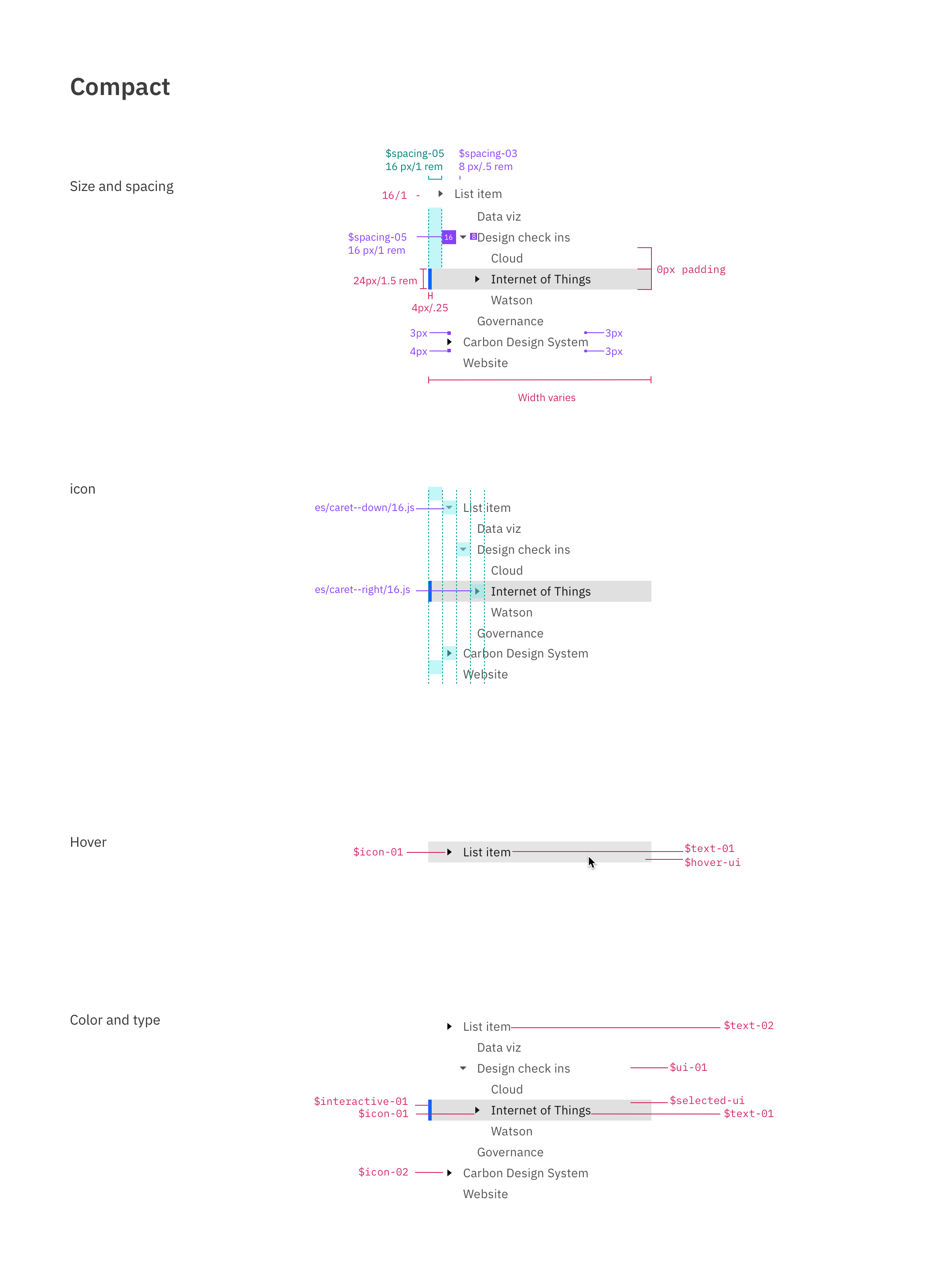
Compact
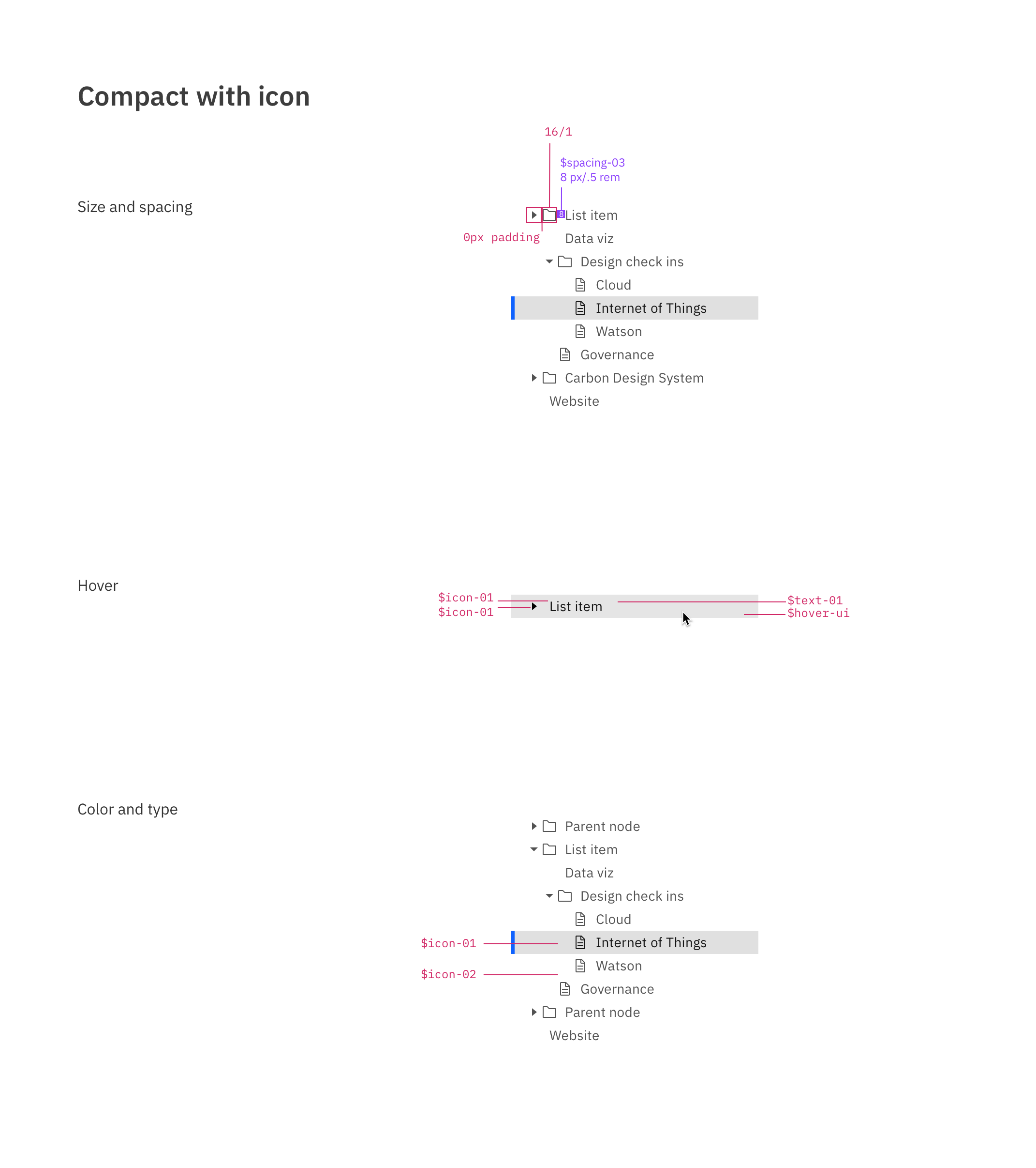
Compact with icon
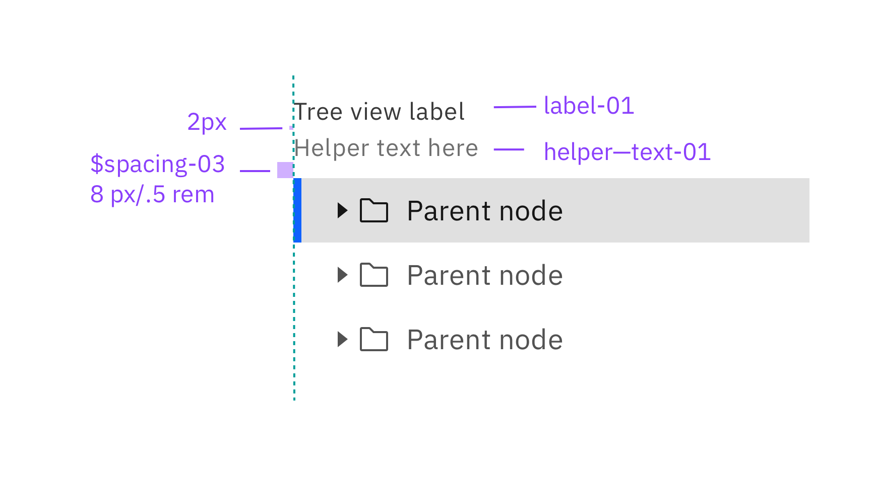
Label and helper text
Target areas and behaviors
Sketch kit
Usage docs
Explorations
[X] Aesthetics are closer to the left nav than the accordion.
This includes:
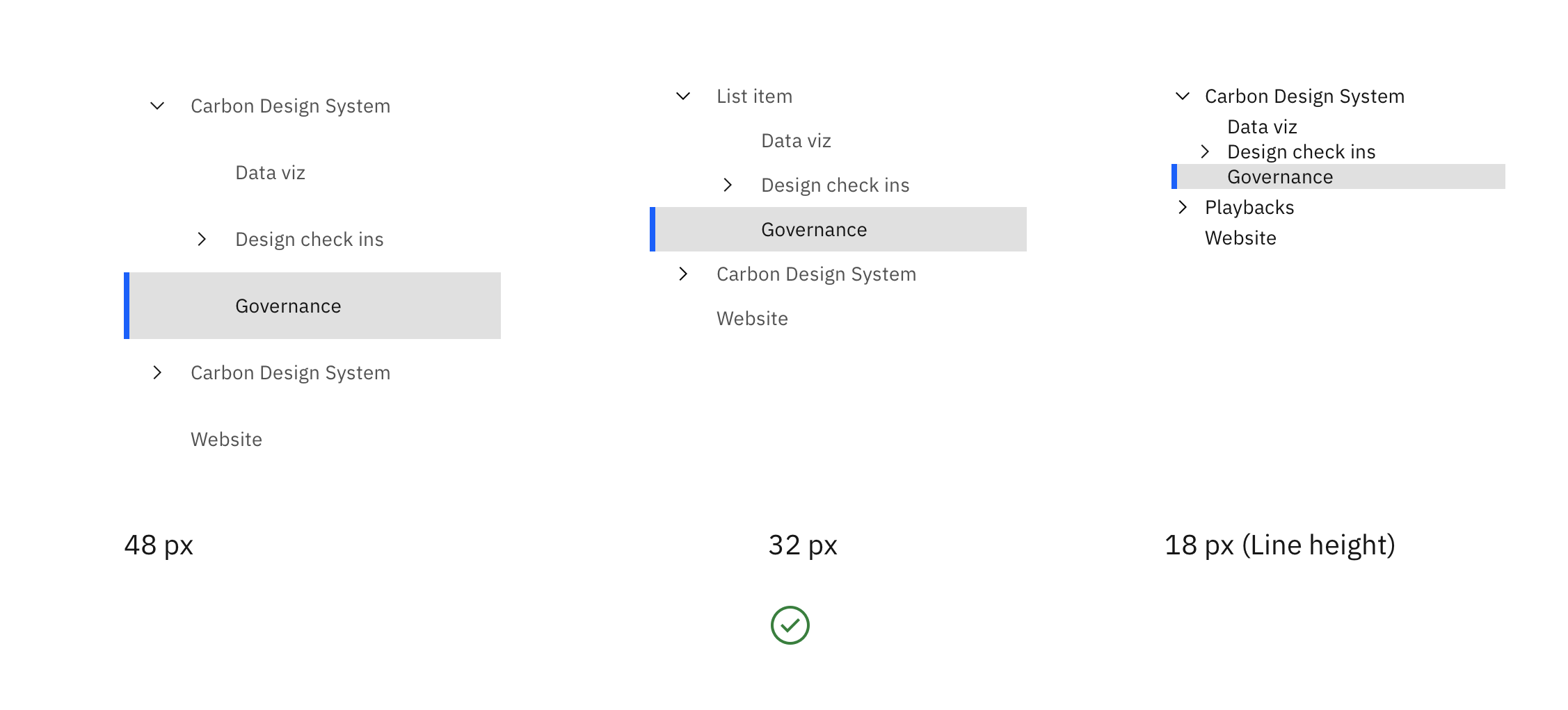
a line-height at 32px
Dividing rules give the tree a closer appearance to the accordion and disrupts the indented grouping of the children nodes if they go full width
Using the 16px caret instead of the chevron. The use of a caret reduces the amount of noise when used with the file type icons that are illustrated with a similar line to the chevron and +/-. The chevron can also be placed against file type icons to give more horizontal room for the node title.[X] Offer variants with file type icon and without file type icon
[X] custom icon (for nodes and/or expand/collapse icon)
[x] Node type (File type) represented by an icon

[x]
+and-vs. chevrons. vs carets

[x] Diving rules vs. no dividers

[x] Expressive vs. productive geometry
[x] Should there be a list counterpart for when there are no children nodes? What does a tree look like where there are no children? Is it just a list?
[x] Graphical element for grouped children nodes (gray blocks like IoT, vertical rules like VS code)

[X] Docked parent nodes similar to VS code.

[X] Hover state
[x] Should parent nodes have a folder file type icon or just the caret? With no parent file type, the alignment of the children nodes is clearer. Not having this icon works better if we chose to use vertical rules for grouping children nodes.

[X] Should the vertical rules change or appear when the user hovers in the tree area? When a node is selected?

Not explored yet (depending on requirements)
- [ ] Geometry for actions on the nodes (checkbox, edit, drag). This depends on the requirements - not explored yet
- [ ] Define the component's intended use: browsing file directory, as navigation?
- [ ] Does the tree exist inside a container or is delivered as an individual node component?
- [ ] Loading state when the children node content may take a while
- [ ] What is the hit area for a node? The caret and icon? The whole row? The text? Are there separate hit areas?
- [ ] can parent nodes be selected without being open?
- [ ] What other types of content would need to be in a node. The number of children? (3)
- [ ] Tree container to define the bounds of the tree, scrolling and docked node behavior, placement of additional functionality.
- [ ] Search
- [ ] Pagination
- [ ] Entering different modes
- [ ] drag and drop reordering/nesting
- [ ] support for different selection styles, e.g. with checkboxes or directory style selection (Ctrl/Cmd + click or Shift + click)
To do:
- [X] Sync up with IoT and their list component
- [x] Sync with cloud and their tree
- [x] Review with Carbon design team
- [x] Review with Carbon development team
- [x] Write docs based on the latest component template.
Reference:
- Follow W3C standards here https://www.w3.org/wiki/TreeView and here https://www.w3.org/TR/aria-role/roles#tree
- Prototype example from WKC https://pages.github.ibm.com/conrad-schmidt/Tree/build/
- Specs from WKC https://ibm.box.com/s/azascty1rmgik858zy1kw3cw6f0a4zo1
- Target size for pointer input must be 44 by44 pixels (AAA) https://www.w3.org/WAI/WCAG21/Understanding/target-size.html
- Tree grid https://www.w3.org/TR/aria-role/roles#treegrid
- Tree role https://www.w3.org/TR/aria-role/roles#tree
- https://www.w3.org/TR/aria-role/roles#treeitem
- Data structures https://en.wikipedia.org/wiki/List_of_data_structures#Trees
 designertyler
All 25 comments
My project need a tree view component on React. May I know when this will be in Carbon? Thanks.
 wangweiu
on 18 Feb 2020
wangweiu
on 18 Feb 2020
@designertyler Really awesome work here! We have a coded version of the Tree in Cloud PAL that could be adapted to for this.
 loganmccaul
on 6 Mar 2020
loganmccaul
on 6 Mar 2020
@designertyler
Hi, I wonder the statue of this feature, i have to use DataTable to implements my treeview now, thanks.
 vincent-pli
on 5 Jun 2020
vincent-pli
on 5 Jun 2020
the features we planned for the first version of the component are complete, we are just fulfilling some important accessibility requirements and testing before releasing
 emyarod
on 5 Jun 2020
emyarod
on 5 Jun 2020
@emyarod Thanks for quick reply, so how long could i adopt the new feature? or is the feature already ready in the master?
vincent-pli
on 8 Jun 2020
the v1 feature set is ready (pending a11y review) and will be included in an upcoming release this month
emyarod
on 8 Jun 2020
@emyarod
Glad to hear that, thanks very much.
vincent-pli
on 9 Jun 2020
Hi, looking forward to the component to go live! But I get questions on the pattern below:
- Icon for the collapsed and expanded state
- The chevron direction(point to the right instead of the top when collapsed)
Any reason why we have different patterns for these?
 apiconnecttesting
on 16 Jun 2020
apiconnecttesting
on 16 Jun 2020
@apiconnecttesting That’s a good question. The main driver for having the collapsed state point right was most data trees follow that behavior so many users will be familiar with the meaning of those two states.
An issue with the caret pointing up for collapsed is that it takes that extra time to determine if the icon represents the current state of the node or the action it will take if I click on it.
An advantage of using a right-pointing caret for closed and down-pointing for open is that it reinforces the flow and hierarchy of the data.
We also considered + and - and may consider adding them as an option.
Did you have feedback for using one pattern vs. the other?
designertyler
on 16 Jun 2020
@emyarod any update on this?
 andrea-gm
on 16 Jul 2020
andrea-gm
on 16 Jul 2020
IBM Accessibility is currently investigating accessible navigation patterns for this component. Until we have the green light to release, I am looking to first release this behind an experimental feature flag
emyarod
on 16 Jul 2020
Reminder that the Usage docs are missing the Interactions section with its Mouse, Keyboard, and Screen readers subsections under Behaviors (note that in other Carbon doc, this is called "Behaviors" and not "Behavior").
 carmacleod
on 20 Aug 2020
carmacleod
on 20 Aug 2020
Is this a typo? Should this line just be deleted?
Ctrl-Arrow-Space - Selects non-contiguous nodes
It is already covered by the line that immediately follows it:
Ctrl-Spacebar with focus on an item toggles the selection of the item
carmacleod
on 20 Aug 2020
Is this a typo? Should this line just be deleted?
Ctrl-Arrow-Space - Selects non-contiguous nodes
It is already covered by the line that immediately follows it:
Ctrl-Spacebar with focus on an item toggles the selection of the item
@carmacleod These keyboard behaviors were sourced from https://www.w3.org/wiki/TreeView
I believe the first one behavior is meant to enable multi selection behavior similar to what you can do with the mouse:
This animation shows the mouse:
- Click on
UI-shell-left-panel
(UI-shell-left-panelis selected) - Shift+click on breadcrumb
(The nodes within the range are automatically selected) - Shift+command+click on
text-inputandtile
(those nodes are selected individually rather than the range.)

I'll update the usage docs. I think they were following an old version of the template and I haven't touched them in a while. Thanks for the feedback!
designertyler
on 20 Aug 2020
Note that the TreeView keyboard behaviors section in the Aria Practices Guide has a subsection for Selection in multi-select trees that is missing from this issue, but should be followed when the tree is multiselectable.
You won't be able to implement the "Recommended selection model" because you want unmodified Space key to select and "activate" (i.e. perform the default action, just like the Enter key). So you need to look at implementing the "Alternative selection model".
carmacleod
on 20 Aug 2020
These keyboard behaviors were sourced from https://www.w3.org/wiki/TreeView
I would lean more heavily on the ARIA Practices Guide for recommended keyboard shortcuts. That wiki page was last updated in 2012, and "Ctrl-Arrow-Space" isn't really a thing. :)
Click... Shift+click... Shift+command+click...
For mouse behaviors, you will want to go with Command+click for non-contiuous selection (not Shift+command+click).
I'll update the usage docs.
Thanks @designertyler !
carmacleod
on 20 Aug 2020
Hi! Any update about the TreeView? Would love to hear how it's development is going! :)
 joseph00
on 2 Sep 2020
joseph00
on 2 Sep 2020
@joseph00 it was merged in 8 days ago (https://github.com/carbon-design-system/carbon/pull/6008) and should be included in the next release (10.19.0) scheduled for later this week 🙂
 tw15egan
on 2 Sep 2020
tw15egan
on 2 Sep 2020
Is there a sample code on how to use it? I tried this but seems like it doesn't have any styling applied:
CodeSandbox
Edit: Nevermind. Found out I have to import the styling manually:
import "carbon-components/scss/components/treeview/_treeview.scss";
Is this because it's an experimental feature?
 akmalhakimi1991
on 13 Sep 2020
akmalhakimi1991
on 13 Sep 2020
Do we have an idea of when this will go live?
 pascal-potvin
on 6 Nov 2020
pascal-potvin
on 6 Nov 2020
the experimental component is already available to use, but further enhancements and variations have been delayed for the time being
emyarod
on 9 Nov 2020
the experimental component is already available to use, but further enhancements and variations have been delayed for the time being
Thanks @emyarod for the swift response. Is this the experimental aspect I should be sharing with my teams? https://codesandbox.io/s/polished-glitter-zkcss?file=/src/App.js
pascal-potvin
on 9 Nov 2020
@pascal-potvin yes, if it works for your use case!
emyarod
on 9 Nov 2020
Is there checkbox support for this? Can't wait for it to come out 👍
 mtucciarone
on 16 Nov 2020
mtucciarone
on 16 Nov 2020
@mtucciarone progress on this enhancement will be slow but it is on the roadmap
emyarod
on 16 Nov 2020
Related issues
 ajdaniel
·
3Comments
ajdaniel
·
3Comments
 antonmc
·
3Comments
antonmc
·
3Comments
 skaparelos1
·
3Comments
skaparelos1
·
3Comments
 mouadcherkaoui
·
3Comments
mouadcherkaoui
·
3Comments
 kalyanixraut
·
3Comments
kalyanixraut
·
3Comments
Most helpful comment
My project need a tree view component on React. May I know when this will be in Carbon? Thanks.