Carbon: [Tabs] remove dropdown variant for tabs
Proposal Accepted
Design spec: https://github.com/carbon-design-system/carbon/issues/4758#issuecomment-579347916
Original issue
Currently, our tab components render in the following way by default:

When the browser screen width gets smaller, it then turns into a dropdown:

There are a couple of issues with this approach, namely:
- The measurement that determines when the tab switches to a dropdown is based on browser width, and not width available to a component which is preferred
- Having the markup represent a listbox/dropdown instead of tabs is confusing for a screen reader user and results in the control being un-perceivable as a tablist
This issue is to decide on potentially two things:
- [ ] Should we remove the dropdown variant of tabs?
- [ ] If so, what would the alternative be?
Some operational things we'd need to do:
- Reach out on Slack to see if teams are using this
Related
 joshblack
All 25 comments
CC @carbon-design-system/design
 asudoh
on 23 Nov 2019
asudoh
on 23 Nov 2019
We were noticing this is how Youtube handles their responsive tabs (the horizontal overflow like you discussed)

I think this works fairly well for our normal tabs in Cloud. However, we're trying to combine that interaction with a higher level of navigation (on-page left-nav) that also needs to collapse, which we were also responding into a dropdown. Is the dropdown model always inaccessible, or just for horizontal tabs?
 tessarodes
on 6 Dec 2019
tessarodes
on 6 Dec 2019
@tessarodes the problem we were running into when going from tabs to the dropdown is that under the hood these are two distinct pieces of functionality that screen readers use, namely tabs and listbox, with different interaction models.
For tabs, we might see something announced like:

For listbox (dropdown), this would look like:

Looking between the two, the tabs example clearly associates the content area with the tab where-as the dropdown will only inform the user of an option selected which seems like a potentially inoperable experience as the user may not know how to navigate to the part of the page that they are changing.
joshblack
on 8 Dec 2019
joshblack
on 9 Dec 2019
The left/right arrows really help this interaction too. The scrolling tabs without any indicators could easily be over looked (like on google) but this youtube example seems a lot better. Plus it give you a click target if you're not on a touch screen and can't easily swipe.
 aagonzales
on 12 Dec 2019
aagonzales
on 12 Dec 2019
_Proposal Triage Meeting, January 21st 2020_
Next Steps
- [x] Need a design for scrolling tabs (inspired by YouTube above)
- Figure out dev impact of removal
- Does it mess up designs
- How could we introduce it safely
joshblack
on 21 Jan 2020
Designs for responsive tabs
Status: Ready for dev 🤖
Sketch file: https://ibm.box.com/s/polgkcgh8ypvi1pkttmieubulzja9jqj
Interactions
- one click of the scroll arrow jumps/scrolls to have the next full tab show.
- click and hold should jump to the start/end of the tab group.
Default tabs

In content / grid alignment


Container tabs

In content / grid alignment


aagonzales
on 28 Jan 2020
@aagonzales is this supposed to show at a specific window size, or is it always available?
joshblack
on 28 Jan 2020
Always available, basically whenever overflow would happen.
aagonzales
on 29 Jan 2020
@aagonzales What are the Keyboard Interactions for this new design?
Some things to think about:
- do the scroll arrows take focus? (It looks as though they do in the picture?)
- if they do, then is a keyboard user expected to type left/right arrow keys to move through the Tabs, then switch to typing space or enter when they get to the arrow button, then switch back to arrow keys to move into newly-shown Tabs? (I think that would be odd...?)
- the keyboard interaction might feel more natural if the scroll arrows don't take focus (and if they are hidden from screen readers, i.e. use div/span with aria-hidden="true" and no role) so that users only need to use arrow keys to traverse the Tabs. I don't know for sure - just trying to think it through. 😄
does the Tab content (i.e. tabpanel) automatically switch as the user types arrow keys to move through the Tabs? Or does the user need to type space or enter to "activate" a Tab? (or does the Tabs control handle both, and the author can choose?)
does the
tabkey take the user directly to the currently-selected Tab's content? (probably should, because if there's going to be the possibility of many Tabs, it would be a chore for a keyboard user to have to type thetabkey so many times to get past all of those Tabs. :)do the Home and End keys do the same as click and hold, i.e. jump to the start/end of the tab group?
how about PageUp and PageDown - might be nice to have those jump to every... 10th(?) Tab, particularly if there are many tabs.
does the Delete key delete the current Tab (if it's delete-able) ?
 carmacleod
on 20 Feb 2020
carmacleod
on 20 Feb 2020
@carmacleod As I'm not a keyboard navigation expert I will gladly defer to your decisions on the topic.
aagonzales
on 20 Feb 2020
... but I am not a designer, so for new patterns I can only make suggestions and hope that someone from design will be able to think it through and take over. 😄
(by "new", I mean the scroll arrows. A regular Tabs control already has keyboard guidance.)
carmacleod
on 20 Feb 2020
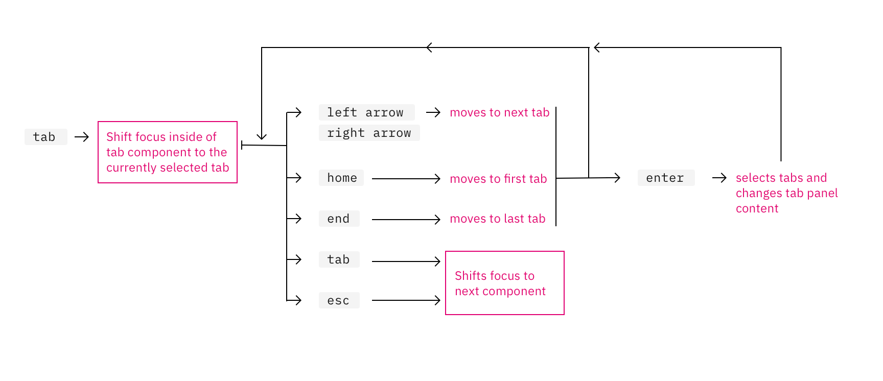
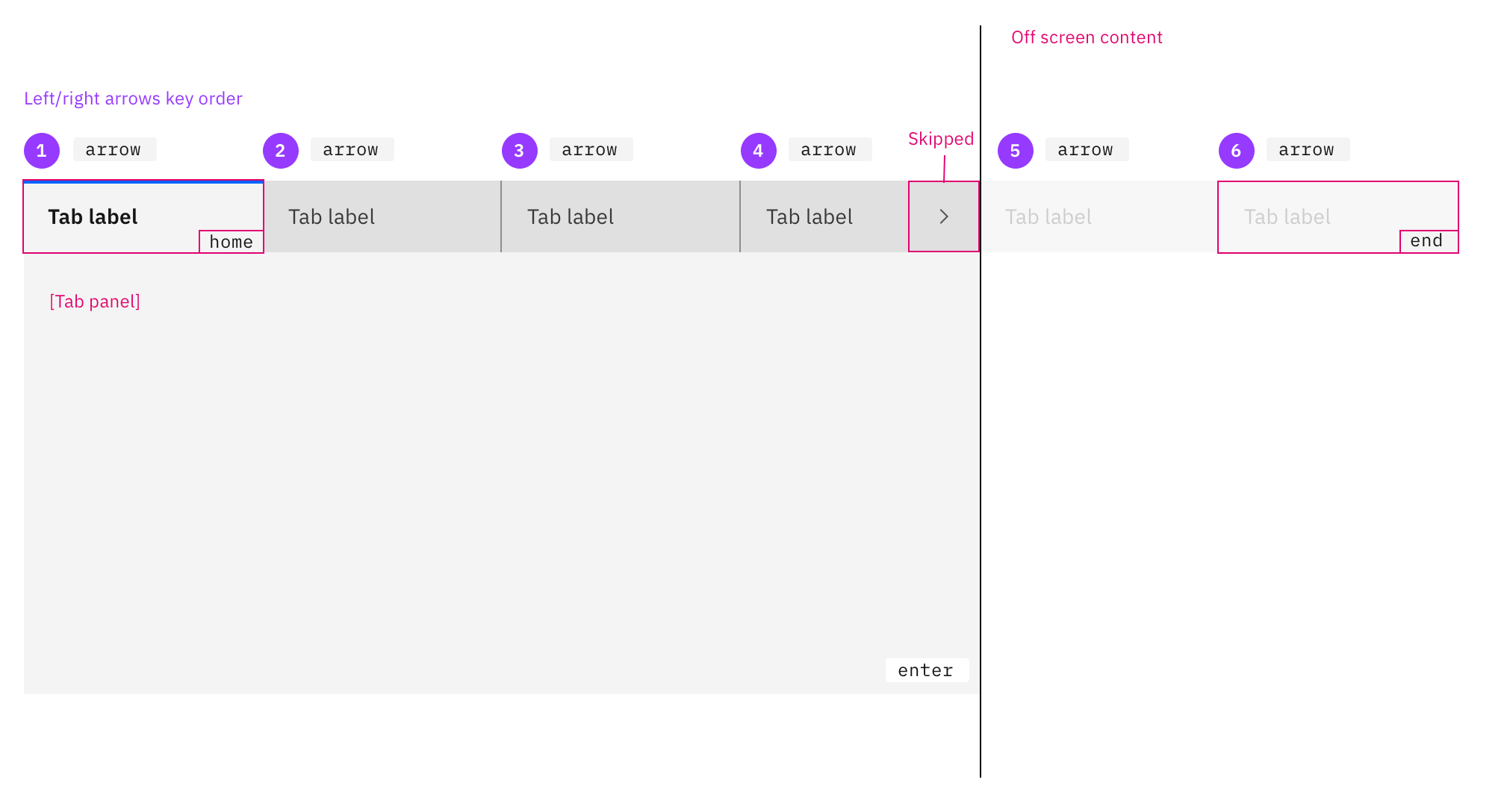
Keyboard navigation:
tab: traps focuses in the tab component starting at the select tab.
- press
tabagain and focus will move out of the tab component and not the next tab inside the component. - clicking
tabat any point while inside tab component will move focus to the next focusable item on page.
- press
left arrowandright arrow: navigates through the component tabs.
- focus remains on the tab component and rotates through tab order continuously.
- Tab panel content does not change with
arrownavigation
enterselects and open that tabs panel's content.- Scrolling arrow buttons will be excluded from screen reader and keyboard arrow selections.
escmoves focus off the tab component and onto the next focusable item on page.homekey takes the user to the first tab.endkey takes the user to the last tab.
Visual aids
I made a visual to help my visual brain:
aagonzales
on 26 Feb 2020
Hi @aagonzales - that looks great!
I would only suggest a couple of changes:
enterselects and open that tabs panel's content.
spaceorenter
escmoves focus off the tab component and onto the next focusable item on page.
- I would just delete this one. Users would just use the
tabkey to move the focus.
Theesckey is usually used for "closing things", like a dialog, menu, or popup/dropdown list. :)
- I would just delete this one. Users would just use the
Thanks so much for doing this!
carmacleod
on 10 Mar 2020
Any ETA on release for this update? Would like to plan ahead to prepare for any updates I need to do in my code.
 gptt916
on 27 Apr 2020
gptt916
on 27 Apr 2020
Hey @gptt916! 👋 No immediate updates plan, we will try and share any changes to this in our monthly planning issues that we pin in the issues tab 👀
joshblack
on 12 May 2020
just want to confirm: this spec is finalized to replace dropdown tabs and is ready for dev?
 emyarod
on 10 Jun 2020
emyarod
on 10 Jun 2020
Yes, it its good to go @emyarod
aagonzales
on 10 Jun 2020
Hi @aagonzales and @emyarod, please consider if the Carbon implementation would include consideration of different widths of the tab. For example, on the storybook, I see currently a Tab has width about 160px. A Tabs component of 800px wide may fit say 4 tabs. If the Tabs component has narrower width like 600px, the scrollable tabs may be enabled and show say 3 tabs at a time. When user clicks on the right arrow, it would show the next 3 tabs or so.
But if a team adopted Tabs and Tab component and each Tab can only be say 100px wide for that page. Then the Tabs component of 600px may fit 5 tabs instead. So how does the developer use the component to show 5 tabs instead of 3? When user clicks on the right arrow, the widget should show the next 5 tabs instead of 3. I would like to know how much customization a team has to do. Or would the new Tabs component take this into account?
 gracelo
on 6 Jul 2020
gracelo
on 6 Jul 2020
I believe the topic of responsive tab widths has come up previously so I will defer to decision around that to @aagonzales, but in the meantime as a workaround, tab widths can be modified via CSS
emyarod
on 6 Jul 2020
@gracelo essentially as long as each tab is the same width as each other and has at least 16px of padding on the right then the width of the tabs can be any size. We know tabs width has some problems currently and we are looking into it.
aagonzales
on 7 Jul 2020
As this is the expected behaviour for responsive tabs - could/should the current behaviour where the tab is switched out to a dropdown be marked as deprecated. We use the carbon design system but have our own component implementation and _almost_ went ahead and implemented the current responsive tab behaviour in our own component - before luckily stumbling across this
 johnjesse
on 31 Jul 2020
johnjesse
on 31 Jul 2020
I searched the WAI ARIA Best Practices, I could _not_ find any guidance on responding to more narrow (phone width) views for _Responsive Tabs_ (or any other component). I did notice an issue raised with the W3C working group, but not yet in their implementation milestone plan:
Consider adapting the tabbed interface component so it morphs to a show/hide in mobile view #1458.
Its not clear to me where the Mobile and Responsive is on the working groups agenda. But keyboard operation needs to be addressed, designed, and documented.
To comment, file an issue in the W3C ARIA Practices GitHub repository, or if that is not possible, send email to [email protected] (comment archive).
 philljenkins
on 31 Jul 2020
philljenkins
on 31 Jul 2020
@aagonzales We have a tabbed interface in our application where the the text in each tab is based on user data (as is the number of tabs displayed). Currently each tab takes up as much space as it needs meaning each tab is most likely a different width to the others. When there is not enough screen real estate we start collapsing them longest first until that is the width of the next longest at which point that one starts collapsing as well and so on. This is obviously not in line with the scrolling interface specified above.
You made a comment above stating that all the tabs should have the same width. What that means in our scenario is that some tabs may end up being elided and some tabs have far more space than needed as the tab widths have all been fixed at an arbitrary value. Allowing them to take the space they require means there may be a reduced need for scrolling as the smaller tabs don't take up more space than they need so the larger tabs might still fit.
What I'd like to propose for our scenario is that tabs always take up as much space as needed and if that happens to be wider than the available screen real estate then we implement the scrolling behaviour you suggest. Would that be acceptable?
You also define the behavior of the tabs to be Select on Enter key press. Currently all of our tabs are automatically activated, i.e. activated when the user uses the arrow key as per the example linked to from here - https://www.w3.org/TR/wai-aria-practices-1.1/#tabpanel. Is that still acceptable? If so, should the design spec be reworded to accommodate this?
 MarkFalconbridge
on 4 Aug 2020
MarkFalconbridge
on 4 Aug 2020
@aagonzales On a windows machine the scrollbars are more prominent than on a Mac, are we supposed to hide the default scrollbar that the user would see when there is insufficient space to render all the tab elements? There are an awful lot of caveats about styling scrollbars - https://caniuse.com/#feat=css-scrollbar.
MarkFalconbridge
on 13 Aug 2020
Related issues
 AnthumChris
·
3Comments
AnthumChris
·
3Comments
 jendowns
·
3Comments
jendowns
·
3Comments
 skaparelos1
·
3Comments
skaparelos1
·
3Comments
 ajdaniel
·
3Comments
carmacleod
·
3Comments
ajdaniel
·
3Comments
carmacleod
·
3Comments
Most helpful comment
The left/right arrows really help this interaction too. The scrolling tabs without any indicators could easily be over looked (like on google) but this youtube example seems a lot better. Plus it give you a click target if you're not on a touch screen and can't easily swipe.