Carbon: The close button in Modal component should have a tooltip
Summary
Sighted users may benefit from a tooltip on the modal's close button.
Justification
Possible WCAG 2.1 compliance
"Must have" functionality
When a sighted user hovers over the close button (an X icon) they are presented with a tooltip saying "Close".
ref #3630
 dakahn
All 18 comments
My understanding from #3630 is that this enhancement is specifically for the vanillaJS component, and would make the behaviors consistent with what is already present in the React component.
 chrisconnors-ibm
on 2 Oct 2019
chrisconnors-ibm
on 2 Oct 2019
@carbon-design-system/design
dakahn
on 2 Oct 2019
Yup, it should work like the react version (like Chris said).
 aagonzales
on 2 Oct 2019
aagonzales
on 2 Oct 2019
@aagonzales @dakahn @chrisconnors-ibm there are flaws with how the react version works as mentioned in the #3630 because it doesn't appear for sighted keyboard users. The issue was originally created for Vanilla because WH has bandwidth for us to make the change in Carbon vanilla version once approved but it would then need to be carried over to react as well. (i've been creating issues for the react work once the vanilla work has been approved/merged).
 elizabethsjudd
on 2 Oct 2019
elizabethsjudd
on 2 Oct 2019
I apologize; I had a hard time following the narrative on #3630 as to what was actually being proposed, to what scope, who benefits, what the costs are (possibly to the experience for other user types).
@elizabethsjudd can you concisely articulate what is being proposed, to which components, the benefits, the costs. what 'done' looks like? That will make it that much easier to verify and approve your PR when it's ready. If you have supporting rationales (like links to rules being violated, or best practices we're out of sync with) that will also help improve the teams receptiveness.
Thanks - I know this has been hanging around in limbo, but we're trying to improve our posture and supportiveness wrt contribution. I appreciate your patience as we try to establish work practices and policies around those issues.
chrisconnors-ibm
on 2 Oct 2019
@chrisconnors-ibm This is a demo of what WH is proposing as a final solution: https://pages.github.ibm.com/liz-judd/design-library/components/detail/modal--transactional.html (demo uses the gray 90 theme)
WH is using the Icon Tooltip component for the close button of the modal instead of a standard button that uses only an icon with an aria-label and title attribute (what's implemented in React).
Rationale
- gives textual description for all users - title attribute does not support sighted keyboard users and is duplicated content for some screen reader users as some will read both the
aria-labelandtitleattribute content - consistency - Carbon uses the icon tooltip for the icon-only button which is what the modal close button is, so we should use the same tooltip styling for all instances of icon-only buttons. WH has already contributed updates to the overflow menu component to use the Icon Tooltip and has a request to make the same a11y enhancement for notifications (#3631) to have consistency across the entire component suite
- IBMa AAT 2.1 update - the new HTML markup removes the potential violation thrown by DAP about having a visible textual label for inputs (verified on the icon tooltip, overflow menu, and icon-only button demos)
We recognize that Carbon does not consider this a bug and has dropped its priority since it's deemed an enhancement. However, in January this will be a violation for sighted keyboard users when WCAG 2.1 is required. Watson Health is working hard to get ahead of the WCAG 2.1 requirements and prioritized this enhancement in our code base. Currently though, we have to copy and paste Carbon code in to WH; meaning changes from Carbon aren't passed through and require additional developer time to catch and apply changes when updating versions of Carbon.
This concept of chasing Carbon has proven to be a large time-sink and drastically slows our dev team down. As a team we've come to the conclusion that the best way for us to alleviate this burden is to make these contributions directly to Carbon from the get-go (this gives the added benefit to all of IBM as well) and have allowed for this in our planning but we must have the issues assigned to us before we begin working on them so we know that the Carbon team has agreed to the work we are going to put in.
elizabethsjudd
on 2 Oct 2019
However, in January this will be a violation for sighted keyboard users when WCAG 2.1 is required.
What rule will the component be in violation of? I see https://www.w3.org/TR/WCAG21/#content-on-hover-or-focus when I look for 'tooltip', but it's about the tooltip behavior itself. I also searched for "sighted", "keyboard", "Label", "Button" but I assume you have a specific violation at your fingertips.
Could your implementation add a .5 or .8 sec delay before the tooltip appears? Displaying it on hover feels pretty aggressive. If users just go click it they never see it, or if they just roll over it they never see it, but if they're pointing at it in confusion they get the tooltip.
chrisconnors-ibm
on 2 Oct 2019
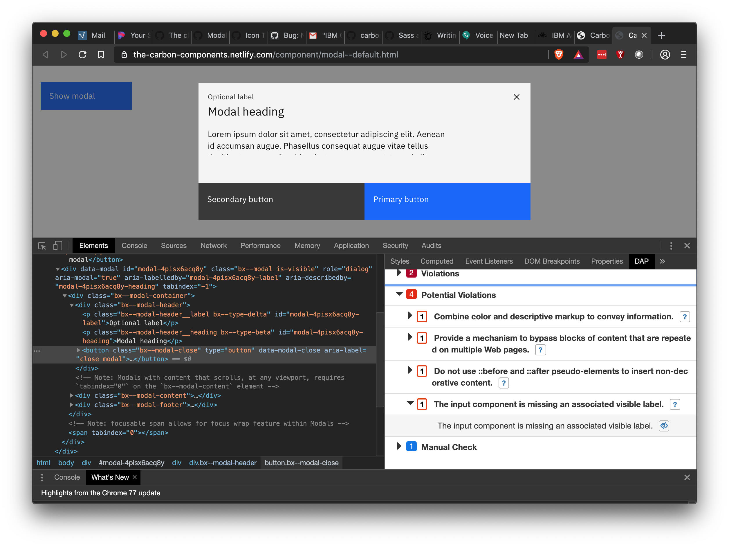
Here's a screen shot of the DAP results. I have the specific violation expanded with the affected element highlighted
I'm not 100% sure if we can do a delay using a CSS only approach with the icon tooltip component. It's been a while since I've really dug in to CSS animations but it's currently using a keyframe animation which I'm pretty sure we can delay. Is the delay something you'd want applied across all icon tooltips or just this specific instance of the modal? Would you expect a delay when the user focus' on the button as well?
elizabethsjudd
on 2 Oct 2019
I believe that's Success Criterion 3.3.2 Labels or Instructions correct?
Is the delay something you'd want applied across all icon tooltips or just this specific instance of the modal?
Everywhere (so for example, overflow menu too).
Would you expect a delay when the user focus' on the button as well?
via Keyboard? Yes for the same reasons. Actually it's probably more important in that case - imagined a toolbar unlabelled, and user is tabbing through the tools and every one fires a tooltip immediately. I think if a user hovers for say .6 sec or leaves focus on a control for that time, it's safe to say they could use some help understanding it.
chrisconnors-ibm
on 2 Oct 2019
It’s a potential violation, meaning we need to use context and precedent to determine if it’s a true violation. The WCAG 2.1 example for labeling close buttons on a modal for instance: https://www.w3.org/WAI/WCAG21/Techniques/aria/ARIA14#examples
Bringing in CSS delays etc is a really heavy handed solution for a potential violation, especially one where we’re following the WCAG success criteria verbatim.
 vpicone
on 2 Oct 2019
vpicone
on 2 Oct 2019
@vpicone the authoring best practices site are not updated for 2.1 and often do not cover more robust examples. While they are a great place to start they are not the only source to look at for best practices. You're also not following it verbatim, their example actually uses the letter x which is text while Carbon is using an image so I feel like that is not a valid argument especially when the IBMa team has said in multiple issues that the full textual description is a better approach. A11y is more than just making sure you have checked off a couple checkpoints, code needs to be user tested and considerations for all user types need to be taken in to considerations. WCAG historically hasn't enforced a lot of guidelines for cognitive disabilities which is something that is changing in 2.1 and even more so in 3.0. By working on better user experiences now, IBM can be a leader in a11y considerations.
@chrisconnors-ibm, I can certainly make that change across icon tooltips but we may want to do that in a different PR since it will affect multiple components and require some more thorough testing while keeping this issue limited to just updating the modal (we can even block this issue with the delay update issue so they are done in the proper order). Since this is a change that WH is wanting, it's definitely something someone on our team can work on so we don't have to wait for the Carbon core team to prioritize it.
elizabethsjudd
on 2 Oct 2019
I agree with adding a slight delay in tooltip appearance. I think it will make a better user experience for the reason Chris pointed out. It would be very disruptive to be moving your mouse around the page (or quickly tabbing through content) and tooltips are popping up over items that aren't your intended destination.
Also fine with making it a separate issue from adding in the tooltip (lets just make sure the issue is made before this is closed)
aagonzales
on 2 Oct 2019
I actually like the timing of the tooltips in slack. It doesn't feel like you have to wait for it but it doesn't show up instantly. It feels like it only shows up when you rest on top of it.
aagonzales
on 2 Oct 2019
@elizabethsjudd let's try out the approach here and when we hone in on the right delay we can roll it out everywhere. Sound good?
chrisconnors-ibm
on 3 Oct 2019
@elizabethsjudd the example I linked is from the updated 2.1 techniques.
vpicone
on 3 Oct 2019
Sorry that was a new page I hadn't seen before. So my understanding is there is an exception to the rule when it's an X but in all other icon-only button scenarios we should have visible label, seems odd to have the inconsistency when it's really not that hard of a change but if it's considered acceptable for a11y I'm okay with that.
elizabethsjudd
on 4 Oct 2019
@dakahn does anything need to be done here or can this be closed?
 tw15egan
on 18 Feb 2020
tw15egan
on 18 Feb 2020
Seems like we're good to close 🏄
dakahn
on 27 Feb 2020
Related issues
 jendowns
·
3Comments
jendowns
·
3Comments
 mouadcherkaoui
·
3Comments
mouadcherkaoui
·
3Comments
 ajdaniel
·
3Comments
ajdaniel
·
3Comments
 joshblack
·
3Comments
joshblack
·
3Comments
 ConradSchmidt
·
3Comments
ConradSchmidt
·
3Comments