Carbon: Adding custom icon to notification
Summary
It would be great to be able to add other carbon icons to notifications instead of the predefined set of three icons. I would add this to the component as an additional prop which if not set would not affect the layout or functionality of the notification.
This would only require development, and that's more or less already done in this pull request:
https://github.com/carbon-design-system/carbon/pull/3622
Justification
Based on the description of the notification icons in the carbon design system, the icons are there to provide additional clarity. I think this aspect could be further enhanced by the option to add other types of icons to the notifications.
Desired UX and success metrics
This would hopefully result in users understanding the message of certain notifications quicker and distinguishing different notifications more efficiently thanks to the icons providing visual guidance and clarity.
"Must have" functionality
The icon provided to the component should be properly displayed.
If no icon is provided, the default functionality and layout should not change.
Specific timeline issues / requests
Available extra resources
I've already created a pull request with the necessary changes, and tested it manually:
https://github.com/carbon-design-system/carbon/pull/3622
 webadam1
All 15 comments
Watson Health guidelines support the creation of custom notifications so this would be a nice feature to have Carbon support
 elizabethsjudd
on 9 Aug 2019
elizabethsjudd
on 9 Aug 2019
@carbon-design-system/design Not sure if we have had a discussion on this topic, but wanted to see if any of you have any thoughts on this... Thanks!
 asudoh
on 10 Aug 2019
asudoh
on 10 Aug 2019
Which notification (warning, error, success , informational) are you suggesting can have a custom icon? There are some distinct color associations with the notification icons at the moment.
- green = success
- red = error
- yellow = warning
- blue = informational
Do you have any visual example you could share about this custom icon notification? Would the colors also need to be changed? This will help in writing guidelines and rules around when you can deviate from the defaults.
 aagonzales
on 13 Aug 2019
aagonzales
on 13 Aug 2019
The requirements provided to the Watson Health Design Pattern & Asset Library (PAL) dev team was to provide the default examples provided by Carbon but also allow our users to change the color and the icon as needed for their specific offering (I believe our sketch kit is set up this way as well). @AT-public @janedepgen, do you have examples from offerings as to why we added this flexibility?
elizabethsjudd
on 13 Aug 2019
In our requirements the icon color would strictly follow the notification type, that could not be customized via the component props. If need be, dev teams can add custom css rules to their site along with css classNames passed down to the component, therefore I think that color modifying is not a thing that this change should address.
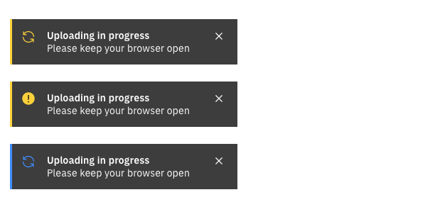
This is the notification design for our use case:

webadam1
on 14 Aug 2019
The notification is yellow I'm assuming because its a "warning" however by replacing the icon, color is now the only indicator that it is a warning (which isn't good for accessibility). I could potentially see the informational one having a customizable icon, but I'm not completely convinced warning, error and success notifications should have customizable icons.
aagonzales
on 14 Aug 2019
@aagonzales As I see based on the component, that the only accessibility related part of the icon is its title, which can be also set by the developer, so that part would not be affected by this change.
Other than that, the notification container has an aria role attribute that's set to "alert", and a 'kind' attribute that's either "info", "success", "warning" or "error", but these wouldn't change if the component had a customizable icon.
Is there something that I missed related to accessibility or you meant that this might damage general understandability of the notification roles?
webadam1
on 14 Aug 2019
You removed the visual cue that its a warning. In our system anything that is a warning _always_ get the circle with the !. Error always gets the 🚫 icon. When a user sees that they visually associate it with warning. So by changing the icon you're saying the visual cue for it to be a warning is that its yellow, which isn't acceptable for color blindness. The text doesn't say "warning" its just a warning statement.
I can bring this up with the rest of the team and with Mike and see what they say about customizing notification icons.
aagonzales
on 14 Aug 2019
Ah I get it, thanks for clarifying.
webadam1
on 15 Aug 2019
Do you have other scenarios where you'd want to change the icon or is it just for loading? I'm also wondering is there's better ways to show loading in a notification, like having some for of progress bar or even some sort of animation to show its doing something.
aagonzales
on 15 Aug 2019
For now we only got this kind of notification with a custom icon in our designs, but there are different kinds of 'connectivity issues' and other error notifications that will be designed, and I imagine some those could also benefit from having easily distinguishable icons that give visual cues as to what went wrong.
For the above shown warning notification, the arrows are rotating at a constant rate to show it's doing something. The upload progress is displayed on another part of the site, that might not be always in the viewport of the user, so we need some kind of always visible warning too.
webadam1
on 15 Aug 2019
@aagonzales
We have a list of videos in various stages of being processed - uploading and transcoding. We use toast notification which stays in the same place when user scrolls the page.
It is more important to bring his attention to the fact that some videos are being uploaded and he/she shouldn't close the page, than to convey it is a warning. We try to do that by changing the icon and rotate it to show that process is still going on. We understand this breaks the convention but in this specific case even subtle animation like this catches the attention better than a static icon (and says "ongoing").
 mariuszmickiewicz
on 15 Aug 2019
mariuszmickiewicz
on 15 Aug 2019
@aagonzales
If you feel like opening a possibility for icon change in the notification component can lead to unpredictable / unintended solutions in the future then we are happy to look for other solutions to our issue.
mariuszmickiewicz
on 15 Aug 2019
I talked to the greater team and we'd like to not allow overriding of icons in notifications. However, we do think that this type of loading notification is valid and could be its own variation. It would be great if you could explore some other potential solutions that limited to being exactly like our notification.
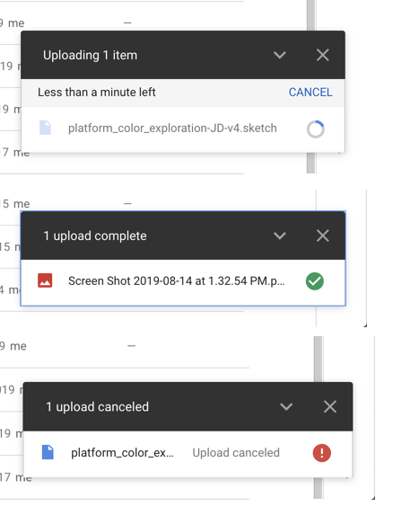
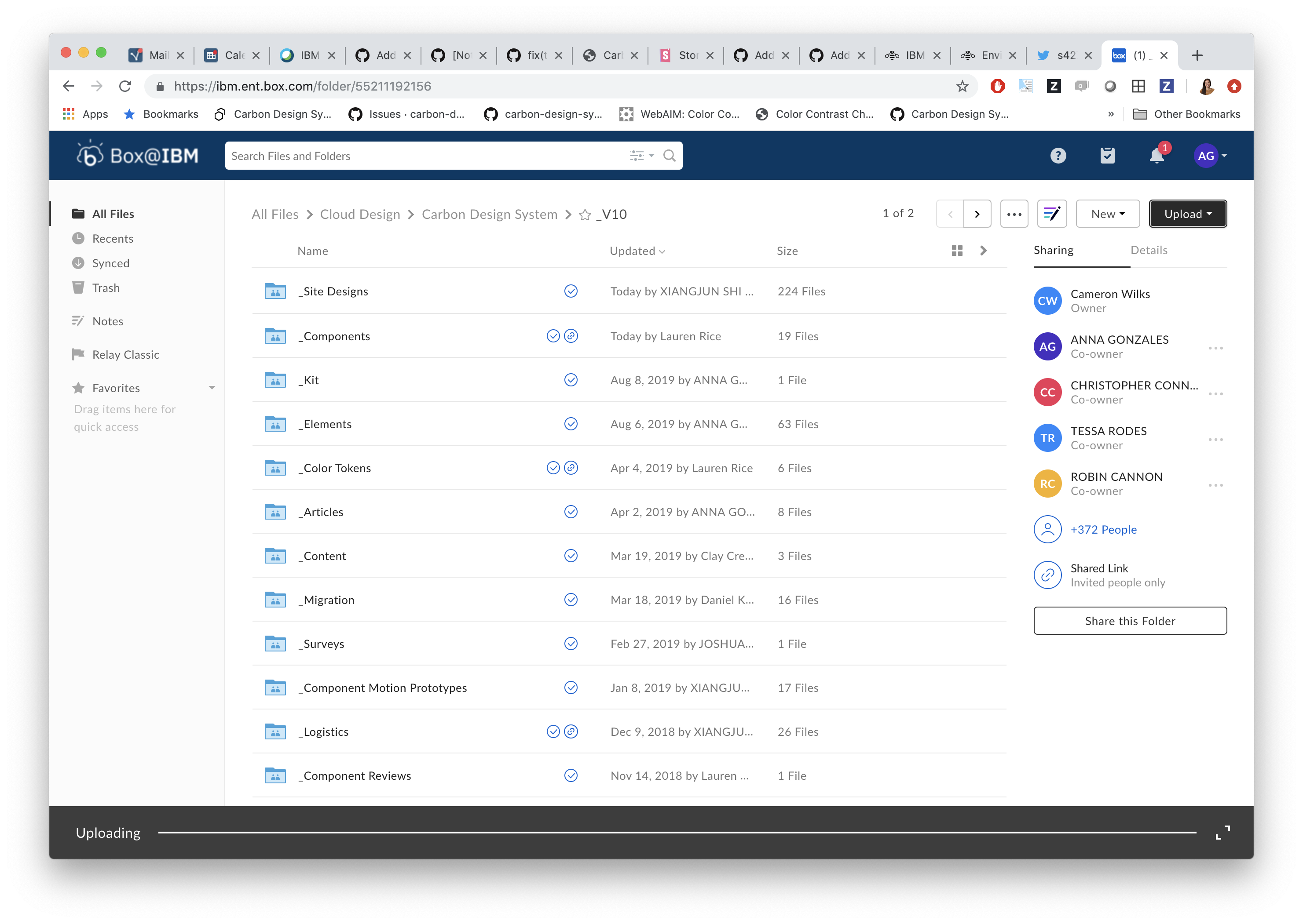
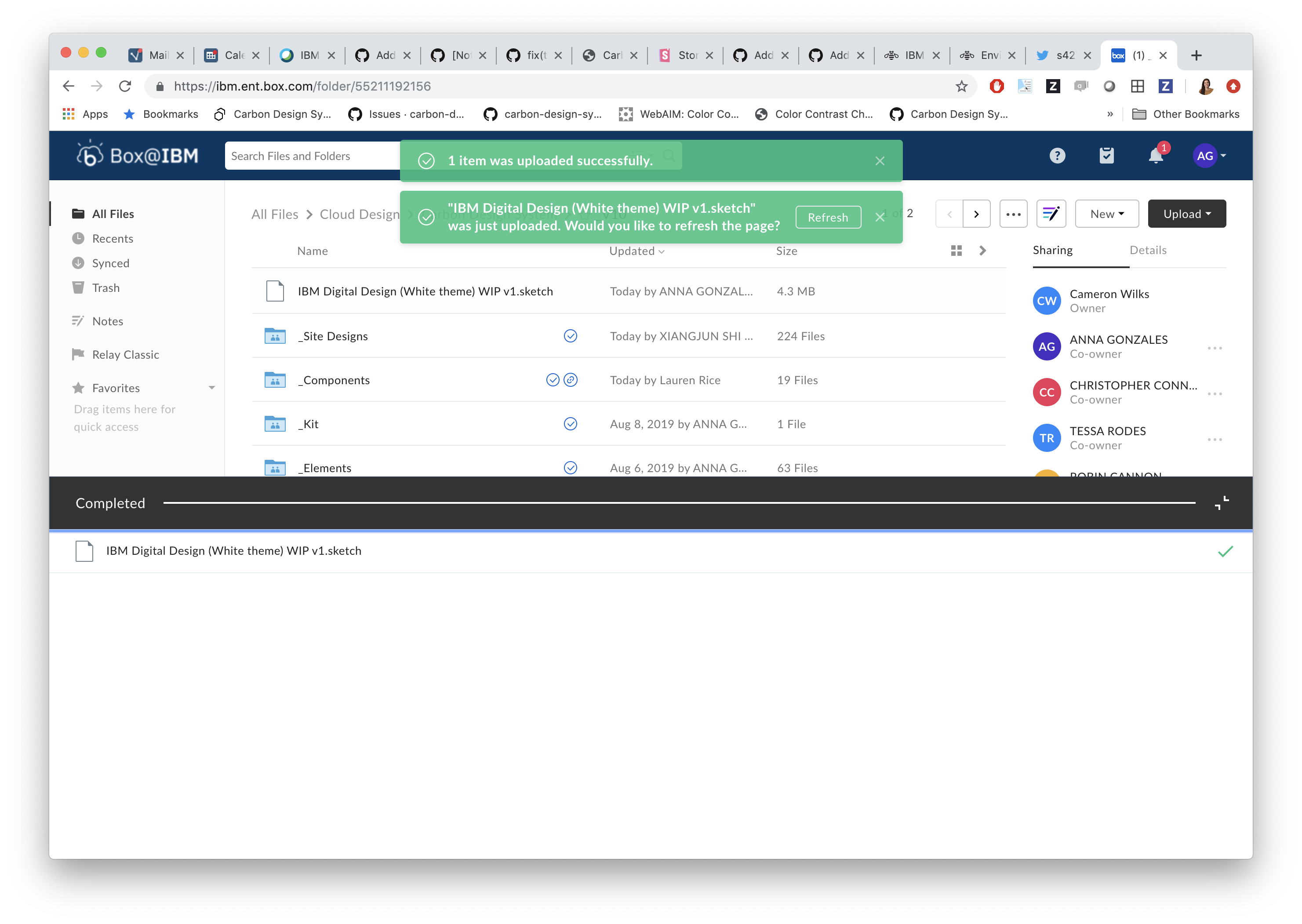
Here's some examples we could think of:
Google
Appears in lower right corner of screen.
Box
aagonzales
on 15 Aug 2019
We've marked this issue as stale because there hasn't been any activity for a couple of weeks. If there's no further activity on this issue in the next three days then we'll close it. You can keep the conversation going with just a short comment. Thanks for your contributions.
![stale[bot] picture](https://avatars3.githubusercontent.com/in/1724?v=4&s=40) stale[bot]
on 15 Sep 2019
stale[bot]
on 15 Sep 2019
Related issues
 ahoyahoy
·
3Comments
ahoyahoy
·
3Comments
 JordanWSmith15
·
3Comments
JordanWSmith15
·
3Comments
 carmacleod
·
3Comments
carmacleod
·
3Comments
 ConradSchmidt
·
3Comments
ConradSchmidt
·
3Comments
 PatrickDuncan
·
3Comments
PatrickDuncan
·
3Comments