Carbon: Notification a11y issues
Environment
Operating system
Mac OS X
Browser
Chrome, Safari, FF
Automated testing tool and ruleset
AAT July 2019 ruleset
WCAG 2.1
Assistive technology used to verify
keyboard, mouse
Detailed description
- The closed button on notifications should use the icon tooltip to provide a textual label for sighted users
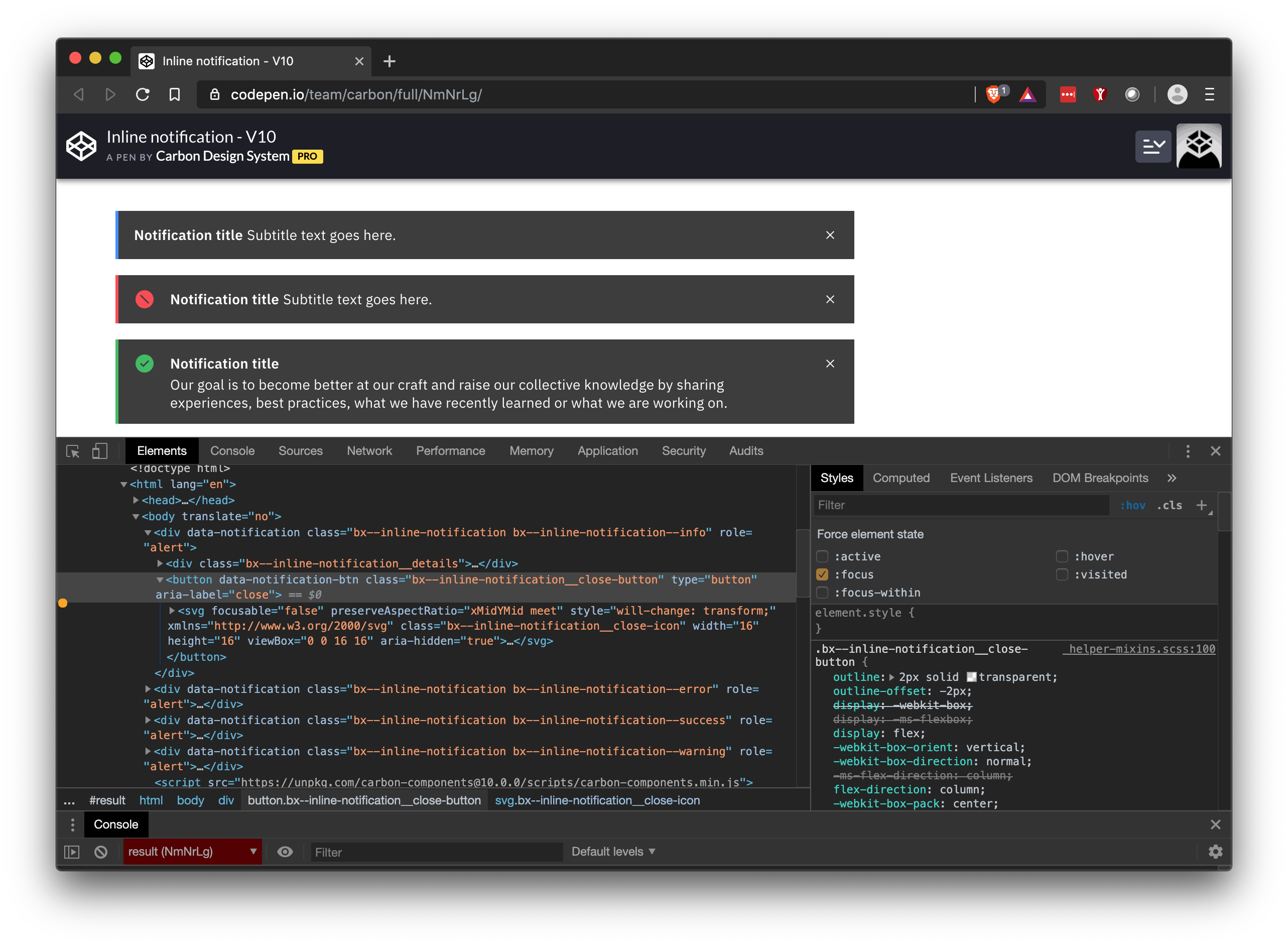
- the close button does not have a focus state (see screen shot in comment)
What version of the Carbon Design System are you using?
v10.4.1
What did you expect to happen?
There is a textual label for sighted users on icon only buttons and for there to be a visual focus state on the close button
What happened instead?
the close button only has a label for screen reader users
What WCAG 2.1 checkpoint does the issue violate?
Steps to reproduce the issue
- Interact (hover/focus) the notification close button
Please create a reduced test case in CodeSandbox
Additional information
@carbon-design-system/developers you can assign this issue to me and I can take a look at it in the next couple of weeks
 elizabethsjudd
All 13 comments
Notifications also don't have a focus state for their close button
elizabethsjudd
on 16 Aug 2019
Do you wanna rename this issue to something more broad a la "Notification a11y issues" or we can roll the hover state violation into another issue? Thanks for reporting Liz!
 dakahn
on 16 Aug 2019
dakahn
on 16 Aug 2019
Because of the high-contrast nature of the notifications, WH uses the inverse icon-tooltip coloring which can be seen here: https://pages.github.ibm.com/Watson-Health/whds-pr/4091/components/preview/notification--all.html
elizabethsjudd
on 16 Aug 2019
Do we have hover styles specced out for the close button of notifications @laurenmrice ?
dakahn
on 16 Aug 2019
We currently do not have a hover color change for the close icon in code for notification. I thought for sighted users specifically that a cursor change and/or aria label was enough to know you would be able to close, is it not? Is there any other way we could use something other than a tooltip to meet these requirements? It seems to be visually invasive if this is what is being proposed for a sighted user. I would rather us implement some kind of hover/focus as well as the cursor change.
 laurenmrice
on 19 Aug 2019
laurenmrice
on 19 Aug 2019
@laurenmrice my issues isn't the hover state, it's the focus state, where the users doesn't have a a "cursor" that changes. However based on the last a11y call earlier this month, subtle hover/focus state changes were a big pain point for low vision users and IMO only changing the cursor is pretty subtle.
elizabethsjudd
on 22 Aug 2019
The notifications need to visually receive focus for sure. Thinking about keyboard navigation here @laurenmrice
dakahn
on 28 Oct 2019
the close button focus outline should be present now (ref #4569) so all that is left is the tooltip. just to confirm, does adding the tooltip and/or changing the button background on focus fall in line with our design spec? cc @laurenmrice
 emyarod
on 26 Nov 2019
emyarod
on 26 Nov 2019
@laurenmrice Any thoughts on @emyarod's question above? Thanks!
 asudoh
on 17 Jan 2020
asudoh
on 17 Jan 2020
Moving this to an open proposal for an enhancement to the Tooltip component. 👍
dakahn
on 20 Jan 2020
any updates regarding the proposed changes to notification close button (adding tooltip or background color change on focus)? if the focus outline from #4569 is enough we can close this cc @laurenmrice
emyarod
on 28 Jan 2020
adding a tooltip is not required and something design does not want to add to the close button. the focus outline from the issue your referenced is enough.
laurenmrice
on 28 Jan 2020
Closing 👍
 tw15egan
on 28 Jan 2020
tw15egan
on 28 Jan 2020
Related issues
 kalyanixraut
·
3Comments
kalyanixraut
·
3Comments
 xrissot-ibm
·
3Comments
xrissot-ibm
·
3Comments
 ConradSchmidt
·
3Comments
ConradSchmidt
·
3Comments
 antonmc
·
3Comments
antonmc
·
3Comments
 joshblack
·
3Comments
joshblack
·
3Comments