Carbon: Transactional Modal does not have 3:1 contrast with adjacent color in High Contrast
Modal does not have 3:1 contrast with adjacent color in High Contrast
Environment
Occurs in Storybook, theme and v10
Operating system
Windows 7
Browser
Firefox (also Chrome with High Contrast extension on)
Assistive technology used to verify
Windows High Contrast Mode
Detailed description
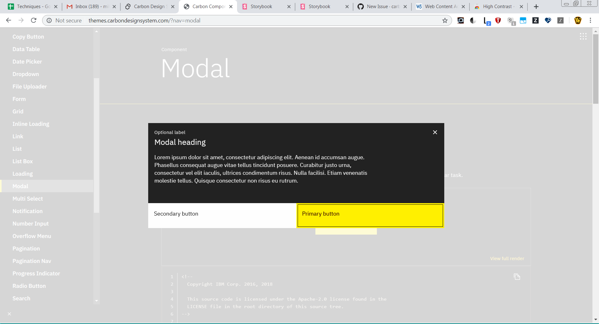
This what caught with the transactional modal, but it applies equally to modal. The modal dialog lacks any kind of border, reyling instead on a lightbox effect by reducing the brightness on the background page. However, this curtain results in a completely black background for both the dialog and the surrounding area. It makes it difficult to determine it is a dialog and what its area is.
What version of the Carbon Design System are you using?
10
What did you expect to happen?
I expected there to be a stroke/border around the dialog which delineates it from the background.
What happened instead?
The design relies on a contrast between the modal background and the page background to define a 'border'. With the backgrounds the same, there is no indication of the dialog's edge, beyond the location of text inside it.
Similarly, in Chrome with the extension on, although the background material goes uniformly to a grey, there is iinsufficient contrast between the two buttons (white and yellow) and the gray to meet 3:1
What WCAG 2.1 checkpoint does the issue violate?
The visual presentation of the following have a contrast ratio of at least 3:1 against adjacent color(s):
Visual information required to identify user interface components
Steps to reproduce the issue
- Start Windows High Contrast Mode (or turn on High Contrast extension in Chrome)
- Open Modal component in Carbon pages and lanuch the Show Modal button
Additional information
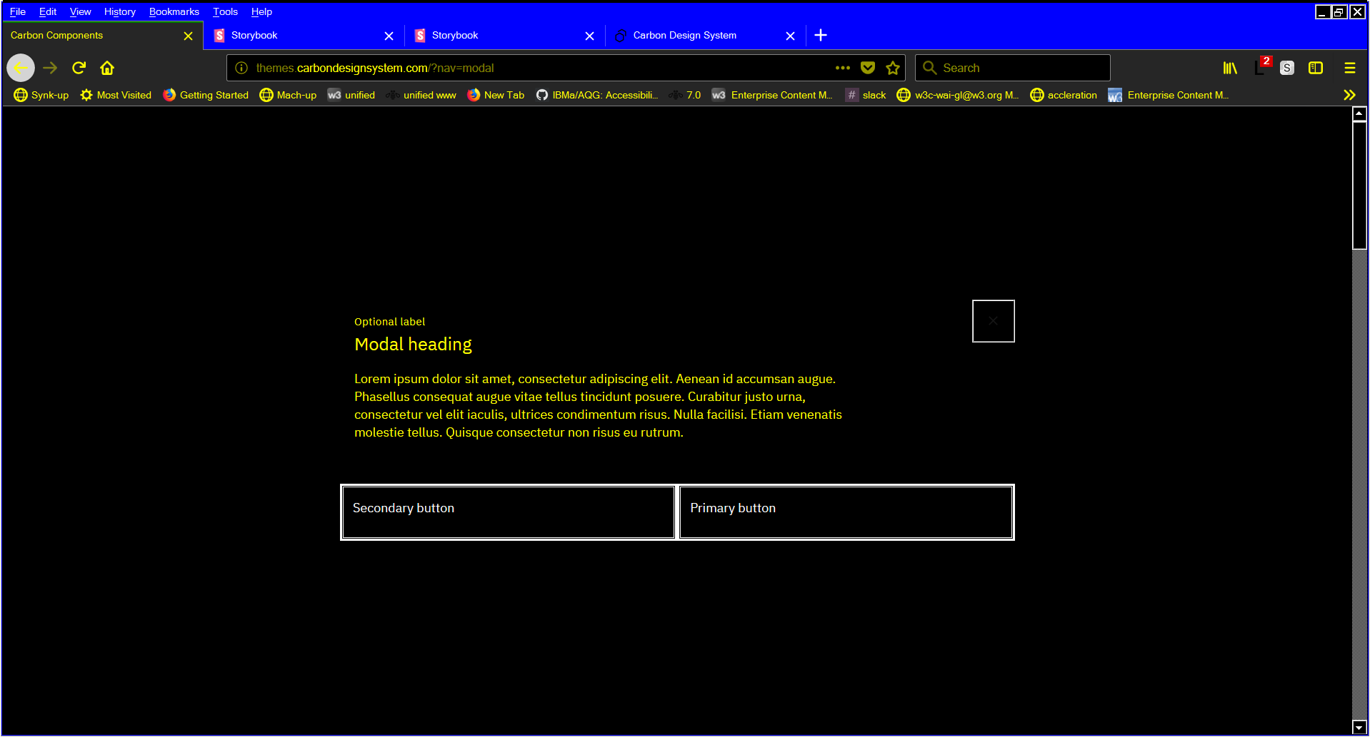
Carbon Theme screenshot
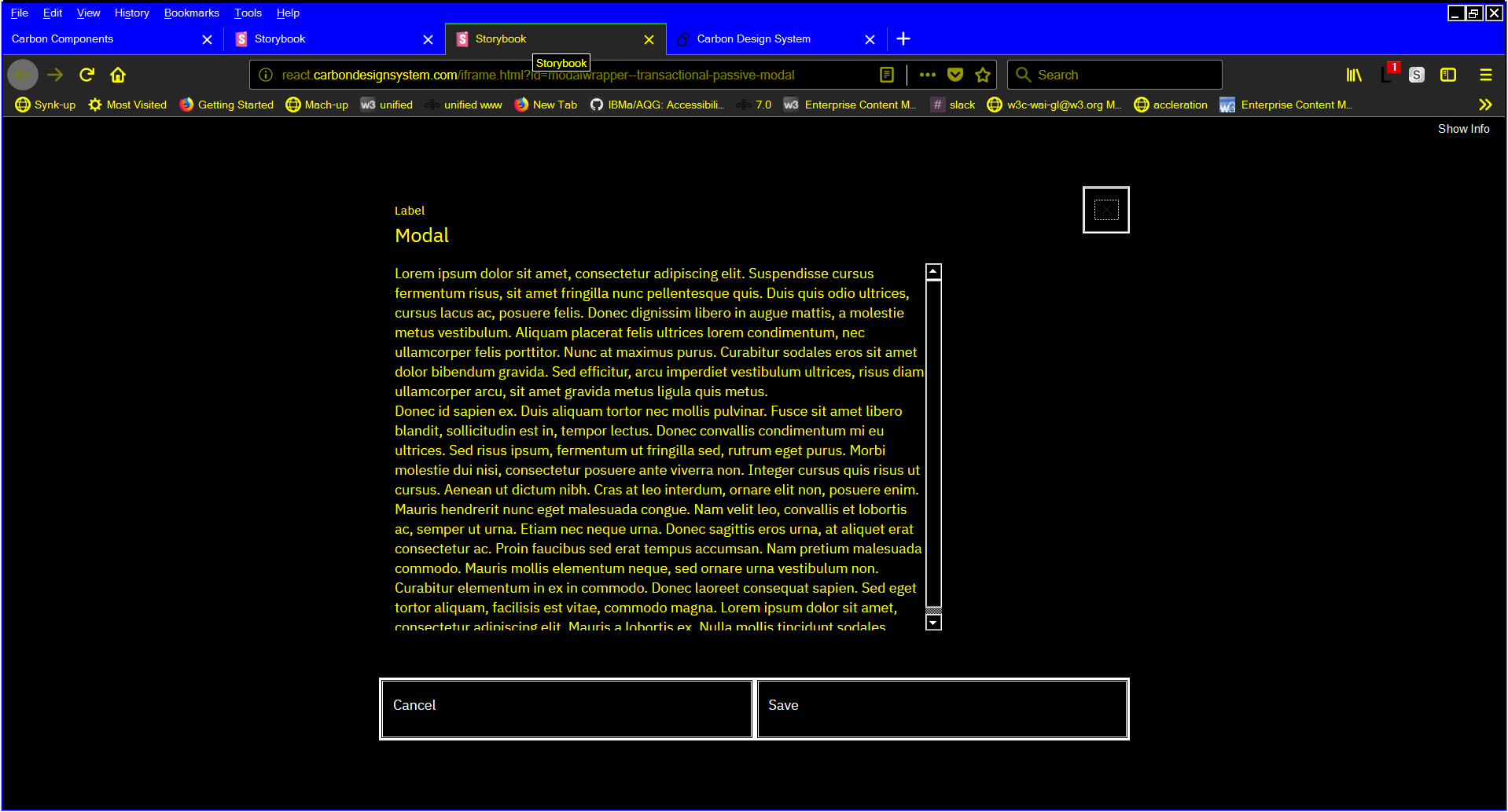
Carbon React Storybook screenshot
Chrome (with high contrast on)
Recommended way to address is to apply a black border/stroke to the outer edge of modal
 mbgower
All 10 comments
@carbon-design-system/design Does this indicate any color change we need to make? Thanks!
 asudoh
on 1 Aug 2019
asudoh
on 1 Aug 2019
Would applying an "invisible" border on the modal solve the problem, ie a border that is the same color as the modal background? I don't think we would want to add a black border to the modal.
 aagonzales
on 1 Aug 2019
aagonzales
on 1 Aug 2019
I think that's what we did back in the day to fix high-contrast issues with our text-inputs, right? We added a 1px solid transparent border to the element, which I believe shows up in HCM
 tw15egan
on 1 Aug 2019
tw15egan
on 1 Aug 2019
@aagonzales I think the 'invisible' border would likely address the Windows High Contrast mode challenge. It is less likely to resolve the 3:1 for the button borders in the Chrome screenshot.
I have other design considerations to enter in the future, and one of them is that those buttons that span the entirety of the bottom of the dialog (instead of just being 'normally' drawn buttons appearing inside the dialog) cause various unforeseen challenges, this being one.
mbgower
on 1 Aug 2019
Could you explain the issue a little more, I'm not familiar with high contrast requirements. Are you saying the yellow against the white has to pass 3:1? How are those color generated, what determines which elements colors get a white, yellow or black value in high contrast mode?
The decision to have the buttons span full width and be attached to the bottom of the modal is a brand level decision, if you are suggesting changes to that aesthetic then we'll have to work with the IBM brand team to resolve the topic. I will say that unless there is a failing accessibility requirement why those buttons aren't working than I don't think they will be changed from a structural perspective. If it's a color issue we can try and work with that. If it does fail a particular test can you link us to documentation on the topic so we can look at ways to resolve it while still attempting to maintain brands direction.
aagonzales
on 1 Aug 2019
Sorry, @aagonzales. Just seeing your comment now.
I actually just opened what is in some ways an identical issue to this against the modal (to the point where that could be marked redundant), which maybe provides a bit more context (and doesn't focus on the buttons, which aren't an issue there).
See #3880
So, if you like, two distinct (but very related) issues:
- the lack of any border on the dialog in HC mode
- the reliance on the button background color to distinguish it from its neighbouring material
In the windows HC screenshots above (the first two), you'll see that the buttons have borders and are clearly visible, despite having an identical black background to the the rest of the page. Whatever was done to achieve this effect, if it could be applied to the dialog itself, would resolve #3880 .
In regard to whether the buttons as constructed would ever fail WCAG, it comes down to two things:
- will buttons ever end up with a background colour that is less than 3:1 contrast with the surrounding page background?
- is a button still understandable as a button with NO identified border?
I can say with great confidence we will encounter the first of these situations. But the wording of Non-Text Contrast refers to
Visual information required to identify user interface components
That takes us to the second bullet. Do buttons need borders?
A careful reading of the new WCAG requirement shows that enough people don't think so that you're likely 'safe' from failing. But I'll submit that the reason buttons have borders is that it is easier for users to discern them. If one removed all visual affordances from buttons, so that users were just relying on white space, I think it is less likely to be a good user experience. (And once we dip below 3:1, for some low vision users, that is essentially the reality they're experiencing.)
mbgower
on 30 Aug 2019
@aagonzales Any update on this?
 dakahn
on 21 Nov 2019
dakahn
on 21 Nov 2019
I've commented on #3880. This issue of "does button need a border" is a much bigger question and would have a lot of visual fallout if all buttons need to have a border added to them. I'm not entirely sure how we can make sure that the under page of a modal will always have 3:1 with the buttons unless we make the overlay opacity very high.
We will need to do some visual exploration in this topic and this will need to be added to backlog planning for next release cycle.
aagonzales
on 2 Dec 2019
I actually just opened what is in some ways an identical issue to this against the modal (to the point where that could be marked redundant), which maybe provides a bit more context (and doesn't focus on the buttons, which aren't an issue there).
since #3880 has been resolved, is this issue still present?
 emyarod
on 13 Feb 2020
emyarod
on 13 Feb 2020
I believe this is resolved to its most complete extent. The button border concern seems to be a gray area in guidance and we are not planning on changing it unless it fails an official test or we get repeated end-user feedback that people are not understand the modal buttons and cannot complete tasks. The button text is always visible and clear; even without borders I think a user would be able to logic out that the action text underneath the modal content is where they should click. We also can't control what will appear under a modal, the most we could do to help with that is increase the opacity of the page overlay so page content is more obscured when the modal is open.
aagonzales
on 13 Feb 2020
Related issues
 ahoyahoy
·
3Comments
ahoyahoy
·
3Comments
 ajdaniel
·
3Comments
ajdaniel
·
3Comments
 xrissot-ibm
·
3Comments
xrissot-ibm
·
3Comments
 snidersd
·
3Comments
snidersd
·
3Comments
 carmacleod
·
3Comments
carmacleod
·
3Comments
Most helpful comment
I think that's what we did back in the day to fix high-contrast issues with our text-inputs, right? We added a
1px solid transparentborder to the element, which I believe shows up in HCM