Carbon: Coordinate Sketch Plugin output with Design Kit
This issue is for coordinating what exactly will be delivered in the Sketch Plugin and how it will be used by the Design Kit. In particular, we'll want to cover:
- [x] IDL Colors
- [x] What should the naming conventions be for the shared styles?
- [x] Theme tokens
- [x] What should the naming convention be for the shared styles?
- [x] Type tokens
- [x] What should the naming convention be for the shared styles?
- [x] Icons
- [x] What hierarchy do we want for icons?
Some of the initial explorations are doing the following:
- IDL Colors:
color / color swatch / color grade, e.g.color / blue / 50 - Theme tokens:
Theme / token, e.g.White 10 theme / interaction-01 - Type tokens:
- Currently just the token name, optional divider for expressive versus productive
body-long-02productive / heading-01
- Icons:
category / icon name / size, e.g.action / add / 16
 joshblack
All 10 comments
cc @lovemecomputer @laurenmrice wanted to make this real quick so that we know exactly what the Sketch Plugin outputs and how the Design Kit will consume it. Let me know if you all have any questions on this 👍
joshblack
on 16 Jul 2019
@laurenmrice and i met to talk about this, and it sounds like we're pretty well-set to keep pushing forward. will continue discussion/notes here
 lovemecomputer
on 18 Jul 2019
lovemecomputer
on 18 Jul 2019
Perfect! Would you mind documenting the decision/formatting here or link to somewhere in code where we're going to be tracking these conventions?
joshblack
on 18 Jul 2019
@joshblack totes! i think the summation is that most of what we have listed above is good, tho after discussion today lauren and i are giving things another lookover to verify our understanding/etc. should be up soon(ish)!
lovemecomputer
on 18 Jul 2019
DL Colors:
color/color swatch/color & grade- e.g.
color/blue/blue-50
- e.g.
Theme tokens:
Theme / token- e.g.
White 10 theme/interaction-01 - _TODO_: needed some clarity on how themes fit into the elements package.
- i.e. each sketch kit for a theme has its own "Elements" page. are we planning to port that data over here into the
elementspackage? - _TODO_: do "themes" in elements include type styles in the theme, or are they only sets of color swatches?
- if "themes" here are only sets of color swatches, discuss renaming of "theme" to "theme-colors" or the like
- e.g.
Type tokens: divider for expressive versus productive:
- e.g.
productive/heading-01
- e.g.
Icons:
category/subcategory/icon-name/size- e.g.
Actions/Navigation/add--filled/16 - want to verify choice btwn
Friendly Nameandicon-nameformats with @laurenmrice icon-nameformat would match with color labels likeinteraction-01- _TODO_: there is open discussion around icon grouping & sizing at https://github.com/carbon-design-system/carbon/issues/3484
- e.g.
Open question: does "Theme" take on both color and type tokens?
Notes:
per todo/question items listed above, we need to clarify or define if "themes" in the carbon-elements package contains _all_ theme data (including type styles), or if it is only for colors.
each sketch kit contains this "elements" page, which conceivably could be generated by our sketch plugin:

@joshblack i think we can talk through some of the open questions. @laurenmrice will probably have some good take on the specification for any other open questions when she is back in office :)
lovemecomputer
on 22 Jul 2019
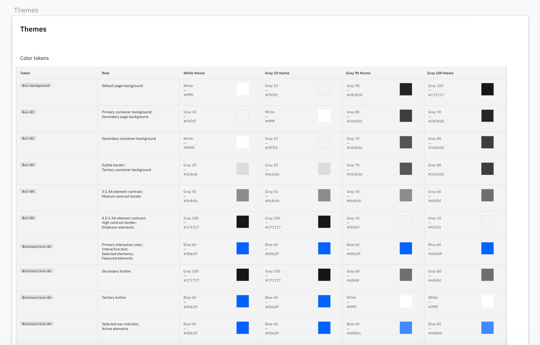
Depending on how we surface the Themes page, if it was just to show color tokens, we could have a similar layout to what is in the kit, but include columns for White, Gray 10, Gray 90 and Gray 100 all in one artboard to view the color difference for each token right next to each other (kind of how the current elements themes page is doing it)
Example:
- In the 4 carbon theme kits we do have the type styles categorized into a further level which shows the available color tokens per type style. Not sure if we wanted to dive that deep into this though.
 laurenmrice
on 23 Jul 2019
laurenmrice
on 23 Jul 2019
Colors
For color symbol structure: currently IDL has it as:
color / color name / color grade
Ex: color / red / red-10
- There is a repetition of the color name with a dash between the grade. Was wondering if you are cool with sticking to this same structure.
Icons
For icon symbol structure: currently IDL has it as:
icon / category / subcategory / name / size
Ex: icon / file / download / 32
Download the current IDL kit to see how they are nesting icon symbols any further than subcategories.
Icons are required to be categorized first by
category, and second bysubcategory. Then third, the structure may differ depending on how many variants there are per subcategory. I know that recently Olivia has been trying to unnest icons more in the library based on user feedback. For example:checkmarkhas a filled and unfilled variant but these will remain on the same level in the subcategory instead of having filled nested inside of the unfilled bucket.

Themes
IDL currently doesn't have a themes page. If themes page includes only color tokens, we can structure this page similarly to what exists in the carbon elements themes (which looks similar to whats in the 4 kits and on the website)
We can structure the symbols like this:
theme / token type / token name
White theme / core color tokens / interactive-01
and
theme / token type / token name
White theme / interaction color tokens / focus
We can categorize the type of token by core colors vs. interaction colors to make the tokens easier to find by function. This is how we present it on the website and in the kit. Let me know your thoughts on this.
Was also thinking about structuring by token as a second level, and token type as the third level. Ex:
White theme / token / core colors / interactive-01but that may be too nested...
Type
From looking at the Elements type style package, we could try starting with splitting the structure into productive and expressive.
type/type usage/type style name
Ex: type / productive / caption-01
laurenmrice
on 23 Jul 2019
yeah that makes sense, thank you!
lovemecomputer
on 24 Jul 2019
Color:
@joshblack
- The spacing of the layout for the color page that the plugin generates is good!
- Can we reorder the way we order the colors in each row so it aligns with what idl currently has?
Example:
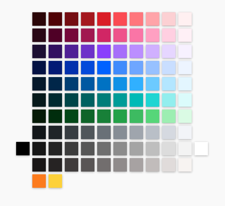
Order of colors per row (dark to light):
Red
Magenta
Purple
Blue
Cyan
Teal
Green
Cool gray
Gray (Have black far left and white far right)
Warm gray
Support colors (Orange and Yellow)
-When the plugin imports the colors, they all have gray borders around them. There shouldn't be any borders.
Themes:
-After discussing further with Anna, we have decided that we should include tokens within the naming convention for the library. So it would be bucketed by core tokens and interactive tokens. It would be a good idea to get people familiar with the terminology of tokens and associate them with our themes, especially if they don't have the actual kit files downloaded.
-We need to add a color to the themes called transparent. It actually doesn't have a color token associated with it and it is just a bounding box, but we use this for our libraries for icons.
laurenmrice
on 2 Aug 2019
Quick status update:
- [x] Re-ordering of colors
- [x] Tried to reset border style on new rectangles (was specific to sketch instances)
- [x] Updated theme token names to include tokens
Going to defer on transparent as this has no representation in code 👍
joshblack
on 7 Aug 2019
Related issues
 ajdaniel
·
3Comments
ajdaniel
·
3Comments
 windgaucho
·
3Comments
windgaucho
·
3Comments
 jendowns
·
3Comments
jendowns
·
3Comments
 carmacleod
·
3Comments
carmacleod
·
3Comments
 PatrickDuncan
·
3Comments
PatrickDuncan
·
3Comments