Carbon: Create button tooltip component
Summary
Currently there is no simple way to add a tooltip to a button. However it is a demand of many services (at least our one: SQL Query) to give users a hint of what a button is going to achieve.
The only current solution is to wrap a tooltip (more specifically <TooltipDefinition>) around a button:
    <div className="button">
      <TooltipDefinition
        tooltipText="this is going to happen when you click"
        direction="bottom"
        alignment="right"
      >
        <Button>A button</Button>
      </TooltipDefinition>
    </div>
While this works in principle it produces a number of errors in the browser:
Warning: Failed prop type: Invalid prop 'children' of type 'object' supplied to 'TooltipDefinition', expected 'string', due to
...
TooltipDefinition.propTypes = {
  /**
   * Specify the tooltip trigger text that is rendered to the UI for the user to
   * interact with in order to display the tooltip.
   */
  children: _propTypes.default.string.isRequired,
...
Warning: validateDOMNesting(...): <button> cannot appear as a descendant of <button>
This is due to the fact that the tooltip itself is creating a<button>into which we are wrapping another button.
A native button tooltip would avoid these issues. I assume design (in case the button tooltip should be different from other tooltips) and development (css, implementation for react...) would be required to solve this issue.
Justification
There is currently no suitable alternatives.
Desired UX and success metrics
"Must have" functionality
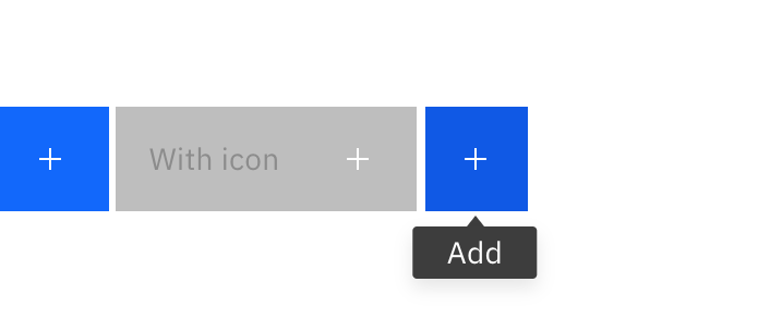
Hovering over a button should show a tooltip similar to the Definition Tooltip (i.e. multiline possible).
Specific timeline issues / requests
SQL Query is currently moving to carbon components (this sprint). Current solution using Definition Tooltip is not satisfying because of browser errors
Available extra resources
What resources do you have to assist this effort?
Here is a codesandbox which highlights what i mean:
https://codesandbox.io/s/rw4w26kkzp.
(I also briefly tried to create a Vanilla-JS version of a multi-line botton tooltip which does not seem to work solely based on the predefined styles: see last button)
 gmoehler
All 13 comments
Hi 👋 thank you for reporting - As you seem to have noticed, definition tooltip is style-only UI. And you'll get the desired result by replacing bx--tooltip__trigger class on the <button> with your custom class (say .your--tooltip-on-button__trigger) and adding .your--tooltip-on-button__trigger:hover + .bx--tooltip--definition__bottom { display: block } - Hope this helps!
Update: Please be sure you work with your designer to see if the "definition tooltip on non-icon button" fits fell in Carbon design ecosystem. Adding @shixiedesign if she has any thoughts.
 asudoh
on 14 May 2019
asudoh
on 14 May 2019
We just merged Icon buttons that comes with tooltip on hover. Would that satisfy your use case? https://the-carbon-components.netlify.com/?nav=button
 shixiedesign
on 15 May 2019
shixiedesign
on 15 May 2019
@shixiedesign that sounds close to what i need.
Does it also allow tooltips for icons with text?
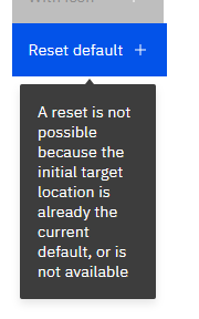
Will it be able to provide multi-line tooltips? This is important because we usually need to add somewhat more information than just 3 words or so, e.g.
- "Reset default to initial target location." (regular explanation for a button that just says "Reset default")
- "A reset is not possible because the initial target location is already the current default, or is not available." (to explain why the "Reset default" button is disabled)
- "Find information about this service. Watch tutorial videos to get started." (for an "API" button that links to a documentation page)
gmoehler
on 15 May 2019
Does it also allow tooltips for icons with text?
Will it be able to provide multi-line tooltips?
@gmoehler although the recommendation is to keep tooltip content short and concise, it should support both of these use cases. just be aware that you will need to make some CSS tweaks. in the example below I adjusted:
.bx--btn--icon-only--bottom::after {
  height: auto;
  padding-top: 1rem;
  padding-bottom: 1rem;
  transform: translate(calc(-13% + 8px), calc(100% + 10px)); // this value will depend on your content
  white-space: normal;
}
as well as margin for .bx--btn__icon
edit: this may change based on #2749
 emyarod
on 15 May 2019
emyarod
on 15 May 2019
Thanks @emyarod for the guidance! Unless @shixiedesign is against it, we may add this guidance to /src/components/button/README.md?
asudoh
on 16 May 2019
@asudoh Nooo why would i be against it?! 😂Please add it 🎉 this is clearly useful knowledge!
shixiedesign
on 16 May 2019
Hi @gmoehler let us know if this is still an issue for you. If not, please close. Thank you!
shixiedesign
on 16 May 2019
Closing for the sake of: #2767
asudoh
on 17 May 2019
@asudoh i am ok with continuing with #2767 if it also addresses tooltips for react buttons (not only icon buttons). I assume that is the case. @shixiedesign can you please confirm?
gmoehler
on 17 May 2019
React button lets you add arbitrary CSS classes, so my assumption is yes (but no change in necessary in our React component).
asudoh
on 17 May 2019
possibly related https://github.com/carbon-design-system/carbon/issues/2490, I can expose this in the React storybook
emyarod
on 17 May 2019
great to have it in the documentation, because from what i see there currently i would not know how to add the tooltip to a react button. I assume it is only available with the next drop anyway
for the time being i may have to fall back to css style button with tooltip @shixiedesign do you already have a css-style only codesandbox of the button with tooltip available so i could take a look ?
Edit: just saw there is some code under the link pasted above... but not yet working for me in codesandbox... probably need to grab the style changes from github
gmoehler
on 17 May 2019
For reference: this is what i am currently using (until 10.3 is out):
https://codesandbox.io/s/buttonwithtooltipref-b2wqn
(added own trigger styles and right aligned styles from master branch)
gmoehler
on 21 May 2019
Related issues
 jhpedemonte
·
3Comments
jhpedemonte
·
3Comments
 JordanWSmith15
·
3Comments
JordanWSmith15
·
3Comments
 mouadcherkaoui
·
3Comments
mouadcherkaoui
·
3Comments
 joshblack
·
3Comments
joshblack
·
3Comments
 drewdistefano
·
3Comments
drewdistefano
·
3Comments
Most helpful comment
@asudoh Nooo why would i be against it?! 😂Please add it 🎉 this is clearly useful knowledge!