Carbon: Contribution: Text toolbar
Is your feature request related to a problem? Please describe.
The usage of an old widget in a new UI to write runbooks or messages directly.

Describe the solution you'd like
I have designed a new component with the Carbon styleguide to type guided tasks easily (runbook automation) while improving the collaboration among teams.
All files here: https://ibm.box.com/s/4rv1jw7xwuv8c8rvqbxp9057qzlydkva
Screenshot details:


Some redlines:

Different color background:

 m-battelli
All 69 comments
cc @IBM/carbon-designers is this a pattern we want to consider for carbon-components?
 joshblack
on 20 Feb 2019
joshblack
on 20 Feb 2019
Something like this will come along at one point so I would say yes but leave that to @aagonzales @jeanservaas and @chrisconnors-ibm
 mjabbink
on 6 Mar 2019
mjabbink
on 6 Mar 2019
verse for example has a similar tool bar with similar functionality/features. We need to do some more research on this kind of thing across some other IBM products and as I write this I’m staring at the tool bar above this entry field!
mjabbink
on 6 Mar 2019
I think this would be a good component to have! However, If we want to build this exact text toolbar, I think some of the smaller interactions will need to be fleshed out and spec-ed. Like how big does the type dropdown go before its starts scrolling. In the text color selector can you pick unique colors and if so how? Or is it only a pre-defined set.
Or if you want to contribute this more as a general file toolbar that can be configured in different ways then we'll need to define and spec what the general widget types are. I'm seeing at least 4 right now (single selection dropdown, Icon button - icon directly triggers an action, Icon menu, Search). Could there be any others?
I think there are a few style discrepancies as well, normally hover goes full bleed instead of inset we'll need to work through as well.
Thanks for reaching out and contributing!
 aagonzales
on 7 Mar 2019
aagonzales
on 7 Mar 2019
Let’s resolve them and push further. Great start!
mjabbink
on 7 Mar 2019
Thank you for feedback @aagonzales
m-battelli
on 8 Mar 2019
@m-battelli The space before the type and with “check” in the dropdowns seems large. Thanks for contributing and keep doing it!

mjabbink
on 8 Mar 2019
@mjabbink Thanks for your feedback!
m-battelli
on 11 Mar 2019
@aagonzales for context their team has a text toolbar compound component already - @m-battelli has been working to apply the new design language to that existing thing. I'd like to have them submit that component to our main set, so expect it to be 1:1 functionality from what they have.
1) we get the styling approved through this, wake, playbacks.
2) they develop the component based on their existing using the new IBM Design Language, our assets, etc.
2a) we help them develop a sketch symbol for eventual inclusion in the kit
 chrisconnors-ibm
on 11 Mar 2019
chrisconnors-ibm
on 11 Mar 2019
@mjabbink @chrisconnors-ibm
I have improved several details, thanks for feedback and the recording link :-)
I have discussed this new stuff with @aagonzales
Please give me suggestions again:

The latest version of the files is here: https://ibm.box.com/s/4rv1jw7xwuv8c8rvqbxp9057qzlydkva
m-battelli
on 12 Mar 2019
40px height is nice with bleeding hovers. I don’t think the drop down needs hover does it? @aagonzales. I like 32px and assume this is an option?
For color version I like 2 or 3
mjabbink
on 13 Mar 2019
in the 40px section I like the vertical lines spanning the 40px versus the vertical line floating. What do you think @aagonzales and @jeanservaas?
mjabbink
on 14 Mar 2019
I think I take back what I said about color swatches. Not sure about the hover/select state when there is the white margin around the colors. When there is no margin the grey hover/select works better. What do you think @aagonzales @chrisconnors-ibm @jeanservaas
option 4 with more white space also works since there is such space around the color. Hmmm.
mjabbink
on 14 Mar 2019
also wonder if adjusting the font dropdown to be a bit less wide (looks like 10px) so the rules align? There will be some headspace on the right side but that might be fine to hold the integrity of alignments in this case.

.
.
.
.
.

mjabbink
on 14 Mar 2019
@mjabbink @aagonzales @chrisconnors-ibm
I've included all the feedback received until now. I'm also exploring the dark version.
Let me know what you think, thanks.

m-battelli
on 19 Mar 2019
@m-battelli What determines the width of the attachment buttons?
mjabbink
on 19 Mar 2019
@mjabbink I have used the file uploader component in this case:

m-battelli
on 20 Mar 2019
This is looking really good! You've polished it up nicely.
- dropdowns look good
- hover and selected states look good
- alignment looks good.
- dark theme looks correct
Just a few things to add:
- focus states are missing: which would probably just be a 2px outline around the buttons (takes up the same space as the hovers). It would be blue-60 for the light and white for the dark theme (color token is just $focus).

- when two icons beside each other are selected, I think there should be a rule between them still. Maybe go darker?

- responsiveness: I would maybe show what happens at some of the other break points. Does the tool bar just gain white space on the end if its on larger monitor? Do the icons slowly start to stack on a second row or does that change all at once? Is there a max and min width for the text bar?
aagonzales
on 20 Mar 2019
@aagonzales
- Focus state is ok for all themes.
For the two selected icon buttons beside each other, I think to add a separator simply. Also we need to consider the hover on a selected icon. This visual seems ok. What do you think?


I have designed the responsive behavior for the maximum and minimum width of the toolbar. I have adopted the ellipses menu with different version (list or panel). Let me know which of these is fine. Thanks!

m-battelli
on 22 Mar 2019
For hover on selected, in the system we've been going an additional shade darker (Gray20) on the light and a shade lighter (Gray 60) on the dark .
The responsive strategy looks good. I think i would just add divides into the overflow menu to maintain the sections.

aagonzales
on 22 Mar 2019
@aagonzales ok, thanks for feedback!I will add these details.
m-battelli
on 22 Mar 2019
@aagonzales I have updated file version based on your feedback. Also I have checked all the colors applied in these two themes. That's all for now. All the stuff is here:
https://ibm.box.com/s/4rv1jw7xwuv8c8rvqbxp9057qzlydkva
Let me know how we can proceed, thanks a lot!
m-battelli
on 27 Mar 2019
This looks great! I think the next steps would be to show it one more time at the IDL playback on Friday then dev can start on it. Is your dev team still building it?
aagonzales
on 27 Mar 2019
A quick suggestion:

Icon needs to be redrawn, but spacing and size may need to be adjusted, but something like this could help.
 wonilsuh
on 29 Mar 2019
wonilsuh
on 29 Mar 2019
@wonilsuh Thanks!
m-battelli
on 29 Mar 2019
Hi Myriam, Great work!
During the playback, I mentioned the Adobe Illustrator toolbar has a good hierarchy set up to help users get the visual cue around there are more options within an individual tool. The screenshot below is the toolbar.
The mockup above from Wonil's reflects what I am saying and will be a good idea to try.

 JennySanchez
on 29 Mar 2019
JennySanchez
on 29 Mar 2019
@JennySanchez Thanks! Sure, I will try to refine this.
m-battelli
on 29 Mar 2019
@wonilsuh and @m-battelli
I think the mini chevron could be a nice solution. Agree it needs to be redrawn. It could also be a touch larger still. @conradennis could have a stab at creating the mini chevron option and get into the Library.
mjabbink
on 29 Mar 2019
@m-battelli I believe that in your dropdown where you use the word "indend" you mean to have "indent"
 JuliHerren
on 29 Mar 2019
JuliHerren
on 29 Mar 2019
@aagonzales @chrisconnors-ibm
I have refined all visual details after our last playback (March 29). Thanks for your feedback!
The latest version with the 3 themes available is here:
Main improvement is related to mini-chevron #491 for text color and text alignment:
The size of this new icon is 8 px and it is integrated in the button
Let me know what you think on this final step. That's all for now.
All the stuff is here: https://ibm.box.com/s/4rv1jw7xwuv8c8rvqbxp9057qzlydkva
m-battelli
on 16 Apr 2019
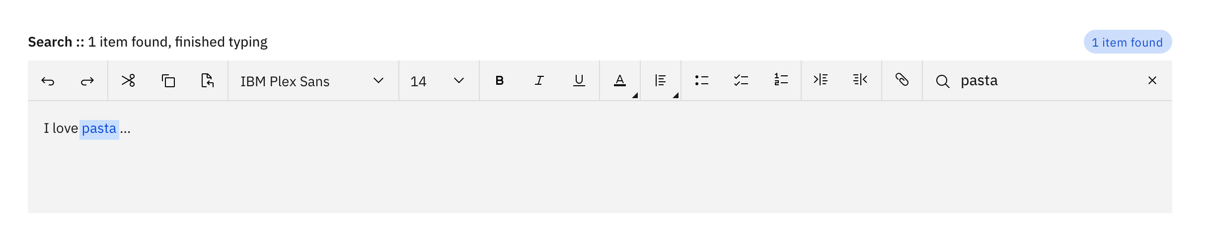
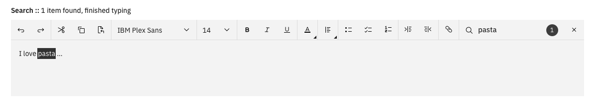
@m-battelli this looks great thanks for fleshing out those details. It alls looks good to me, the only one concern I have is with the search results. In context, if the toolbar is flush to the top the of page or container where would the tag go? Maybe inside the field and could potentially be just a number?
aagonzales
on 17 Apr 2019
I'm also wondering if maybe the text height shouldn't be a tag style? It looks like its will add some padding around the word that might make the content after a highlighted word move, which would not be ideal. Something more like a traditional highlight could work better.
aagonzales
on 17 Apr 2019
@aagonzales agree with you. I will refine it!
m-battelli
on 17 Apr 2019
@aagonzales
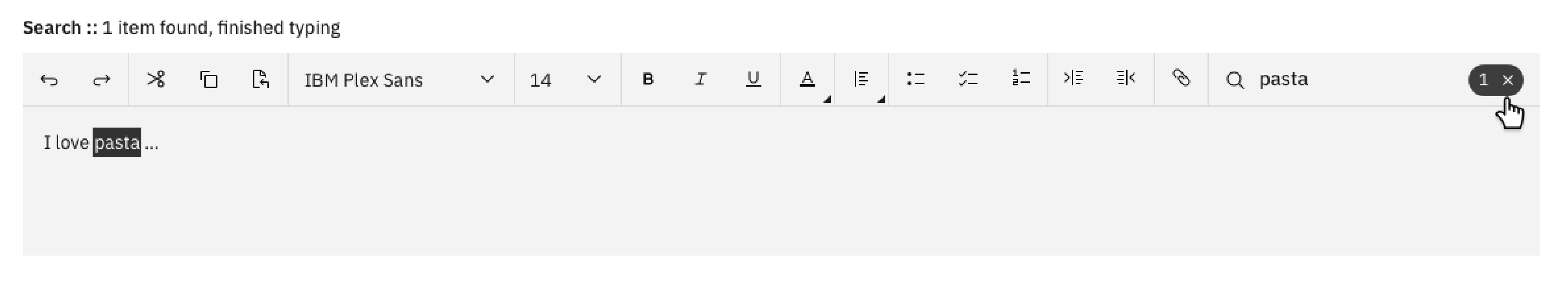
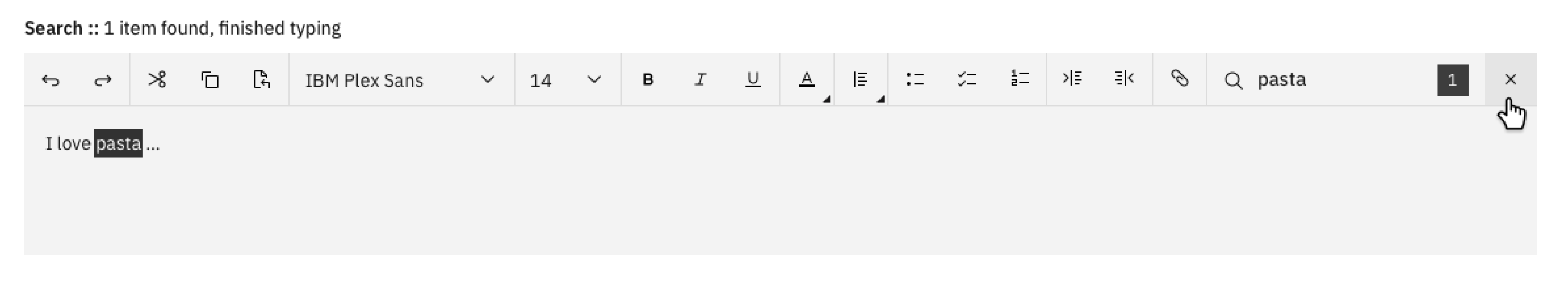
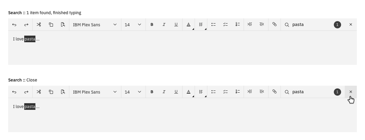
Option 1 (with interactive tag)
Option 2 (two separeted visuals: number and close icon)
What do you think?
m-battelli
on 17 Apr 2019
@m-battelli I can't decide ... I know in our filterable and multi-select dropdowns we use the tag with the x but just looking around at what other things do with a find search they seem to separate them. I think either way would be acceptable.
aagonzales
on 17 Apr 2019
In the separated option couldn’t the number still be in a tag rounded container without “x” rather than square container? I like the separated version.
These look great!
mjabbink
on 20 Apr 2019
@mjabbink @aagonzales
I have fixed the search details as you suggested, thank you for the feedback!
The updated files are here: https://ibm.box.com/s/4rv1jw7xwuv8c8rvqbxp9057qzlydkva
Please let me know if there is anything else to do or I can mark this design as completed :)
m-battelli
on 24 Apr 2019
I would say its complete now! Looks great!
aagonzales
on 24 Apr 2019
Great work and dedication. Shows.
mjabbink
on 2 May 2019
@aagonzales @mjabbink @chrisconnors-ibm
Thank you for supporting me with great advice during this task. I have just aligned the shetch / pdf files with the 4 themes now available. I don't like to leave things halfway :-)
I remain available for further updates or questions.
Let me know when this new component will be implemented.
Ciao!
m-battelli
on 2 May 2019
@m-battelli "Let me know when this new component will be implemented."
SInce your team, who built the v9 component, will be doing this development work, we're waiting for you to deliver them a spec, and your team to size, develop the refactor of their existing component, and submit it back. From there, successful submission requires building a sketch Symbol (we'll help you) and document how to use the component (minimum as we have documented existing components and compound components).
When will your team start the dev work once you've spec'd it for them?
chrisconnors-ibm
on 2 May 2019
Create symbols on sketch on my plan 💪
m-battelli
on 29 May 2019
@aagonzales as a step towards this component as a contribution, do we need a separate issue articulating the as resolved design? ie @joshblack do we need some cleanup here so any dev in the world could pick up this spec and develop it?
thinking here is this will be an experimental component with a design spec, a sketch symbol, and usage/style documentation until we get a building team to code it.
chrisconnors-ibm
on 3 Jun 2019
@chrisconnors-ibm @m-battelli Yeah I think we could make a new clean issue with the final design specs in it and then maybe a list of the different contribution points, like:
Component contribution
Design:
- [x] Design spec
- [x] Carbon approval (link to this issue)
- [ ] Sketch symbols for Kit
- [ ] Website guidelines (experimental usage and style)
Dev:
- [ ] Vanilla
- [ ] React
- [ ] Documentation
aagonzales
on 6 Jun 2019
For code perspective, given how compound the component is, great to see the code is maintained in a separate repo from https://github.com/carbon-design-system/carbon. Still be in carbon-design-system, though, and I think we can provide a link so such separate library is easy to find.
 asudoh
on 6 Jun 2019
asudoh
on 6 Jun 2019
@aagonzales @chrisconnors-ibm
Skecth with all symbols is here: https://ibm.ent.box.com/file/475636979327
It is a work in progress :-)
Thank you @laurenmrice for the support 👍
m-battelli
on 14 Jun 2019
Skecth with all symbols is here: https://ibm.ent.box.com/file/475636979327
It is an updated of the work in progress. I have included Lauren feedback and I'm proceeding with custom dropdowns for text color and text alignment.
m-battelli
on 2 Jul 2019
We've marked this issue as stale because there hasn't been any activity for a couple of weeks. If there's no further activity on this issue in the next three days then we'll close it. You can keep the conversation going with just a short comment. Thanks for your contributions.
![stale[bot] picture](https://avatars3.githubusercontent.com/in/1724?v=4&s=40) stale[bot]
on 1 Aug 2019
stale[bot]
on 1 Aug 2019
I'm continuing to design the sketch symbols for this component.
m-battelli
on 1 Aug 2019
I’m creating Sketch symbols related to responsiveness.
*Pending issues (or new contributions):
- Medium search bar (40 px) to integrate to text bar;
- Interaction pattern related to search & highlight text
Thanks @laurenmrice for you constant and precious support!
m-battelli
on 30 Aug 2019
We've marked this issue as stale because there hasn't been any activity for a couple of weeks. If there's no further activity on this issue in the next three days then we'll close it. You can keep the conversation going with just a short comment. Thanks for your contributions.
stale[bot]
on 29 Sep 2019
I'm designing the Sketch symbols for responsiveness.
m-battelli
on 30 Sep 2019
@laurenmrice Updates
Done:
- Replaced undo/redo, mini-chevron, checkbox icons (as new IDL icons);
Inserted new search (40 px)
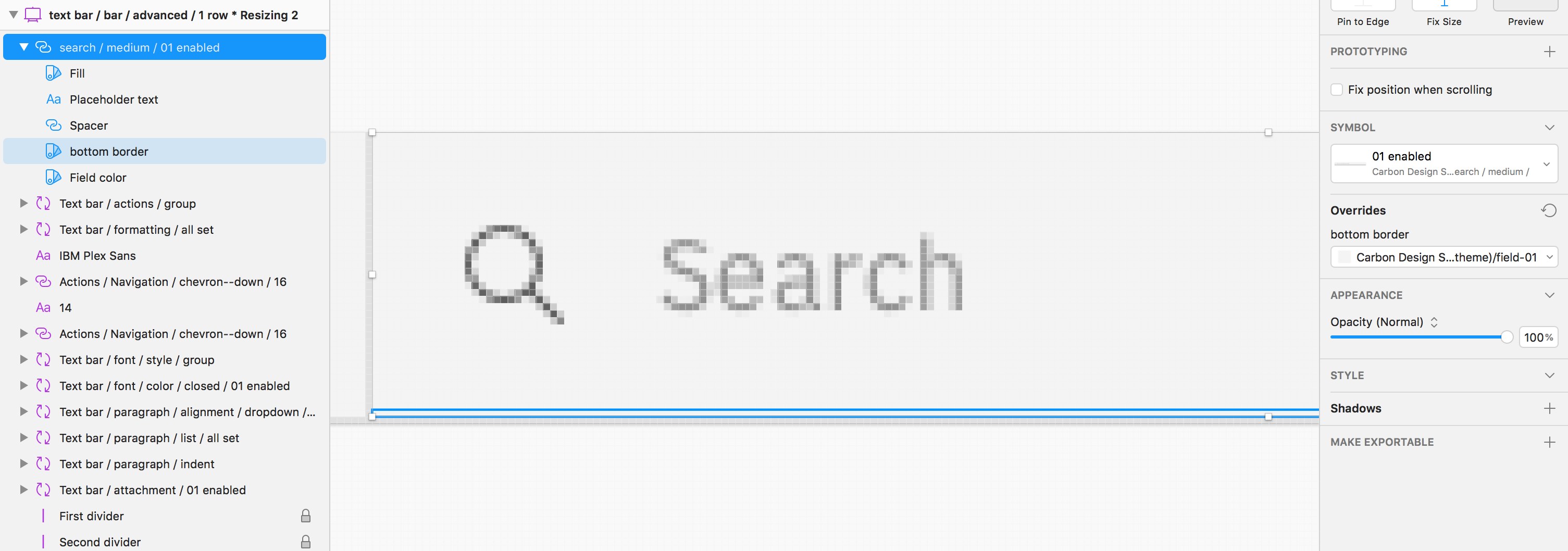
I have changed the color of bottom border to hide the gray line. Make sense?I can't hide the same line for typeface/size dropdowns because that symbol is locked. For this reason, I have adopted the selection approch used in the pagination bar. Make sense?
I have created new symbols for the entire text bar based on width size, advanced and simple.
I have designed 2 different resize behaviours for "Advanced / 1 row" symbol. Which one is correct?
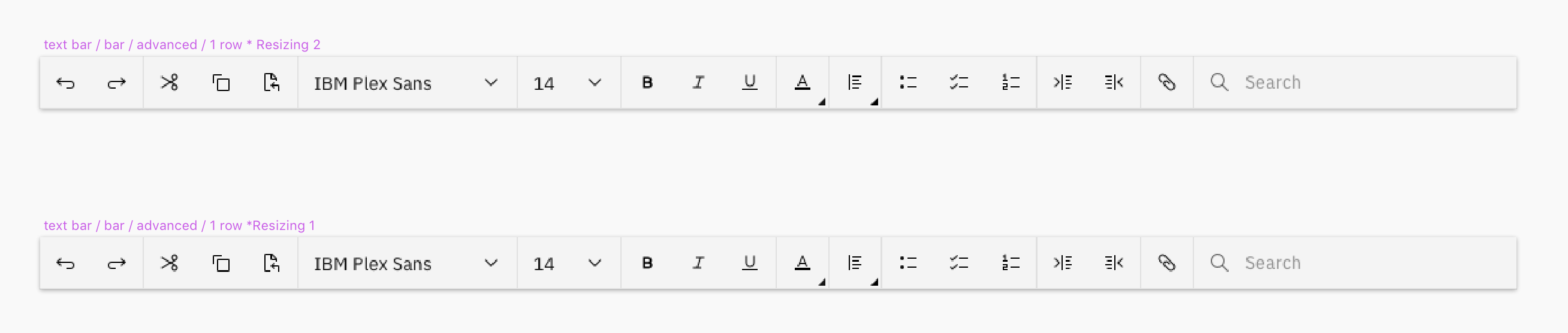
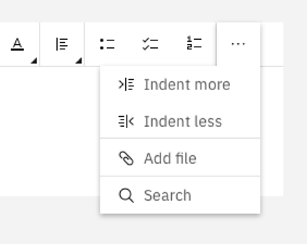
So I can apply the same for "Advanced / 2 rows" and "Simple" symbols.I have uncluded the overflow menu for this latest symbols. Have I design the opened menu?
I have re-organized all the file with Rename-it :-)
The latest sketch file is here: https://ibm.ent.box.com/file/475636979327
Pending: Organizing idea for experimental section (content & images).
🐢
Thanks!
m-battelli
on 14 Oct 2019
@laurenmrice
All updated stuff related this contribution is here:
https://ibm.ent.box.com/folder/66697964510
Documentation for Experimental section (Work in progress):
https://ibm.ent.box.com/folder/90602971210
m-battelli
on 18 Oct 2019
@m-battelli Thank you Myriam !! Will get to this next week :)
 laurenmrice
on 18 Oct 2019
laurenmrice
on 18 Oct 2019
@mjabbink
The textual content for Text bar experimental section is ready!
Usage: https://ibm.ent.box.com/notes/549429666421
Style: https://ibm.ent.box.com/notes/549446327433
A facsimile of Carbon website layout is here: https://ibm.ent.box.com/file/549427944650
All hi-resolution images are here: https://ibm.ent.box.com/folder/90602971210
m-battelli
on 31 Oct 2019
This is an open issue to have this component/pattern contributed by end of year
mjabbink
on 30 Nov 2019
@mjabbink thanks for the update!
m-battelli
on 2 Dec 2019
Related design variations here #4948
@aagonzales any feedback/updates on that?
m-battelli
on 9 Jan 2020
Is this being delivered into Carbon? I can't tell where it is falling in the backlog. Thanks.
 creckling
on 14 May 2020
creckling
on 14 May 2020
@janchild @connor-leech @jeanservaas @aagonzales What will it take to get this added to the Patterns section? It seems so close it’s a shame to not take it to the finish line. If Carbon too busy can @creckling team maybe help polish it off so we can get it added?
mjabbink
on 14 May 2020
@mjabbink - generating and publishing the usage guidance and a design kit asset is probably possible now, but I bet @creckling is likely referring to is an actual coded component.
@creckling what this effort has gone begging for is a developer resources. Any chance your folks can pitch in here against this design spec?
chrisconnors-ibm
on 14 May 2020
Yes. Carbon team should get this guidance/kit asset and agree it would be magic to get developer resources!
mjabbink
on 15 May 2020
Yes, I was looking for code - right now they use a third party editor, so likely will just re-theme it rather than build one.
creckling
on 15 May 2020
@chrisconnors-ibm @mjabbink I have generated all the documentation for the usage and style guidance (Experimental section for Carbon website) last year. Just a reminder if this can still be useful to you: https://ibm.ent.box.com/folder/90604183280
m-battelli
on 19 May 2020
@m-battelli thanks for sending. I think the team is backed up on some other urgent priorities but have your content on the back burner to finish up soon. I’ll let @Lauren or @connor-leech chime because I think they’re on the case. We are eager to get it into the patterns page so it’s only because there is way too much work for our little tiny team.
mjabbink
on 19 May 2020
@m-battelli Yes, this is something we definitely need to pick up, it is just the matter of prioritizing it, dedicating a design resource to it (which we are limited on right now) and finding someone to implement code. Our main priority at the moment is revamping our documentation for component usage and code tabs on the Carbon website. Having the documentation you wrote around textbar is very helpful and we just need to transfer it over to our new template. Since we are already in documentation mode I would hope we could extend our efforts to get this in soon.
laurenmrice
on 19 May 2020
@mjabbink I'm adding this to the list so it's considered in the next planning session.
 janchild
on 19 May 2020
janchild
on 19 May 2020
Ok, thanks for the update @mjabbink @laurenmrice
m-battelli
on 20 May 2020
Related issues
 jendowns
·
3Comments
jendowns
·
3Comments
 skaparelos1
·
3Comments
skaparelos1
·
3Comments
 mouadcherkaoui
·
3Comments
mouadcherkaoui
·
3Comments
 AnthumChris
·
3Comments
AnthumChris
·
3Comments
 antonmc
·
3Comments
antonmc
·
3Comments
Most helpful comment
@mjabbink I'm adding this to the list so it's considered in the next planning session.