Carbon: Primary Button fails accessibility contrast standards on dark backgrounds
Originally reported by @petewoodhouse-rg at carbon-design-system/carbon-contribution#11:
Name of the component:
Primary Button (Carbon V2 dark theme)
Explanation of change
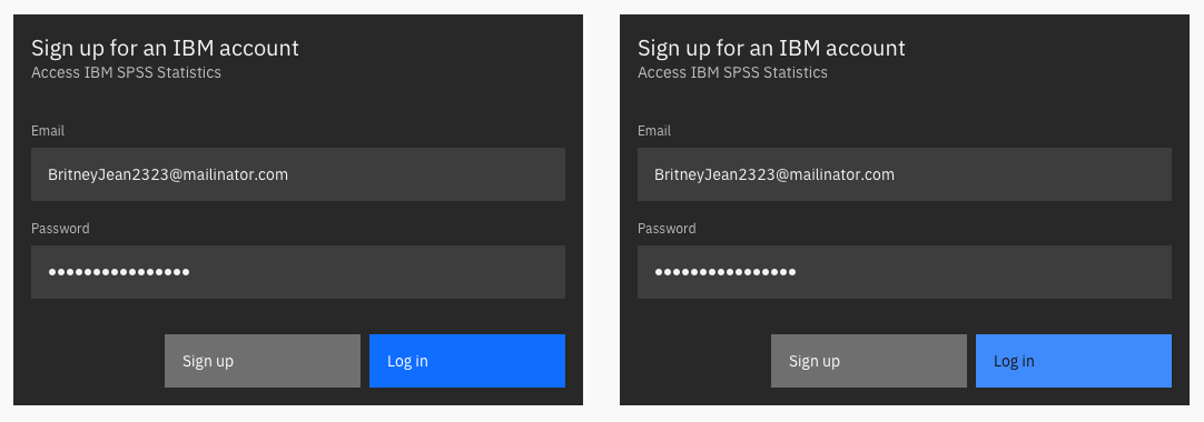
Color changes - currently the Primary Button fails accessibility contrast standards on dark backgrounds (UI components should have at least 3:1 contrast)
Change = Primary Button color to Blue 50 with Gray 100 text
The research supporting the change
UI components
Visual information used to indicate states and boundaries of UI components must have a contrast ratio of 3:1 against adjacent colors. A UI component is defined as “a part of the content that is perceived by users as a single control for a distinct function.” This includes form elements.
https://next.carbondesignsystem.com/guidelines/accessibility/color
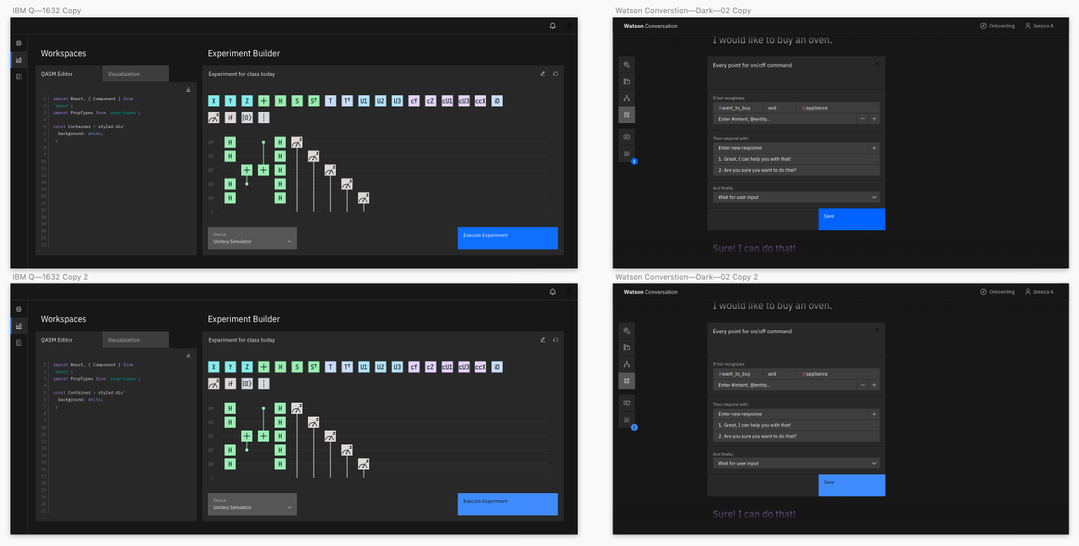
Screenshots of the proposed design


 asudoh
All 17 comments
@IBM/carbon-designers What does visual think about this 🤔? Should we provide guidance around background page colors as they relate to contrast?
 dakahn
on 12 Mar 2019
dakahn
on 12 Mar 2019
We should pass this up to the Brand team.
 aagonzales
on 12 Mar 2019
aagonzales
on 12 Mar 2019
I'm going to take a look at this a bit further. We wouldn't change to Blue 50 to avoid putting Black text on the button which is not a tenable solution and would throw everything else off. There are some cases where we may need to include a thin outline around UI elements to separate from the background. For example, a Gray 10 component on a white background does not pass 3:1 unless a darker hairline stroke is added.
 sadekbazaraa
on 12 Mar 2019
sadekbazaraa
on 12 Mar 2019
@sadekbazaraa I'm curious why would using black text on the button not be a tenable solution?
 petewoodhouse-rg
on 13 Mar 2019
petewoodhouse-rg
on 13 Mar 2019
@petewoodhouse-rg there's been an extensive amount of fine tuning the way colors are applied to our dark and light UI sets as a whole, with particular focus and emphasis around Blue 60 as the primary action color between the two.
In some cases, we have to use lighter values of Blue 60 in dark UI (a hyperlink for example) but that has been intentionally kept to a minimum in order to have a holistic application of Blue 60 carried throughout.
In regards to black text on a Blue 50 button, it is not an elegant solution when played out more comprehensively. We want to keep white text on all of our buttons for consistency across themes. We often have primary and secondary buttons side by side and mixed dark and light UIs side by side and don't want to have a patchwork effect with the text and button colors bouncing around.
I've included a handful of examples below from various studies to help illustrate the point. The interesting thing is that the White text on Blue 60 buttons are much more legible and pop more accessibility-wise even though they don't quite meet the 3:1 requirement.
FYI @kuehndaniel
sadekbazaraa
on 13 Mar 2019
Unfortunately, we cannot simply adjust the Blue 60 value to bring it from a 2.92:1 to 3:1 contrast ratio because of the global 50 away rule which requires that 10s pass on 60s. As soon as you make Blue 60 a little bit lighter the 10 values no longer pass. The whole system is incredibly fine tuned in this way.
That being said, another proposed solution is to include a slightly lighter blue border (only as needed) with as minimal of an impact as possible. You can see in the approach below that a Blue 50 stroke can be used with different alphas to get us to 3:1 without introducing any new colors to the palette or reworking the color system.
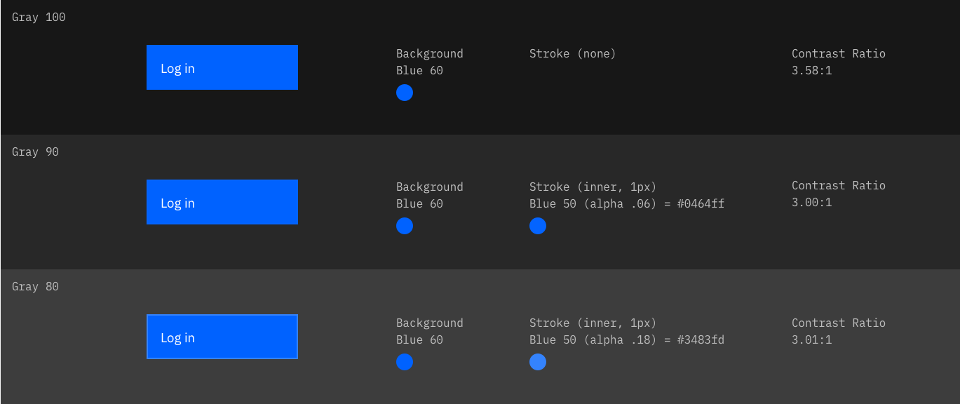
sadekbazaraa
on 13 Mar 2019
@sadekbazaraa - have you specifically confirmed that a very slight increase in that color will break everything across the board. I know they are very fine tuned but sometimes there is a tiny bit of leeway. If we get really lucky, that color could be tweaked a tiny bit for the dark theme.
This new 2.1 rule is going to create some difficult situations for flat design now and this is a glaring example. The crazy answer (future?) might be that the dark theme (or every theme) has a whole new set of colors that are tweaked slightly.
The other option, as mentioned, would be to delineate the button somehow with an outline on at least one side, maybe two - like the text input boxes. Obviously the best scenario wouldn't be just barely complying but being very visible.
 bocampbell
on 14 Mar 2019
bocampbell
on 14 Mar 2019
@bocampbell thanks for chiming in. I have checked into making making Blue 60 just light enough to be 3:1 compliant on Gray 90 but the 10s are no longer 4.5:1 adhering to the 50 away rule. There's no leeway in this particular case.
I do like the consideration of not having to include the border around all four sides. I think in the case of future 2:1 compliance that nearly every object on screen will have to have a stroke. I don't think there's any amount of tweaking to the palette itself that will allow us to achieve that level of contrast ratio across the board. We have done some explorations in that regard. Perhaps, that becomes another level of theming option—the super 2:1 switch that essentially puts a stroke on everything.
sadekbazaraa
on 14 Mar 2019
@sadekbazaraa This is a problem that every design system is going to face. An elegant, scalable solution would be something to talk about.
bocampbell
on 14 Mar 2019
@sadekbazaraa @bocampbell Thanks for the insights they're super helpful. I'm having exactly the same problems becoming compliant with the new 3:1 contrast.
I love the fact now it includes components - it always puzzled me why it didn't before - but it certainly gives a smaller contrast window to play with. I've also found myself putting borders on everything just to pass, maybe it's an aesthetic that will grow on me - the wireframe look!
Or maybe I need a completely different approach - retrofitting doesn't seem to be working.
It worries me when I hear about creating extra themes for accessibility as it doesn't feel in the spirit of inclusivity, and means we're creating an inaccessible theme that arguably looks nice (why not just create an extra high contrast mode in this case). It also worries me that i'm now having to use the minimum contrast I can to become compliant. This feels a bit like box ticking rather than accessibility.
I'll keep exploring more options...
petewoodhouse-rg
on 15 Mar 2019
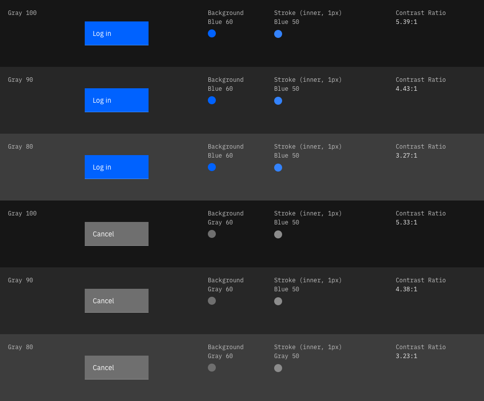
@bocampbell @petewoodhouse-rg I've revisited the buttons and come to a much more simplified solution. I think the key is to use the single underline vs. outlining the whole button which makes sense as it's synonymous with the way we're handling our other components such as dropdowns.
We should just be able to use Blue 50 strokes without having to get into the complexities of the alphas as prescribed above. And Pete, to your point, this gives us much higher contrast ratios than simply checking the 3:1 box. I think it's a win win all the way around with minimal impact.
FYI @jeanservaas @aagonzales
sadekbazaraa
on 18 Mar 2019
@sadekbazaraa @bocampbell certainly is an interesting solution.
For someone with low vision do you think a 1px line at the bottom would help all that much? Wouldn't they need to be able to see the boundary of the button to recognize it as a button and the hit area?
Though I could be interpreting it wrong.
petewoodhouse-rg
on 19 Mar 2019
We've marked this issue as stale because there hasn't been any activity for a couple of weeks. If there's no further activity on this issue in the next three days then we'll close it. Thanks for your contributions.
![stale[bot] picture](https://avatars3.githubusercontent.com/in/1724?v=4&s=40) stale[bot]
on 1 May 2019
stale[bot]
on 1 May 2019
Was there a final solution for this?
aagonzales
on 2 May 2019
We've marked this issue as stale because there hasn't been any activity for a couple of weeks. If there's no further activity on this issue in the next three days then we'll close it. You can keep the conversation going with just a short comment. Thanks for your contributions.
stale[bot]
on 16 May 2019
Not stale
aagonzales
on 16 May 2019
Continuing the solution of this issue here: https://github.com/carbon-design-system/carbon/issues/2729
Most likely adjusting the palette.
 shixiedesign
on 13 Jun 2019
shixiedesign
on 13 Jun 2019
Related issues
 snidersd
·
3Comments
snidersd
·
3Comments
 mouadcherkaoui
·
3Comments
mouadcherkaoui
·
3Comments
 ahoyahoy
·
3Comments
ahoyahoy
·
3Comments
 ajdaniel
·
3Comments
ajdaniel
·
3Comments
 drewdistefano
·
3Comments
drewdistefano
·
3Comments