Carbon: fix[Link component]: focus and active states
fix[Link component]: focus and active states
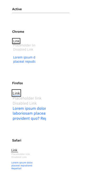
(Right now there’s a 3px line underneath for both :focus and :active)
[x] Change to a one pixel box for :focus (box is 18px in height; 1px weight; 2px offset on either side of type)
[x] Make sure link token is $body-short-01
[x] Only difference for :active is that it turns black: underline should stay the same as hover state
[x] 32px of space between enabled and disabled link in component display window (has nothing to do with the component, this is just website display)
[x] Restore default distance between underline and link (right now it looks like there’s an offset of 5px); the spec has Sketch default underline (looks like about 1px distance)
[x] Need to fix Active state in Chrome and Firefox per issue https://github.com/IBM/carbon-components/issues/1909#issuecomment-467183947 (see spec)
Spec:

 jeanservaas
All 11 comments
I think this feedback is based on an outdated version of the component (if it was based on the documentation website's examples then it's outdated)
https://github.com/IBM/carbon-components/pull/1802 should have addressed most if not all of these points if I'm not mistaken
 emyarod
on 25 Feb 2019
emyarod
on 25 Feb 2019
@emyarod Does the Netlify link in #1802 show that this issue is fixed? Thanks!
 asudoh
on 25 Feb 2019
asudoh
on 25 Feb 2019
I believe there is confusion over :focus and :active and that both can be applied on a mouse click (additional discussion here https://github.com/IBM/carbon-components/issues/1909#issuecomment-467183947)
if I understand correctly it seems like we need to clarify what the :focus:active state should be
emyarod
on 25 Feb 2019
@emyarod
I didn't see these issues linked in air table and I'm not that familiar with the status of link... I checked out those issues and checked off boxes that appear resolved, there are still some fixes here though.
My goals is to try to consolidate all of these audit issues into one and close the others.
jeanservaas
on 27 Feb 2019
just to clarify, on :focus we want the box drawn around the link, and on :active we want the underline is that correct? what do we want to happen when both :focus and :active are applied? it seems like the audit feedback is about :focus together with :active rather than just a single state
emyarod
on 27 Feb 2019
Yes that's correct according to the spec... the spec treats them as distinct states...
i would say, if you are focusing and you click the link, you'd see only the active state (just the black underline) not a black focus state. Does that make sense? Or are you thinking that it needs to be a unique combo state for some reason?
jeanservaas
on 27 Feb 2019
got it so :focus:active should be identical to :active, that's what I wanted to clarify since the spec only showed the individual states and not what should happen when both were applied (which occurs on mouse clicks and also when keyboard users press space bar while the link is focused)
emyarod
on 27 Feb 2019
- Only difference for :active is that it turns black: underline should stay the same as hover state
is there a color token for the :active color and :hover color?
- Restore default distance between underline and link (right now it looks like there’s an offset of 5px); the spec has Sketch default underline (looks like about 1px distance)
can I see an example of this with letters like p/q/y etc?
emyarod
on 28 Feb 2019
Tokens:
- Active state is just $text-01
- Hover state is $hover-primary-text

This seems to be working on the next site right now, although I don't think we're calling our link component
jeanservaas
on 28 Feb 2019
got it, opened #1960 @jeanservaas
emyarod
on 28 Feb 2019
:tada: This issue has been resolved in version 9.82.17 :tada:
The release is available on:
Your semantic-release bot :package::rocket:
 carbon-bot
on 5 Mar 2019
carbon-bot
on 5 Mar 2019
Related issues
 AnthumChris
·
3Comments
AnthumChris
·
3Comments
 mouadcherkaoui
·
3Comments
mouadcherkaoui
·
3Comments
 joshblack
·
3Comments
joshblack
·
3Comments
 skaparelos1
·
3Comments
skaparelos1
·
3Comments
 jhpedemonte
·
3Comments
jhpedemonte
·
3Comments