Caprine: More Mojave-like dark theme
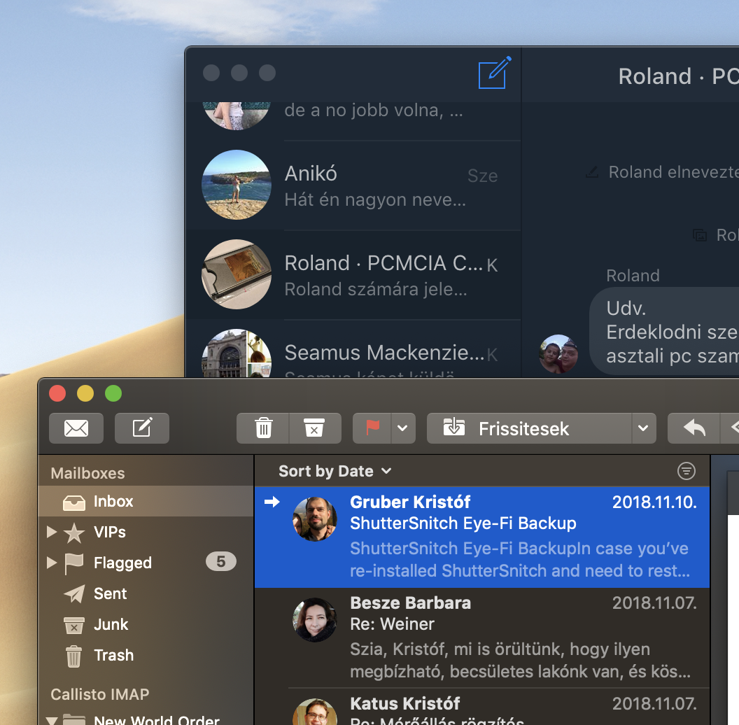
MacOS Mojave includes a Dark Theme which is (IMHO) much better than Caprine's current theme. I understand that some might prefer the current theme, so I think you should introduce a third, more OS-native feeling theme.
I think two main problems are visible with the current theme:
- The currently selected conversation is not highlighted enough, it's barely visible
- Either nothing or the whole window can be set "vibrant". I think only the sidebar should be transparent, the message view should remain opaque.
Beside this, Caprine's dark theme uses a nice blue-ish color tint, which also adds an odd, akward-look for the app. It stands out from the rest of the dark apps.
What do you think about it?
 gklka
gklka
All 12 comments
Messages app is a better example than Mail, sorry:
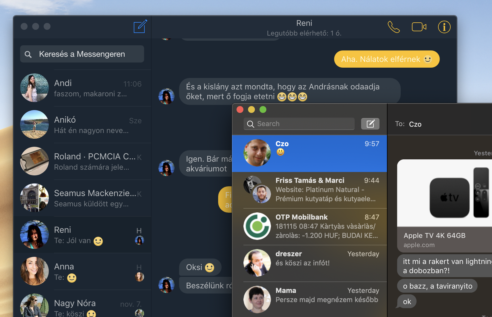
gklka
on 15 Nov 2018
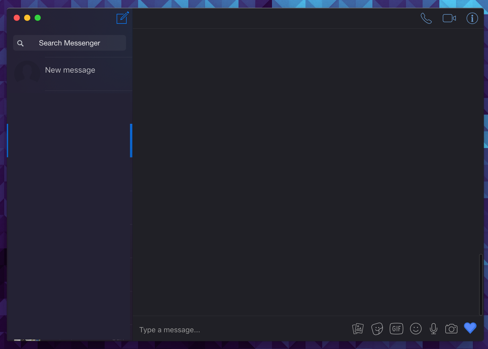
This is how it looks like in master branch now:
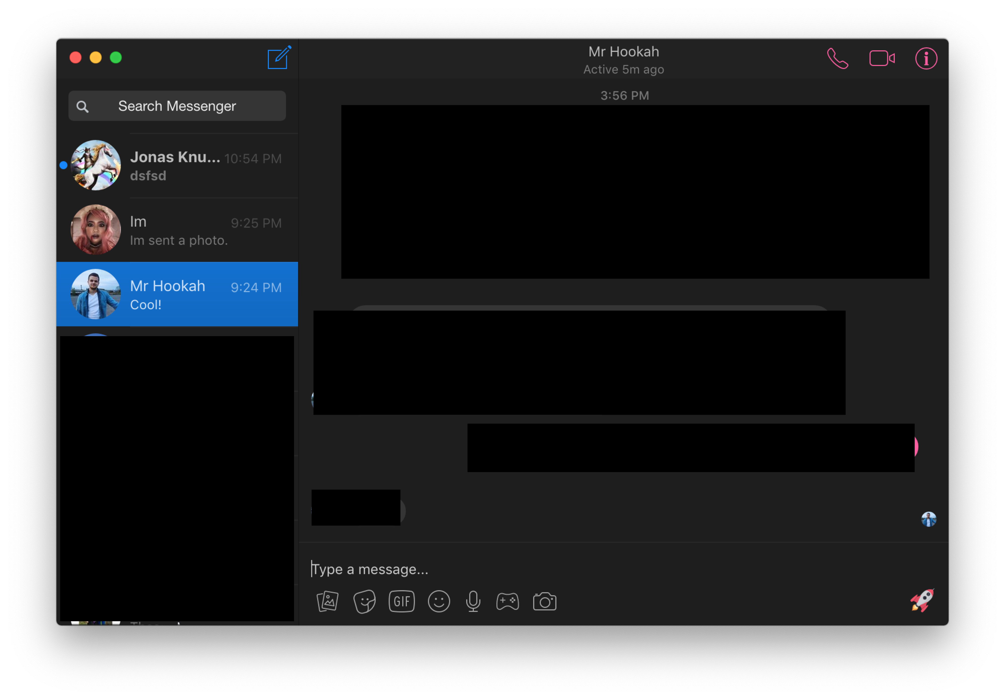
 sindresorhus
on 19 Nov 2018
sindresorhus
on 19 Nov 2018
Making only the sidebar vibrant is blocked by https://github.com/electron/electron/issues/13460.
sindresorhus
on 19 Nov 2018
PR welcome to improve it further.
sindresorhus
on 19 Nov 2018
(EDITED) This is a POC for dark mode + vibrancy using CSS:
html.vibrancy body,
html.vibrancy ._4sp8 {
    background: transparent !important;
}

/* Message placeholder text color */
html.vibrancy ._kmc ._1p1t {
    color: #999 !important;
    -webkit-text-fill-color: #999 !important;
}

/* Contact list: search input */
html.vibrancy ._5iwm ._58al {
    background-color: rgba(246, 247, 249, 0.5) !important;
}

/* Chat title bar */
html.vibrancy ._673w {
    background-color: #202026 !important;
    border-bottom: 1px solid rgba(255, 255, 255, 0.05) !important;
}

/* Share previews: title and subtitle */
html.vibrancy .__6k,
html.vibrancy .__6l {
    background-color: transparent !important;
}

/* Contact list: person container */
html.vibrancy ._1qt4 {
    border-top: solid 1px rgba(0, 0, 0, 0.06);
}

/* Styles for vibrancy in dark mode */
html.dark-mode.vibrancy body {
    background: rgba(0, 0, 0, 0.26) !important;
}

/* Main container? */
html.dark-mode.vibrancy ._4sp8 {
    background: transparent !important;
}

/* Message list: header above */
html.dark-mode.vibrancy ._5742 {
    background: transparent !important;
}

/* Contact list: header above */
html.dark-mode.vibrancy ._36ic {
    background: transparent !important;
}

/* Login button */
html.dark-mode.vibrancy button {
    background: transparent !important;
}

/* Message container + right sidebar */
html.dark-mode.vibrancy ._4_j4,
html.dark-mode.vibrancy ._4_j5 {
    background: #202026 !important;
    border-top: #4c4c4c !important;
}

/* Contact list: search input */
html.dark-mode.vibrancy ._5iwm ._58al {
    background: rgba(255, 255, 255, 0.05) !important;
}

/* New conversation name input field */
html.dark-mode.vibrancy ._2y8y {
    background: #202026 !important;
}
 neegool
on 27 Nov 2018
neegool
on 27 Nov 2018
@neegool The search field should be darker, to make it as invisible as in the light version
 cawa-93
on 27 Nov 2018
cawa-93
on 27 Nov 2018
I accidentally omitted the css code for the search field for dark mode. I've updated the CSS above to reflect that.
neegool
on 27 Nov 2018
@neegool The chat title bar is dark in the light mode. You left the dark-mode class selector.
 janosorcsik
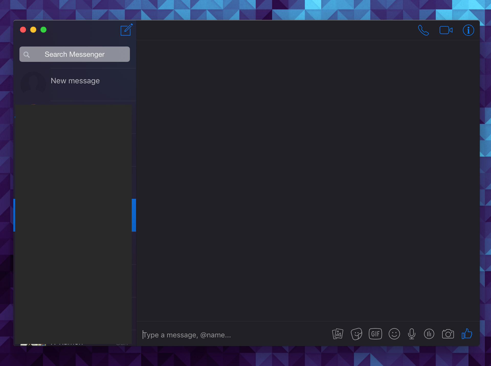
on 28 Nov 2018
janosorcsik
on 28 Nov 2018
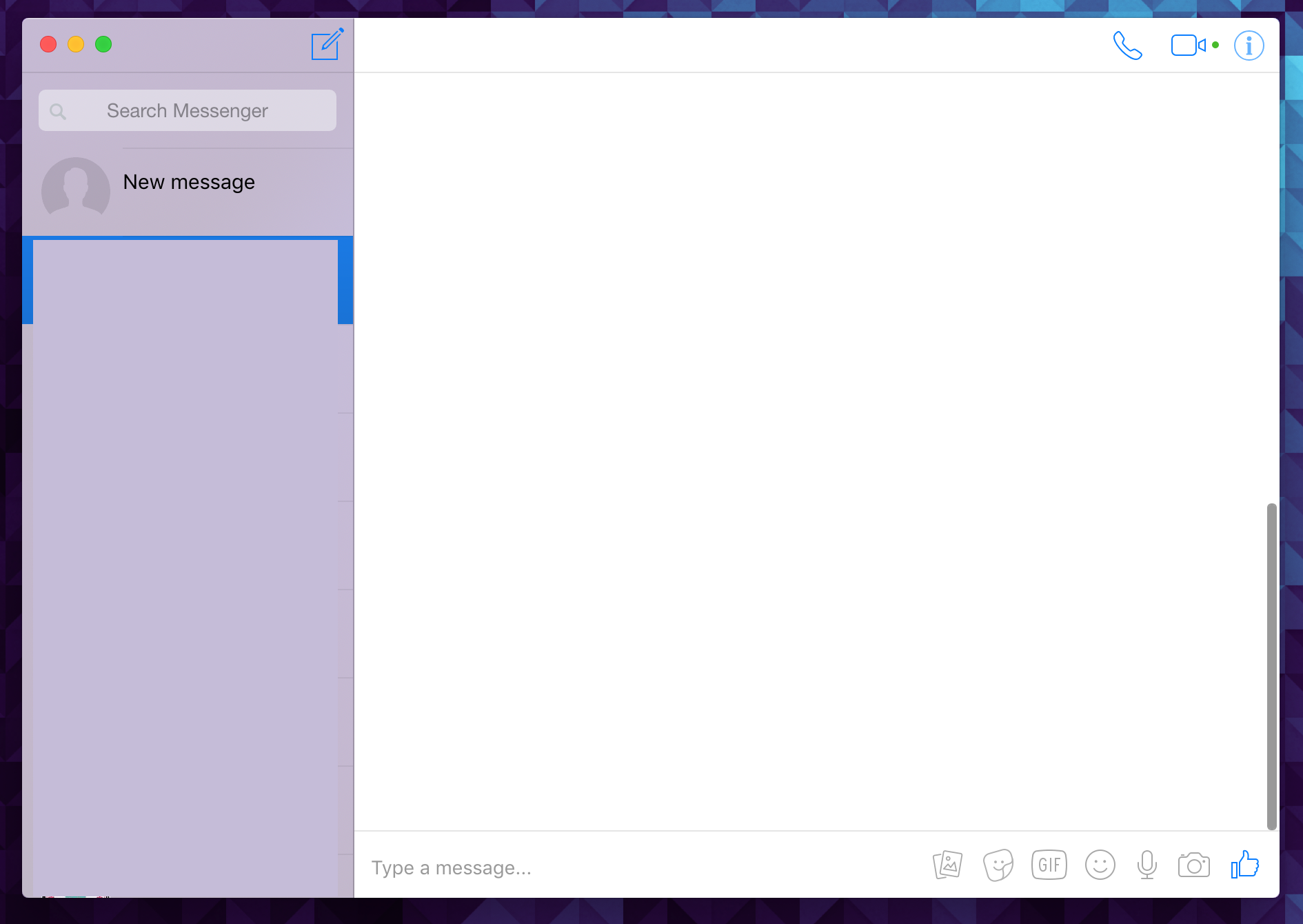
Added styling for light mode as well:
I agree with OP's suggestion on making this another style instead of replacing the vibrancy style altogether. I personally like using the full-window vibrancy. I propose the following menu structure for the vibrancy options:
Vibrancy mode:
- Disabled
- Full-window
- Native-like
html.vibrancy body,
html.vibrancy ._4sp8 {
    background: rgba(255, 255, 255, 0.4) !important;
}

html.dark-mode.vibrancy body,
html.dark-mode.vibrancy ._4sp8 {
    background: transparent !important;
}

/* Message placeholder text color */
html.vibrancy ._kmc ._1p1t {
    color: #999 !important;
    -webkit-text-fill-color: #999 !important;
}

/* Contact list: search input */
html.vibrancy ._5iwm ._58al {
    background-color: rgba(246, 247, 249, 0.5) !important;
}

/* Chat title bar (light mode) */
html.vibrancy ._673w {
    background-color: #ffffff !important;
    border-bottom: 1px solid rgba(0, 0, 0, .10);
}

/* Chat title bar (dark mode) */
html.dark-mode.vibrancy ._673w {
    background-color: #202026 !important;
    border-bottom: 1px solid rgba(255, 255, 255, 0.05) !important;
}

/* Share previews: title and subtitle */
html.vibrancy .__6k,
html.vibrancy .__6l {
    background-color: transparent !important;
}

/* Contact list: person container */
html.vibrancy ._1qt4 {
    border-top: solid 1px rgba(0, 0, 0, 0.06);
}

/* Styles for vibrancy in dark mode */
html.dark-mode.vibrancy body {
    background: rgba(0, 0, 0, 0.26) !important;
}

/* Main container? */
html.dark-mode.vibrancy ._4sp8 {
    background: transparent !important;
}

/* Message list: header above */
html.dark-mode.vibrancy ._5742 {
    background: transparent !important;
}

/* Contact list: header above */
html.dark-mode.vibrancy ._36ic {
    background: transparent !important;
}

/* Login button */
html.dark-mode.vibrancy button {
    background: transparent !important;
}

/* Message container + right sidebar (light mode) */
html.vibrancy ._4_j4,
html.vibrancy ._4_j5 {
    background: #ffffff !important;
}

/* Message container + right sidebar (dark mode) */
html.dark-mode.vibrancy ._4_j4,
html.dark-mode.vibrancy ._4_j5 {
    background: #202026 !important;
}

/* New conversation name input field */
html.vibrancy ._2y8y {
    background: #ffffff !important;
}

/* Contact list: search input */
html.dark-mode.vibrancy ._5iwm ._58al {
    background: rgba(255, 255, 255, 0.05) !important;
}

/* New conversation name input field */
html.dark-mode.vibrancy ._2y8y {
    background: #202026 !important;
}
@neegool It may be better if you create a PR instead of issue
cawa-93
on 28 Nov 2018
What if we have an option to allow us to use custom css without having to compile it ourselves? :o
 outpoints
on 2 Dec 2018
outpoints
on 2 Dec 2018
I think it's nice to have that feature down the road, and I hope that the framework I introduced in my PR would be an acceptable starting point for that to happen. :) However, I think that it's better for that to be a separate issue/feature request altogether, as it's a bit outside the scope of this particular issue.
neegool
on 2 Dec 2018
Related issues
sindresorhus
·
4Comments
 0wlyW00d
·
3Comments
0wlyW00d
·
3Comments
 logxseven
·
3Comments
logxseven
·
3Comments
 Martina-Neumayer
·
4Comments
Martina-Neumayer
·
4Comments
 mmatyas
·
3Comments
mmatyas
·
3Comments
Most helpful comment
I accidentally omitted the css code for the search field for dark mode. I've updated the CSS above to reflect that.
