Caprine: Add menu bar icon on macOS
![]()
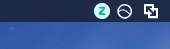
It'd be cool to show the number of unread notifications and add the ability to remove the app from dock. Something like this:


The number may be too small in my example, but I think the main idea is there.
IssueHunt Summary
#
#
#
#
[
<
i
m
g
s
r
c
'
h
t
t
p
s
:
/
/
a
v
a
t
a
r
s
0
.
g
i
t
h
u
b
u
s
e
r
c
o
n
t
e
n
t
.
c
o
m
/
u
/
8
3
0
9
4
1
7
?
v
4
'
a
l
t
'
w
h
i
t
e
c
r
o
w
n
c
l
o
w
n
'
w
i
d
t
h
2
4
h
e
i
g
h
t
2
4
>
w
h
i
t
e
c
r
o
w
n
c
l
o
w
n
]
(
h
t
t
p
s
:
/
/
i
s
s
u
e
h
u
n
t
.
i
o
/
u
/
w
h
i
t
e
c
r
o
w
n
c
l
o
w
n
)
h
a
s
b
e
e
n
r
e
w
a
r
d
e
d
.
Backers (Total: $2.00)
rororofff ($2.00)
Submitted pull Requests
- #804 Add menu bar mode for macOS
Tips
- Checkout the Issuehunt explorer to discover more funded issues.
- Need some help from other developers? Add your repositories on IssueHunt to raise funds.
IssueHunt has been backed by the following sponsors. Become a sponsor
 antonio-ramadas
All 22 comments
Related to #31.
I think we should discuss if just an unread icon is enough or if we should have the message count too. Readability of the unread count may be an issue since the icon is so small.
 veniversum
on 15 May 2017
veniversum
on 15 May 2017
I think we could simply have a dark icon when there's no new message, and one having a little red circle at the top (without any numbers) if there are unread messages.
In my opinion, the unread count may not be necessary here...
 eveningkid
on 15 May 2017
eveningkid
on 15 May 2017
The number as I showed is too small, but its size may be increased if placed next to the icon (for example, on the right). For now, @eveningkid's suggestion seems good to me.
antonio-ramadas
on 15 May 2017
I'm lukewarm to the idea, but if anyone spends time on a good PR, I'm open to it. It's too small for a numbered indicator. The indicator should also not be colored. Nothing else on the menubar uses colors and having colors means we can't make it a template image, so it won't automatically work in dark mode. Let's open our creative minds and think how we can indicate this without a color. I also don't want a number besides the icon, that looks messy. Maybe the lighting symbol indicates unread messages? So when there are none, the lightning symbol is not there.
// @ryanseys @johndbritton
 sindresorhus
on 15 May 2017
sindresorhus
on 15 May 2017
Don’t know if you ever used Line https://line.me/en, @sindresorhus. This is how it looks when you have unread messages using the macOS app:
http://image.prntscr.com/image/aa7749c02253497796f7822978fa3ee9.png
Does it look that messy? I kind of like it…
I do understand your opinion about this though; but as long as all this remains optional, I believe it can be helpful for some caprine users.
On 15 May 2017, at 20:02, Sindre Sorhus notifications@github.com wrote:
I'm lukewarm to the idea, but if anyone spends time on a good PR, I'm open to it. It's too small for a numbered indicator. The indicator should also not be colored. Nothing else on the menubar uses colors and having colors means we can't make it a template image, so it won't automatically work in dark mode. Let's open our creative minds and think how we can indicate this without a color. I also don't want a number besides the icon, that looks messy. Maybe the lighting symbol indicates unread messages? So when there are none, the lightning symbol is not there.
// @ryanseys https://github.com/ryanseys @johndbritton https://github.com/johndbritton
—
You are receiving this because you were mentioned.
Reply to this email directly, view it on GitHub https://github.com/sindresorhus/caprine/issues/206#issuecomment-301555521, or mute the thread https://github.com/notifications/unsubscribe-auth/AG2wDoSsfc70r2KIlY-hEkgas3htb2fQks5r6JNKgaJpZM4Nag8R.
eveningkid
on 15 May 2017
I have Line on my iPhone, and it's such a badly made app. I don't think it's the right company to take design cues from.
sindresorhus
on 15 May 2017
I believe your opinion is as worth it as mine, who do like the app the way it is.
I doubt it's fair to say you don't like it and then call it an argument.
Caprine remains your project anyway. Hope someone will do work on this.
eveningkid
on 15 May 2017
@sindresorhus
I agree with you that less is more - a numbers indicator shouldn't be necessary from a UX perspective.
However having the option to run the app from the menubar (instead of the dock) would be so awesome!
I don't think there currently is an open source messenger app that does this - this could be a great feature to make your app more unique and stand out from others such as Goofy.
EDIT: In that same context adding a (customizable) global shortcut for opening the Caprine window would be lovely so that it can truly be used as a great messenger app, that stays in the background when not needed.
Anyways I made a quick sketch of what it could look like to encourage someone working on that feature - my coding isn't good enough for that:
If you need simple vector graphics I could help with that.
EDIT 2:
For comparison: I have been using Current for the past years. While it is a good app in terms of its features it also does a lot more than a good messenger app really needs and it seems to have become quite a resource hog in the latest releases.
 steven-tk
on 12 Jun 2017
steven-tk
on 12 Jun 2017
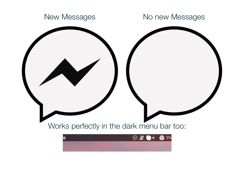
@Cakelicious The shape is squashed way more than it should be.
 mirshko
on 12 Jun 2017
mirshko
on 12 Jun 2017
@mirshko you're right - thanks!
I guess I must have not properly held down shift when scaling at some point - such things happen at 3 a.m. ;)
Either way it was just a quick mockup so it still works as a first impression of what a finished version could look like.
If @sindresorhus needs me to create a proper vector version I'd surely be more thorough than that.
Edit: Actually here's the correct version
steven-tk
on 13 Jun 2017
@Cakelicious That still looks a tad off.
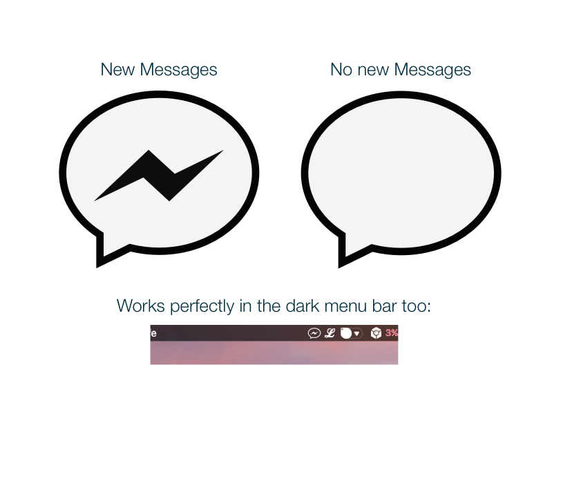
Here is what I came up with using Official Facebook brand assets. I think this makes it look a little more obvious that there is a message, while still keeping the icon recognizable. @sindresorhus ?
mirshko
on 13 Jun 2017
Thicker line variant.

mirshko
on 13 Jun 2017
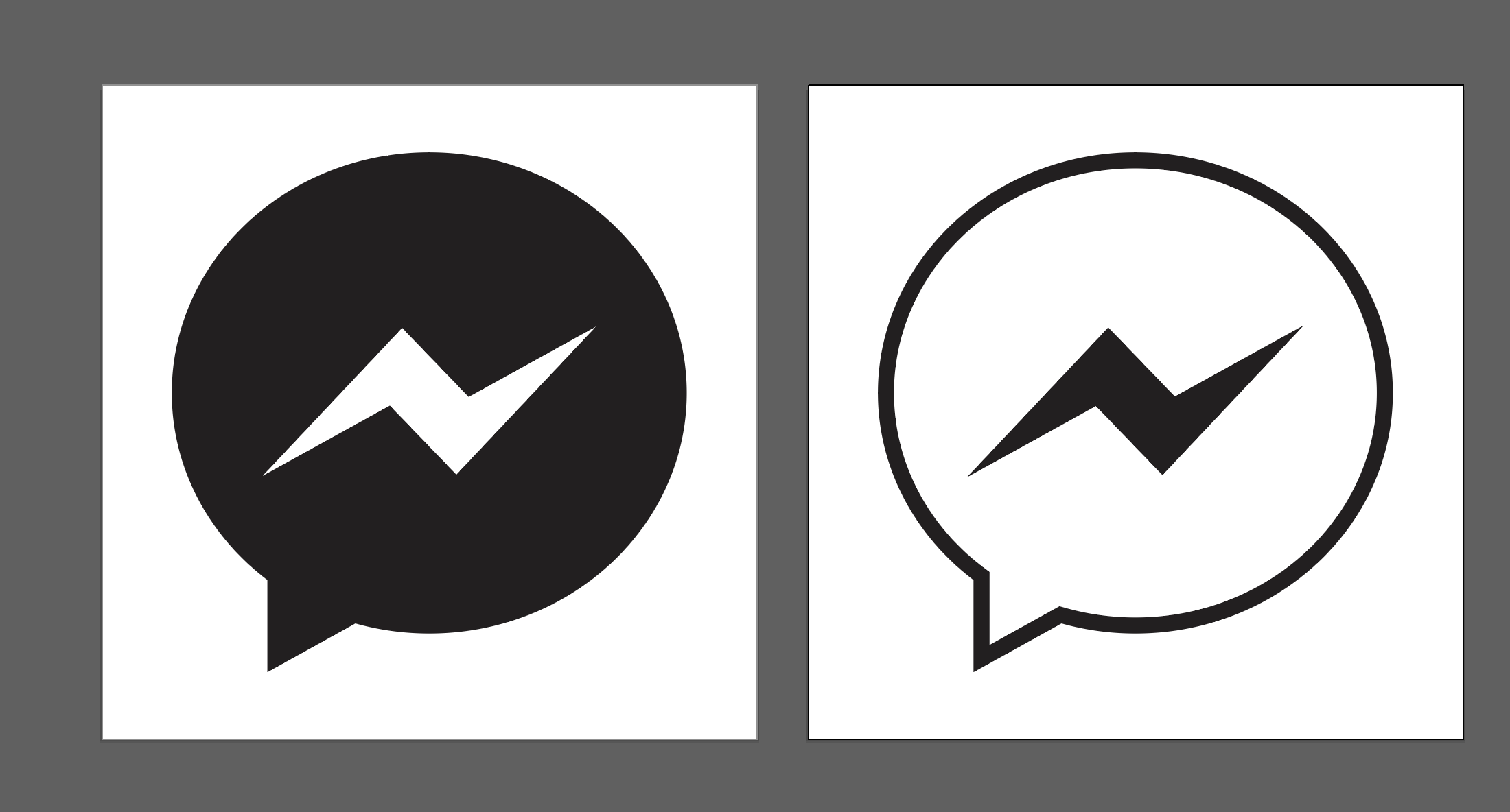
@mirshko I actually based it on the Caprine app icon on MacOS - maybe that's slightly different to the FB assets?
steven-tk
on 13 Jun 2017
@Cakelicious could just be my eyes as well. /shrug
mirshko
on 13 Jun 2017
I like @mirshko proposal the most (the thicker line one). Could you share the vector assets?
I don't have time to implement this feature, but pull request welcome if anyone want to give it a go :)
sindresorhus
on 15 Jun 2017
Here is a zip with both svgs @sindresorhus
mirshko
on 15 Jun 2017
This is on my to do list. My goal is to do this by Monday. Also, @Cakelicious talked about a global shortcut. @sindresorhus, is it to be implemented on this pull request?
antonio-ramadas
on 16 Jun 2017
Yeah, a global shortcut would be useful.
sindresorhus
on 16 Jun 2017
@sindresorhus In Zulip, this is how we have implemented the unread tray counts -
- If there is unread count we create tray icon using canvas image + unread counts and show it like this -

- When there are no unread counts we create tray icon from the default icon -
Hope this helps!
 akashnimare
on 29 Jul 2017
akashnimare
on 29 Jul 2017
Throwing this out there: if anyone wants this feature implemented, consider picking up and continuing https://github.com/sindresorhus/caprine/pull/374
I'll try to see if I can do this myself to finally merge this feature in.
 ProLoser
on 13 Sep 2018
ProLoser
on 13 Sep 2018
@rororofff has funded $2.00 to this issue.
- Submit pull request via IssueHunt to receive this reward.
- Want to contribute? Chip in to this issue via IssueHunt.
- Checkout the IssueHunt Issue Explorer to see more funded issues.
- Need help from developers? Add your repository on IssueHunt to raise funds.
 IssueHuntBot
on 14 Mar 2019
IssueHuntBot
on 14 Mar 2019
@sindresorhus has rewarded $1.80 to @whitecrownclown. See it on IssueHunt
- :moneybag: Total deposit: $2.00
- :tada: Repository reward(0%): $0.00
- :wrench: Service fee(10%): $0.20
![issuehunt-app[bot] picture](https://avatars.githubusercontent.com/in/29881?v=4&s=40) issuehunt-app[bot]
on 21 Jun 2019
issuehunt-app[bot]
on 21 Jun 2019
Related issues
 skymakai
·
3Comments
skymakai
·
3Comments
 IdiosApps
·
3Comments
IdiosApps
·
3Comments
 Vexorify
·
3Comments
sindresorhus
·
4Comments
Vexorify
·
3Comments
sindresorhus
·
4Comments
 PanagiotisGts
·
4Comments
PanagiotisGts
·
4Comments
Most helpful comment
I'm lukewarm to the idea, but if anyone spends time on a good PR, I'm open to it. It's too small for a numbered indicator. The indicator should also not be colored. Nothing else on the menubar uses colors and having colors means we can't make it a template image, so it won't automatically work in dark mode. Let's open our creative minds and think how we can indicate this without a color. I also don't want a number besides the icon, that looks messy. Maybe the lighting symbol indicates unread messages? So when there are none, the lightning symbol is not there.
// @ryanseys @johndbritton