Caprine: Improve the look of code blocks
They look pretty ugly by default, and would be nice to have a different style in dark mode.
Follow-up to https://github.com/sindresorhus/caprine/issues/105.
 sindresorhus
All 7 comments
It's messed up for me (unreadable)

Without dark mode:

 SimenB
on 18 Aug 2016
SimenB
on 18 Aug 2016
They probably changed some CSS selectors.
 😉
😉
sindresorhus
on 18 Aug 2016
looks like the lightest color is the only broken one.
I'll poke around at this in a few hours when I'm off work :)
 tschuy
on 18 Aug 2016
tschuy
on 18 Aug 2016
I'm curious that why css class name look unreadable
I think I could help but it's kinda hard to guess what is it.
 katopz
on 7 Dec 2016
katopz
on 7 Dec 2016
So, I use code blocks a lot, and seeing that I'm not the only one finding those very ugly, I made a thing :
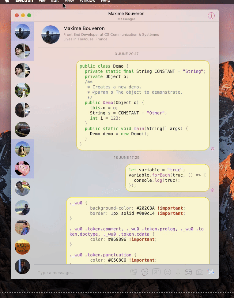
But this seems a bit overkill for an app that isn't really targeted at developers, so I also made this :
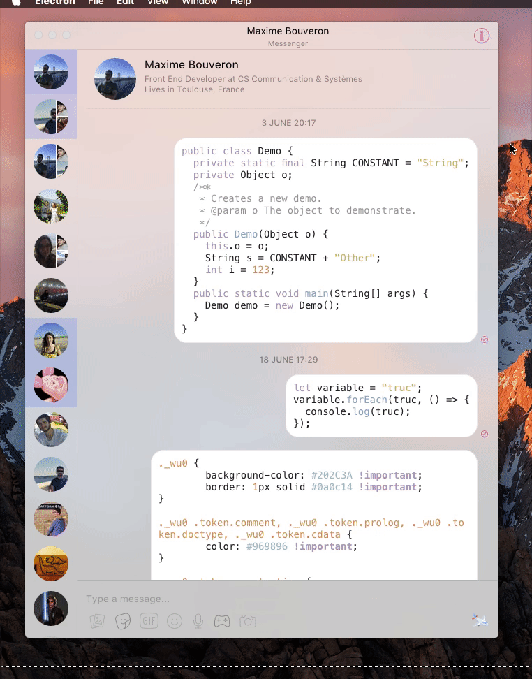
Of course I can do this with any other color scheme
 Bo-Duke
on 25 Jun 2017
Bo-Duke
on 25 Jun 2017
The second one looks amazing. Would you be interested in doing a pull request?
sindresorhus
on 25 Jun 2017
Of course, I'll do it when I get home
Bo-Duke
on 26 Jun 2017
Related issues
 willashley23
·
3Comments
willashley23
·
3Comments
 vogu66
·
3Comments
vogu66
·
3Comments
 bsucker98
·
3Comments
bsucker98
·
3Comments
 petersng
·
3Comments
petersng
·
3Comments
 Vexorify
·
3Comments
Vexorify
·
3Comments
Most helpful comment
So, I use code blocks a lot, and seeing that I'm not the only one finding those very ugly, I made a thing :
But this seems a bit overkill for an app that isn't really targeted at developers, so I also made this :
Of course I can do this with any other color scheme