Canvasblocker: Separate extension page for UI and settings
The current layout that is within about:addons is pretty long and not as user friendly to be able to easily find settings and options.
I think a separate extension page for UI and settings where there are organized and clickable headers to represent each item (e.g. General settings, Canvas API, History API etc.) would make the extension easier and more pleasant to configure.
 grenzor
All 16 comments
Hm... we already have the sections and I could change it that only the headers are shown and on click the sections will appear.
 kkapsner
on 28 May 2019
kkapsner
on 28 May 2019
Yes, headers are there but what I'm suggesting is rather than having it all in one long page it would be better have it in a easy to navigate tabs or panes (something like uBlock Origin's dashboard)
grenzor
on 28 May 2019
OK - let's see.
kkapsner
on 28 May 2019
I implemented what I meant with the hideable sections. Please check the latest alpha and tell me what you think about it: https://canvasblocker.kkapsner.de/versions/
kkapsner
on 11 Jun 2019
The hideable sections are definitely better than how it is now but I'm not sure if they would really be needed if you plan to implement tabs.
grenzor
on 11 Jun 2019
There are up to 12 sections. So I think also tabs would not be user friendly. Also tabs would make the search functionality much harder to use.
You still have to convince me that I should implement tabs.
kkapsner
on 11 Jun 2019
I'm curious why you think tabs will be less user friendly than the current UI which is just every setting on a single page which makes users either search or keep scrolling until they find what they want.
There are 12 sections but it can be reduced/moved around. Settings like those at the top (like Display hidden settings, Expert mode etc), "Misc", "Settings" can come under a single header "General Settings". The options are similar thematically, apply globally rather than having many options to whitelist or tweak specifically so it would make sense to have them under one general settings header. If you can use collapsable sections within tabs that would be better. Each API will get it's own tab and everything related to that API will be contained in its tab. There won't be need for separate pages specific to APIs e.g. Navigator API settings opens in a new page right now and doesn't have to be in a tabs setup.
About search, would it really be necessary have if there are tabs? I wonder what type of things people search for. My guess is they mainly search for the API name rather than any specific API thing like "Fixed indices".
These are just my thoughts. Whether you want to implement tabs is up to you.
grenzor
on 11 Jun 2019
It's just laziness that makes me reluctant doing tabs... so I should just do a mockup and see how it looks. I can image there being three or four tabs or the general topic and then the section underneath.
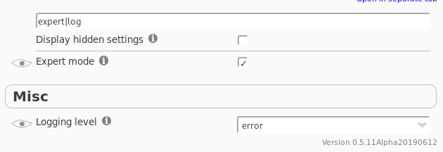
In fact I have no clue if and for what the search is used. But I use it a lot in development so it will stay. It can help seeing settings that far apart at the same time:
kkapsner
on 11 Jun 2019
My thinking is left side headers/tabs rather than normal landscape tabs would allow an easy to navigate UI and still keep it neat if more sections are added in the future.
Something like:
CanvasBlocker
Search: _____________________________________
General Settings |
Notifications |
Lists |
Faking |
Canvas API |
...
...
Clicking each header would show on right side of the page with relevant options of the header/section.
ViolentMonkey has sidebar headers and collapsable headers within it similar to what I described in case you want to get some ideas.
Anyway just ping me if you ever do some mockups, I'd be happy to provide feedback.
grenzor
on 12 Jun 2019
Quite like the idea. Especially as Firefox has a similar layout in the settings.
kkapsner
on 14 Jun 2019
Please check the latest alpha version: https://canvasblocker.kkapsner.de/versions/
I think the basic layout is done. But I'm not sure about the actual tabs and sections within the tabs. @spodermenpls any input from you?
kkapsner
on 29 Jun 2019
I was skeptical at first towards how much improvement it would add in the end (being used to the current design for 3 years, and not knowing about the possibility of tabs inside the existing "embedded settings" panel), but the division into those three tabs is good, I like it. I don't see much room for improvement there. I've just tested it on my phone, it doesn't fit anymore width-wise like it did before (but you can open it in a separate tab), on the other hand it doesn't require as much scrolling anymore as before, so I'd say it's a good deal. The individual tab labels could be a bit (just a bit) taller, though, to make it easier to select them on touchscreens.
 spodermenpls
on 30 Jun 2019
spodermenpls
on 30 Jun 2019
Thanks for the input. Will make the tabs taller. Then let's roll with the current setup. If we find something to improve the groups and sections can easily be moved/changed.
kkapsner
on 30 Jun 2019
The layout is good but there really should be separate tabs for each API. With all APIs in the same tab it still has the same issues of the previous UI that tabs were meant to help with like making it easier to find and look through particular API settings by just clicking a tab for the API and to lessen the need to keep scrolling or searching.
IMO "Notifications" and "Lists" sections would be better as their own tabs. Also the "Display hidden settings" and "Settings" section would seem like it would be a better fit in "General" than "Misc".
grenzor
on 30 Jun 2019
I also already thought of having a separate tab for each API. I discarded it because in the non expert mode you only only have one or two settings per section (and the history section is not visible at all).
In expert mode the page gets long due to the protected functions - if you hide these I think it's not too bad. And you can still collapse the sections.
Lists are also only available in expert mode and I do not want to promote them (the white and black are actually legacy and should not be used).
On "Notifications" I just simply think they are well suited in general.
The "Display hidden settings" is always visible.
Moving Settings to General is a good idea.
kkapsner
on 3 Jul 2019
kkapsner
on 6 Jul 2019
Related issues
 nkestrel
·
7Comments
kkapsner
·
5Comments
spodermenpls
·
4Comments
spodermenpls
·
6Comments
nkestrel
·
7Comments
kkapsner
·
5Comments
spodermenpls
·
4Comments
spodermenpls
·
6Comments
 ghost
·
6Comments
ghost
·
6Comments