Calendar: Design polishing of new event popover
Some first impressions:
- [ ] There is always a short flash of the popover being somewhere else before the popover is positioned correctly. Any way we can prevent this?
- [ ] The title field needs to be focused when the popup appears so you can directly start typing
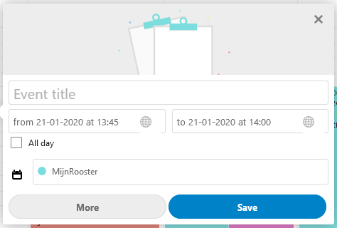
- [x] The title field placeholder shouldn’t say "Untitled event" but "Event title"
- [x]
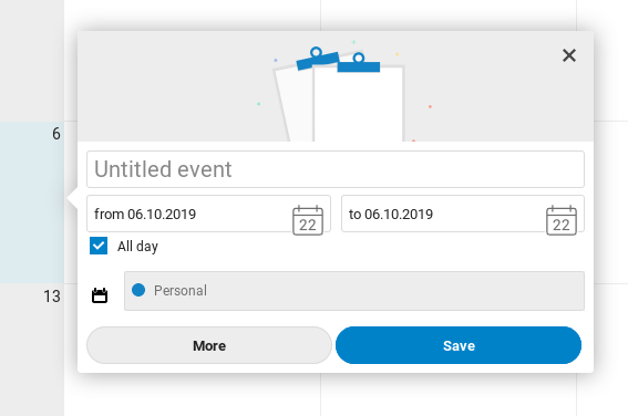
It’s rather wide / huge.width: 300px;seems a lot more compact and friendly, and less complicated. - [x] The calendar icon in the picker is much too big, and also it’s confusing since it says "22" which is todays date but is still massively confusing. I’d say cut the icon for simplicity.
- [x] Unchecking the "All day" checkbox takes a tiny bit too long? It’s not instant for sure, which is quite confusing and led to me clicking it twice.
- [x]
The calendar icon for the calendar dropdown seems a bit misplaced. It is not needed here I’d sayscratch this for now, as it would then look strange if it shows differently depending on if the location is set as per https://github.com/nextcloud/calendar/pull/1561 - [x] If you only have one calendar (in this case I have "Personal" and the uneditable "Contact birthdays", then the dropdown does not need to be shown at all.
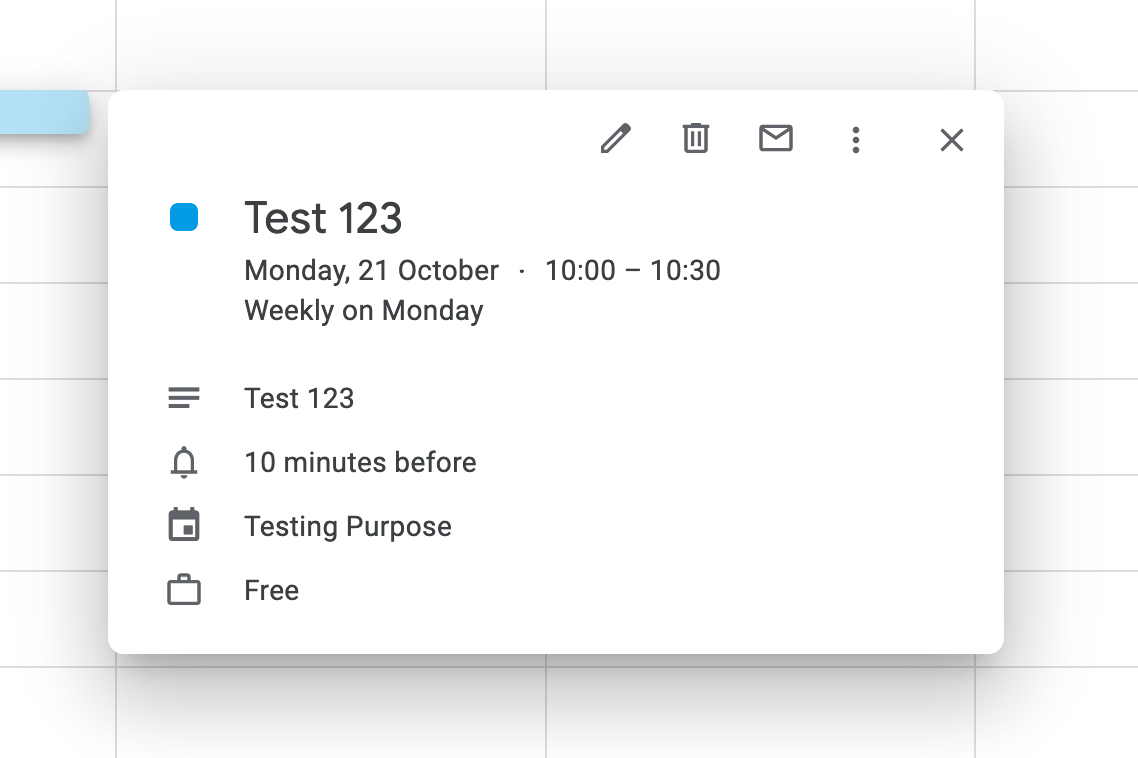
- [ ] Deleting existing events is quite cumbersome. A "Delete" button would be expected in this popover. To make it more obvious we could add icons to the buttons: "More" gets the icon-more, "Save" gets icon-checkmark. Then for existing events, you get a 50% width "Save" on the right, an icon-only "More" on the left, and a "Delete" filling up the space between.
- [x] Also I initially thought the graphic up top wouldn’t change, cause a bunch of the keywords I used didn’t work: "dentist", "date", "practice", "nextcloud", "conf", "contributor week", "film", "hack", … ;) Maybe we should add a few more – yes this will likely be a long list but hey writing long text files is what we are doing.
- It is very nice! :)
cc @georgehrke @tcitworld
Want to back this issue? Post a bounty on it! We accept bounties via Bountysource.
 jancborchardt
All 8 comments
The calendar icon in the picker is much too big, and also it’s confusing since it says "22" which is todays date but is still massively confusing. I’d say cut the icon for simplicity.
The icon is actually part of the DateTimePicker shipped by all Nextcloud/vue. see https://nextcloud-vue-components.netlify.com/#/Components?id=datetimepicker
But obviously that icon is way too big, will fix that.
 georgehrke
on 22 Oct 2019
georgehrke
on 22 Oct 2019
I was wondering whether we should move the More and Save button into the upper right corner, but i was also worried about discoverability then. (As in replace with icons)
@jancborchardt Any opinion? ^
A bit similar to Google:
georgehrke
on 22 Oct 2019
The icons without labels on the top are a bit too cryptic. We have it clearly right now, I’d not move away from that for now. At least it’s a separate discussion?
jancborchardt
on 22 Oct 2019
* The calendar icon in the picker is much too big, and also it’s confusing since it says "22" which is todays date but is still massively confusing. I’d say cut the icon for simplicity.
Running v2.0.0 here and I do not see the icon you show. I do however see a white space right where your icon overlaps the text box (right below the time zone icon):
Secondly, with respect to the last comments, there is a difference in how to open the details panel for different calendars. As shown above, there is a large button "More" in the lower left corner. However, for calendar items from subscription link or birthday calendar (which cannot be edited), the details panel is opened from the upper right corner with an icon:
Would be more logical if they would have the same way of entering the details panel. In my opinion upper right corner icon looks better and seems more intuitive, but more important is to have the same look for both cases I think.
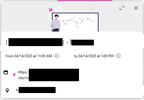
Third a small note: I noticed two white projections of the popover on the right edge, which appears on all non-editable calendar events (see latter image). Not sure if that is intended to be there or minor issue?
 memen45
on 20 Jan 2020
memen45
on 20 Jan 2020
The title field needs to be focused when the popup appears so you can directly start
I was about to open a new issue about that, and discovered this one thanks to issue title suggestion :). Thank you @jancborchardt for pointing this, the absence of focus is indeed, a bit frustrating.
 raphaelbastide
on 20 Jan 2020
raphaelbastide
on 20 Jan 2020
@raphaelbastide A pull-request would be very much welcome. :)
georgehrke
on 20 Jan 2020
@bcag2 Did you check the list above?
The ninth point is:
Deleting existing events is quite cumbersome. A "Delete" button would be expected in this popover. To make it more obvious we could add icons to the buttons: "More" gets the icon-more, "Save" gets icon-checkmark. Then for existing events, you get a 50% width "Save" on the right, an icon-only "More" on the left, and a "Delete" filling up the space between.
That's exactly what #2062 and #2247 are about.
georgehrke
on 15 May 2020
No, I didn't check the list, I use a stylus darkthem and the list was unreadable (grey on grey… ok by select it). Sorry.
 bcag2
on 15 May 2020
bcag2
on 15 May 2020
Related issues
 deanforrest
·
4Comments
deanforrest
·
4Comments
 scorewinner
·
3Comments
bcag2
·
4Comments
georgehrke
·
3Comments
scorewinner
·
3Comments
bcag2
·
4Comments
georgehrke
·
3Comments
 ml94
·
3Comments
ml94
·
3Comments