Calcite-components: Enhancement: Input invalid state styling
Description
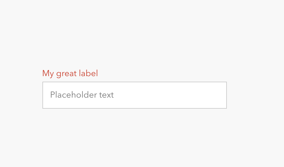
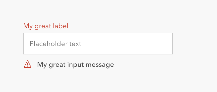
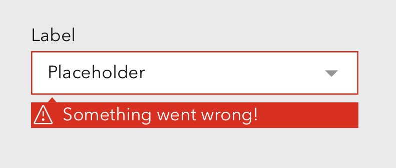
Currently, input invalid states have the label turn red, and will have the error message below.
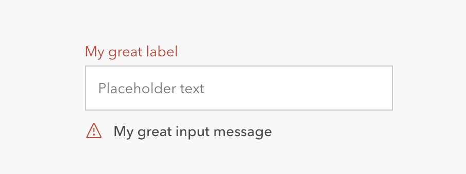
This can create a weird red/blue state when the input is in focus:
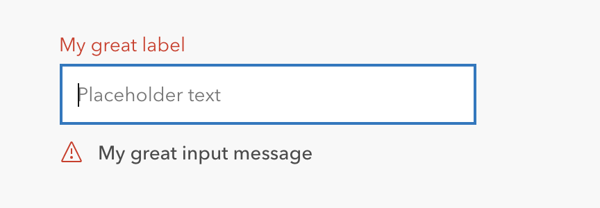
To address this, I'd like to propose that the red color highlight happens on the input field instead of the label.
Which Component
Input. Specifically looking at input with label and input message, but I supposed this could apply to all input types.
I would note, that I'm not sure how the input without label displays the error state.
Next steps
@macandcheese, can you notate the additional components you think should be considered with this update so @abigailmbravo-uxuidev can do design exploration on this?
cc @bstifle, @julio8a, @paulcpederson
 capeoples
All 33 comments
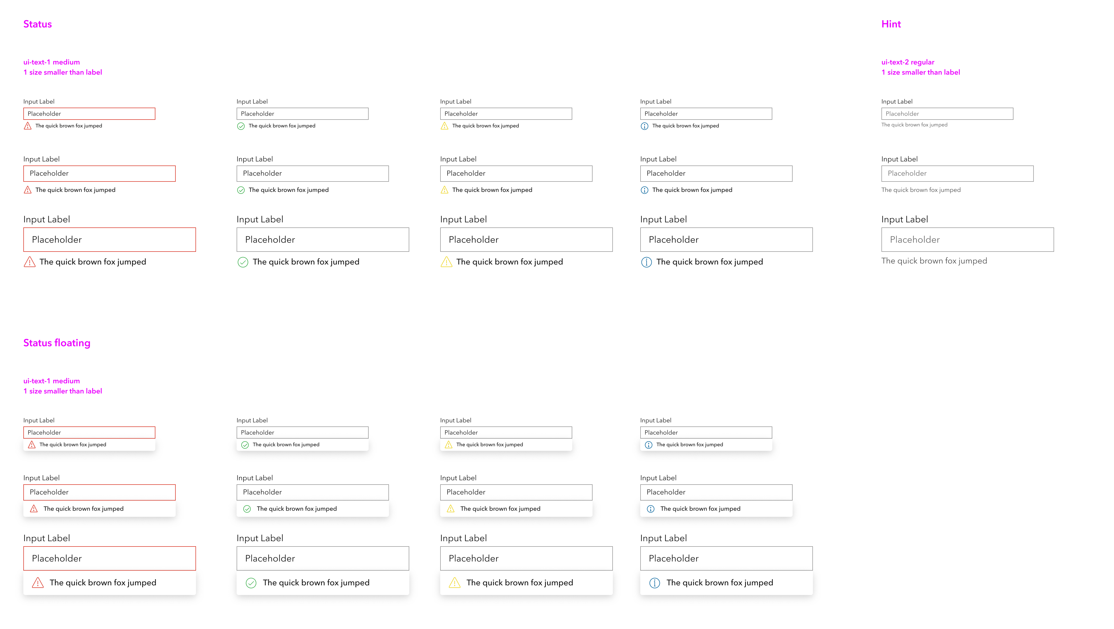
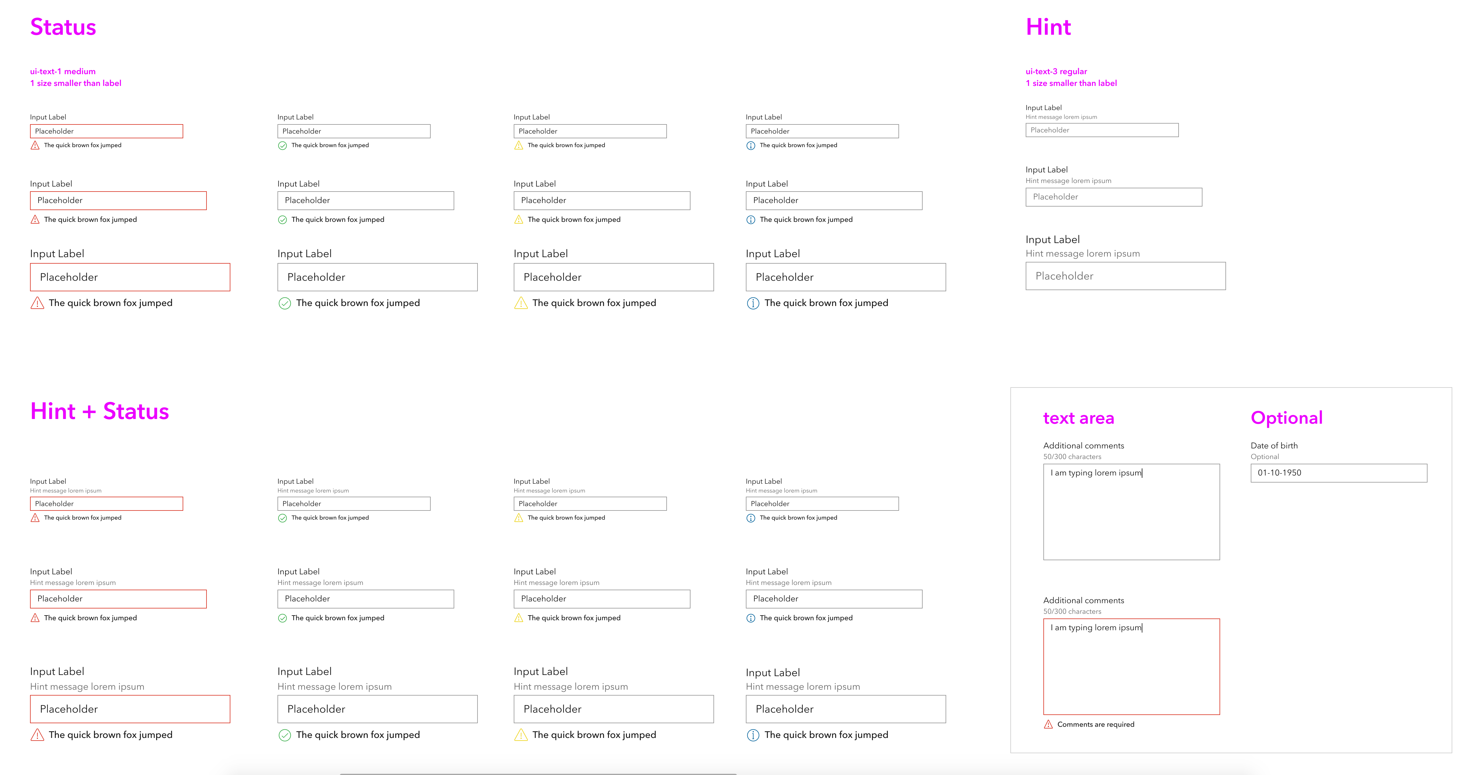
I agree this is a good change. Surveying the current components that van have invalid or red states they pretty uniformly use border/background/icon to communicate it:

Then you look at inputs which currently use just text color, it feels like an outlier for sure:
 paulcpederson
on 22 Feb 2021
paulcpederson
on 22 Feb 2021
Awesome. @capeoples looking forward to seeing that exhaustive form view!!
 bstifle
on 23 Feb 2021
bstifle
on 23 Feb 2021
👍 for this as well! We are currently overriding the blue border with red, so this would be great to remove that.
 ethanbdev
on 24 Feb 2021
ethanbdev
on 24 Feb 2021
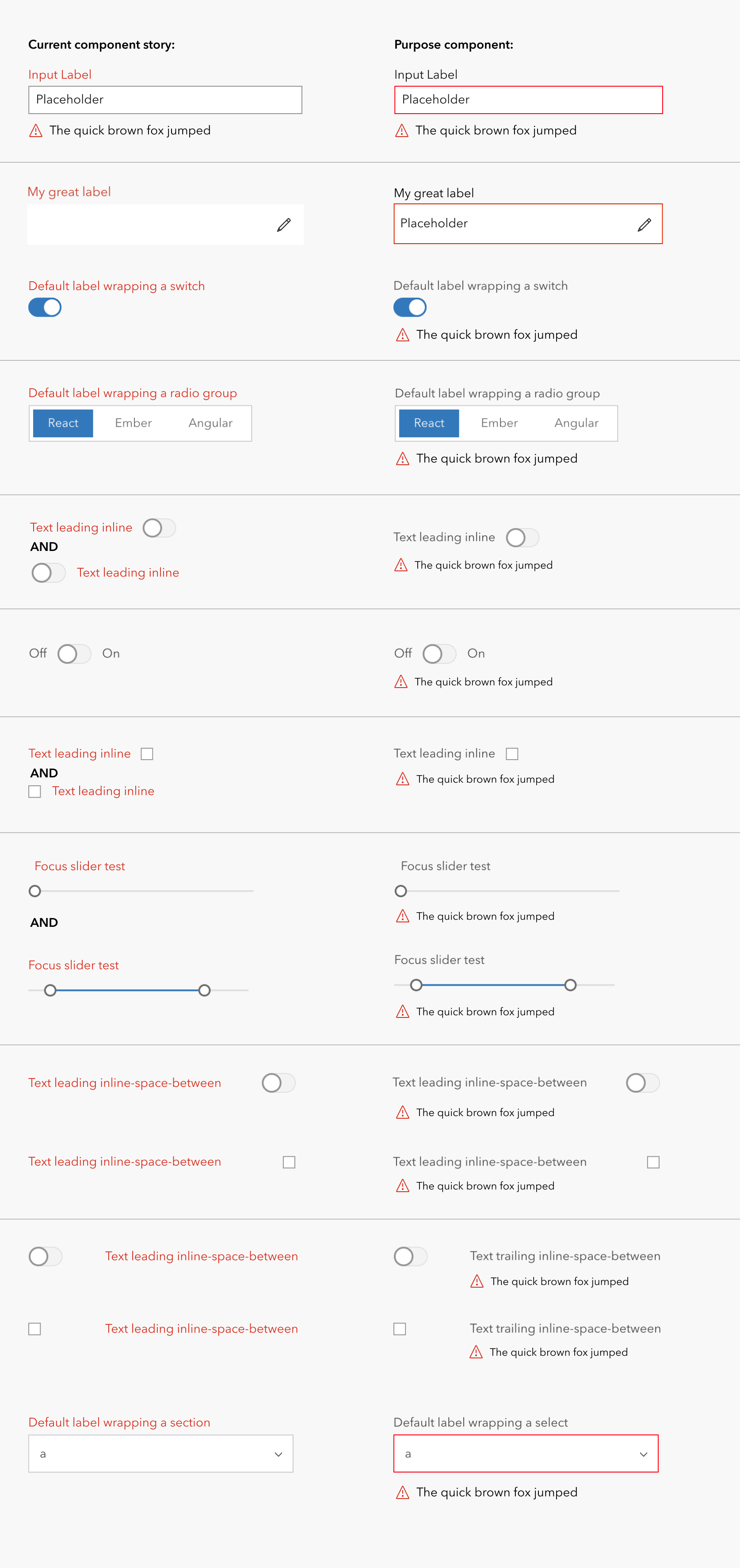
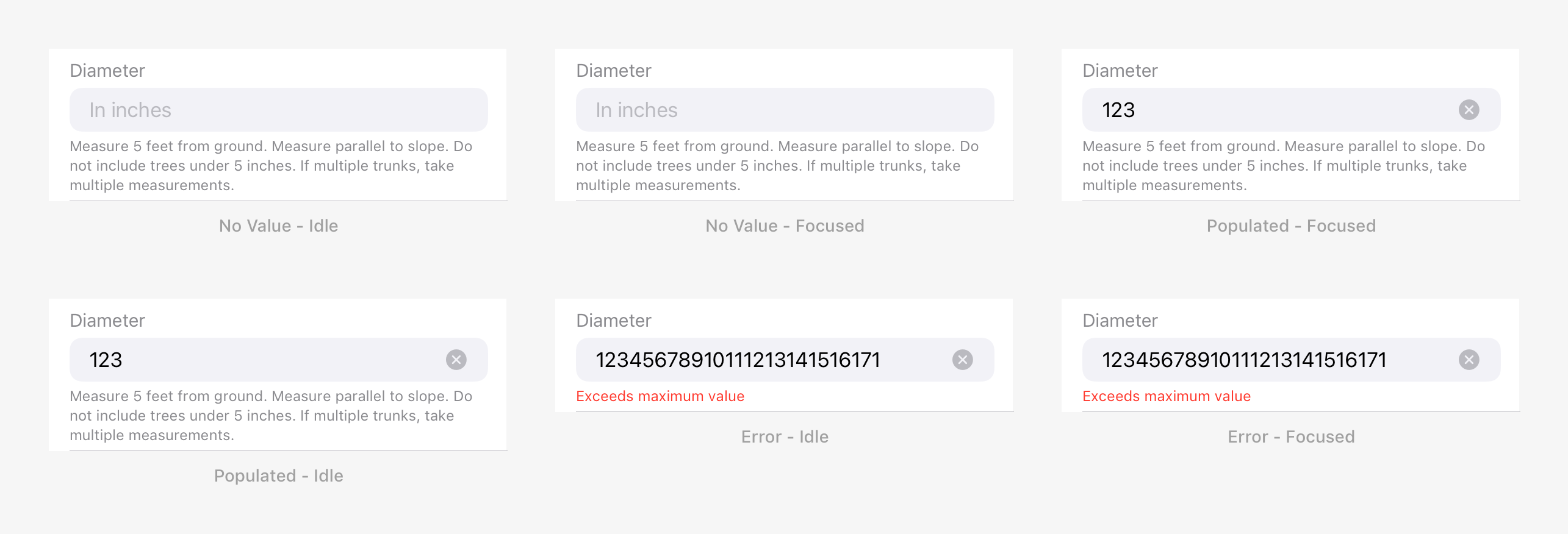
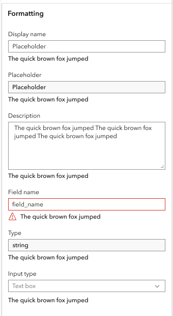
Hey everyone! Here is a list of the invalid error states around form controls. For consistency, @capeoples and I wanted to explore removing the red label on input and this is how the rest of the form control would be represented. We have discussed with @macandcheese and we have all agreed on what we have here!
This is ready to go. Please let me know if anyone has any questions.
 abigailmbravo-uxuidev
on 4 Mar 2021
abigailmbravo-uxuidev
on 4 Mar 2021
Because in many cases the validation message is critical to our users workflow, we would prefer to see that text in red also to provide additional visual distinction from the description text.
 TheBlueDog
on 17 Mar 2021
TheBlueDog
on 17 Mar 2021
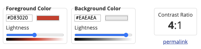
I just checked and the ui-danger passes WCAG 2.0 on the ui-background, so would be fine from an accessibility perspective.
paulcpederson
on 17 Mar 2021
Green, and yellow do not pass. so we'd be inconsistent by doing that
bstifle
on 18 Mar 2021
also, does not pass on all foregrounds
i'd call that a no-go
bstifle
on 18 Mar 2021
let's move forward with the red input border, and removing the red input-label styling.
bstifle
on 18 Mar 2021
Cool I can try to help update these.
paulcpederson
on 18 Mar 2021
As long as the color is not in the shadow can be set or overridden by the app
TheBlueDog
on 19 Mar 2021
FWIW we are tinting the error message red in the field apps for both iOS and Android.
I think it’s worth considering, since the description in the form spec appears beneath the field too (not tinted red)- so the change in color is a nice differentiator if the field is in error (description is replaced by the error message in this case).
 nick-esri
on 23 Mar 2021
nick-esri
on 23 Mar 2021
@nick-esri can you post a screenshot please
bstifle
on 23 Mar 2021
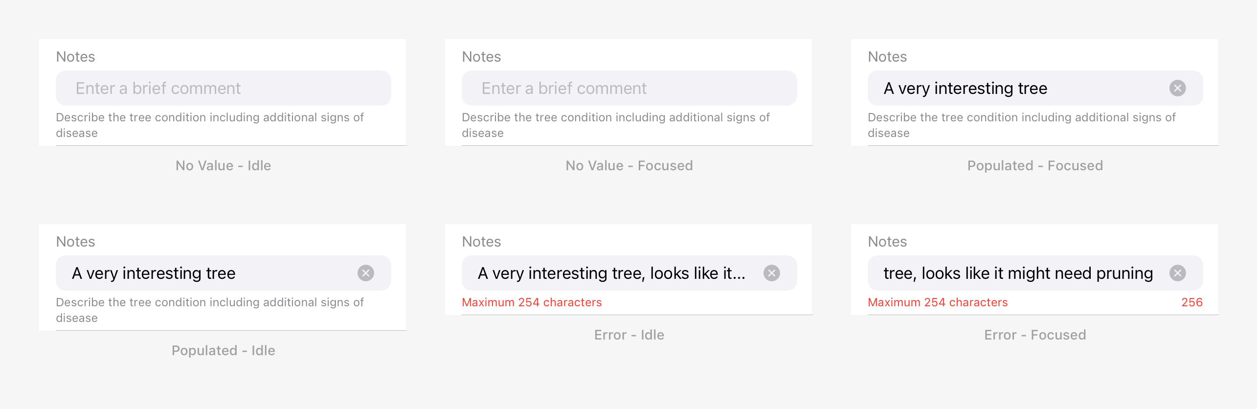
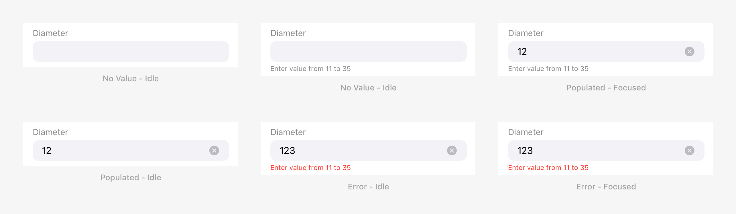
Since Description, Helper Text and Error Message are presented beneath an input, they are mutually exclusive:
- Description: A string placed beneath an input that provides instructions as to how to fill out the field. Descriptions are optional and restricted to a maximum of 255 characters.
- Helper Text: A string placed beneath an input that provides character constraint information for strings, or range domain constraints for numeric fields.
- Error Message: A string placed beneath an input when in an error state, that informs the user about an invalid value.
Rules:
- When a Description is specified, it is always displayed except when the field is in an error state, in which case it is replaced by the Error Message.
- When a Description is not specified, the Helper Text is displayed when the field is focused. If it is in error state, it is replaced by the Error Message.
Here's some examples from iOS:
String Field - Character Constraints
String Field - Description
Numeric Field - Range Domain
Numeric Field - Description
nick-esri
on 26 Mar 2021
@nick-esri cool! what red #hex are you using?
bstifle
on 30 Mar 2021
We're using systemRed one of the iOS semantic colors that adjusts automatically based on whether the user in dark mode:
https://developer.apple.com/design/human-interface-guidelines/ios/visual-design/color/
nick-esri
on 30 Mar 2021
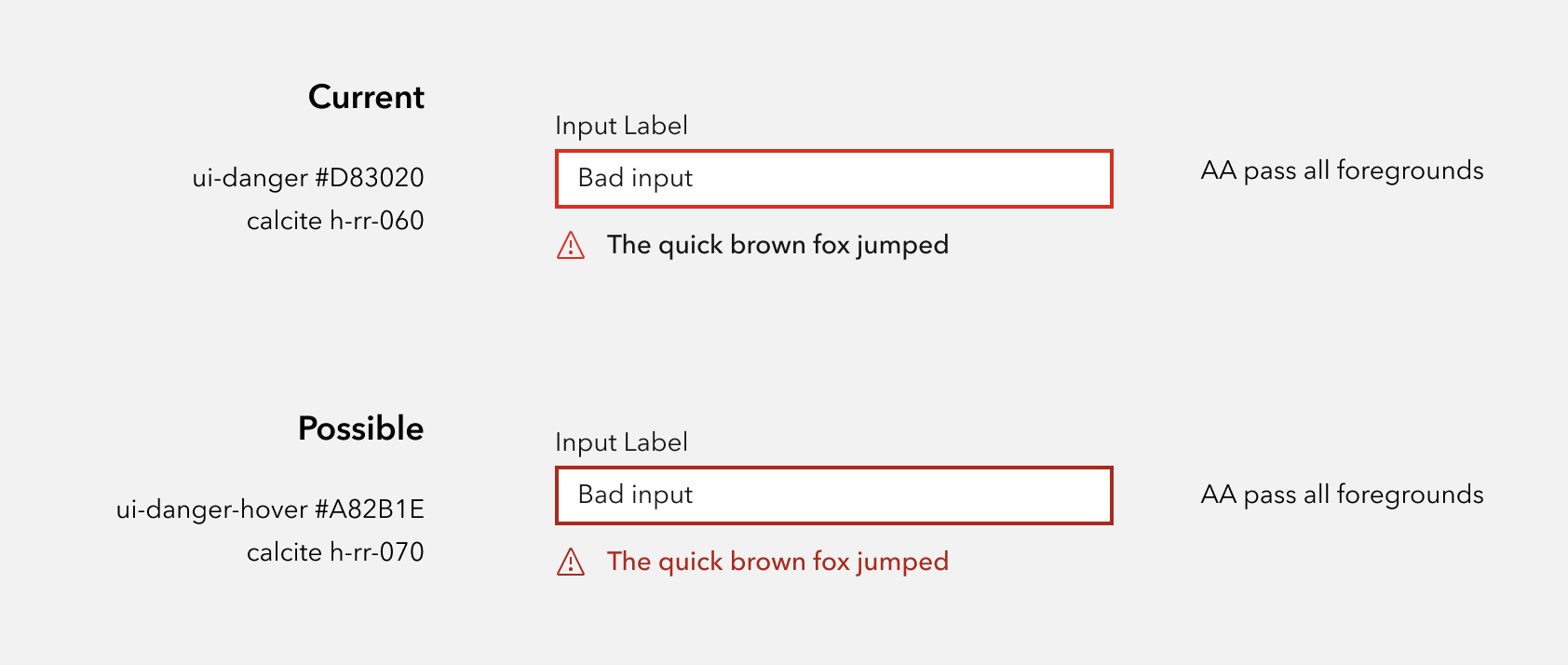
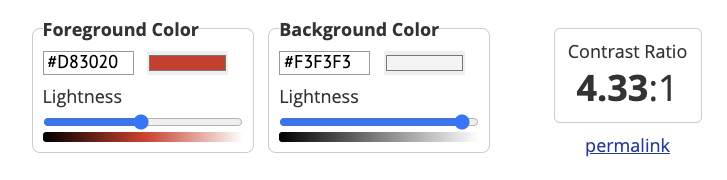
so if we use ui-danger-hover, it passes on all 3 foreground colors.
I'm not convinced this is an improvement
bstifle
on 1 Apr 2021
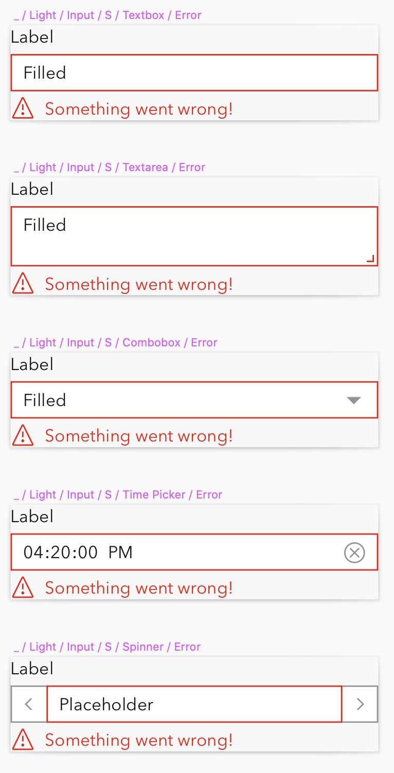
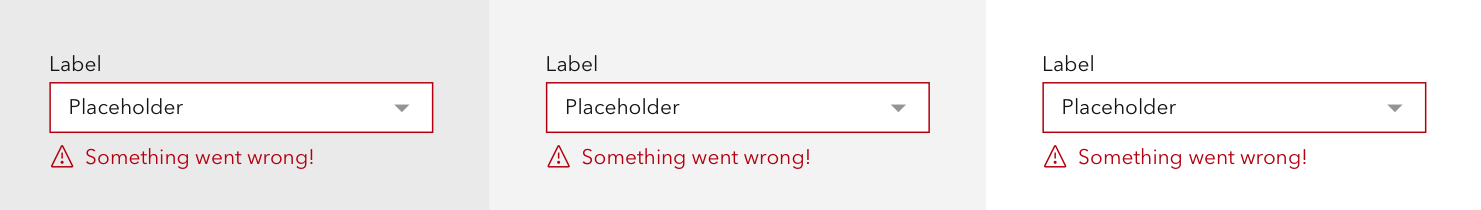
This is using v-rr-180 (#B3000F) on top, as compared to h-rr-070 below. It passes AA on all. Shown here against ui-foreground-3
Shown against all three foreground:
Another option that would achieve our goal using the existing color would be a pattern we've used elsewhere in the platform.
TheBlueDog
on 2 Apr 2021
Right, yeah that color is about the same as #A82B1E visually.
We could either:
- keep existing
- use ui-danger-hover for these error states
- or rework all of the reds on light theme to be darker
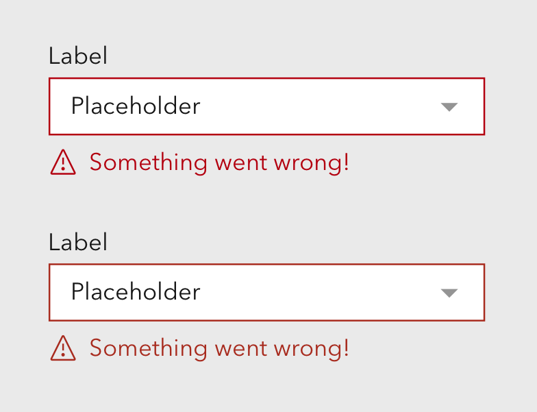
not a fan of the super red box
bstifle
on 2 Apr 2021
If the text is being tinted we probably don’t need the border of the field to be red- feels like overkill.
Tangentially related, can I ask about the size of the icon? It looks a little large compared to the font size.
Agree with Bryan on the super red box- not a fan either.
nick-esri
on 2 Apr 2021
And the red border get hidden by the focus ring. Unless we can change the focus ring color on fields with errors to red.
TheBlueDog
on 2 Apr 2021
@bstifle - I know we probably need to drive to a decision here.
We could either:
- keep existing
- use
ui-danger-hoverfor these error states- or rework all of the reds on light theme to be darker
On reflection I think it's reasonable to "keep existing" if that means going with with the red border / red focus ring when the field is in error. Can you confirm that when the field is in focus the border will be red too?
I quite like some other aspects of @capeoples proposal in the description:
Namely the error text is a little smaller and the error text looks to be gray. Might be out of scope for this particular issue.
nick-esri
on 2 Apr 2021
Tailwind has a built in solution for handling the focus ring, color, width, inset, opacity and offset. Seems like that could be really useful here. https://tailwindcss.com/docs/ring-color
TheBlueDog
on 2 Apr 2021
@nick-esri
yeah I think making the text gray could be nice.
Yes, red error borders are gonna be in for sure. As far as focusing then and staying red, i think that makes sense for most cases, but i believe we'll have a way to disable that.
bstifle
on 5 Apr 2021
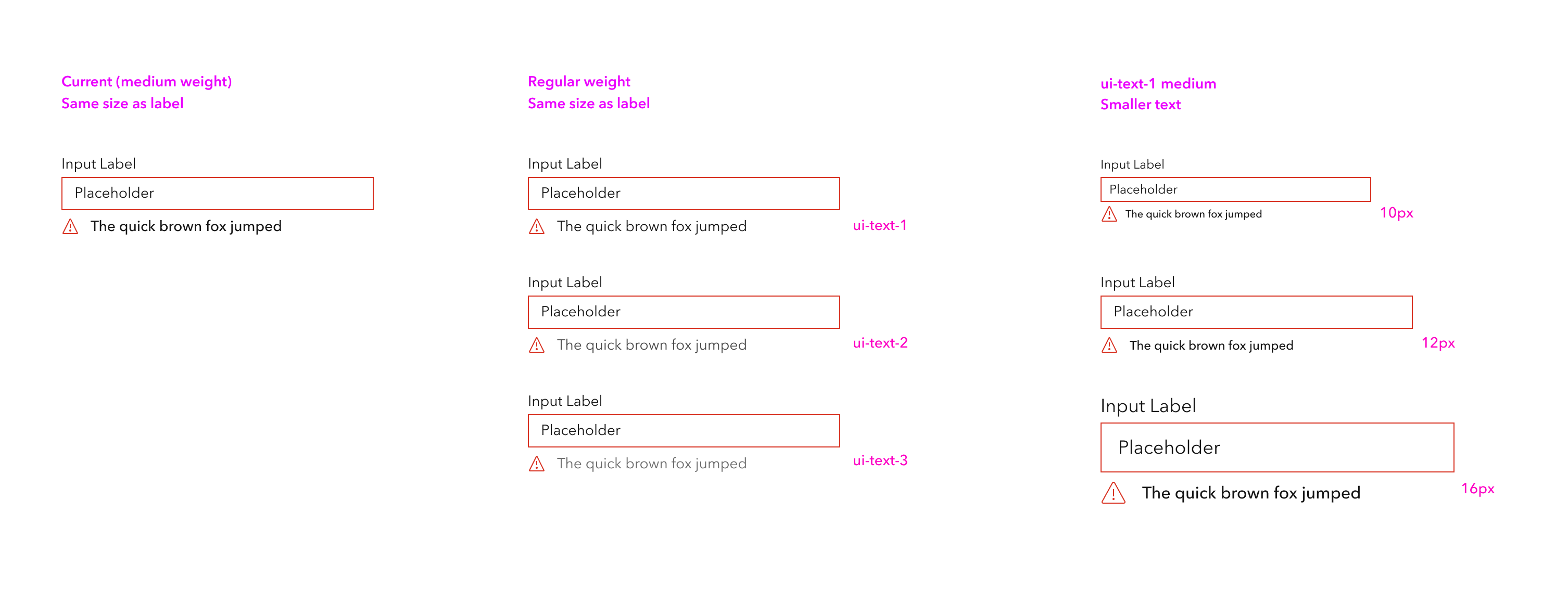
@nick-esri @TheBlueDog couple more iterations without changing the reds.
if we make the text smaller we need to consider Small which would then use 10px. i think those look good with the medium weight.
not a fan of the grayer text for these, as the messages themselves tend to be important
bstifle
on 12 Apr 2021
Thanks for these iterations @bstifle. I'm with you on the grey- now that I see them all together.
I quite like the 12px version in the 3rd column. Making the error text smaller does bring some hierarchy to the component.
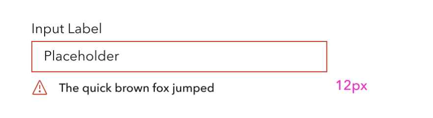
I do find the error icon slightly large compared to the text, and it might be worth tightening up the space between the icon and the error text.
nick-esri
on 13 Apr 2021
yeah man agreed on the space between. unfortunately we cant really make the icon smaller. it will make the lines fall off pixel and get all blurry unfortunately. i can def see a case for 12px icons but man with 633 concepts in the ui-icon library that could open a can of worms.
bstifle
on 13 Apr 2021
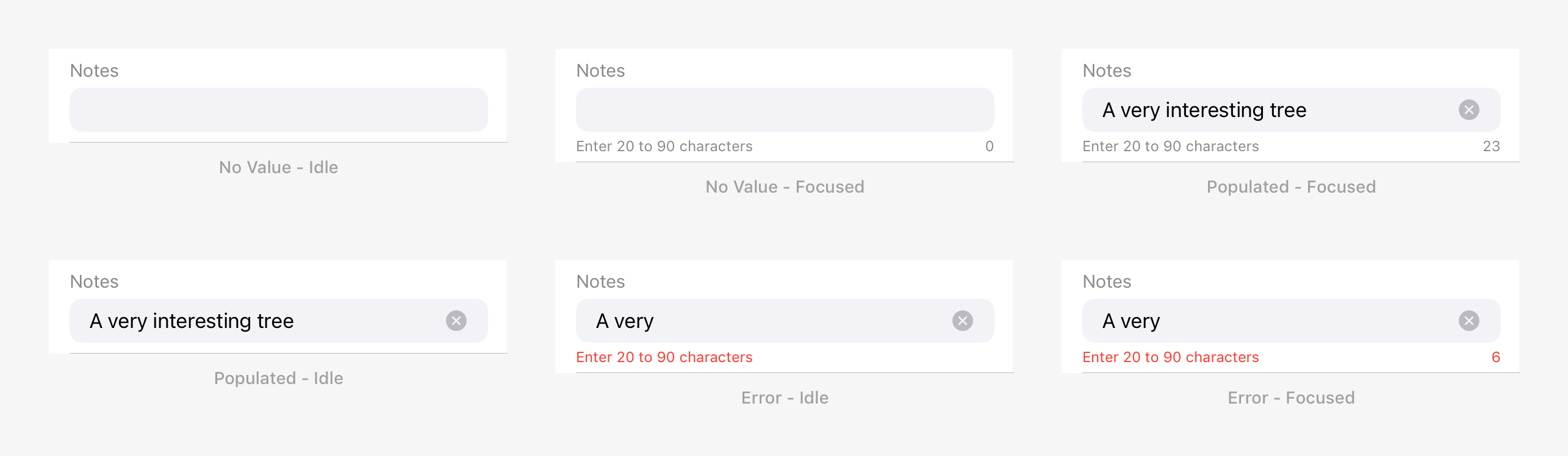
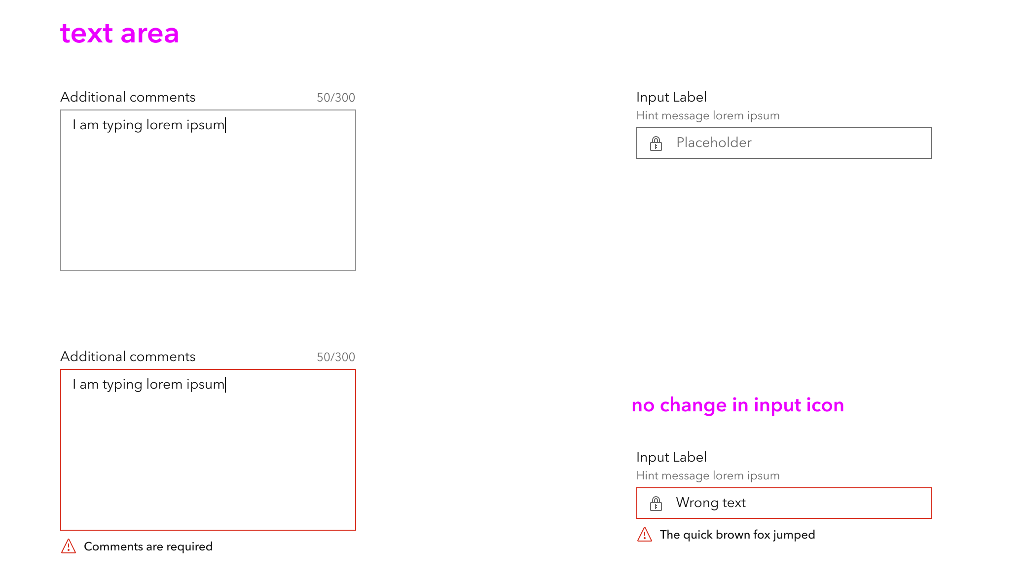
Had a note about regular Hint Texts under input fields - for anything that's non-info/warning/error, I think it would be better if it were styling with Regular Avenir rather than Medium. For example, a Medium character counter easily becomes one of the most emphasized objects in a form, which it really doesn't deserve IMO.
 rmstinson
on 15 Apr 2021
rmstinson
on 15 Apr 2021
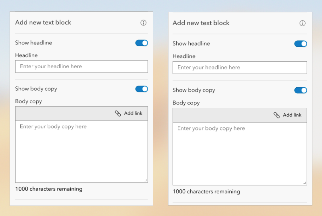
Real-world example of what a form could look like in our app. The text below the input being a heavier weight than the label can be quite distracting and doesn't fall in like with the information hierarchy. Same holds true for the read only fields.
TheBlueDog
on 20 Apr 2021
@rmstinson 100% agree hint should be regular. i think hint should ALSO be ui-text-2 or 3 to be more subdued
@TheBlueDog the text would be then styled identically to the labels. isn't the idea for errors to be more prominent since they require immediate attention?
in general, i kinda like the idea of keeping things medium, and dropping them down one font size for error per this thing (plus tightening up the spacing between the icon and text)
all visuals
bstifle
on 20 Apr 2021
another pass, based on feedback from adam.
Would be pretty smart to keep hint in a separate slot, would also be read directly after label for screenreaders.
and the hint can persist when a status message is displayed. @rmstinson @TheBlueDog @nick-esri thoughts?
bstifle
on 21 Apr 2021
For the text area character count and optional (or translated optional string), I think those are two areas we can look at to standardize around as well.
 macandcheese
on 21 Apr 2021
macandcheese
on 21 Apr 2021
yeah agreed. some more considerations.
bstifle
on 21 Apr 2021
Related issues
ethanbdev
·
4Comments
 jcfranco
·
3Comments
jcfranco
·
3Comments
 kevindoshier
·
4Comments
kevindoshier
·
4Comments
 driskull
·
3Comments
driskull
·
3Comments
 rslibed
·
3Comments
rslibed
·
3Comments