Calcite-components: Bug: calcite-button containing calcite-icon is blank at 1.0.0-beta.47
Summary
The "X" icon is not appearing in a calcite-button at 1.0.0-beta.47; it does appear at 1.0.0-beta.46.
Actual Behavior
 (in
(in div with aliceblue background)
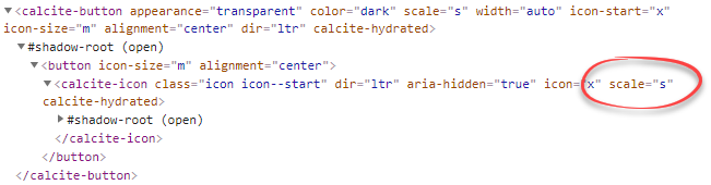
Expected Behavior
 (in
(in div with aliceblue background)
Reproduction Steps
<!doctype html>
<html lang="en" dir="ltr">
<head>
  <meta http-equiv="content-type" content="text/html; charset=utf-8" />

  <!-- blank -->
  <link rel="stylesheet" type="text/css" href="https://unpkg.com/@esri/[email protected]/dist/calcite/calcite.css" />
  <script type="module" src="https://unpkg.com/@esri/[email protected]/dist/calcite/calcite.esm.js"></script>

  <!-- OK -->
  <!--link rel="stylesheet" type="text/css" href="https://unpkg.com/@esri/[email protected]/dist/calcite/calcite.css" />
  <script type="module" src="https://unpkg.com/@esri/[email protected]/dist/calcite/calcite.esm.js"></script-->

</head>
<body style="padding:4px;">
  <div style="display: inline-block; background-color:aliceblue; width:32px; height:32px">
    <calcite-button appearance="transparent" color="dark" scale="s" width="auto">
      <calcite-icon scale="m" icon="x"></calcite-icon>
    </calcite-button>
  </div>
</body>
</html>
Relevant Info
Windows browsers Chrome 87, Firefox 84, Edge 87
 MikeTschudi
All 10 comments
Hey @MikeTschudi - could you instead use the "icon-start" (or "icon-end") prop on the calcite-button itself, instead of wrapping the icon component in a button?
https://esri.github.io/calcite-components/?path=/story/components-button--with-icon-start&knob-appearance=transparent&knob-color=dark&knob-scale=m&knob-round=&knob-floating=&knob-href=&knob-loading=&knob-disabled=&knob-icon-start=x&knob-text=
This is still a valid issue if the provided code was previously working, but the icon-start/end props on the button were meant for this kind of use case. Is there a reason those didn't work here?
 macandcheese
on 1 Jan 2021
macandcheese
on 1 Jan 2021
Thanks, @macandcheese, we just didn't think of using icon-start for a close button!
Is there a way to set the icon's size? I didn't see such a parameter, and my guess doesn't change the icon from "s" to "m":
Old method icon size on left; new method on right:

I ask because my UI people prefer the medium size.
MikeTschudi
on 1 Jan 2021
Yeah, that makes total sense. We generally avoid using the "large" icon size within components because it's so large, and use small icon for scale s/m of components, with medium icon for scale l, but it definitely causes some weird things like this. cc @bstifle
macandcheese
on 5 Jan 2021
@MikeTschudi We prescribe the icon size based on the component + scale. Like Adam said, we typically used the 16x16px icons for small and medium components (exception for things like modal X and a couple other areas)
and then we typically use 24x24px icons for large components.
In my opinion, it would be best to not be able to change the icon size within the component, since we want to keep consistency with scale across esri applications
 bstifle
on 5 Jan 2021
bstifle
on 5 Jan 2021
@bstifle, what is the modal X that you're referring to, please? I'm trying to create close button, and perhaps that's what I'm looking for.
MikeTschudi
on 5 Jan 2021
Sorry for any confusion here... The icon component only comes in three sizes from the icon and illustration team. The largest icon size is generally too large to be used for any UI element except a standalone icon. So, we use the "small" icon for scale small AND medium, and the "medium" icon for scale large when rendering icons within a component (whether through requested props or by default like an input clear button).
It does lead to having to workaround like you tried to do by placing an icon inside a button, so we should get that initial issue fixed :)
macandcheese
on 5 Jan 2021
24x24px for the modal close button icon :)
bstifle
on 5 Jan 2021
@MikeTschudi, were you able to get the results you needed based on the info Adam provided?
if so, I'll close this issue.
 julio8a
on 26 Jan 2021
julio8a
on 26 Jan 2021
There’s an open pr for a fix for this
macandcheese
on 26 Jan 2021
Need a check from @asangma https://github.com/Esri/calcite-components/pull/1449
macandcheese
on 26 Jan 2021
Related issues
 driskull
·
4Comments
bstifle
·
3Comments
driskull
·
4Comments
bstifle
·
3Comments
 ethanbdev
·
4Comments
ethanbdev
·
4Comments
 asangma
·
4Comments
asangma
·
4Comments
 jcfranco
·
3Comments
jcfranco
·
3Comments