Calcite-components: Component: Tooltips
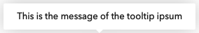
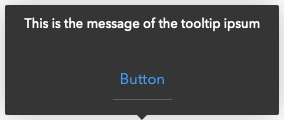
Light Theme
Basic:
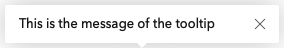
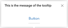
With action:
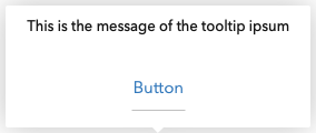
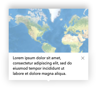
With image:
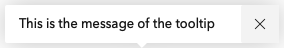
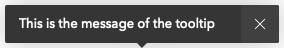
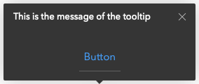
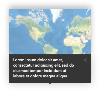
Dark Theme
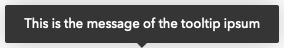
Basic:
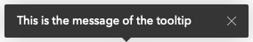
With action:
With image:
WIP
- Mobile
calcite-tooltip
Properties
| Property | Attribute | Description | Type | Default |
| ------------------ | ------------------- | ----------------------------------------------------------------------------------- | ------------------------------------------------------------------------------------------------------------------------------------------------------------------------------------------------------------ | ----------- |
| open | open | Display and position the component. | boolean | false |
| placement | placement | Determines where the component will be positioned relative to the referenceElement. | "auto" \| "auto-end" \| "auto-start" \| "bottom" \| "bottom-end" \| "bottom-start" \| "left" \| "left-end" \| "left-start" \| "right" \| "right-end" \| "right-start" \| "top" \| "top-end" \| "top-start" | "auto" |
| referenceElement | reference-element | Reference HTMLElement used to position this component. | HTMLElement \| string | undefined |
| theme | theme | Select theme (light or dark) | "dark" \| "light" | "light" |
Methods
reposition() => Promise<void>
Returns
Type: Promise<void>
 julio8a
All 18 comments
API proposal
See top of issue
 driskull
on 20 Sep 2019
driskull
on 20 Sep 2019
@driskull will devs be able to pass custom html into this? That is the one requirement I've heard over and over.
 paulcpederson
on 20 Sep 2019
paulcpederson
on 20 Sep 2019
@julio8a does dismiss mean that the user will have to click the element to open the tooltip and then click the x to close it?
paulcpederson
on 20 Sep 2019
will devs be able to pass custom html into this? That is the one requirement I've heard over and over.
@paulcpederson I'm thinking that is what the slot would be for. Anything placed inside would go below the text. Only the image goes above and it uses the image attribute.
does dismiss mean that the user will have to click the element to open the tooltip and then click the x to close it?
dismissible would mean that the close button is rendered and will allow closing it. Opening it will still be up to the developer to do.
Do we want some way to auto open the tooltip? Like on hover or click or something?
driskull
on 20 Sep 2019
Yeah, I feel like the hover/click interaction is a big part of what makes this a useful component, so we should probably try to handle that out of the box.
paulcpederson
on 20 Sep 2019
Yeah, I feel like the hover/click interaction is a big part of what makes this a useful component, so we should probably try to handle that out of the box.
Gotcha. So maybe by adding the following instead of dismissible?
type: "hover" | "click";
If its a hover tooltip, then it doesn't show the close box. it will close on mouseout.
driskull
on 20 Sep 2019
yep, the intention is to have a hover, or click-to-open, depending on the need.
For the click to open, it would be good to add esc and click away functionality to make it easier to close it.
 bstifle
on 20 Sep 2019
bstifle
on 20 Sep 2019
We should structure the dom differently in these two cases for accessibility. This article has a good breakdown of these two, they refer to them as "tooltips" and "toggletips" but very similar to our hover/click distinction https://inclusive-components.design/tooltips-toggletips/
paulcpederson
on 20 Sep 2019
@paulcpederson What would you like the property called to distinguish these two interactions? I'm thinking type might not be correct.
Even hover and click might not be right because they would open on any accessible click like enter key and space bar. hover might also open on focus.
Naming is hard :)
driskull
on 20 Sep 2019
maybe mode? Like mode="click" or mode="hover"
paulcpederson
on 20 Sep 2019
@paulcpederson We have the use case of the on-hover and on-click components that you mentioned in Online. Currently this is done via tooltips and information popovers (triggered by clicking the i icon). One of the goals for Q4 is to establish the pattern for using these components in Online.
I synced with @julio8a and @macandcheese about their ongoing tooltip work and I am trying to use the newer components here. Obviously the design will change based on updates to the component. It is pretty rough right now and is more prescriptive for Online's use cases, but let me know if this is a good use of the component:
3) Tooltips vs information popovers (wiki outlining key differences)
 arjavbadjatiya
on 24 Sep 2019
arjavbadjatiya
on 24 Sep 2019
@arjavbadjatiya can you grant me access to that repo?
driskull
on 24 Sep 2019
I just did, let me know if you can see it now!
arjavbadjatiya
on 24 Sep 2019
Thanks! yes I can see now.
There is some conflicting information between the Tooltip design and the wiki guidelines.
The requirements for this issue has tooltips with a click, close button, image and buttons. Should we just use popover for those? cc @julio8a @paulcpederson ??
driskull
on 24 Sep 2019
@driskull The wiki only covers a specific configuration of the tooltip component that matches use cases in Online. I posted the wiki to get feedback on how best to use the component for this small set of use cases. The component itself can have all of those additional configurations that you mentioned.
arjavbadjatiya
on 24 Sep 2019
I got the tooltip in a a working state with tests and all but need a designer to take the rest. Anyone available to do that?
The only bummer is we have to do the positioning of the pointer arrow ourselves. Because the Popper.js logic can't find the arrow element when its in the shadowRoot. They don't support that yet and moving it into the element won't work right either.
driskull
on 4 Oct 2019
@driskull, been in training from Oct 1 - 3 all day. Will do the review tonight or first thing tomorrow.
julio8a
on 4 Oct 2019
Installed
driskull
on 15 Oct 2019
Related issues
driskull
·
3Comments
bstifle
·
5Comments
 AdelheidF
·
4Comments
AdelheidF
·
4Comments
 nwhittaker
·
5Comments
nwhittaker
·
5Comments
 ethanbdev
·
4Comments
ethanbdev
·
4Comments