The metrics have an unusual look in comparison to other metrics. The metric display should be improved.
Here are some problems I see with the current display:
Every other setting then "last hour" makes to much averaging (so points are pretty sense-less) and drop downs are not visible. Only really long lasting failures would be remarkable.
Line has a "strange" curve, point should be connected directly.
Make the value more remarkable. e.g. show the last value with suffix.
Dont show to much labels (every point makes a label).
Here are some examples of other pages:


 gn-ley
All 5 comments
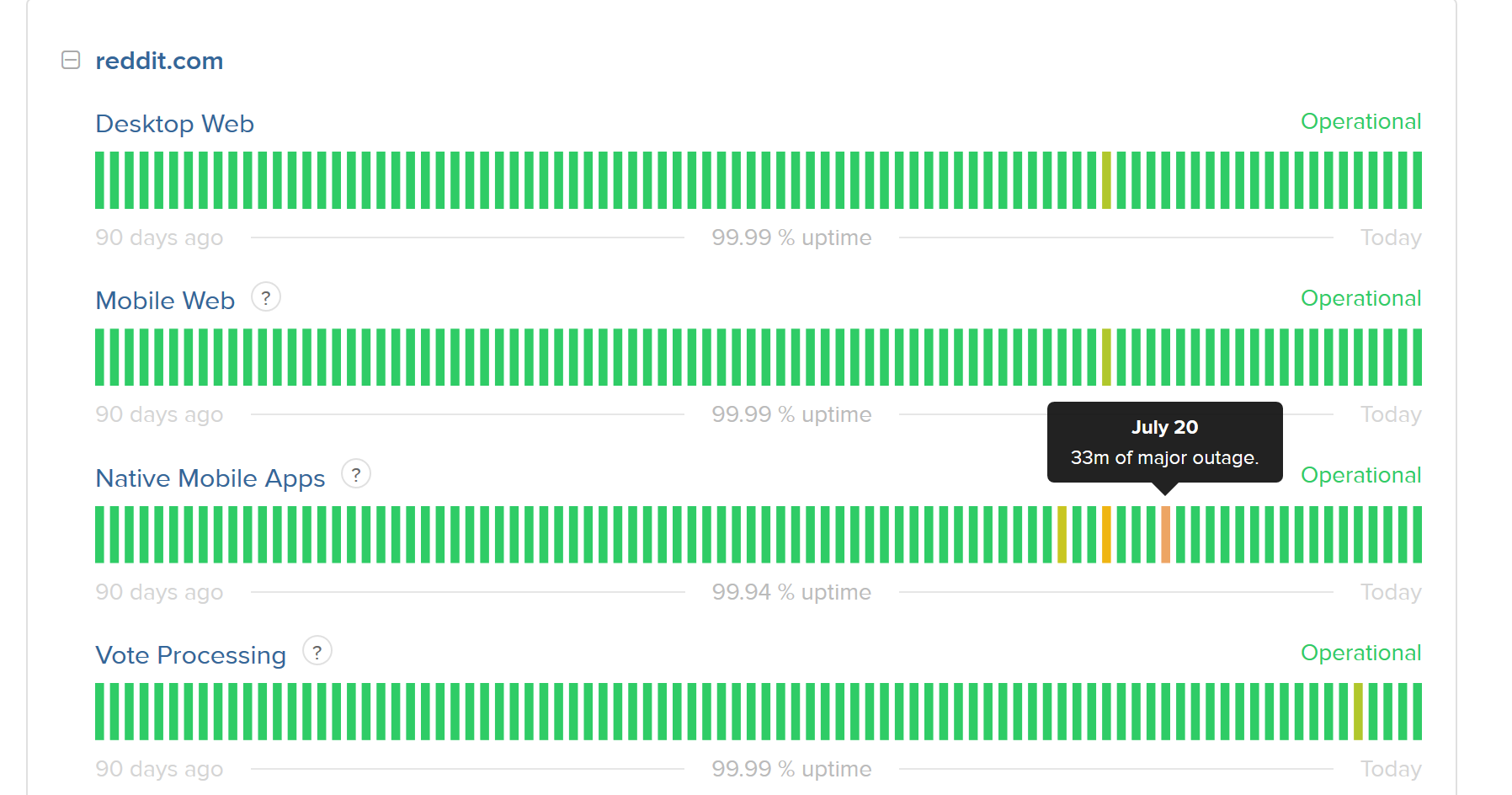
I'd love for someone to implement a new metrics system! The example from StatusPage.io is far nicer and way easier to understand.
 jbrooksuk
on 25 May 2017
jbrooksuk
on 25 May 2017
One addition: The new StatusPage-Showcase is very nice. (see Atlassian Reddit-Statuspage CircleCI-StatusPage
It would probably be a good Idea to also include Maintanance-Windows in there.
 AdaptiveThinking
on 6 Aug 2017
AdaptiveThinking
on 6 Aug 2017
Similar issue is #1656. Which apparently has an PR already.
gn-ley
on 16 Oct 2017
If someone wants to overhaul the metric system, please do so :) It's currently nowhere near fit for purpose.
jbrooksuk
on 17 Oct 2017
Closed in favour of https://github.com/CachetHQ/Cachet/issues/2641
jbrooksuk
on 23 Jun 2019
Related issues
 sgutermann
·
5Comments
sgutermann
·
5Comments
 thomvaill
·
7Comments
thomvaill
·
7Comments
 brianjking
·
4Comments
jbrooksuk
·
5Comments
brianjking
·
4Comments
jbrooksuk
·
5Comments
 marpme
·
7Comments
marpme
·
7Comments
Most helpful comment
I'd love for someone to implement a new metrics system! The example from StatusPage.io is far nicer and way easier to understand.