Buttercup-desktop: [UI] Working with multiple Vaults // Switching Vaults
Cheers! o/
I generally really like the new Update and the new UI. I have one big issue with the Desktop Client tho. Switching between different vaults is a giant hassle. I wasn't able to find an issue regarding this which could very well mean that I'm just stupid and missing something. _Anyway:_
Version 1 had all my vaults listed in the sidebar which made it easy to switch between them whenever necessary.
To switch to another vault in V2 I have to
- first click on the Submenu in the Sidebar
- then either close the current vault or click "Choose Vault"
- click on "configure vault"
- select the one I wanna get into
- click the big Icon above
- and enter my password.
These are a lot of steps to go through… and it's annoying me a lot.
I can unlock multiple vaults through the menu but I don't have a way to cycle through them. When unlocked they're also grayed out in the menu which makes sense but I was hoping that this would maybe also allow to switch.
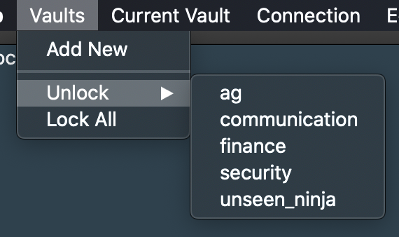
Even with all my Vault unlocked my Sidebar looks like this:
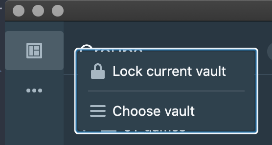
Is this really how it's intended to be or am I jus stupid and missing something really important?
I've been using Buttercup for two years or something now and I'd hate to switch to another Password Manager just because of that. :/
I'm running Version Desktop @ v2.2.0, Core @ v5.13.0 installed via Homebrew on macOS Catalina 10.15.7 (19H15).
 andreasgrafen
All 7 comments
Hi @andreasgrafen. I'm sorry to hear that this is such an inconvenience. We've generally received the feedback that most people are using but a single vault, and having a UI tailed for multiple vaults was:
- Causing confusion (indicating to people that multiple vaults was the intended use, which it hasn't been)
- Requiring a UI which wasn't what we'd envisioned
- Taking up extra UI real-estate that could be better used
All in all, a one-vault-at-a-time approach is what we've ended up with - BUT: We don't want to make it any harder to use multiple vaults. I still use multiple, for testing and work/personal... As do some others like yourself. Our intended way to address this need was primarily hotkeys, as the v1 app supported, so that switching back and fourth would be easy. Does this sound OK? For me having some way to switch to a vault at a position using a single keystroke would solve the issue of not having a UI-based nav-bar for vaults.
 perry-mitchell
on 28 Apr 2021
perry-mitchell
on 28 Apr 2021
Hey there! Thanks for your reply. c:
Your approach makes sense for sure. Since I share some of my vaults across devices and some even with other people having multiple vaults is basically the only way to go with for me tho.
Since I rarely use my mouse anyway keyboard shortcuts sound like a great solution to me. But that might not be the case for everyone. Since the current UI still has a small Sidebar anyway an additional button to list all available vaults could do the trick; or maybe even just replace the "Choose Vault"-option in the Meatball-Menu with a list of the available vaults?
As far as I can tell the top icon has no practical use right now anyway. At least nothing happens when I click on it. For single-vault users the Meatball-Menu only gives the option to lock their vault anyway. Maybe the lock button could even be moved directly to the sidebar and the Meatball-Menu could hold just a list of the vaults.
I'm no UX/UI Expert tho, so there might be a strong argument against that. o:
This would make the option for multiple vaults much less prominent on first glance but for mouse users all vaults are accessible by just one/two clicks.
Edit: Seems like there are some additional entries planned for the sidebar – according to this file VaultSidebar.tsx. I'd say a vault selection could really be a nice thing to place in there then. c:
andreasgrafen
on 28 Apr 2021
After further feedback, we've decided that it's necessary to reconsider a UI component for easily changing vaults in a multi-vault environment. We'll start looking into this - ideas and suggestions are welcome.
EDIT: We'll probably remove the top-left icon in the sidebar currently, and replace it with all currently added vaults. Similar to how v1 worked. Additional menu items will be below the vault icons in the sidebar, after a divider.
perry-mitchell
on 17 May 2021
Why not have a grid like selection here? The activator icon for the current vault looks good in fact. Having more than one and then simply go back to the overview of vaults to select another seems a pretty good approach here...
 nickbe
on 18 May 2021
nickbe
on 18 May 2021
I think both suggested approaches have their benefits.
A list in the sidebar component is probably easier to reach and navigate through after getting used to it. Having the same button open a grid like view as suggested in the comment above would look a little bit more organised overall and is likely also better for environments with a lot of vaults as it could get quite cluttered having 10+ entries in a vertical list.
Personally I'd go for the grid option but as stated I think that both ideas would work great in addition to the keyboard centered navigation.
What I like is that both approaches are just two clicks to select a new vault. c:
andreasgrafen
on 21 May 2021
I like these suggestions. I’ll most likely build in both.. Working on the sidebar form now and will check out the grid option afterwards.
perry-mitchell
on 23 May 2021
I've made a lot of changes, which are now visible in #1036. I'll most likely merge and release it very shortly.
EDIT: I didn't go for the grid approach as I removed the entire lock-screen. It conflicted with the sidebar approach imo, and having everything in the sidebar visible all of the time makes navigation and state management easier.
perry-mitchell
on 29 May 2021
Related issues
 julianpoemp
·
6Comments
julianpoemp
·
3Comments
julianpoemp
·
6Comments
julianpoemp
·
3Comments
 wtsiamruk
·
6Comments
perry-mitchell
·
4Comments
perry-mitchell
·
6Comments
wtsiamruk
·
6Comments
perry-mitchell
·
4Comments
perry-mitchell
·
6Comments
Most helpful comment
Hey there! Thanks for your reply. c:
Your approach makes sense for sure. Since I share some of my vaults across devices and some even with other people having multiple vaults is basically the only way to go with for me tho.
Since I rarely use my mouse anyway keyboard shortcuts sound like a great solution to me. But that might not be the case for everyone. Since the current UI still has a small Sidebar anyway an additional button to list all available vaults could do the trick; or maybe even just replace the "Choose Vault"-option in the Meatball-Menu with a list of the available vaults?
As far as I can tell the top icon has no practical use right now anyway. At least nothing happens when I click on it. For single-vault users the Meatball-Menu only gives the option to lock their vault anyway. Maybe the lock button could even be moved directly to the sidebar and the Meatball-Menu could hold just a list of the vaults.
I'm no UX/UI Expert tho, so there might be a strong argument against that. o:
This would make the option for multiple vaults much less prominent on first glance but for mouse users all vaults are accessible by just one/two clicks.
Edit: Seems like there are some additional entries planned for the sidebar – according to this file VaultSidebar.tsx. I'd say a vault selection could really be a nice thing to place in there then. c: