Bulma: Container is-fluid does not retain margins on both sides below 1088px
This is about Bulma.
Is it a bug/feature/question or do you need help?
BUG
Overview of the problem
This is about the Bulma CSS framework
I'm using Bulma version [0.7.1]
My browser is: Chrome
Description
I'm trying to use a container with .container .is-fluid classes. The docs it says that it will keep a 32px gap in both sides on any viewport size. I read that the $gap variable was changed to 64px recently, but that's not my problem. My problem is that once the viewport hits below1088px, the gap on both ends disappear. I wonder if this is part of a bigger bug?
Steps to Reproduce
Create an index.html file and copy and paste the following:
<!DOCTYPE html>
<html>
<head>
<meta charset="utf-8" />
<meta http-equiv="X-UA-Compatible" content="IE=edge">
<title>Page Title</title>
<meta name="viewport" content="width=device-width, initial-scale=1">
<link rel="stylesheet" type="text/css" media="screen" href="https://cdnjs.cloudflare.com/ajax/libs/bulma/0.7.1/css/bulma.css" />
</head>
<body>
<section>
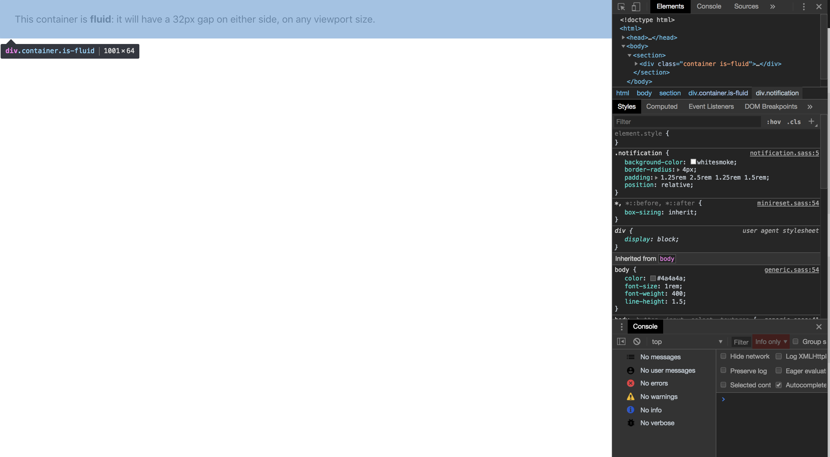
<div class="container is-fluid">
<div class="notification">
This container is <strong>fluid</strong>: it will have a 32px gap on either side, on any viewport size.
</div>
</div>
</section>
</body>
</html>
Open the the index.html in a browser and resize window manually
Expected behavior
The nav bar should keep its margins on each size
Actual behavior
The nav bar goes full width:
 jorgedavila25
All 12 comments
Wanted to follow up on this. This seems to be a legitimate issue, but I don't really know. Any insight would be awesome. Thanks!
jorgedavila25
on 29 Aug 2018
It seems to be a documentation issue. The gap should only appear on $desktop viewports and onwards.
 jgthms
on 4 Sep 2018
jgthms
on 4 Sep 2018
Any plans to introduce a new class to restore this functionality? I'm not really that on board with having no spacing for container on mobile.
 nojaf
on 4 Sep 2018
nojaf
on 4 Sep 2018
@jgthms Thanks. To @nojaf point, is there a way to keep the gap on viewports lower than $desktop ?
jorgedavila25
on 4 Sep 2018
I believe a is-fluid-mobile additional class could exist.
For mobile spacing, I'd say using a .section is preferred though.
jgthms
on 4 Sep 2018
@jgthms I don't believe is-fluid-mobile is a thing.
nojaf
on 11 Sep 2018
I just found this issue as is-fluid was not behaving as the documentation states. The expected behaviour (spacing on mobile screen sizes) would be desirable in a class.
 samdoidge
on 26 Oct 2018
samdoidge
on 26 Oct 2018
I believe a
is-fluid-mobileadditional class could exist.For mobile spacing, I'd say using a
.sectionis preferred though.
I was about to plus-1 this until I saw @jgthms's comment about .section, which I now think is a good solution.
The .container page in the docs is indeed misleading however: "...will have a 32px gap on either side, on any viewport size."
 jorgepinon
on 16 Nov 2018
jorgepinon
on 16 Nov 2018
The .container page in the docs is indeed misleading however: "...will have a 32px gap on either side, on any viewport size."
I am curious as to why the docs is still midleading if .section is to be used for mobile.
 vgm106
on 18 Feb 2019
vgm106
on 18 Feb 2019
I would like to agree with @vgm106. If the documentation is wrong:
a) why has this not been rectified yet? I do not mind to do it but I'd like to be certain this is accurate.
b) why does the example in the documentation behave as described in the documentation?
I'm only starting out with Bulma so apologies if my concerns aren't valid.
 KayJay89
on 17 Mar 2019
KayJay89
on 17 Mar 2019
This issue has been automatically marked as stale because it has not had recent activity. It will be closed if no further activity occurs. Thank you for your contributions.
![stale[bot] picture](https://avatars3.githubusercontent.com/in/1724?v=4&s=40) stale[bot]
on 13 Sep 2019
stale[bot]
on 13 Sep 2019
Not sure .section is the the best out-of-box solution for navbar as it introduces a 3rem of top bottom padding. Fixes the left/right padding though...
 swaylock
on 21 Apr 2020
swaylock
on 21 Apr 2020
Related issues
 swamikevala
·
3Comments
swamikevala
·
3Comments
 Yard8
·
3Comments
Yard8
·
3Comments
 Qard
·
3Comments
Qard
·
3Comments
 Cosbgn
·
3Comments
Cosbgn
·
3Comments
 dotMastaz
·
3Comments
dotMastaz
·
3Comments
Most helpful comment
I believe a
is-fluid-mobileadditional class could exist.For mobile spacing, I'd say using a
.sectionis preferred though.