Bulma: is-desktop is triggered on columns on screen widths 1088px and above instead of 1024px
This is about the Docs.
Overview of the problem
This is about the Bulma Docs
I'm using Bulma version [0.7.1]
My browser is: Google Chrome
Description
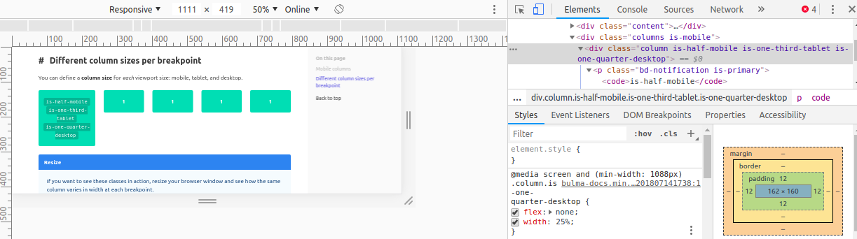
The responsive breakpoint to trigger the is-desktop for colums seems to be 1088px instead of 1024px
Steps to Reproduce
- Visit https://bulma.io/documentation/columns/responsiveness/#different-column-sizes-per-breakpoint
- Open Chrome Developer Tools
- Resize the screen and check for the columns resizing themselves
Expected behavior
The is-one-quarter-desktop should get triggered when the screen width goes above 1024px
Actual behavior
The is-one-quarter-desktop gets triggered only when the screen width is atleast 1088px
 sohamkanade
All 11 comments
this seeped in with the release of 0.7.0, where the $gap was increased from 32px to 64px.
The breakpoint, however, is set at 960+(2*$gap), resulting in 1088 now instead of the intended 1024.
Change your breakpoint to 896 to fix it for now, found in sass/utilities/initial-variables.sass or through your customisation sass.
 emkajeej
on 18 Jul 2018
emkajeej
on 18 Jul 2018
That's true. It's more of a documentation issue then.
You can however set the gap back to 32px.
 jgthms
on 18 Jul 2018
jgthms
on 18 Jul 2018
Cool, thanks! For now working with changing the gap back to 32px.
sohamkanade
on 18 Jul 2018
@jgthms are you gonna open this until docs gets updated?
 frederikhors
on 20 Jul 2018
frederikhors
on 20 Jul 2018
@jgthms will this bug be fixed in version 0.7.2?
 eskrynnikov
on 23 Jul 2018
eskrynnikov
on 23 Jul 2018
How can I override the $gap if that resides in node module? it will be overidden at next install.
 Spiti
on 10 Aug 2018
Spiti
on 10 Aug 2018
@spiti customize it
 aocneanu
on 10 Aug 2018
aocneanu
on 10 Aug 2018
It's more of a documentation issue then.
I wouldn't say that; 1024px is a _default_ desktop size.
Not that tablet/desktop checking should happen purely on that (but if you have over 1024px a "desktop-like" interface should work out.
 jlsjonas
on 7 Nov 2018
jlsjonas
on 7 Nov 2018
Was going to do some javascript changes when bulma configures itself to the desktop layout, but noticed docs record a different desktop width (1024) than actually observed (1088). Hope this gets fixed.
 dyllandry
on 12 Mar 2019
dyllandry
on 12 Mar 2019
@dyllandry since it's marked as a documentation issue & closed by the owner I wouldn't count too much on it.
jlsjonas
on 15 Mar 2019
Trouble is, it's _not_ a documentation issue, as it affects standard Bulma behavior even now -- leaving viewports from 1025px to 1087px wide in limbo as neither tablet nor desktop or some partial combination of the two -- and until this bug is fixed at the source, apparently the only workaround is to override some Bulma default(s), such as the $gap variable.
 SubGothius
on 22 Jan 2020
SubGothius
on 22 Jan 2020
Related issues
 Wikiki
·
3Comments
Wikiki
·
3Comments
 JenCant
·
3Comments
JenCant
·
3Comments
 Laraveldeep
·
3Comments
Laraveldeep
·
3Comments
 dotMastaz
·
3Comments
dotMastaz
·
3Comments
 fundon
·
3Comments
fundon
·
3Comments
Most helpful comment
@jgthms are you gonna open this until docs gets updated?