Bulma: Font Awesome icon has no space before text in with navbar items.
This is about the Bulma CSS framework.
I'm using Bulma version 0.7.1.
My browser is: Chrome Version 67.0.3396.87 (Official Build) (64-bit) (Windows 10 Professional)
I have a simple little navbar, like this:
<nav class="navbar is-fixed-top" role="navigation" aria-label="main navigation">
  <div class="navbar-start">
    <a class="navbar-item" href="#about"><i class="far fa-question-circle"></i> About</a>
    <a class="navbar-item" href="#jobs"><i class="fas fa-briefcase"></i> Jobs</a>
  </div>
<nav>
That looks decent, but the Font Awesome icon is squished up against the text of each menu item. (The appearance of the "Jobs" item is particularly problematic.)
I tried to split the link out below its navbar-item:
<div class="navbar-item">
  <a href="#jobs"><i class="fas fa-briefcase"></i> Jobs</a>
</div>
That gives me the correct spacing, but ruins the effect of the navbar item. (Instead of a block flyover, I get a link with its link color.
This is my first Bulma project, and my first impression is that it seems very finicky about the order and combination of things. (A button requires a <span> wrapper both for the icon and for the text!!!) I can live with that until I decide whether to stick with Bulma or go to something less verbose, but there wasn't anything obvious I could do here to fix the problem of the missing space between the nav item icon and text. I even tried the <span> wrappers that Bulma buttons use, to no avail.
 garretwilson
All 9 comments
You need to add <span> in your code for proper spacing. Your Code should be like this.
Don't forgot to add class icon for the icon.
<a class="navbar-item" href="#about"><span class="icon"><i class="far fa-question-circle"></i></span><span> About</span></a>
 imkrunal
on 15 Jun 2018
imkrunal
on 15 Jun 2018
I'm 90% sure I already tried that, but I'll try it again.
(Sorry to say it, but it looks ugly as heck, even if it works. I would prefer to use semantic HTML, and not put multiple wrappers around everything. The whole point of CSS was that we could relegate the style to a stylesheet.)
garretwilson
on 15 Jun 2018
I noticed this too.
<a class="navbar-item" href="...">
    <span class="icon">
        <i class="fas fa-fw fa-chart-pie"></i>
    </span>
    Metrics
</a>
produces:

in Chrome on MacOS.
Adding is-medium to the icon helps get around it but the expected result is not so condensed..
 thecristen
on 13 Jul 2018
thecristen
on 13 Jul 2018
You can try adding another span so that the icon and the text are treated as text and not as flexbox items.
<a class="navbar-item" href="#about">
  <span>
    <span class="icon"><i class="far fa-question-circle"></i></span>
    About
  </span>
</a>
 jgthms
on 13 Jul 2018
jgthms
on 13 Jul 2018
I'm afraid this is a blocker for me. <i class="fas fa-briefcase"></i> Jobs is the approach recommended by Font Awesome. It works on Bootstrap.
I don't want a framework that makes add a lot of artificial physical structure just to get the styling I want. This is a deal-breaker.
garretwilson
on 31 Jul 2018
I’m sorry to hear that but it’s the nature of CSS. “navbar-item” needs to be a flexbox container for various reasons. One drawback might be an additional span in this particular case.
jgthms
on 31 Jul 2018
I’m sorry to hear that but it’s the nature of CSS. “navbar-item” needs to be a flexbox container for various reasons. One drawback might be an additional span in this particular case.
If this is just a flexbox issue because of some tricks you are playing with navbars, then why is it broken in simple buttons as well?
For example, this does not work; it exhibits the same problem:
<a class="button"><i class="fas fa-briefcase"></i> Jobs</a>
Instead Bulma makes me do this just so my button can look halfway decent:
<a class="button"><span class="icon"><i class="fas fa-briefcase"></i></span> <span>Jobs</span></a>
The problem arises because you are using display: inline-flex on a button. _On a button!!_ You even use inline-flex on <button>! Flexbox is wonderful, but… for button content? Really? Methinks this is the case of having a hammer and suddenly everything looks like a nail. Here flexbox causes more problems than it solves.
garretwilson
on 15 Aug 2018
Added this to my CSS/SCSS after Bulma import: (Not pretty, but it works for the navbar at least)
.icon {
    margin-right: 0.2rem !important;
}
 tgrushka
on 27 May 2020
tgrushka
on 27 May 2020
@thecristen's screenshot is exact.
By using the recommended Bulma-FontAwesome's icon syntax within the .navbar-brand element, this is what we get :
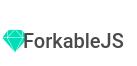
<div class="navbar-brand has-text-weight-medium is-size-5">
    <a class="navbar-item" href="https://">
       <span class="icon"> <i class="fab fa-sketch fa-lg has-text-primary"></i></span>
       ForkableJS
    </a>
</div>
@jgthms, I think you didn't notice this issue because on https://Bulma.io you use an image as a logo, so the end result is clean :

Most users will copy your navbar, remove the image, and jump in to code its alternative, as we did and fail to do. The navbar is one of the first Bulma compoment we hack, so it's rather confusing to see such rendering.
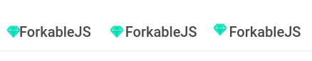
I followed comments presented on this issue #1943 I tested the following syntaxes :
<a class="navbar-item" href="https://">
      <span class="icon"> <i class="fab fa-sketch has-text-primary"></i></span>
      ForkableJS
    </a>

    <a class="navbar-item" href="https://">
      <span class="icon"> <i class="fab fa-sketch has-text-primary"></i></span>
      <span>ForkableJS</span>
    </a>

    <a class="navbar-item" href="https://">
      <span>
        <span class="icon"> <i class="fab fa-sketch has-text-primary"></i></span>
        ForkableJS
      </span>
    </a>
Gives :
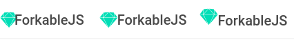
When building a navbar with the brand logo, we generally enlarge the logo, as you did with your image, via fa-lg :
<a class="navbar-item" href="https://">
  <span class="icon"> <i class="fab fa-sketch fa-lg has-text-primary"></i></span>
  ForkableJS
</a>

<a class="navbar-item" href="https://">
  <span class="icon"> <i class="fab fa-sketch fa-lg has-text-primary"></i></span>
  <span>ForkableJS</span>
</a>

<a class="navbar-item" href="https://">
  <span>
    <span class="icon"> <i class="fab fa-sketch fa-lg has-text-primary"></i></span>
    ForkableJS
  </span>
</a>
Gives:
It could be interesting to migrate your Bulma.io navbar's logo from image to code, to manipulate this issue. Who knows, it could deserve a fix in next release :heart:
Migrating Bulma logo to css svg (based on one of font awesome approaches):
.bulma-logo {
  background: url("data:image/svg+xml;charset=UTF-8,<svg role='img' xmlns='http://www.w3.org/2000/svg' viewBox='0 0 48 48'><path fill='%2300D1B2' d='m 20.5,1.5 15,14 -9,8.7 11.9,11.5 -17.5,11 -14.5,-14 3,-20.2 z'></path></svg>") center no-repeat;
  background-color: none;
  background-size: 100%;
  width: 32px;
  height:32px;
}
 hugolpz
on 23 Aug 2020
hugolpz
on 23 Aug 2020
Related issues
 swamikevala
·
3Comments
swamikevala
·
3Comments
 Antrikshy
·
3Comments
Antrikshy
·
3Comments
 fundon
·
3Comments
fundon
·
3Comments
 rogervila
·
3Comments
rogervila
·
3Comments
 jaredreich
·
3Comments
jaredreich
·
3Comments
Most helpful comment
If this is just a flexbox issue because of some tricks you are playing with navbars, then why is it broken in simple buttons as well?
For example, this does not work; it exhibits the same problem:
Instead Bulma makes me do this just so my button can look halfway decent:
The problem arises because you are using
display: inline-flexon a button. _On a button!!_ You even useinline-flexon<button>! Flexbox is wonderful, but… for button content? Really? Methinks this is the case of having a hammer and suddenly everything looks like a nail. Here flexbox causes more problems than it solves.