Bulma: is-half-mobile columns are not side by side
.column .is-half-mobile columns are not displaying side-by-side. All other breakpoints work as anticipated.
<section class="section">
<h1 class="title">Core</h1>
<h2 class="subtitle">Lorem ipsum dolor sit amet, consectetur adipisicing.</h2>
<div class="columns is-multiline">
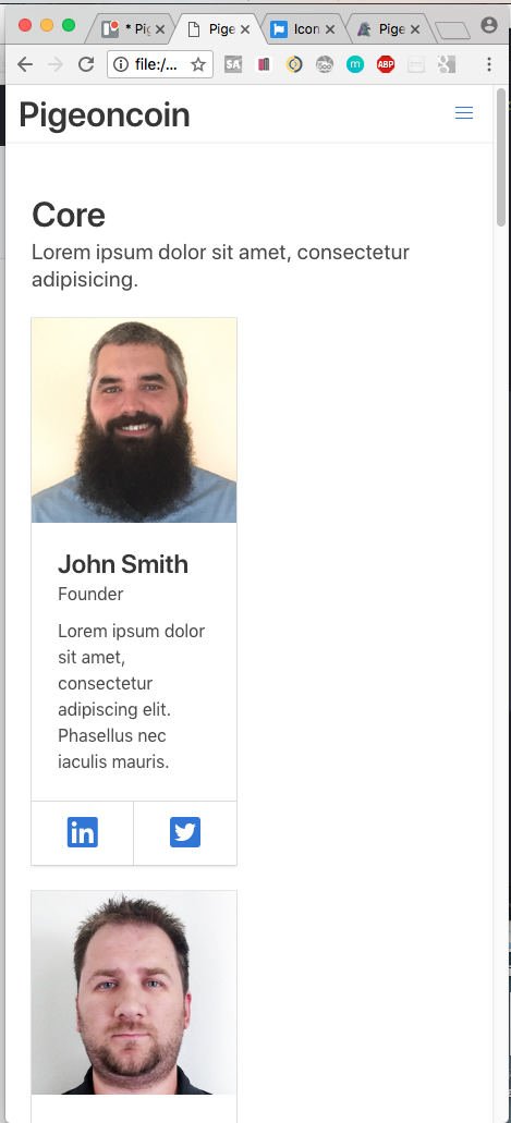
<div class="column is-half-mobile is-one-third-tablet is-one-quarter-desktop is-one-fifth-widescreen">
<div class="card">
<div class="card-image">
<figure class="image is-square">
<img src="img/luke-pighetti.jpg" alt="">
</figure>
</div>
<div class="card-content">
<div class="media">
<div class="media-content">
<p class="title is-4">John Smith</p>
<p class="subtitle is-6">Founder</p>
</div>
</div>
<div class="content">
Lorem ipsum dolor sit amet, consectetur adipiscing elit.
Phasellus nec iaculis mauris.
</div>
</div>
<footer class="card-footer">
<p class="card-footer-item">
<span>
<a href=""><i class="fab fa-linkedin fa-2x"></i></a>
</span>
</p>
<p class="card-footer-item">
<span>
<a href=""><i class="fab fa-twitter-square fa-2x"></i></a>
</span>
</p>
</footer>
</div>
</div>
<div class="column is-half-mobile is-one-third-tablet is-one-quarter-desktop is-one-fifth-widescreen">
<div class="card">
<div class="card-image">
<figure class="image is-square">
<img src="img/gabriel-muresen.jpg" alt="">
</figure>
</div>
<div class="card-content">
<div class="media">
<div class="media-content">
<p class="title is-4">John Smith</p>
<p class="subtitle is-6">Founder</p>
</div>
</div>
<div class="content">
Lorem ipsum dolor sit amet, consectetur adipiscing elit.
Phasellus nec iaculis mauris.
</div>
</div>
<footer class="card-footer">
<p class="card-footer-item">
<span>
<a href=""><i class="fab fa-linkedin fa-2x"></i></a>
</span>
</p>
<p class="card-footer-item">
<span>
<a href=""><i class="fab fa-twitter-square fa-2x"></i></a>
</span>
</p>
</footer>
</div>
</div>
<div class="column is-half-mobile is-one-third-tablet is-one-quarter-desktop is-one-fifth-widescreen">
<div class="card">
<div class="card-image">
<figure class="image is-square">
<img src="img/erik-mourin.jpg" alt="">
</figure>
</div>
<div class="card-content">
<div class="media">
<div class="media-content">
<p class="title is-4">John Smith</p>
<p class="subtitle is-6">Founder</p>
</div>
</div>
<div class="content">
Lorem ipsum dolor sit amet, consectetur adipiscing elit.
Phasellus nec iaculis mauris.
</div>
</div>
<footer class="card-footer">
<p class="card-footer-item">
<span>
<a href=""><i class="fab fa-linkedin fa-2x"></i></a>
</span>
</p>
<p class="card-footer-item">
<span>
<a href=""><i class="fab fa-twitter-square fa-2x"></i></a>
</span>
</p>
</footer>
</div>
</div>
</div>
</section>
stale
 lukepighetti
👍1
Related issues
 swthate
·
3Comments
swthate
·
3Comments
 Wikiki
·
3Comments
Wikiki
·
3Comments
 Yard8
·
3Comments
Yard8
·
3Comments
 rogervila
·
3Comments
rogervila
·
3Comments
 JenCant
·
3Comments
JenCant
·
3Comments
Most helpful comment
What about adding an extra is-mobile class on the columns div :)
All 10 comments
What about adding an extra is-mobile class on the columns div :)
Worked! thanks!
Though adding the
is-mobileclass to the columns div worked, this is not necessary to make the responsive classes work as expected for tablet or desktop viewports.I believe this inconsistency should be addressed.
Is this really the case? It's not very well thought out if so. There are responsive column helpers supposedly so that we can have multiple layouts depending on viewport size, but if we have to specify the .is-mobile on the columns wrapper, won't this fix the child columns to the mobile setting?
Following this advice ( adding
is-mobile) on a 4 column layout renders the last 2 columns not visible.@yoyowinkler You have to add the class
is-multilineto the columns div. See more at https://bulma.io/documentation/columns/options/#multilineSame here. I don't want to add
is-mobile, since other classes likeis-one-fifth-desktopwill be not able to work. Does anyone have any ideas?I solved it myself. And Sorry, I was using
is-half. So it was a different issue.is-one-fifth-desktopworks. Butis-halfdoesn't work on mobile size. The 6 div will drop out.Add
is-mobile, thenis-halfworks on mobile size. Butis-one-fifth-desktopdoesn't work...Change
is-halftois-half-touch. It completely work!06-16-2019 8:42 AM JST
fix some typos
.is-mobileshould be added whenever you want to make the columns take affect in mobile. Expecting.is-x-mobileto work without a.columns.is-mobileparent is confusing and inconsistent with how the rest of bulma works. This ticket should be closed.This issue has been automatically marked as stale because it has not had recent activity. It will be closed if no further activity occurs. Thank you for your contributions.