Bulma: Consider adding `is-transparent` to the 9 color modifier classes.
This is about Bulma.
Overview of the problem
There are a handful of specific is-* color classes. An is-transparent could be a helpful catch-all for cases that don't fit the default color options.
Description
It might be handy to have an is-transparent background modifier class (and very cheap).
Expected behavior
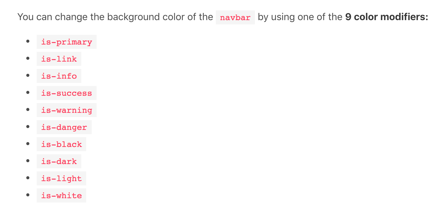
Apply no background color to an element (like the navbar).
Thanks for considering!
 benjaminapetersen
All 19 comments
Have you an example of usefull application of .is-transparent please ?
 Come2Daddy
on 25 Mar 2018
Come2Daddy
on 25 Mar 2018
I've made my own modifier to apply to the nav as I have a subtle white-to-gray gradient background in the element behind the nav in a current project, so eliminating the default background color white was important.
Granted, this is very very easy to implement as a consumer, just suggesting it may fit well into the current set of modifiers. No pressure to add frills if it seems unnecessary.
benjaminapetersen
on 26 Mar 2018
I may have misunderstood you, .navbar already have a .is-transparent class which makes sens. .nav is deprecated.
Come2Daddy
on 26 Mar 2018
Would also like an is-darker which applies rgba(3,3,3,0.3) or something along those lines
or maybe is-primary is-darker which pulls from a variable that is darken($primary, $amount)
 lukepighetti
on 17 Apr 2018
lukepighetti
on 17 Apr 2018
Hard to find the right balance between case coverage and simplicity. Bulma can't include a 256 colors palette out of the box, with shades and variations.
You can easily achieve what you want by extending bulma's SASS colors.
Come2Daddy
on 17 Apr 2018
I think an is-lighter and is-darker would be a very much appreciated addition to Bulma's color helpers, without going to the "256 color palette"
lukepighetti
on 18 Apr 2018
and I do think that bulma really needs an is-secondary as well. Most developed brands have two colors.
lukepighetti
on 18 Apr 2018
That's the purpose of SASS, brands wont use bulma's default colors. As long as they do customize the color palette, they can add any color with mostly any name.
If it's specific to color helpers, .is-lighter and .is-darker aren't a big deal to implement.
Come2Daddy
on 19 Apr 2018
So perhaps I am missing something. Were I a brand with a secondary color, would I use is-link, is-info, is-success, is-warning, or is-danger?
I think of those as UI colors not brand colors personally. I have been so far unwilling to really change them, except for is-link, and only because the secondary color was very close to a standard blue URL color.
lukepighetti
on 19 Apr 2018
I don't get your point, sorry. To me, colors are customizable enougth...
Come2Daddy
on 19 Apr 2018
It's not about it being customizable, it's about it being brandable. I'm not sure what your opinion or experience is with branding or color but an is-secondary and is-lighter is-darker would significantly improve Bulma's color classes for branding. That's my opinion, and I see very little downside.
lukepighetti
on 19 Apr 2018
Provide us some examples please.
What would be the range of theses classes ? Would they be bound to color helpers, or widely to each elements ?
Come2Daddy
on 19 Apr 2018
Tend to agree, bulma doesn't necessarily need to provide branding, that might just fall into the realm of finding helpful examples.
benjaminapetersen
on 19 Apr 2018
I don't know that bootstrap, foundation or any other framework provide branding helpers, either.
benjaminapetersen
on 19 Apr 2018
FWIW, I did similar to what you are talking about, with $brand-font-primary, $brand-font-secondary, $brand-color-primary, $brand-color-secondary, etc etc in my _variables.scss, then in my _bulma-overrides.scss would swap in my brand options where appropriate, by overriding variables.
benjaminapetersen
on 19 Apr 2018
welp, I needed this for button on black background coz I don't want it to have white background.
I think that is-transparent has cases where it would really be useful to have it
 diomed
on 26 Jun 2018
diomed
on 26 Jun 2018
Not that it really matters anymore but my question of branding was simply to say that having a built in "is-secondary" without having to extend Bulma would be great. This is what I do now, but I see no reason why it shouldn't be available from the beginning.
lukepighetti
on 27 Jun 2018
This issue has been automatically marked as stale because it has not had recent activity. It will be closed if no further activity occurs. Thank you for your contributions.
![stale[bot] picture](https://avatars3.githubusercontent.com/in/1724?v=4&s=40) stale[bot]
on 21 Jan 2019
stale[bot]
on 21 Jan 2019
Tags is another use case where is-transparent would be useful to format links, such as "Show more/less" toggle:
<div class="tags">
  <span class="tag is-rounded">1.0.0</span>
  <span class="tag is-rounded">1.0.1</span>
  <span class="tag is-transparent">
    <a>Show 2 more...</a>
  </span>
</div>
.is-transparent {
    background-color: transparent !important;
}

 sshymko
on 13 Nov 2020
sshymko
on 13 Nov 2020
Related issues
 JenCant
·
3Comments
JenCant
·
3Comments
 scottgrayson
·
3Comments
scottgrayson
·
3Comments
 Antrikshy
·
3Comments
Antrikshy
·
3Comments
 Yard8
·
3Comments
Yard8
·
3Comments
 jaredreich
·
3Comments
jaredreich
·
3Comments
Most helpful comment
Hard to find the right balance between case coverage and simplicity. Bulma can't include a 256 colors palette out of the box, with shades and variations.
You can easily achieve what you want by extending bulma's SASS colors.